解决fixed在苹果手机抖动问题/头部底部固定布局

1、头部和底部固定,中间内容滚动,不涉及fixed

1)absolute与height:100%

<!DOCTYPE html>
<html>
<head>
  <meta charset="utf-8">
  <meta name="viewport" content="initial-scale=1.0, maximum-scale=1.0, user-scalable=no" />
  <title></title>
  <style>
    html{height: 100%;}
    body{padding:0px;margin:0px;overflow: hidden;height: 100%;}
    header{height: 50px;line-height: 50px;background: red;text-align: center;}
    section{height: 100%;overflow-y: auto;}
    .content{padding-bottom: 100px;}
    footer{height: 50px;line-height: 50px;background: red;position: absolute;width: 100%;bottom: 0px;text-align: center;}
  </style>
</head>
<body>
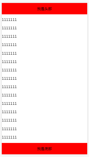
  <header>我是头部</header>
  <section>
    <div class="content"></div>
  </section>
  <footer>我是底部</footer>
</body>
</html>

2) flex与 height: 100vh


 <!DOCTYPE html>

<html>

<head>
<meta charset="utf-8">
<meta name="viewport" content="width=device-width, initial-scale=1.0, minimum-scale=1.0, maximum-scale=1.0, user-scalable=no">
<style>
body {
  margin: 0px;
  padding: 0px;
}
.main {
  display: flex;
  flex-direction: column;
  height: 100vh;
}
header {
  height: 50px;
  line-height: 50px;
  background: #ddd;
  text-align: center;
}
section {
  overflow-y: auto;
}
footer {
  height: 50px;
  line-height: 50px;
  background: #ddd;
  width: 100%;
  text-align: center;
}
</style>
</head>
<body>
  <div class="main">
    <header class="main_1">我是头部</header>
    <section class="main_1">
      <div class="content">
        <div>11111111111</div>
      </div>
    </section class="main_1">
    <footer>我是底部</footer>
  </div>
</body>


2、如果是使用ionic框架,用其自带组件
     <ion-fab></ion-fab>
posted @ 2018-04-28 22:17  雨夜稻草  阅读(1437)  评论(0编辑  收藏  举报