气泡小角的css实现
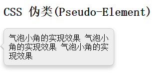
<!DOCTYPE html>
<html xmlns="http://www.w3.org/1999/xhtml" dir="ltr">
<head> <title>CSS 箭头Demo</title>
    <style type="text/css">
        /* 基本样式 */
        .tip {
            background: #eee;
            border: 1px solid #ccc;
            padding: 10px;
            border-radius: 8px;
            box-shadow: 0 5px 10px rgba(0, 0, 0, 0.2);
            position: relative;
            width: 200px;
        }
        /* 箭头 - :before and :after, 一起组成了气泡小角 */
        .tip:before {
            position: absolute;
            display: inline-block;
            border-width: 7px;
            border-style: solid;
            border-color: transparent rgba(0, 0, 0, 0.2) transparent transparent;
            left: -15px;
            top: 40%;
            content: '';
        }
        /* 小角的背景填充*/
        .tip:after {
            position: absolute;
            display: inline-block;
            border-width: 6px;/*与before的三角形重叠差1px,和元素边框是边框宽度一致*/
            border-style: solid;
            border-color: transparent #eee transparent transparent;/*边框颜色(小角的填充色)要与整体元素背景一致*/
            left: -12px;
            top: 40%;
            content: '';
        }
    </style>
</head>
<body>
<div id="contentHolder">
    <h2>CSS  伪类(Pseudo-Element)</h2>
    <div style="position:relative;">
        <div class="tip">
            气泡小角的实现效果
            气泡小角的实现效果
            气泡小角的实现效果
        </div>
    </div>
</div>
</body>
</html>
执行效果图: