drawBar(){
                let that = this;
                let chart = this.$echarts.init(document.getElementById('bar-graph'));
                let barOption = {
                    color: ['#29B4FC'],
                    tooltip : {
                        trigger: 'axis',
                        // formatter: function(params) {
                        //     return params[0].value + '篇-' + params[0].name +'年'
                        // }
                    },
                    grid: {
                        top:'20%',
                        left: '1%',
                        bottom: '5%',
                        containLabel: true
                    },
                    xAxis : [
                        {
                            type : 'category',
                            data : that.countryName,
                            axisLine:{show:false},
                            axisTick:{show:false},
                            //max:5
                        }
                    ],
                    yAxis : [
                        {
                            type : 'value',
                            show:false
                        }
                    ],
                    series : [
                        {
                            type:'bar',
                            barWidth: '30%',
                            data:that.countryValue,
                            itemStyle: {   
                                //通常情况下:
                                normal:{  
                                //每个柱子的颜色即为colorList数组里的每一项,如果柱子数目多于colorList的长度,则柱子颜色循环使用该数组
                                    color: function (params){
                                        var colorList = that.colorList;
                                        return colorList[params.dataIndex];
                                    }
                                },
                                
                            },
                            label:{
                                normal:{
                                    show:true,
                                    position:'top',
                                    textStyle:{
                                        color:function (params){
                                            var colorList = that.colorList;
                                            return colorList[params.dataIndex];
                                        },
                                        //fontSize:9
                                    }                                    
                                }
                            },
                            barCategoryGap:"65%"
                        }
                    ]
                };
                chart.setOption(barOption);
                chart.on('click', function (params) {
                    that.colorList.forEach((i,v)=>{
                        that.colorList[v] = "#29b4fc"
                    })
                    that.colorList[params.dataIndex] = "#00C99A"//点击时改变当前柱子的颜色
                    chart.setOption(barOption);
                    that.circleId = params.dataIndex+1;
                    let lis = that.$refs.green.getElementsByTagName("li");
                    let li = Array.from(lis);
                    li.forEach((li)=>{
                        li.style.cssText = "border-bottom:none"
                    })
                    li[params.dataIndex].style.cssText = "border-bottom:2px solid #00C99A"
                    that.getCircleData();
            })
            },

echarts柱状图的点击事件,之前在网上找了很久,在echarts的官网查了API,本人属于阅读有障碍的人,真的不愿意看文档,就自己瞎琢磨试验,很好使,之后再vue的项目中就照这个套路使,一直没有出错 很成功,这个模板比较适合刚开始接触vue 以及在vue的项目中使用echarts的同学们 

"barGap": "30%" 是调整双柱状图之间的间隔的 有人说不生效 ,那应该你的柱状图不是双的
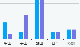
 

类似于这种

"axisTick": {
show: true
},
"axisLine":{
    show:true
   }
这两个属性是控制x轴或y轴的刻度以及线条是否显示
"legend": {
'left':'2%',}调整小图标的位置


posted on 2018-03-28 18:07  陈玉蓉  阅读(5249)  评论(0编辑  收藏  举报