


一、圆角、rgba
设置某一个角的圆角,比如设置左上角的圆角:
border-top-left-radius:30px 60px;
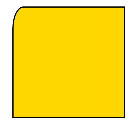
border-top-left-radius: 60px;

同时分别设置四个角:
border-radius:30px 60px 120px 150px;
设置四个圆角相同:
border-radius:50%;
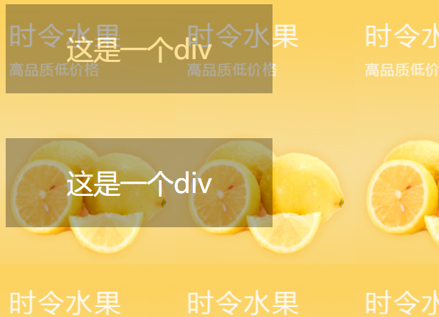
①盒子透明度表示法:
.box
    {
        opacity:0.1;
        /* 兼容IE */
        filter:alpha(opacity=10);
    }
②rgba(0,0,0,0.1) 前三个数值表示颜色,第四个数值表示颜色的透明度
<!DOCTYPE html>
<html lang="en">
<head>
    <meta charset="UTF-8">
    <title>透明度</title>
    <style type="text/css">
        body{
            background: url(images/banner01.jpg);
        }
        .box{
            width: 300px;
            height: 100px;
            background-color: #000;
            color: #fff;
            text-align: center;
            line-height: 100px;
            font-size: 30px;
            /*设置透明度*/
            opacity: 0.3;
            /*兼容IE*/
            filter: alpha(opacity=30);
        }
        .box2{
            width: 300px;
            height: 100px;
            /*设置盒子透明但文字不会变透明*/
            background-color: rgba(0,0,0,0.3);
            color: #fff;
            text-align: center;
            line-height: 100px;
            font-size: 30px;
            margin-top: 50px;
        }
    </style>
</head>
<body>
    <div class="box">这是一个div</div>
    <div class="box2">这是一个div</div>
</body>
</html>
二、transition动画
1、transition-property 设置过渡的属性,比如:width height background-color
2、transition-duration 设置过渡的时间,比如:1s 500ms
3、transition-timing-function 设置过渡的运动方式,常用有 linear(匀速)|ease(缓冲运动)
4、transition-delay 设置动画的延迟
5、transition: property duration timing-function delay 同时设置四个属性
<!DOCTYPE html>
<html lang="en">
<head>
    <meta charset="UTF-8">
    <title>transition动画</title>
    <style type="text/css">
        .box{
            width: 100px;
            height: 100px;
            background-color: gold;
            transition: width 1s ease,height 1s ease 1s,background-color 1s ease 2s;

        }
        .box:hover{
            width: 600px;
            height: 600px;
            background-color: red;
        }
    </style>
</head>
<body>
    <div class="box"></div>
</body>
</html>
如果是多个属性同时的动画,可以合并成下面语句:
      .box{
            width: 100px;
            height: 100px;
            background-color: gold;
            /*transition: width 1s ease,height 1s ease,background-color 1s ease;*/
            transition: all 1s ease;
        }
        .box:hover{
            width: 600px;
            height: 600px;
            background-color: red;
        }
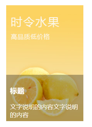
案例:
<!DOCTYPE html>
<html lang="en">
<head>
    <meta charset="UTF-8">
    <title>图片说明</title>
    <style type="text/css">
        .pic_con{
            width: 200px;
            height: 300px;
            margin: 50px auto 0;
            position: relative;
            overflow: hidden;
        }
        .pic_info{
            position: absolute;
            left: 0;
            top: 300px;
            width: 180px;
            height: 100px;
            background-color: rgba(0,0,0,0.3);
            color: #fff;
            padding: 10px;
            transition: all 500ms ease;
        }
        .pic_con:hover .pic_info{
            top:180px;
        }

    </style>
</head>
<body>
    <div class="pic_con">
        <a href=""><img src="images/banner01.jpg" alt=""></a>
        <div class="pic_info">
            <h3>标题</h3>
            <p>文字说明的内容文字说明的内容</p>
        </div>
    </div>
</body>
</html>
三、transform变换
1、translate(x,y) 设置盒子位移
2、scale(x,y) 设置盒子缩放
3、rotate(deg) 设置盒子旋转
4、skew(x-angle,y-angle) 设置盒子斜切
<!DOCTYPE html>
<html lang="en">
<head>
    <meta charset="UTF-8">
    <title>变换</title>
    <!-- 变换不是动画 -->
    <style type="text/css">
        .box{
            width: 200px;
            height: 200px;
            border: 3px solid #000;
            background-color: gold;
            margin: 50px auto 0;
            /*translate位移的性能比定位要高*/
            transform: translate(0px,0px);
            transition: all 1s ease;
        }
        .box:hover{
            transform: translate(30px,30px);
        }
        .box2{
            width: 200px;
            height: 200px;
            border: 3px solid #000;
            background-color: gold;
            margin: 50px auto 0;
            /*放大一倍*/
            transform: scale(1,1);
            transition: all 1s ease;
        }
        .box2:hover{
            transform: scale(2,2);
        }
        .box3{
            width: 200px;
            height: 200px;
            border: 3px solid #000;
            background-color: gold;
            margin: 50px auto 0;
            /*旋转 默认绕着z轴旋转*/
            transform: rotate(0deg);
            transition: all 1s ease;
        }
        .box3:hover{
            transform: rotate(45deg);
        }
        .box4{
            width: 200px;
            height: 200px;
            border: 3px solid #000;
            background-color: gold;
            margin: 50px auto 0;
            /*斜切 不好控制一般不用*/
            transform: skew(0,0);
            transition: all 1s ease;
        }
        .box4:hover{
            transform: skew(45deg,0deg);
        }
    </style>
</head>
<body>
    <div class="box"></div>
    <div class="box2"></div>
    <div class="box3"></div>
    <div class="box4"></div>
</body>
</html>
5、tranform-origin 设置变形的中心点
<!DOCTYPE html>
<html lang="en">
<head>
    <meta charset="UTF-8">
    <title>transform</title>
    <style type="text/css">
        div{
            width: 200px;
            height: 200px;
            border: 3px solid #000;
            background-color: pink;
            margin: 30px;
            float: left;
            transition: all 500ms ease;
        }
        .box2{
            transform-origin: left center;
        }
        .box3{
            transform-origin: left top;
        }
        .box4{
            transform-origin: 50px 50px;
        }
        div:hover{
            transform: rotate(45deg);
        }
    </style>
</head>
<body>
    <div class="box1"></div>
    <div class="box2"></div>
    <div class="box3"></div>
    <div class="box4"></div>
</body>
</html>
6、rotateX、rotateY、rotateZ 设置三维旋转
7、perspective 设置透视距离
8、transform-style:flat | preserve-3d 设置盒子是否按3d空间显示
<!DOCTYPE html>
<html lang="en">
<head>
    <meta charset="UTF-8">
    <title>三维旋转</title>
    <style type="text/css">
        .box{
            width: 300px;
            height: 300px;
            background-color: yellowgreen;
            border: 3px solid #000;
            margin: 50px auto 0;
            /*设置盒子按3d显示*/
            transform-style: preserve-3d;
            /*3d旋转需要设置一个透视距离,一般值为800px*/
            /*不设置初始值 可能会出现跳变的bug*/
            transform: perspective(800px) rotateY(0deg);
            transition: all 1s ease;
        }
        .box:hover{
            transform: perspective(800px) rotateY(90deg);
        }
    </style>
</head>
<body>
    <div class="box"></div>
</body>
</html>
9、scaleX、scaleY、scaleZ 设置三维缩放
10、translateX、translateY、translateZ 设置三维移动
11、backface-visibility 设置盒子背面是否可见
<!DOCTYPE html>
<html lang="en">
<head>
    <meta charset="UTF-8">
    <title>图片翻转</title>
    <style type="text/css">
        .box{
            width: 700px;
            height: 272px;
            border: 3px solid #000;
            margin: 50px auto 0;
            position: relative;
            transform-style: preserve-3d;
        }
        .box img{
            position: absolute;
            left: 200px;
            top: 0;
            transform: perspective(800px) rotateY(0deg);
            transition: all 1s ease;
            /*设置盒子背面不可见*/
            backface-visibility: hidden;
        }
        .box:hover img{
            transform:perspective(800px) rotateY(180deg);
        }
        .box .back{
            width: 300px;
            height: 272px;
            background-color: pink;
            font-size: 20px;
            text-align: center;
            line-height: 272px;
            position: absolute;
            left: 200px;
            top: 0;
            /*背面的初始角度设为-180deg,保证顺时针旋转*/
            transform: perspective(800px) rotateY(-180deg);
            transition: all 1s ease;
            backface-visibility: hidden;
        }
        .box:hover .back{
            transform: perspective(800px) rotateY(0deg);
        }
    </style>
</head>
<body>
    <div class="box">
        <img src="images/location_bg.jpg" />
        <div class="back">图片的说明文字</div>
    </div>
</body>
</html>
四、animation动画
关键帧动画,设置元素自己动,不需要触发。
1、@keyframes 定义关键帧动画
2、animation-name 动画名称
3、animation-duration 动画时间
4、animation-timing-function 动画曲线 linear(匀速)|ease(缓冲)|steps(步数)
5、animation-delay 动画延迟
6、animation-iteration-count 动画播放次数 n|infinite
7、animation-direction 动画结束后是否反向还原 normal|alternate
8、animation-play-state 动画状态 paused(停止)|running(运动)
9、animation-fill-mode 动画前后的状态 none(缺省)|forwards(结束时停留在最后一帧)|backwards(开始时停留在定义的开始帧)|both(前后都应用)
10、animation:name duration timing-function delay iteration-count direction;同时设置多个属性
<!DOCTYPE html>
<html lang="en">
<head>
    <meta charset="UTF-8">
    <title>动画</title>
    <style type="text/css">
        /* 定义动画 */
        @keyframes moving{
            from{
                width: 100px;
            }
            to{
                width: 500px;
            }
        }

        .box{
            width: 100px;
            height: 100px;
            background-color: gold;
            /*名称 时间 动画曲线 动画延迟 播放次数 是否反向还原*/
            /*如果设置了反向还原,一去一来算两次播放*/
            animation: moving 1s ease 1s 4 alternate;
        }
        .box:hover{
            /*播放状态变为暂停*/
            animation-play-state: paused;
        }
    </style>
</head>
<body>
    <div class="box"></div>
</body>
</html>
风车动画:

<!DOCTYPE html>
<html lang="en">
<head>
    <meta charset="UTF-8">
    <title>风车</title>
    <style type="text/css">
        @keyframes fc_rotate{
            from{
                transform: rotate(0);
            }
            to{
                transform: rotate(360deg);
            }
        }

        .fc{
            display: block;
            width: 400px;
            height: 400px;
            margin: 50px auto 0;
            /*一次1s 匀速旋转 延迟可以不设 无限次 不设返回*/
            animation: fc_rotate 1s linear infinite;
            animation-play-state: paused;
        }
        .fc:hover{
            /*鼠标放上去才会转动*/
            animation-play-state: running;
        }
    </style>
</head>
<body>
    <img src="images/fengche.png" alt="风车" class="fc" />
</body>
</html>
loading动画:
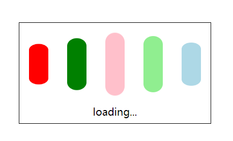
<!DOCTYPE html>
<html lang="en">
<head>
    <meta charset="UTF-8">
    <title>loading动画</title>
    <style type="text/css">
        @keyframes loading{
            from{
                transform: scale(1,1);
            }
            to{
                transform: scale(1,0.5);
            }
        }
        .con{
            width: 300px;
            height: 158px;
            border: 1px solid #000;
            margin: 150px auto 0;
        }
        .con div{
            width: 30px;
            height: 100px;
            float: left;
            background-color: gold;
            margin: 15px;
            border-radius: 15px;
            animation: loading 500ms ease infinite alternate;
        }
        .con div:nth-child(1){
            background-color: red;
        }
        .con div:nth-child(2){
            background-color: green;
            animation-delay: 100ms;
        }
        .con div:nth-child(3){
            background-color: pink;
            animation-delay: 200ms;
        }
        .con div:nth-child(4){
            background-color: lightgreen;
            animation-delay: 300ms;
        }
        .con div:nth-child(5){
            background-color: lightblue;
            animation-delay: 400ms;
        }
        .con p{
            text-align: center;
        }
    </style>
</head>
<body>
    <div class="con">
        <div></div>
        <div></div>
        <div></div>
        <div></div>
        <div></div>
        <p>loading...</p>
    </div>
</body>
</html>
走路动画:
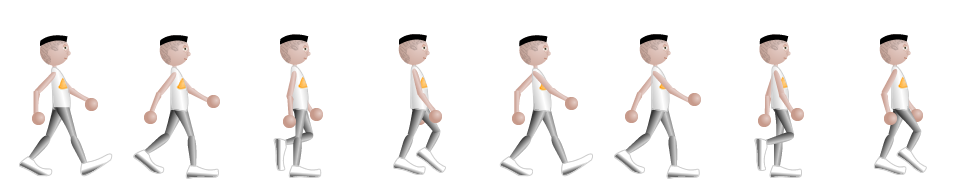
<!DOCTYPE html>
<html lang="en">
<head>
    <meta charset="UTF-8">
    <title>走路动画</title>
    <style type="text/css">
        @keyframes walking{
            from{
                left: 0;
            }
            to{
                left: -960px;
            }
        }

        .box{
            width: 120px;
            height: 180px;
            border: 1px solid #000;
            margin: 50px auto 0;
            overflow: hidden;
            position: relative;
        }
        .box img{
            position: absolute;
            left: 0;
            top: 0;
            /*变换方式为跳变,分八次完成*/
            animation: walking 1s steps(8) infinite;
        }
    </style>
</head>
<body>
    <div class="box">
        <img src="images/walking.png" alt="走路动画">
    </div>
</body>
</html>
五、CSS3新增选择器
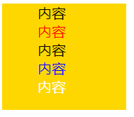
1、E:nth-child(n):匹配元素类型为E且是父元素的第n个子元素
2、E:first-child:匹配元素类型为E且是父元素的第一个子元素
3、E:last-child:匹配元素类型为E且是父元素的最后一个子元素
<!DOCTYPE html>
<html lang="en">
<head>
    <meta charset="UTF-8">
    <title>选择器</title>
    <style type="text/css">
        .list{
            list-style: none;
            width: 100px;
            height: 120px;
            background-color: gold;
        }
        .list li:nth-child(2){
            color: red;
        }
        .list li:nth-child(4){
            color: blue;
        }
        .list li:last-child{
            color: #fff;
        }
    </style>
</head>
<body>
    <ul class="list">
        <li>内容</li>
        <li>内容</li>
        <li>内容</li>
        <li>内容</li>
        <li>内容</li>
    </ul>
</body>
</html>
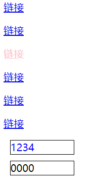
4、E > F E元素下面第一层子集
5、E ~ F E元素后面的所有兄弟元素
6、E + F 紧挨着的后面的兄弟元素
<!DOCTYPE html>
<html lang="en">
<head>
    <meta charset="UTF-8">
    <title>选择器</title>
    <style type="text/css">
        .box p:nth-child(3)>a{
            text-decoration: none;
            color: pink;
        }
        .box~div{
            border: 1px solid #000;
            width: 100px;
            margin: 10px;
        }
        .box+div{
            color: blue;
        }
    </style>
</head>
<body>
    <div class="box">
        <p><a href="#">链接</a></p>
        <p><a href="#">链接</a></p>
        <p><a href="#">链接</a></p>
        <p><a href="#">链接</a></p>
        <p><a href="#">链接</a></p>
        <p><a href="#">链接</a></p>
    </div>
    <div>
        1234
    </div>
    <div>
        0000
    </div>
</body>
</html>
属性选择器:
1、E[attr] 含有attr属性的元素
<style type="text/css">
    div[data-attr='ok']{
        color:red;
    }
</style>
......
<div data-attr="ok">这是一个div元素</div>
2、E[attr='ok'] 含有attr属性的元素且它的值为“ok”
3、E[attr^='ok'] 含有attr属性的元素且它的值的开头含有“ok”
4、E[attr$='ok'] 含有attr属性的元素且它的值的结尾含有“ok”
5、E[attr*='ok'] 含有attr属性的元素且它的值中含有“ok”
六、CSS权重
CSS权重指的是样式的优先级,有两条或多条样式作用于一个元素,权重高的那条样式对元素起作用,权重相同的,后写的样式会覆盖前面写的样式。
把样式的应用方式分为几个等级,按照等级来计算权重
1、!important,加在样式属性值后,权重值为 10000
2、内联样式,如:style=””,权重值为1000
3、ID选择器,如:#content,权重值为100
4、类,伪类和属性选择器,如: content、:hover 权重值为10
5、标签选择器和伪元素选择器,如:div、p、:before 权重值为1
6、通用选择器(*)、子选择器(>)、相邻选择器(+)、同胞选择器(~)、权重值为0
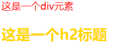
<!DOCTYPE html>
<html lang="en">
<head>
    <meta charset="UTF-8">
    <title>权重</title>
    <style type="text/css">
        .box{
            color: red!important;
        }
        #content div.main_content h2{
            color: gold;
        }
        #content .main_content h2{
            color: green;
        }
    </style>
</head>
<body>
    <div class="box" style="color: blue;">
        这是一个div元素
    </div>

    <div id="content">
        <div class="main_content">
            <h2>这是一个h2标题</h2>
        </div>
    </div>
    <!--
    第一条样式的权重计算: 100+1+10+1,结果为112;
    第二条样式的权重计算: 100+10+1,结果为111;
    h2标题的最终颜色为red
    -->
</body>
</html>
七、移动端与PC端布局区别
视口
视口是移动设备上用来显示网页的区域,一般会比移动设备可视区域大,宽度可能是980px或者1024px,目的是为了显示下整个为PC端设计的网页,这样带来的后果是移动端会出现横向滚动条,为了避免这种情况,移动端会将视口缩放到移动端窗口的大小。这样会让网页不容易观看。
可以用 meta 标签,name=“viewport ” 来设置视口的大小,将视口的大小设置为和移动设备可视区一样的大小。
设置方法如下( 快捷方式:meta:vp + tab ):
<head>
......
<meta name="viewport" content="width=device-width, user-scalable=no,
 initial-scale=1.0, maximum-scale=1.0, minimum-scale=1.0">
......
</head>
pc端与移动端渲染网页过程
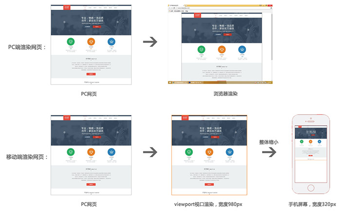
视口默认按980px渲染网页,然后直接缩放,这样虽然不会出现滚动条,但会导致页面内容过小。
设置视口大小,可以使视口渲染时就按照手机屏幕大小来渲染
<!DOCTYPE html>
<html lang="en">
<head>
    <meta charset="UTF-8">
    <title>视口</title>
    <style type="text/css">
        .box{
            width: 300px;
            height: 300px;
            background-color: gold;
        }
    </style>
    <!-- 快捷键 meta:vp + tab -->
    <!-- width=device-width 视口宽度 -->
    <!-- user-scalable=no 不允许用户自己缩放 -->
    <meta name="viewport" content="width=device-width, user-scalable=no, initial-scale=1.0, maximum-scale=1.0, minimum-scale=1.0">
</head>
<body>
    <div class="box"></div>
</body>
</html>
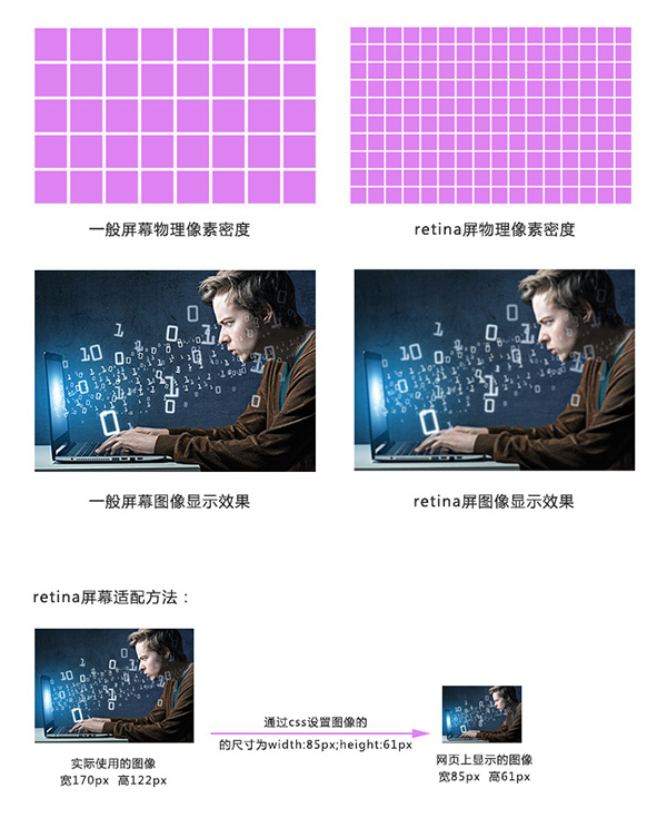
视网膜屏幕(retina屏幕)清晰度解决方案
视网膜屏幕指的是屏幕的物理像素密度更高的屏幕,物理像素可以理解为屏幕上的一个发光点,无数发光的点组成的屏幕,视网膜屏幕比一般屏幕的物理像素点更小,常见有2倍的视网膜屏幕和3倍的视网膜屏幕,2倍的视网膜屏幕,它的物理像素点大小是一般屏幕的1/4,3倍的视网膜屏幕,它的物理像素点大小是一般屏幕的1/9。
图像在视网膜屏幕上显示的大小和在一般屏幕上显示的大小一样,但是由于视网膜屏幕的物理像素点比一般的屏幕小,图像在上面好像是被放大了,图像会变得模糊,为了解决这个问题,可以使用比原来大一倍的图像,然后用css样式强制把图像的尺寸设为原来图像尺寸的大小,就可以解决模糊的问题。
<!DOCTYPE html>
<html lang="en">
<head>
    <meta charset="UTF-8">
    <title>retina</title>
    <style type="text/css">
        <!-- 通过样式将尺寸设为原来的一半 -->
        .shipei{
            width: 300px;
            height: 215px;
        }
    </style>
</head>
<body>
    <img src="images/pic1x.jpg" alt="1倍图">
    <img src="images/pic2x.jpg" alt="2倍图" class="shipei">
</body>
</html>
背景图为了适配retina,也要用两倍图片来缩放。
背景图强制改变大小,可以使用background新属性:
background-size:
length:用长度值指定背景图像大小。不允许负值。
percentage:用百分比指定背景图像大小。不允许负值。
auto:背景图像的真实大小。
cover:将背景图像等比缩放到完全覆盖容器,背景图像有可能超出容器。
contain:将背景图像等比缩放到宽度或高度与容器的宽度或高度相等,背景图像始终被包含在容器内。
八、适配布局类型
适配方法
设备屏幕有多种不同的分辨率,页面适配方案有如下几种:
1、全适配:响应式布局+流体布局
2、移动端适配:
流体布局+少量响应式
基于rem的布局
流体布局
流体布局,就是使用百分比来设置元素的宽度,元素的高度按实际高度写固定值,流体布局中,元素的边线无法用百分比,可以使用样式中的计算函数 calc() 来设置宽度,或者使用 box-sizing 属性将盒子设置为从边线计算盒子尺寸。
calc()
可以通过计算的方式给元素加尺寸,比如: width:calc(25% - 4px);
box-sizing
1、content-box 默认的盒子尺寸计算方式
2、border-box 设置盒子的尺寸计算方式为从边框开始,盒子的尺寸,边框和内填充算在盒子尺寸内
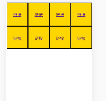
<!DOCTYPE html>
<html lang="en">
<head>
    <meta charset="UTF-8">
    <title>流体布局</title>
    <meta name="viewport" content="width=device-width, user-scalable=no, initial-scale=1.0, maximum-scale=1.0, minimum-scale=1.0">
    <style type="text/css">
        body{
            margin: 0;
        }
        .con a{
            display: block;
            /*css3新属性 解决边框问题 要写空格*/
            width: calc(25% - 4px);
            height: 100px;
            background-color: gold;
            text-align: center;
            line-height: 100px;
            font-size: 18px;
            float: left;
            border: 2px solid #000;
        }
        .con2 a{
            display: block;
            width: 25%;
            height: 100px;
            background-color: gold;
            text-align: center;
            line-height: 100px;
            font-size: 18px;
            float: left;
            border: 2px solid #000;
            /*设置宽度从边框开始计算*/
            box-sizing: border-box;
        }
    </style>
</head>
<body>
    <div class="con">
        <a href="#">链接</a>
        <a href="#">链接</a>
        <a href="#">链接</a>
        <a href="#">链接</a>
    </div>
    <div class="con2">
        <a href="#">链接</a>
        <a href="#">链接</a>
        <a href="#">链接</a>
        <a href="#">链接</a>
    </div>
</body>
</html>
响应式布局
响应式布局就是使用媒体查询的方式,通过查询浏览器宽度,不同的宽度应用不同的样式块,每个样式块对应的是该宽度下的布局方式,从而实现响应式布局。响应式布局的页面可以适配多种终端屏幕(pc、平板、手机)
@media (max-width:960px){
    .left_con{width:58%;}
    .right_con{width:38%;}
}
@media (max-width:768px){
    .left_con{width:100%;}
    .right_con{width:100%;}
}
<!DOCTYPE html>
<html lang="en">
<head>
    <meta charset="UTF-8">
    <title>响应式布局</title>
    <meta name="viewport" content="width=device-width, user-scalable=no, initial-scale=1.0, maximum-scale=1.0, minimum-scale=1.0">
    <style type="text/css">
        body{
            margin: 0;
        }
        .con div{
            width: 23%;
            height:200px;
            border: 2px solid #000;
            background-color: gold;
            margin: 1%;
            float: left;
            /*边框算到23%里*/
            box-sizing: border-box;
        }
        /*屏幕宽度小于800时下面的样式起作用*/
        @media (max-width: 800px) {
            .con div{
                width: 46%;
                margin: 2%;
            }
        }

        @media (max-width: 400px) {
            .con div{
                width: 94%;
                margin: 3%;
            }
        }

    </style>
</head>
<body>
    <div class="con">
        <div>1</div>
        <div>2</div>
        <div>3</div>
        <div>4</div>
    </div>
</body>
</html>
基于rem的布局
首先了解em单位,em单位是参照元素自身的文字大小来设置尺寸。
<!DOCTYPE html>
<html lang="en">
<head>
    <meta charset="UTF-8">
    <title>em</title>
    <style type="text/css">
        .box{
            font-size: 15px;
            width: 20em;/*300px*/
            height: 10em;/*150px*/
            background-color: gold;
        }
        .box2{
            font-size: 20px;
            width: 20em;/*400px*/
            height: 10em;/*200px*/
            text-indent: 2em;/*缩进两个字大小*/
            background-color: green;
        }
    </style>
</head>
<body>
    <div class="box">这是一个盒子</div>
    <div class="box2">这是一个盒子</div>
</body>
</html>
rem指的是参照根节点的文字大小,根节点指的是html标签,设置html标签的文字大小,其他的元素相关尺寸设置用rem,这样,所有元素都有了统一的参照标准,改变html文字的大小,就会改变所有元素用rem设置的尺寸大小。
<!DOCTYPE html>
<html lang="en" style="font-size: 20px;">
<!-- rem参照HTML的文字大小标准 -->
<head>
    <meta charset="UTF-8">
    <title>rem</title>
    <style type="text/css">
        .box{
            font-size: 15px;
            width: 20rem;
            height: 10rem;
            background-color: gold;
        }
        .box2{
            font-size: 20px;
            width: 20rem;
            height: 10rem;
            text-indent: 2rem;
            background-color: green;
        }
    </style>
</head>
<body>
    <div class="box">这是一个盒子</div>
    <div class="box2">这是一个盒子</div>
</body>
</html>
cssrem安装
cssrem插件可以动态地将px尺寸换算成rem尺寸
下载本项目,比如:git clone https://github.com/flashlizi/cssrem 进入packages目录:Sublime Text -> Preferences -> Browse Packages,复制下载的cssrem目录到刚才的packges目录里。 重启Sublime Text。
配置参数 参数配置文件:Sublime Text -> Preferences -> Package Settings -> cssrem px_to_rem - px转rem的单位比例,默认为40。 max_rem_fraction_length - px转rem的小数部分的最大长度。默认为6。 available_file_types - 启用此插件的文件类型。默认为:[".css", ".less", ".sass"]。
九、浏览器前缀
为了让CSS3样式兼容,需要将某些样式加上浏览器前缀:
-ms- 兼容IE浏览器
-moz- 兼容firefox
-o- 兼容opera
-webkit- 兼容chrome 和 safari(一般加这一句就可以了)
div
{
    -ms-transform: rotate(30deg);
    -webkit-transform: rotate(30deg);
    -o-transform: rotate(30deg);
    -moz-transform: rotate(30deg);
    transform: rotate(30deg);
}
自动添加浏览器前缀:
目前的状况是,有些CSS3属性需要加前缀,有些不需要加,有些只需要加一部分,这些加前缀的工作可以交给插件来完成,比如安装: autoprefixer
可以在Sublime text中通过package control 安装 autoprefixer
Autoprefixer在Sublime text中的设置:
1、preferences/key Bindings-User
{ "keys": ["ctrl+alt+x"], "command": "autoprefixer" }
2、Preferences>package setting>AutoPrefixer>Setting-User
{
    "browsers": ["last 7 versions"],
    "cascade": true,
    "remove": true
}
last 7 versions:最新的浏览器的7个版本
cascade:缩进美化属性值
remove:是否去掉不必要的前缀
十、HTML5新增标签
新增语义标签
1、<header> 页面头部、页眉
2、<nav> 页面导航
3、<article> 一篇文章
4、<section> 文章中的章节
5、<aside> 侧边栏
6、<footer> 页面底部、页脚
音频视频
1、<audio>
2、<video>
以上标签实际使用不多。
PC端兼容h5的新标签的方法,在页面中引入以下js文件
<script type="text/javascript" src="//cdn.bootcss.com/html5shiv/r29/html5.js"></script>
HTML5新增表单控件
新增类型:网址 邮箱 日期 时间 星期 数量 范围 电话 颜色 搜索
<label>网址:</label><input type="url" name="" required><br><br>
<label>邮箱:</label><input type="email" name="" required><br><br>
<label>日期:</label><input type="date" name=""><br><br>
<label>时间:</label><input type="time" name=""><br><br>
<label>星期:</label><input type="week" name=""><br><br>
<label>数量:</label><input type="number" name=""> <br><br>
<label>范围:</label><input type="range" name=""><br><br>
<label>电话:</label><input type="tel" name=""><br><br>
<label>颜色:</label><input type="color" name=""><br><br>
<label>搜索:</label><input type="search" name=""><br><br>
新增常用表单控件属性:
1、placeholder 设置文本框默认提示文字
2、autofocus 自动获得焦点(不用设置值)
3、autocomplete 联想关键词
