1、CSS简介
为了让网页元素的样式更加丰富,也为了让网页的内容和样式能拆分开,CSS由此思想而诞生
CSS是 Cascading Style Sheets 的首字母缩写,意思是层叠样式表
有了CSS,html中大部分表现样式的标签就废弃不用了,html只负责文档的结构和内容,表现形式完全交给CSS,html文档变得更加简洁。
css的定义方法是:
选择器 { 属性:值; 属性:值; 属性:值;}
2、CSS引入方式
<!DOCTYPE html>
<html lang="en">
<head>
    <meta charset="UTF-8">
    <title>css引入</title>
    <!-- 外联式:常用,内容和样式分离 -->
    <link rel="stylesheet" type="text/css" href="css/001.css">
    <style type="text/css">
        /* 注释快捷键:Ctrl+shift+/ */
        /* 嵌入式:首页一般会用可以提高性能 */
        h2{
            font-size: 26px;
            color: blue;
        }
    </style>
</head>
<body>
    <div>这是一个div标签</div>
    <h2>这是一个标题</h2>
    <!-- 内联式:不推荐使用 -->
    <p style="font-size: 14px;color: gold;">这是一个段落</p>
</body>
</html>
div{
    font-size: 20px;
    color: red;
}
3、常用文本样式
-
color 设置文字的颜色,如: color:red;
-
font-size 设置文字的大小,如:font-size:12px;
-
font-family 设置文字的字体,如:font-family:'微软雅黑';
-
font-style 设置字体是否倾斜,如:font-style:'normal'; 设置不倾斜,font-style:'italic';设置文字倾斜
-
font-weight 设置文字是否加粗,如:font-weight:bold; 设置加粗 font-weight:normal 设置不加粗
-
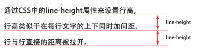
line-height 设置文字的行高,设置行高相当于在每行文字的上下同时加间距, 如:line-height:24px;
-
-
font 同时设置文字的几个属性,写的顺序颠倒会有兼容问题,建议按照如下顺序写: font:是否加粗 字号/行高 字体;如: font:normal 12px/36px '微软雅黑';
-
text-decoration 设置文字的下划线,如:text-decoration:none; 将文字下划线去掉
-
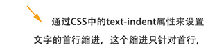
text-indent 设置文字首行缩进,如:text-indent:24px; 设置文字首行缩进24px
-
text-align 设置文字水平对齐方式,如text-align:center 设置文字水平居中
<!DOCTYPE html>
<html lang="en">
<head>
    <meta charset="UTF-8">
    <title>文本样式</title>
    <link rel="stylesheet" type="text/css" href="css/002.css">
</head>
<body>
    <h2>这是标题</h2>
    <div>为了让网页元素的样式更加丰富,也为了让网页的内容和样式能拆分开,CSS由此思想而诞生
        ,CSS是 <em>Cascading Style Sheets</em> 的首字母缩写,意思是层叠样式表。
        有了CSS,html中大部分表现样式的标签就废弃不用了,html只负责文档的结构和内容,表现形式完全交给CSS,html文档变得更加简洁。<br />
        选择器是将样式和页面元素关联起来的名称,属性是希望设置的样式属性,每个属性有一个或多个值。</div>
    <a href="http://www.baidu.com">百度</a>
</body>
</html>
div{
    /* fontsize默认是16px */
    font-size: 26px;
    color: green;
    font-family: 'Microsoft Yahei';
    /* font-style: italic; */
    line-height: 40px;
    text-indent: 52px;
}
em{
    color: pink;
    font-style: normal;
    font-weight: bold;
}
h2{
    font: normal 30px/50px 'Microsoft Yahei';
    text-align: center;
    text-decoration: underline;
}
a{
    font: normal 20px/30px '宋体';
    text-decoration: none;
}
css颜色值主要有三种表示方法:
(1)颜色名表示,比如:red 红色,gold 金色
(2)rgb表示,比如:rgb(255,0,0)表示红色,rgb(255,255,255)为黑色
(3)16进制数值表示,比如:#ff0000 表示红色,这种可以简写成 #f00
4、选择器
标签选择器、id选择器、类选择器
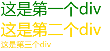
<!DOCTYPE html>
<html lang="en">
<head>
    <meta charset="UTF-8">
    <title>选择器</title>
    <style type="text/css">
        /* *可以选择所有标签 */
        *{
            font-size: 20px;
        }
        /* 标签选择器 */
        div{
            color: red;
        }
        /* id选择器 */
        #div1{
            color: green;
        }
        /* class选择器 */
        .gold{
            color: gold;
        }
        .big{
            font-size: 40px;
        }
    </style>
</head>
<body>
    <div id="div1" class="gold big">这是第一个div</div>
    <div class="gold big">这是第二个div</div>
    <div class="gold">这是第三个div</div>
</body>
</html>
层级选择器:一般不要超过四层,否则会影响性能
<!DOCTYPE html>
<html lang="en">
<head>
    <meta charset="UTF-8">
    <title>选择器</title>
    <style type="text/css">
        .box{
            font-size: 20px;
            line-height: 30px;
            text-indent: 40px;
        }
        .box span{
            color: red;
            font-weight: bold;
        }
        .box em{
            color: green;
            text-decoration: underline;
            font-style: normal;
        }
    </style>
</head>
<body>
    <div class="box"><span>层级选择器</span>主要应用在选择父元素下的子元素,或者子元素下面的子元素,可与标签元素结合使用,减少命名,同时也可以通过层级,<em>防止命名冲突</em>。层级选择器主要应用在选择父元素下的子元素,或者子元素下面的子元素,可与标签元素结合使用,减少命名,同时也可以通过层级,防止命名冲突。层级选择器主要应用在选择父元素下的子元素,或者子元素下面的子元素,可与标签元素结合使用,减少命名,同时也可以通过层级,防止命名冲突。
    </div>

    <div class="box2"><span>层级选择器</span>主要应用在选择父元素下的子元素,或者子元素下面的子元素,可与标签元素结合使用,减少命名,同时也可以通过层级,防止命名冲突。</div>
</body>
</html>
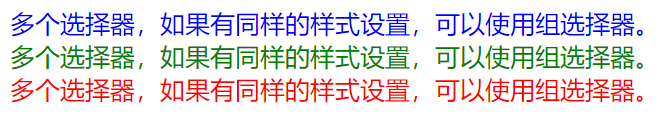
组选择器:
<!DOCTYPE html>
<html lang="en">
<head>
    <meta charset="UTF-8">
    <title>选择器</title>
    <style type="text/css">
        .box1,.box2,.box3{
            font-size: 20px;
            font-style: initial;
        }
        .box1{
            color: blue;
        }
        .box2{
            color: green;
        }
        .box3{
            color: red;
        }
    </style>
</head>
<body>
    <div class="box1">多个选择器,如果有同样的样式设置,可以使用组选择器。</div>
    <div class="box2">多个选择器,如果有同样的样式设置,可以使用组选择器。</div>
    <div class="box3">多个选择器,如果有同样的样式设置,可以使用组选择器。</div>
</body>
</html>
伪类选择器:常用的伪类选择器有hover,表示鼠标悬浮在元素上时的状态
伪元素选择器有before和after,它们可以通过样式在元素中插入内容。插入的内容无法被鼠标选中。
<!DOCTYPE html>
<html lang="en">
<head>
    <meta charset="UTF-8">
    <title>伪类选择器</title>
    <style type="text/css">
        .bd{
            font-size: 26px;
            text-decoration: none;
            color: pink;
        }
        .bd:hover{
            color: red;
            font-weight: bold;
        }
        .box1,.box2{
            font-size: 20px;
        }
        .box1:before{
            content: "加在前面";
            color: purple;
        }
        .box2:after{
            content: "加在后面";
            color: green;
        }
    </style>
</head>
<body>
    <a href="http://www.baidu.com" class="bd">百度搜索</a>
    <div class="box1">这是第一个</div>
    <div class="box2">这是第二个</div>
</body>
</html>

5、盒子模型
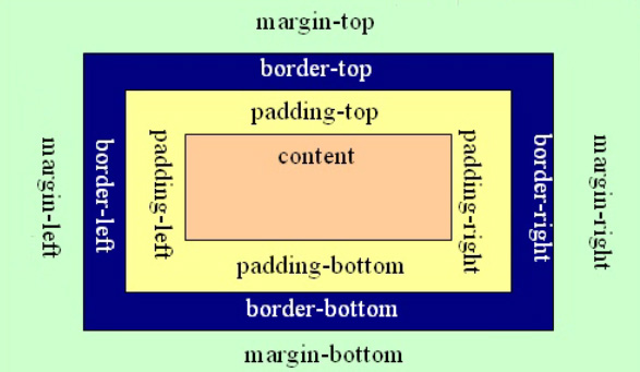
把元素叫做盒子,设置对应的样式分别为:
盒子的宽度(width)、盒子的高度(height)、盒子的边框(border)、盒子内的内容和边框之间的间距(padding)、盒子与盒子之间的间距(margin)。
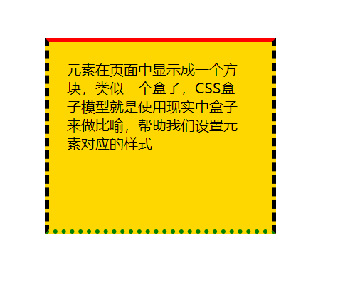
<!DOCTYPE html>
<html lang="en">
<head>
    <meta charset="UTF-8">
    <title>盒子模型</title>
    <style type="text/css">
        .box1{
            /*这里的宽高指的是内容的宽高,不包含内外边距和边框*/
            width: 200px;
            height: 150px;
            background-color: gold;
            /*border-top-color:red;*/
            /*border-top-width:10px;*/
            /*border-top-style:solid*/
            /*solid实线dashed虚线dotted点线*/
            border-top: 5px solid red;
            border-left: 5px dashed #000;
            border-bottom: 5px dotted green;
            border-right: 5px dashed #000;
            /*上 右 下 左*/
            /*上 左右 下*/
            /*上下 左右*/
            padding: 20px 30px 40px 20px;
            margin: 50px;
        }
    </style>
</head>
<body>
    <div class="box1">元素在页面中显示成一个方块,类似一个盒子,CSS盒子模型就是使用现实中盒子来做比喻,帮助我们设置元素对应的样式</div>
</body>
</html>
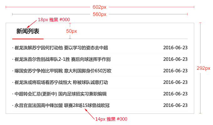
<!DOCTYPE html>
<html lang="en">
<head>
    <meta charset="UTF-8">
    <title>盒子模型做标题</title>
    <style type="text/css">
        .news_title{
            width: 400px;
            height: 20px;
            font: normal 20px/20px 'Microsoft Yahei';
            color: #333;
            text-indent: 20px;
            border-bottom: 3px solid #666;
            border-top: 1px solid #f00;
            padding: 15px 0;
        }
    </style>
</head>
<body>
    <h3 class="news_title">新闻标题</h3>
</body>
</html>

使用技巧:
(1)margin的左右值可以设为auto,可以使盒子水平居中。
<!DOCTYPE html>
<html lang="en">
<head>
    <meta charset="UTF-8">
    <title>margin使用技巧</title>
    <style type="text/css">
        .box{
            width: 200px;
            height: 200px;
            font: normal 20px/200px 'Microsoft Yahei';
            color: white;
            text-align: center;
            background-color: blue;
            margin: 0 auto;
        }
    </style>
</head>
<body>
    <!-- 设置元素水平据中 -->
    <div class="box">水平居中的盒子</div>
</body>
</html>
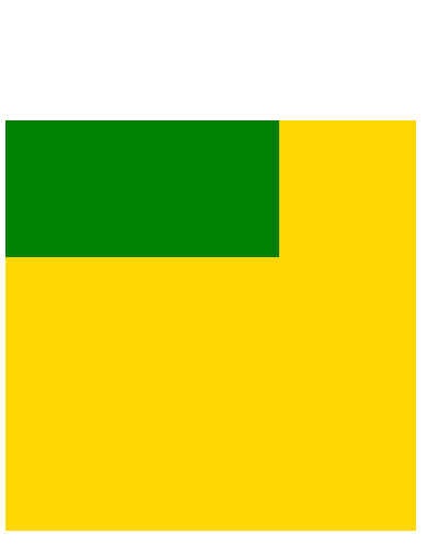
(2)margin负值让元素位移及边框合并
<!DOCTYPE html>
<html lang="en">
<head>
    <meta charset="UTF-8">
    <title>margin</title>
    <style type="text/css">
        body{
            /*body默认带有margin*/
            margin: 0;
        }
        .box{
            width: 202px;
            height: 156px;
            background-color: pink;
            margin: 50px auto 0;
        }
        .box div{
            width: 200px;
            height: 30px;
            border: 1px solid green;
            background-color: gold;
            /*下面的样式可以把上面的覆盖掉*/
            /*border-bottom: 0;*/
            margin-top: -1px;
        }
        /*.box .b5{
            border-bottom: 1px solid green;
        }*/

    </style>
</head>
<body>
    <div class="box">
        <div></div>
        <div></div>
        <div></div>
        <div></div>
        <div class="b5"></div>
    </div>
</body>
</html>

(3)外边距合并问题
当两个垂直外边距相遇时,它们将形成一个外边距。合并后的外边距的高度等于两个发生合并的外边距的高度中的较大者。
<!DOCTYPE html>
<html lang="en">
<head>
    <meta charset="UTF-8">
    <title>margin合并问题</title>
    <style type="text/css">
        .box1,.box2{
            width: 200px;
            height: 200px;
            background-color: gold;
        }
        .box1{
            margin-bottom: 20px;
        }
        .box2{
            margin-top: 20px;
        }
    </style>
</head>
<body>
    <div class="box1"></div>
    <div class="box2"></div>
</body>
</html>

解决方法:
a. 使用这种特性
b. 设置一边的外边距,一般只设置margin-top
c. 将元素浮动或者定位
垂直外边距特性的应用场景:

<!DOCTYPE html>
<html lang="en">
<head>
    <meta charset="UTF-8">
    <title>Document</title>
    <style type="text/css">
        .box{
            width: 500px;
            border: 1px solid #000;
            margin: 50px auto 0;
        }
        .box div{
            margin: 20px;
        }
    </style>
</head>
<body>
    <div class="box">
        <div>外边距合并指的是,当两个垂直外边距相遇时,它们将形成一个外边距。合并后的外边距的高度等于两个发生合并的外边距的高度中的较大者</div>
        <div>外边距合并指的是,当两个垂直外边距相遇时,它们将形成一个外边距。合并后的外边距的高度等于两个发生合并的外边距的高度中的较大者</div>
        <div>外边距合并指的是,当两个垂直外边距相遇时,它们将形成一个外边距。合并后的外边距的高度等于两个发生合并的外边距的高度中的较大者</div>
        <div>外边距合并指的是,当两个垂直外边距相遇时,它们将形成一个外边距。合并后的外边距的高度等于两个发生合并的外边距的高度中的较大者</div>
    </div>
</body>
</html>
(4)margin-top塌陷
在两个盒子嵌套时候,内部的盒子设置的margin-top会加到外边的盒子上,导致内部的盒子margin-top设置失败
<!DOCTYPE html>
<html lang="en">
<head>
    <meta charset="UTF-8">
    <title>margin-top塌陷</title>
    <style type="text/css">
        .con{
            width: 300px;
            height: 300px;
            background-color: gold;
        }
        .box{
            width: 200px;
            height: 100px;
            background-color: green;
            margin-top: 100px;
        }
    </style>
</head>
<body>
     <div class="con">
         <div class="box"></div>
     </div>
</body>
</html>
解决方法:
a. 外部盒子设置一个边框
b. 外部盒子设置 overflow:hidden
c. 使用伪元素类
<!DOCTYPE html>
<html lang="en">
<head>
    <meta charset="UTF-8">
    <title>margin-top塌陷</title>
    <style type="text/css">
        .clearfix:before{
            content: '';
            display: table;
        }
        .con{
            width: 300px;
            height: 300px;
            background-color: gold;
        }
        .box{
            width: 200px;
            height: 100px;
            background-color: green;
            margin-top: 100px;
        }
    </style>
</head>
<body>
     <div class="con clearfix">
         <div class="box"></div>
     </div>
</body>
</html>

6、css元素溢出
当子元素的尺寸超过父元素的尺寸时,需要设置父元素显示溢出的子元素的方式,设置的方法是通过overflow属性来设置。
overflow的设置项:
1)visible 默认值。内容不会被修剪,会呈现在元素框之外。
2)hidden 内容会被修剪,并且其余内容是不可见的,此属性还有清除浮动、清除margin-top塌陷的功能。
3)scroll 内容会被修剪,但是浏览器会显示滚动条以便查看其余的内容(不管是否溢出都会有滚动条)
4)auto 如果内容被修剪,则浏览器会显示滚动条以便查看其余的内容。(溢出的时候才会产生滚动条)
5)inherit 规定应该从父元素继承 overflow 属性的值。
<!DOCTYPE html>
<html lang="en">
<head>
    <meta charset="UTF-8">
    <title>元素溢出</title>
    <style type="text/css">
        .box{
            width: 300px;
            /*如果不给高度内容会自动撑开盒子*/
            height: 200px;
            border: 1px solid #000;
            margin: 50px auto 0;
            background-color: gold;
            font-size: 18px;
            line-height: 25px;
            overflow: auto;
        }
    </style>
</head>
<body>
        <div class="box">当子元素的尺寸超过父元素的尺寸时,需要设置父元素显示溢出的子元素的方式,设置的方法是通过overflow属性来设置。
    overflow的设置项:
    1、visible 默认值。内容不会被修剪,会呈现在元素框之外。
    2、hidden 内容会被修剪,并且其余内容是不可见的,此属性还有清除浮动、清除margin-top塌陷的功能。
    3、scroll 内容会被修剪,但是浏览器会显示滚动条以便查看其余的内容。
    4、auto 如果内容被修剪,则浏览器会显示滚动条以便查看其余的内容。
    5、inherit 规定应该从父元素继承 overflow 属性的值。
        </div>
</body>
</html>
7、元素类型
块元素
块元素,也可以称为行元素,布局中常用的标签如:div、p、ul、li、h1~h6、dl、dt、dd等等都是块元素,它在布局中的行为:
- 支持全部 的样式
- 如果没有设置宽度,默认的宽度为父级宽度100%
- 盒子占据一行、即使设置了宽度
内联元素
内联元素,也可以称为行内元素,布局中常用的标签如:a、span、em、b、strong、i等等都是内联元素,它们在布局中的行为:
- 支持部分样式(不支持宽、高、margin上下、padding上下)
- 宽高由内容决定
- 盒子并在一行
- 由于代码换行,盒子之间会产生间距
- 子元素是内联元素,父元素可以用text-align属性设置子元素水平对齐方式
解决内联元素间隙的方法
- 去掉内联元素代码之间的换行
- 将内联元素的父级设置font-size为0,内联元素自身再设置font-size
<!DOCTYPE html>
<html lang="en">
<head>
    <meta charset="UTF-8">
    <title>内联元素</title>
    <style type="text/css">
        .box{
            width: 500px;
            height: 300px;
            border: 1px solid #000;
            margin: 50px auto 0;
            font-size: 0;
        }
        .box a{
            background-color: gold;
            font-size: 20px;
        }
    </style>
</head>
<body>
    <div class="box">
        <a href="#">链接1</a>
        <a href="#">链接2</a>
        <a href="#">链接3</a>
    </div>
</body>
</html>
内联块元素
内联块元素,也叫行内块元素,是新增的元素类型,现有元素没有归于此类别的,img和input元素的行为类似这种元素,但是也归类于内联元素,我们可以用display属性将块元素或者内联元素转化成这种元素。它们在布局中表现的行为:
- 支持全部样式
- 如果没有设置宽高,宽高由内容决定
- 盒子并在一行
- 代码换行,盒子会产生间距
- 子元素是内联块元素,父元素可以用text-align属性设置子元素水平对齐方式。
这三种元素,可以通过display属性来相互转化,不过实际开发中,块元素用得比较多,所以我们经常把内联元素转化为块元素,少量转化为内联块,而要使用内联元素时,直接使用内联元素,而不用块元素转化了。
<!DOCTYPE html>
<html lang="en">
<head>
    <meta charset="UTF-8">
    <title>内联块元素</title>
    <style type="text/css">
        .box{
            width: 500px;
            height: 400px;
            border: 1px solid #000;
            margin: 50px auto 0;
            /*还是需要解决间隙问题*/
            font-size: 0;
        }
        .box a{
            display: inline-block;
            background-color: gold;
            font-size: 20px;
            /*可以设置上下padding了*/
            padding: 10px 20px;
            /*可以设置宽高了*/
            height: 100px;
        }
    </style>
</head>
<body>
    <div class="box">
        <a href="#">1111</a>
        <a href="#">2222</a>
        <a href="#">3333</a>
        <a href="#">4444</a>
        <a href="#">5555</a>
    </div>
</body>
</html>
display属性
display属性是用来设置元素的类型及隐藏的,常用的属性有:
- none 元素隐藏且不占位置
- block 元素以块元素显示
- inline 元素以内联元素显示
- inline-block 元素以内联块元素显示
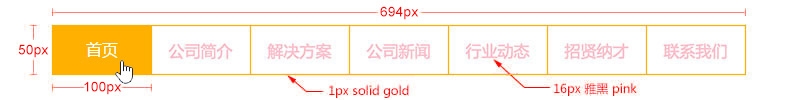
<!DOCTYPE html>
<html lang="en">
<head>
    <meta charset="UTF-8">
    <title>Document</title>
    <style type="text/css">
        .menu{
            width: 694px;
            height: 50px;
            margin: 50px auto 0;
            font-size: 0;
        }
        .menu a{
            display: inline-block;
            width: 98px;
            height: 48px;
            background-color: #fff;
            font-size: 16px;
            border: 1px solid gold;
            margin-left: -1px;
            text-align: center;
            text-decoration: none;
            line-height: 48px;
            color: pink;
            font-family: 'Microsoft Yahei';
        }
        .menu a:hover{
            background-color: gold;
            color: #fff;
        }
    </style>
</head>
<body>
    <div class="menu">
        <a href="#">首页</a>
        <a href="#">公司简介</a>
        <a href="#">公司简介</a>
        <a href="#">公司简介</a>
        <a href="#">公司简介</a>
        <a href="#">公司简介</a>
        <a href="#">公司简介</a>
    </div>
</body>
</html>
display:none的使用:
<!DOCTYPE html>
<html lang="en">
<head>
    <meta charset="UTF-8">
    <title>Document</title>
    <style type="text/css">
        .con{
            width: 200px;
        }
        .box{
            width: 200px;
            height: 200px;
            background-color: gold;
            display: none;
        }
        .con h3{
            font-size: 20px;
        }
        .con:hover .box{
            display: block;
        }
    </style>
</head>
<body>
    <div class="con">
        <h3>文字标题</h3>
        <div class="box">说明文字</div>
    </div>
</body>
</html>
8、浮动
浮动元素有左浮动(float:left)和右浮动(float:right)两种
浮动的元素会向左或向右浮动,碰到父元素边界、其他元素才停下来
相邻浮动的块元素可以并在一行,超出父级宽度就换行
浮动让行内元素或块元素自动转化为行内块元素(此时不会有行内块元素间隙问题)
浮动元素后面没有浮动的元素会占据浮动元素的位置,没有浮动的元素内的文字会避开浮动的元素,形成文字饶图的效果
父元素如果没有设置尺寸(一般是高度不设置),父元素内整体浮动的元素无法撑开父元素,父元素需要清除浮动
浮动元素之间没有垂直margin的合并
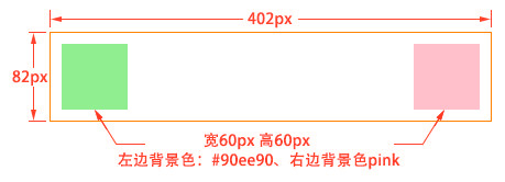
<!DOCTYPE html>
<html lang="en">
<head>
    <meta charset="UTF-8">
    <title>浮动</title>
    <style type="text/css">
        .con{
            width: 400px;
            height: 80px;
            border: 1px solid gold;
            margin: 50px auto 0;
        }
        .con div{
            width: 60px;
            height: 60px;
            margin: 10px;
        }
        .con .box1{
            background-color: #90ee90;
            float: left;
        }
        .con .box2{
            background-color: pink;
            float: right;
        }
    </style>
</head>
<body>
    <div class="con">
        <div class="box1"></div>
        <div class="box2"></div>
    </div>
</body>
</html>
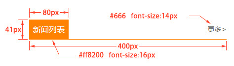
<!DOCTYPE html> <html lang="en"> <head> <meta charset="UTF-8"> <title>Document</title> <style type="text/css"> .news_title{ width: 400px; height: 40px; border-bottom: 1px solid #ff8200; margin: 50px auto 0; } .news_title h3{ float: left; width: 80px; height: 40px; background-color: #ff8200; margin: 0; color: #fff; font-size: 16px; text-align: center; line-height: 40px; font-weight: normal; } .news_title a{ float: right; line-height: 40px; color: #666; font-size: 14px; text-decoration: none; } .news_title a:hover{ color: #ff8200; } </style> </head> <body> <div class="news_title"> <h3>新闻列表</h3> <a href="#">更多 ></a> </div> </body> </html>
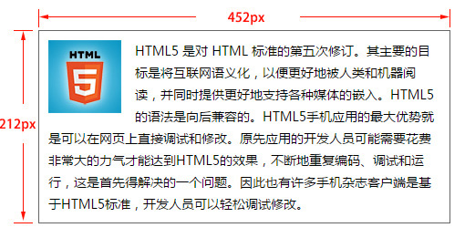
<!DOCTYPE html>
<html lang="en">
<head>
    <meta charset="UTF-8">
    <title>文字绕图</title>
    <style type="text/css">
        .con{
            width: 450px;
            height: 210px;
            border: 1px solid #000;
            margin: 50px auto 0;
        }
        .con .pic{
            width: 80px;
            height: 80px;
            background-color: gold;
            float: left;
            margin: 10px;
        }
        .con .text{
            background-color: green;
            height: 150px;
            color: #fff;
        }
    </style>
</head>
<body>
    <div class="con">
        <div class="pic"></div>
        <div class="text">浮动元素后面没有浮动的元素会占据浮动元素的位置,没有浮动的元素内的文字会避开浮动的元素,形成文字饶图的效果;浮动元素后面没有浮动的元素会占据浮动元素的位置,没有浮动的元素内的文字会避开浮动的元素,形成文字饶图的效果;浮动元素后面没有浮动的元素会占据浮动元素的位置,没有浮动的元素内的文字会避开浮动的元素,形成文字饶图的效果;</div>
    </div>
</body>
</html>

<!DOCTYPE html>
<html lang="en">
<head>
    <meta charset="UTF-8">
    <title>菜单</title>
    <style type="text/css">
        .menu{
            width: 694px;
            height: 50px;
            font-size: 0;
            /*去掉小圆点*/
            list-style: none;
            /*ul默认有margin和padding*/
            margin: 50px auto 0;
            padding: 0;
        }
        .menu li{
            float: left;
            width: 98px;
            height: 48px;
            border: 1px solid gold;
            background-color: #fff;
            margin-left: -1px;
        }
        .menu li a{
            /*使得a可以设置宽高*/
            display: block;
            text-decoration: none;
            width: 98px;
            height: 48px;
            text-align: center;
            line-height: 48px;
            color: pink;
            font-size: 16px;
            font-family: 'Microsoft Yahei'
        }
        .menu li a:hover{
            background-color: gold;
            color: #fff;
        }
    </style>
</head>
<body>
    <ul class="menu">
        <li><a href="#">首页</a></li>
        <li><a href="#">公司简介</a></li>
        <li><a href="#">公司简介</a></li>
        <li><a href="#">公司简介</a></li>
        <li><a href="#">公司简介</a></li>
        <li><a href="#">公司简介</a></li>
        <li><a href="#">公司简介</a></li>
    </ul>
</body>
</html>
9、清除浮动
- 父级上增加属性overflow:hidden(用这种方法会把定位出去的元素截掉,一般也不推荐)
- 在最后一个子元素的后面加一个空的div,给它样式属性 clear:both(不推荐)
- 使用成熟的清浮动样式类,clearfix
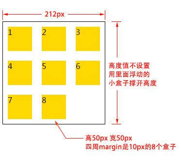
<!DOCTYPE html>
<html lang="en">
<head>
    <meta charset="UTF-8">
    <title>Document</title>
    <style type="text/css">
        .list{
            width: 210px;
            /*height: 400px;*/
            border: 1px solid #000;
            margin: 50px auto 0;
            list-style: none;
            padding: 0;
            /*清除浮动 使得高度随内容多少自动变化*/
            overflow: hidden;
        }
        .list li{
            width: 50px;
            height: 50px;
            background-color: gold;
            margin: 10px;
            float: left;
        }
    </style>
</head>
<body>
    <!-- ul.list>(li{$}*8) -->
    <ul class="list">
        <li>1</li>
        <li>2</li>
        <li>3</li>
        <li>4</li>
        <li>5</li>
        <li>6</li>
        <li>7</li>
        <li>8</li>
    </ul>
</body>
</html>
实际使用中把解决margin塌陷和解决清除浮动的代码合并在一起:
.clearfix:after,.clearfix:before{ content: "";display: table;}
.clearfix:after{ clear:both;}
.clearfix{zoom:1;}
zoom是用来兼容IE,IE中解决缩放网页的bug
10、定位
文档流:是指盒子按照html标签编写的顺序依次从上到下,从左到右排列,块元素占一行,行内元素在一行之内从左到右排列,先写的先排列,后写的排在后面,每个盒子都占据自己的位置。使用定位可以不受文档流的限制。
我们可以使用css的position属性来设置元素的定位类型,postion的设置项如下:
-
relative 生成相对定位元素,元素所占据的文档流的位置保留,元素本身相对自身原位置进行偏移。
-
        .box1{
            background-color: green;
            /*原先占据的文档流位置是保留的*/
            /*相对于原位置向右向下分别偏移了50px*/
            position: relative;
            left: 50px;
            top: 50px;
            /*相对定位一般不常用,
            相对定位一般用来作为绝对定位的参照物*/
        }
-
absolute 生成绝对定位元素,元素脱离文档流,不占据文档流的位置,可以理解为漂浮在文档流的上方,相对于上一个设置了定位的父级元素来进行定位,如果找不到,则相对于body元素进行定位。
-
    <style type="text/css">
        .con{
            width: 400px;
            height: 400px;
            border: 1px solid #000;
            margin: 50px auto 0;
            /*一般把父元素设置为相对定位*/
            position: relative;
        }
        .box1,.box2{
            width: 300px;
            height: 100px;
            margin: 10px;
        }
        .box1{
            background-color: green;
            /*绝对定位的元素会脱离文档流,不占有原先的位置*/
            position: absolute;
            /*绝对定位会去找上一个设置了定位的父级元素进行定位*/
            /*如果找不到,则相对于body进行定位*/
            left: 50px;
            top: 50px;
        }
        .box2{
            background-color: red;
        }
    </style>
-
fixed 生成固定定位元素,元素脱离文档流,不占据文档流的位置,可以理解为漂浮在文档流的上方,相对于浏览器窗口进行定位。
-
        .box1{
            background-color: green;
            /*无论父元素是否定位,都根据浏览器窗口来定位*/
            position: fixed;
            left: 50px;
            top: 50px;
        }
-
static 默认值,没有定位,元素出现在正常的文档流中,相当于取消定位属性或者不设置定位属性。
-
inherit 从父元素继承 position 属性的值。
定位元素的偏移 :
定位的元素还需要用left、right、top或者bottom来设置相对于参照元素的偏移值。
定位元素层级 :
定位元素是浮动的正常的文档流之上的,可以用z-index属性来设置元素的层级
.box01{
    ......
    position:absolute;  /* 设置了绝对定位 */
    left:200px;            /* 相对于参照元素左边向右偏移200px */
    top:100px;          /* 相对于参照元素顶部向下偏移100px */
    z-index:10          /* 将元素层级设置为10 */
}
定位元素特性 :
绝对定位和固定定位的块元素和行内元素会自动转化为行内块元素
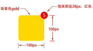
<!DOCTYPE html>
<html lang="en">
<head>
    <meta charset="UTF-8">
    <title>Document</title>
    <style type="text/css">
        .con{
            width: 100px;
            height: 100px;
            background-color: gold;
            margin: 50px auto 0;
            position: relative;
            /*圆角矩形*/
            border-radius: 14px;
        }
        .box{
            width: 28px;
            height: 28px;
            background-color: red;
            color: white;
            text-align: center;
            line-height: 28px;
            /*定位*/
            position: absolute;
            right: -14px;
            top: -14px;
            /*设置圆角*/
            border-radius: 14px;
        }
    </style>
</head>
<body>
    <div class="con">
        <div class="box">5</div>
    </div>
</body>
</html>
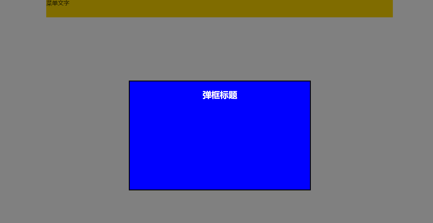
固定在顶部的水平居中的菜单、相对于浏览器窗口水平垂直居中的弹框:
<!DOCTYPE html>
<html lang="en">
<head>
    <meta charset="UTF-8">
    <title>Document</title>
    <style type="text/css">
        .menu{
            width: 960px;
            height: 50px;
            background-color: gold;
            position: fixed;
            top: 0;
            /*定位的元素无法用margin居中*/
            /*margin: 0 auto;*/
            /*将元素定位到距离浏览器左边50%的地方*/
            left: 50%;
            margin-left: -480px;
        }
        .popup{
            width: 500px;
            height: 300px;
            border: 2px solid #000;
            background-color: blue;
            color: #fff;
            text-align: center;
            position: fixed;
            left: 50%;
            top: 50%;
            margin-left: -251px;
            margin-top: -151px;
            /*保证弹框能盖住所有元素*/
            z-index: 999;
        }
        .mask{
            position: fixed;
            width: 100%;
            height: 100%;
            background-color: #000;
            left: 0;
            top: 0;
            /*设置透明度*/
            opacity: 0.5;
            z-index: 998;
        }
        .pop_con{
            display: block;
        }
    </style>
</head>
<body>
    <div class="menu">菜单文字</div>
    <div class="pop_con">
        <div class="popup">
            <h2>弹框标题</h2>
        </div>
        <div class="mask"></div>
    </div>

</body>
</html>
11、background
background属性是css中应用比较多,且比较重要的一个属性,它是负责给盒子设置背景图片和背景颜色的,background是一个复合属性,它可以分解成如下几个设置项:
- background-color 设置背景颜色
- background-image 设置背景图片地址
- background-repeat 设置背景图片如何重复平铺
- background-position 设置背景图片的位置
- background-attachment 设置背景图片是固定还是随着页面滚动条滚动
实际应用中,我们可以用background属性将上面所有的设置项放在一起,而且也建议这么做,这样做性能更高,而且兼容性更好,比如:“background: #00FF00 url(bgimage.gif) no-repeat left center fixed”,这里面的“#00ff00”是设置background-color;“url(bgimage.gif)”是设置background-image;“no-repeat”是设置background-repeat;“left center”是设置background-position;“fixed”是设置background-attachment,各个设置项用空格隔开,有的设置项不写也是可以的,它会使用默认值。
<!DOCTYPE html>
<html lang="en">
<head>
    <meta charset="UTF-8">
    <title>Document</title>
    <style type="text/css">
        .box{
            width: 400px;
            height: 200px;
            border: 3px solid #000;
            margin: 50px auto 0;
            background-image: url(./images/bg.jpg);
            /*默认是repeat,可以设置为repeat-x,repeat-y,no-repeat*/
            background-repeat: no-repeat;
            /*设置图片位置,默认左上开始*/
            /*左上 左中 左下 右上 右中 右下 中间 中上 中下*/
            /*background-position: left bottom; 左下开始*/
            /*background-position: center bottom; 中间下面*/
            /*background-position: -20px -20px; 距离左上-10px*/
            background-position: 10px 10px;
            /*背景图没有平铺的部分显示背景色*/
            background-color: cyan;
            /*一起设置,性能更高,这几个值可以缺省也可以调换顺序*/
            background: url(images/bg.jpg) 20px 10px no-repeat cyan;
        }
    </style>
</head>
<body>
    <div class="box">
        html5图片
    </div>
</body>
</html>
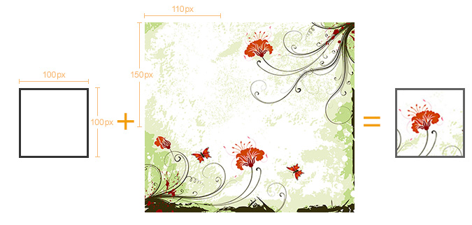
<!DOCTYPE html>
<html lang="en">
<head>
    <meta charset="UTF-8">
    <title>背景图定位</title>
    <style type="text/css">
        .box{
            width: 100px;
            height: 100px;
            border: 5px solid #000;
            margin: 50px auto 0;

            background: url(images/location_bg.jpg) -110px -150px no-repeat;
        }
    </style>
</head>
<body>
    <div class="box"></div>
</body>
</html>
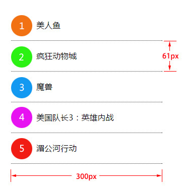
<!DOCTYPE html>
<html lang="en">
<head>
    <meta charset="UTF-8">
    <title>Document</title>
    <style type="text/css">
        .list{
            list-style: none;
            margin: 50px auto 0;
            padding: 0;
            width: 300px;
            height: 305px;
        }
        .list li{
            height: 60px;
            border-bottom: 1px dotted #000;
            line-height: 60px;
            text-indent: 50px;
            background: url(images/bg01.png) left 10px no-repeat;
        }
        .list .l2{
            background-position: left -71px;
        }
        .list .l3{
            background-position: left -152px;
        }
        .list .l4{
            background-position: left -233px;
        }
        .list .l5{
            background-position: left -314px;
        }
    </style>
</head>
<body>
    <ul class="list">
        <li>哪吒</li>
        <li class="l2">流浪地球</li>
        <li class="l3">红海行动</li>
        <li class="l4">大主宰</li>
        <li class="l5">白蛇缘起</li>
    </ul>
</body>
</html>
12、特征布局实例
(1)翻页:
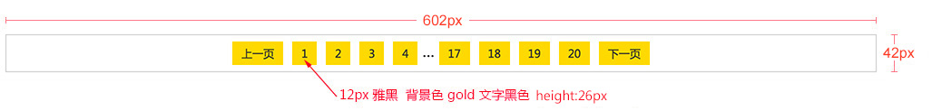
<!DOCTYPE html>
<html lang="en">
<head>
    <meta charset="UTF-8">
    <title>翻页</title>
    <style type="text/css">
        .pagenation{
            list-style: none;
            width: 600px;
            height: 40px;
            border: 1px solid #ccc;
            margin: 50px auto 0;
            padding: 0;
            font-size: 0;
            /*子元素为行内块,可以这样来使子元素居中*/
            text-align: center;
        }
        .pagenation li{
            display: inline-block;
            height: 26px;
            margin: 7px 5px;
            font-size: 12px;
        }
        .pagenation li a{
            text-decoration: none;
            display: block;
            height: 26px;
            font: normal 12px/26px 'Microsoft Yahei';
            color: #000;
            padding: 0 10px;
            background-color: gold;
        }
        .pagenation li a:hover{
            background-color: #ccc;
            color: gold;
            font-weight: bold;
        }
    </style>
</head>
<body>
    <ul class="pagenation">
        <li><a href="#">上一页</a></li>
        <li><a href="#">1</a></li>
        <li><a href="#">2</a></li>
        <li><a href="#">3</a></li>
        <li><a href="#">4</a></li>
        <li><span>...</span></li>
        <li><a href="#">17</a></li>
        <li><a href="#">18</a></li>
        <li><a href="#">19</a></li>
        <li><a href="#">20</a></li>
        <li><a href="#">下一页</a></li>
    </ul>
</body>
</html>
(2)底部导航条
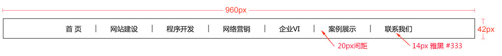
<!DOCTYPE html>
<html lang="en">
<head>
    <meta charset="UTF-8">
    <title>底部导航条</title>
    <style type="text/css">
        .menu{
            list-style: none;
            height: 40px;
            width: 958px;
            border: 1px solid #000;
            margin: 50px auto 0;
            padding: 0;
            text-align: center;
            font-size: 0;
        }
        .menu li{
            display: inline-block;
            font-size: 14px;
            margin: 0 10px;
            height: 40px;
        }
        .menu li a{
            display: block;
            height: 40px;
            text-decoration: none;
            font: normal 14px/40px 'Microsoft Yahei';
            color: #333;
        }
        .menu li span{
            display: block;
            height: 40px;
            font: normal 14px/40px 'Microsoft Yahei';
            color: #333;
        }
        .menu li a:hover{
            color: #ff8800;
        }
    </style>
</head>
<body>
    <ul class="menu">
        <li><a href="#">首页</a></li>
        <li><span>|</span></li>
        <li><a href="#">网站建设</a></li>
        <li><span>|</span></li>
        <li><a href="#">程序开发</a></li>
        <li><span>|</span></li>
        <li><a href="#">网络营销</a></li>
        <li><span>|</span></li>
        <li><a href="#">企业VI</a></li>
        <li><span>|</span></li>
        <li><a href="#">案例展示</a></li>
        <li><span>|</span></li>
        <li><a href="#">联系我们</a></li>
    </ul>
</body>
</html>
(3)顶部导航条
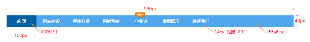
<!DOCTYPE html>
<html lang="en">
<head>
    <meta charset="UTF-8">
    <title>顶部导航条</title>
    <style type="text/css">
        .menu{
            width: 960px;
            height: 40px;
            list-style: none;
            background-color: #55a8ea;
            margin: 50px auto 0;
            padding: 0;
            position: relative;
        }
        .menu li{
            width: 100px;
            height: 40px;
            float: left;
        }
        .menu li a{
            display: block;
            text-decoration: none;
            font: normal 14px/40px 'Microsoft Yahei';
            color: #fff;
            height: 40px;
            width: 100px;
            text-align: center;
        }
        .menu li a:hover{
            background-color: #00619f;
        }
        .menu .new{
            width: 33px;
            height: 20px;
            background: url(images/new.png) no-repeat;
            position: absolute;
            left: 432px;
            top: -10px;
        }
    </style>
</head>
<body>
    <ul class="menu">
        <li><a href="#">首页</a></li>
        <li><a href="#">网站建设</a></li>
        <li><a href="#">程序开发</a></li>
        <li><a href="#">网络营销</a></li>
        <li><a href="#">企业VI</a></li>
        <li><a href="#">案例展示</a></li>
        <li><a href="#">联系我们</a></li>
        <li class="new"></li>
    </ul>
</body>
</html>
(4)图片列表
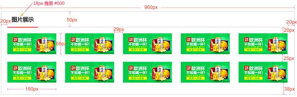
<!DOCTYPE html>
<html lang="en">
<head>
    <meta charset="UTF-8">
    <title>图片列表</title>
    <style type="text/css">
        .pic_list_con{
            width: 958px;
            border: 1px solid #ccc;
            margin: 50px auto 0;
        }
        .pic_list_title{
            width: 918px;
            height: 50px;
            border-bottom: 2px solid #ccc;
            margin: 0 auto;
        }
        .pic_list_title h3{
            /*h3自带margin,浮动以后,margin-top的塌陷也没有了*/
            float: left;
            margin: 0;
            font: normal 18px/50px 'Microsoft Yahei';
            padding: 0 10px;
            border-bottom: 2px solid red;
        }
        .pic_list_wrap{
            /*解决由于右边距,一排只能放四个:
            在外面套一个盒子,这样比给每一排最后一个li单独加class效果好*/
            width: 918px;
            margin: 20px auto 13px;
            /*溢出隐藏*/
            overflow: hidden;
        }
        .pic_list_con ul{
            list-style: none;
            padding: 0;
            /*内盒子宽度加宽,一排就能放下五个了*/
            width: 950px;
            margin: 0;
            /*由于没有高度,需要清除浮动*/
            overflow: hidden;
        }
        .pic_list_con ul li{
            width: 160px;
            height: 68px;
            float: left;
            margin: 0 29px 25px 0;
        }
    </style>
</head>
<body>
    <div class="pic_list_con">
        <div class="pic_list_title">
            <h3>图片展示</h3>
        </div>
        <div class="pic_list_wrap">
            <ul>
                <li><a href="#"><img src="images/goods.jpg" alt="商品图片"></a></li>
                <li><a href="#"><img src="images/goods.jpg" alt="商品图片"></a></li>
                <li><a href="#"><img src="images/goods.jpg" alt="商品图片"></a></li>
                <li><a href="#"><img src="images/goods.jpg" alt="商品图片"></a></li>
                <li><a href="#"><img src="images/goods.jpg" alt="商品图片"></a></li>
                <li><a href="#"><img src="images/goods.jpg" alt="商品图片"></a></li>
                <li><a href="#"><img src="images/goods.jpg" alt="商品图片"></a></li>
                <li><a href="#"><img src="images/goods.jpg" alt="商品图片"></a></li>
                <li><a href="#"><img src="images/goods.jpg" alt="商品图片"></a></li>
                <li><a href="#"><img src="images/goods.jpg" alt="商品图片"></a></li>
            </ul>
        </div>
    </div>
</body>
</html>
(5)新闻列表