
# -*- coding: utf-8 -*-
"""
Spyder Editor
This is a temporary script file.
"""
import pandas as pd
import matplotlib.pyplot as plt
plt.rcParams['font.sans-serif'] = ['SimHei']
plt.rcParams['axes.unicode_minus'] = False
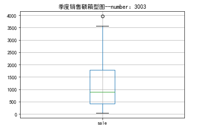
plt.figure()
url = r"D:\ju\catering_fish_congee(1).xls"
data = pd.read_excel(url)
p = data.boxplot(return_type=('dict'))
x = p['fliers'][0].get_xdata()
y = p['fliers'][0].get_ydata()
y.sort()
# print(data.describe().max())
# print(data)
import pandas as pd
import matplotlib.pyplot as plt #导入绘图包
plt.rcParams['font.sans-serif'] = ['SimHei'] #解决中文显示问题
plt.rcParams['axes.unicode_minus'] = False # 解决中文显示问题
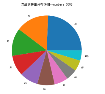
url = r"D:\资料\python\数据\catering_dish_profit.xls"
data = pd.read_excel(url)
#饼图
plt.figure(figsize=(6,6))#将画布设定为正方形,则绘制的饼图是正圆
plt.pie(data['盈利'], labels=data['菜品名'])
plt.title('菜品销售量分布饼图--number:3003') #加标题
plt.show()
#条形图
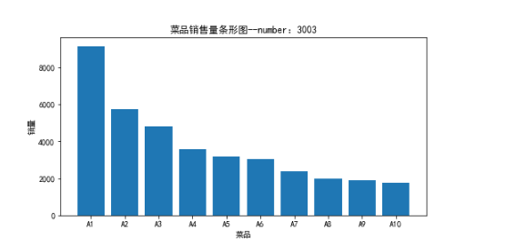
plt.figure(figsize=(8,4))
plt.bar(data['菜品名'],data['盈利'])
plt.xlabel('菜品')
plt.ylabel('销量')
plt.title('菜品销售量条形图--number:3003') #加标题
plt.show()
import pandas as pd
import matplotlib.pyplot as plt #导入绘图包
plt.rcParams['font.sans-serif'] = ['SimHei'] #解决中文显示问题
plt.rcParams['axes.unicode_minus'] = False # 解决中文显示问题
url = r"D:\资料\python\数据\dish_sale.xls"
data = pd.read_excel(url)
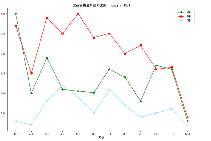
#画折线图对比数据
plt.figure(figsize=(12,8))
plt.plot(data['月份'],data['A部门'],color='green',label='A部门',marker='o')
plt.plot(data['月份'],data['B部门'],color='red',label='B部门',marker='s')
plt.plot(data['月份'],data['C部门'],color='skyblue',label='C部门',marker='x')
plt.xlabel('月份')
plt.ylabel('销售额(万元)')
plt.title('菜品销售量折线对比图--number:3003') #加标题
plt.legend() #显示图例
plt.show()
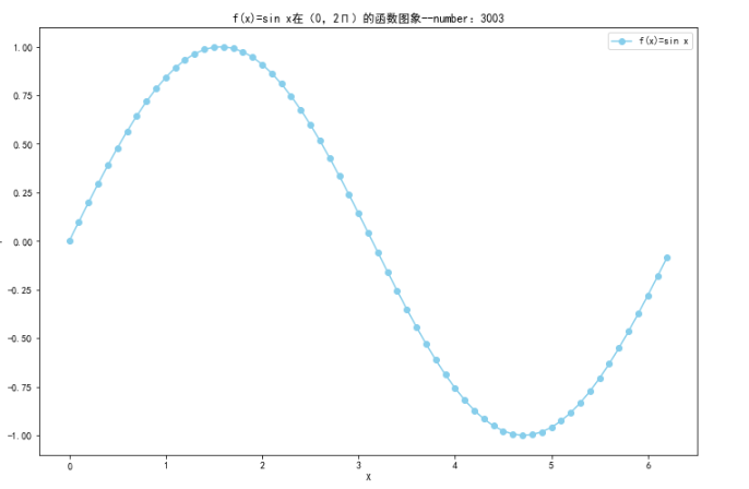
import numpy as np
import matplotlib.pyplot as plt                #导入绘图包
import math

plt.rcParams['font.sans-serif'] = ['SimHei']   #解决中文显示问题
plt.rcParams['axes.unicode_minus'] = False    # 解决中文显示问题

x=np.arange(0,2*math.pi,0.1)#以0.1为单位,生成0到6的数据
y=np.sin(x)

plt.figure(figsize=(12,8))
plt.plot(x,y,color='skyblue',label='f(x)=sin x',marker='o')
plt.title('f(x)=sin x在(0,2Π)的函数图象--number:3003') #加标题
plt.xlabel('X')
plt.ylabel('Y')
plt.legend() #显示图例
plt.show()

 浙公网安备 33010602011771号