AnyGantt创建瀑布图教程
AnyGantt是基于JavaScript的高级解决方案,用于构建复杂且信息丰富的甘特图。它完全跨浏览器和跨平台,可用于ASP.NET、ASP、PHP、JSP、ColdFusion、Ruby on Rails或简单的HTML页面。
瀑布图是一种数据可视化,显示了一系列中间正或负中间值如何影响初始值。此类又称为级联图,桥梁图,飞砖图或Mario图。
通常,中间值可视化为浮动列,而初始值和最终值看起来像整个列。元素通常用线连接。
本文介绍了如何创建基本的瀑布图以及配置特定于该类型的设置。您还可以查看下表以简要了解瀑布图的特征:
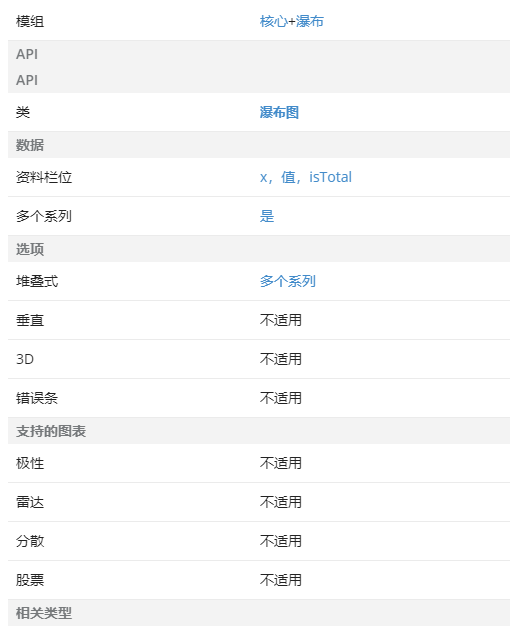
模组
Waterfall图表需要添加Core和Waterfall模块:
<script src="https://cdn.anychart.com/releases/8.9.0/js/anychart-core.min.js"></script>
<script src="https://cdn.anychart.com/releases/8.9.0/js/anychart-waterfall.min.js"></script>
快速开始
要创建瀑布图,请使用anychart.waterfall() 图表构造函数。如果将数据传递给此图表构造函数,它将创建一个Waterfall系列。
要显式创建Waterfall系列,请调用Waterfall ()方法。
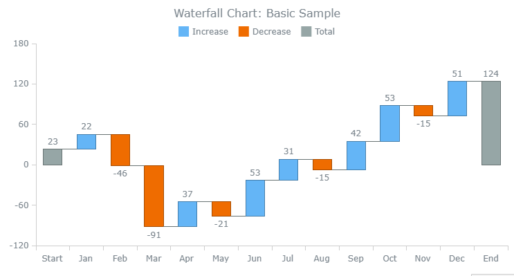
下面的示例演示如何创建基本的瀑布图:
// create data
var data = [
    {x: "Start", value:  23},
    {x: "Jan",   value:  22},
    {x: "Feb",   value: -46},
    {x: "Mar",   value: -91},
    {x: "Apr",   value:  37},
    {x: "May",   value: -21},
    {x: "Jun",   value:  53},
    {x: "Jul",   value:  31},
    {x: "Aug",   value: -15},
    {x: "Sep",   value:  42},
    {x: "Oct",   value:  53},
    {x: "Nov",   value: -15},
    {x: "Dec",   value:  51},
    {x: "End", isTotal: true}
];

// create a waterfall chart
chart = anychart.waterfall();

// create a series and set the data
var series = chart.waterfall(data);

// set the container id
chart.container("container");

// initiate drawing the chart
chart.draw();
通用设置
在AnyChart中,为所有图表类型(包括瀑布图)以相同的方式配置了许多设置(例如,图例和交互设置)。
特殊设定
数据
瀑布图的数据可以传递到图表构造函数anychart.waterfall()或data()方法。
使用以下数据字段:
- x 设置类别
- value 设定值
- isTotal 显示总价值
注意:可以向数据添加自定义字段-请参见本文的“标签和工具提示”部分。
该isTotal字段是布尔值,可选地用于显示/隐藏总值。默认情况下,如果未指定总值,则该值将显示在一个点中;如果指定了该值,则该总值将不显示。
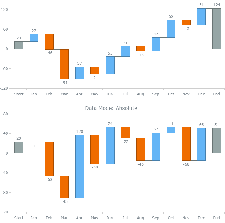
value可以根据数据模式以不同的方式解释该字段,该数据模式是通过使用dataMode()方法(以"diff"或"absolute"作为参数)来设置的-请参见anychart.enums.WaterfallDataMode。
默认的数据模式是difference。这意味着value数据字段被解释为当前点和上一个点之间的差,绝对值是自动计算的。
在绝对数据模式下,该value字段将解释为点的绝对值,并且会自动计算差值。
下面的示例显示了如何设置数据模式:
// create data
var data = [
    {x: "Start", value:  23},
    {x: "Jan",   value:  22},
    {x: "Feb",   value: -46},
    {x: "Mar",   value: -91},
    {x: "Apr",   value:  37},
    {x: "May",   value: -21},
    {x: "Jun",   value:  53},
    {x: "Jul",   value:  31},
    {x: "Aug",   value: -15},
    {x: "Sep",   value:  42},
    {x: "Oct",   value:  53},
    {x: "Nov",   value: -15},
    {x: "Dec",   value:  51},
    {x: "End", isTotal: true}
];

// create and configure the first waterfall chart
var chart1 = anychart.waterfall(data);
// set the data mode
chart1.dataMode("diff");

// create and configure the second waterfall chart
var chart2 = anychart.waterfall(data);
// set the data mode
chart2.dataMode("absolute");
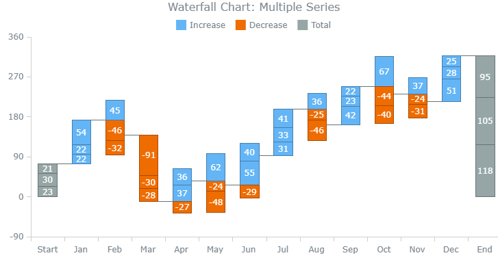
多个系列
瀑布图支持多个系列,此示例显示了它们的可视化方式:
// create a data set
var data = anychart.data.set([
    ["Start", 23,  30,  21],
    ["Jan",   22,  22,  54],
    ["Feb",  -46,  45, -32],
    ["Mar",  -91, -30,  -28],
    ["Apr",   37, -27,  36],
    ["May",  -24,  62, -48],
    ["Jun",   55,  40, -29],
    ["Jul",   31,  33,  41],
    ["Aug",  -25, -46,  36],
    ["Sep",   42,  23,  22],
    ["Oct",   67, -44, -40],
    ["Nov",  -24, -31,  37],
    ["Dec",   51,  28,  25],
    ["End", {isTotal: true}, {isTotal: true}, {isTotal: true}],
]);

// map the data
var seriesData_1 = data.mapAs({x: 0, value: 1});
var seriesData_2 = data.mapAs({x: 0, value: 2});
var seriesData_3 = data.mapAs({x: 0, value: 3});

// create a waterfall chart
chart = anychart.waterfall();

// create the first series and set the data
var series1 = chart.waterfall(seriesData_1);

// create the second series and set the data
var series2 = chart.waterfall(seriesData_2);

// create the third series and set the data
var series3 = chart.waterfall(seriesData_3);
出现
列
Waterfall列的外观设置可以配置为三种状态:正常,悬停和选中。使用normal(),hovered()和selected()方法。
将它们与以下方法结合以调整指示总值的列:
- fill()设置填充
- hatchFill()设置填充图案
- stroke()设置笔划
要调整下降列,请使用:
- FallingFill()
- fallingHatchFill()
- fallingStroke()
要调整上升列,请使用:
- risingFill()
- riseHatchFill()
- riseStroke()
另外,您可以使用anychart.core.StateSettings中的其他方法。
在以下示例中,有一个配置了外观设置的瀑布图:
// configure the visual settings of the series
series.normal().fill("#ff6666", 0.3);
series.normal().hatchFill("forward-diagonal", "#ff6666", 0.5, 10);
series.normal().stroke("#ff6666");
series.hovered().fill("#ff6666", 0.1);
series.hovered().hatchFill("forward-diagonal", "#ff6666", 0.5, 10);
series.hovered().stroke("#ff6666", 2);
series.selected().fill("#ff6666", 0.5);
series.selected().hatchFill("forward-diagonal", "#ff6666", 0.5, 10);
series.selected().stroke("#ff6666", 4);

series.normal().fallingFill("#00cc99", 0.3);
series.normal().fallingStroke("#00cc99", 1, "10 5", "round");
series.hovered().fallingFill("#00cc99", 0.1);
series.hovered().fallingStroke("#00cc99", 2, "10 5", "round");
series.selected().fallingFill("#00cc99", 0.5);
series.selected().fallingStroke("#00cc99", 4, "10 5", "round");

series.normal().risingFill("#0066cc", 0.3);
series.normal().risingStroke("#0066cc");
series.hovered().risingFill("#0066cc", 0.1);
series.hovered().risingStroke("#0066cc", 2);
series.selected().risingFill("#0066cc", 0.5);
series.selected().risingStroke("#0066cc", 4);
连接器
连接器是连接瀑布图的两列的线。要配置连接器的笔划,请使用connectorStroke()方法:
// configure connectors
chart.connectorStroke("#ff6666", 2, "2 2", "round");
点大小
此图表类型允许您设置其点的大小。在Point Size文章中阅读更多内容。
标签和工具提示
标签是可以放置在任何图表上任何位置的文本或图像元素(可以在整个系列或单个点上启用它们)。对于文本标签,可以使用字体设置和文本格式器。
甲工具提示是文本时的曲线图上的点悬停在显示框。有许多可视设置和其他设置:例如,您可以使用字体设置和文本格式设置器来编辑文本,更改背景样式,调整工具提示的位置等等。
代币
要更改标签的文本,请将labels()和format()方法与tokens结合使用。
要配置工具提示,请对tooltip()和format()方法执行相同的操作。也可以更改工具提示的标题:使用titleFormat()。
除了适用于所有图表类型的标记外,还有两个特定于Waterfall的标记:{%diff}和{%absolute}。第一个返回点之间的差,第二个返回点的绝对值。
另外,您可以向数据添加自定义字段,并使用与其对应的自定义标记。
默认情况下,标签显示差异,在以下示例中,{%absolute}标记用于显示绝对值。工具提示的文本(包括标题)也被修改,并使用自定义标记:
// create data
var data = [
    {x: "Start", value:  23, custom_field: "info 1"},
    {x: "Jan",   value:  22, custom_field: "info 2"},
    {x: "Feb",   value: -46, custom_field: "info 3"},
    {x: "Mar",   value: -91, custom_field: "info 4"},
    {x: "Apr",   value:  37, custom_field: "info 5"},
    {x: "May",   value: -21, custom_field: "info 6"},
    {x: "Jun",   value:  53, custom_field: "info 7"},
    {x: "Jul",   value:  31, custom_field: "info 8"},
    {x: "Aug",   value: -15, custom_field: "info 9"},
    {x: "Sep",   value:  42, custom_field: "info 10"},
    {x: "Oct",   value:  53, custom_field: "info 11"},
    {x: "Nov",   value: -15, custom_field: "info 12"},
    {x: "Dec",   value:  51, custom_field: "info 13"},
    {x: "End", isTotal: true, custom_field: "info 14"}
];

// create a waterfall chart
var chart = anychart.waterfall();

// create a series and set the data
var series = chart.waterfall(data);

// configure labels
chart.labels().format("{%absolute}");

// configure tooltips
chart.tooltip().titleFormat("Absolute | Difference");
chart.tooltip().format("{%absolute}\n{%diff}\n\n{%custom_field}");
格式化功能
要配置标签和工具提示,可以使用格式设置功能和以下字段(默认字段除外):
- diff
- absolute
- isTotal
该isTotal字段允许找出一列是否表示总价值与否。
您还可以将自定义字段添加到数据中,并使用getData()方法对其进行引用。
在下面的示例中,所有标签均显示绝对值,并且指示总值的列标签带有颜色。指示总值的列的工具提示也被修改,并使用自定义字段:
// create data
var data = [
    {x: "Start", value:  23, custom_field: "info 1"},
    {x: "Jan",   value:  22, custom_field: "info 2"},
    {x: "Feb",   value: -46, custom_field: "info 3"},
    {x: "Mar",   value: -91, custom_field: "info 4"},
    {x: "Apr",   value:  37, custom_field: "info 5"},
    {x: "May",   value: -21, custom_field: "info 6"},
    {x: "Jun",   value:  53, custom_field: "info 7"},
    {x: "Jul",   value:  31, custom_field: "info 8"},
    {x: "Aug",   value: -15, custom_field: "info 9"},
    {x: "Sep",   value:  42, custom_field: "info 10"},
    {x: "Oct",   value:  53, custom_field: "info 11"},
    {x: "Nov",   value: -15, custom_field: "info 12"},
    {x: "Dec",   value:  51, custom_field: "info 13"},
    {x: "End", isTotal: true, custom_field: "info 14"}
];

// create a waterfall chart
var chart = anychart.waterfall();

// create a series and set the data
var series = chart.waterfall(data);

// enable HTML for labels
chart.labels().useHtml(true);

// configure labels
chart.labels().format(function() {
    if (this.isTotal)
        return "" +
               this.absolute + "";
    return this.absolute;
});

// configure tooltips
chart.tooltip().titleFormat(function() {
    if (this.isTotal)
        return "TOTAL (" + this.getData("custom_field") + ")";
    return this.x + " (" + this.getData("custom_field") + ")";
});
瀑布图的默认图例显示增加,减少和总计列。如果要使用多系列图表,而要显示系列,则可以通过将legend()方法与itemsSourceMode()结合使用来更改图例项目的来源,并用作参数:"default"
// add hatch fills
series1.hatchFill("percent05", "white", 1, 9);
series1.fallingHatchFill("percent05", "white", 1, 9);
series1.risingHatchFill("percent05", "white", 1, 9);

series2.hatchFill("dashed-backward-diagonal", "white", 1, 9);
series2.fallingHatchFill("dashed-backward-diagonal", "white", 1, 9);
series2.risingHatchFill("dashed-backward-diagonal", "white", 1, 9);

series3.hatchFill("forward-diagonal", "white", 1, 6);
series3.fallingHatchFill("forward-diagonal", "white", 1, 6);
series3.risingHatchFill("forward-diagonal", "white", 1, 6);

// configure the legend
chart.legend().itemsSourceMode("default");

 浙公网安备 33010602011771号