


CSS图片高斯模糊方式
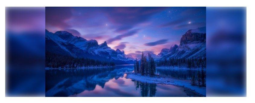
方式一:filter:blur()
图片显示区域给定宽高,图片比例保持不变,周围空白区域填充图片模糊显示
核心属性:
object-fit: contain;
filter: blur(10px) brightness(1.2);
页面元素:
<div class="wrapBox1">
    <img src="./pic1.jpg" alt="" />
</div>
样式如下:

            .wrapBox1 {
                width: 800px;
                height: 300px;
                overflow: hidden;
                margin: 100px auto;
                display: flex;
                justify-content: center;
                align-items: center;
                position: relative;
            }
            .wrapBox1::after{
                width: 100%;
                height: 100%;
                content: '';
                position: absolute;
                z-index: -1;
                background-image: url("./pic1.jpg");
                background-size: 100% 100%;
                background-repeat: no-repeat;
                filter: blur(10px) brightness(1.2);

            }
            img {
                width: 100%;
                height: 100%;
                object-fit: contain;
                position: relative;
                z-index: 10;
            }
使用伪元素模糊,注意层级关系,子元素图片位于最上层;
效果如下:
方式二:backdrop-filter
图片任意区域模糊,使用 backdrop-filter 属性给背景增加蒙层模糊;
页面元素:
<div class="wrapBox2">
    <div class="subBox"></div>
    <div class="text">部分模糊</div>
</div>
样式如下:
            .wrapBox2 {
                width: 800px;
                height: 300px;
                overflow: hidden;
                margin: 100px auto;
                display: flex;
                justify-content: center;
                align-items: center;
                position: relative;
                background-image: url("./pic1.jpg");
                background-size: 100% 100%;
                background-repeat: no-repeat;
            }
            .subBox{
                position: absolute;
                width: calc(100% - 100px);
                height: calc(100% - 100px);
                z-index: 2;
                backdrop-filter: blur(10px);
            }
            .text{
                position: relative;
                z-index: 10;
                font-size: 40px;
                font-weight: bold;
                color: #fff;
            }
效果如下:
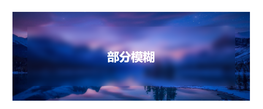
同样需要注意模糊盒子的层级关系


【推荐】国内首个AI IDE,深度理解中文开发场景,立即下载体验Trae
【推荐】编程新体验,更懂你的AI,立即体验豆包MarsCode编程助手
【推荐】抖音旗下AI助手豆包,你的智能百科全书,全免费不限次数
【推荐】轻量又高性能的 SSH 工具 IShell:AI 加持,快人一步
· 被坑几百块钱后,我竟然真的恢复了删除的微信聊天记录!
· 没有Manus邀请码?试试免邀请码的MGX或者开源的OpenManus吧
· 【自荐】一款简洁、开源的在线白板工具 Drawnix
· 园子的第一款AI主题卫衣上架——"HELLO! HOW CAN I ASSIST YOU TODAY
· Docker 太简单,K8s 太复杂?w7panel 让容器管理更轻松!