
布局元素和用户控件设计Silverlight网站02
2010-05-26 21:08 夜雨瞳 阅读(780) 评论(0) 编辑 收藏 举报 1 文件安排2 导入图片 2.1 图片ff4.png 2.2 图片header.jpg 3创建Silverlight应用程序 3.1 MainPage.xaml文件Code highlighting produced by Actipro CodeHighlighter)http://www.CodeHighlighter.com使用线性渐变绘制区域。该直线的终点由线性渐变的StartPoint和EndPoint属性定义。LinearGradientBrush沿此直线绘制其GradientStops。默认的线性渐变是沿对角方向代码中的xmlns:uc="clr-namespace:silverlight_website.element_xaml" 就是引用名为silverlight_website.element_xaml的命名空间。这样一来,凡是属于此空间的UserControl均可以在FYW
1 文件安排

2 导入图片
2.1 图片ff4.png

2.2 图片header.jpg

3 创建Silverlight应用程序
3.1 MainPage.xaml文件

xmlns="http://schemas.microsoft.com/winfx/2006/xaml/presentation"
xmlns:x="http://schemas.microsoft.com/winfx/2006/xaml"
xmlns:d="http://schemas.microsoft.com/expression/blend/2008"
xmlns:mc="http://schemas.openxmlformats.org/markup-compatibility/2006"
mc:Ignorable="d" d:DesignWidth="640" d:DesignHeight="900"
xmlns:uc="clr-namespace:silverlight_website.element_xaml">
<Grid x:Name="LayoutRoot">
<Grid.RowDefinitions>
<RowDefinition Height="80"/>
<RowDefinition Height="35"/>
<RowDefinition />
<RowDefinition Height="30"/>
</Grid.RowDefinitions>
<Grid.ColumnDefinitions>
<ColumnDefinition />
</Grid.ColumnDefinitions>
<!--标题UserControl-->
<uc:FYWorkShopTitle Grid.Row="0"/>
<!--菜单UserControl-->
<uc:FYWorkShopMenu Grid.Row="1"/>
<Grid Grid.Row="2" ShowGridLines="True" Background="Gray">
<Grid.RowDefinitions></Grid.RowDefinitions>
<Grid.ColumnDefinitions>
<ColumnDefinition Width="200"></ColumnDefinition>
<ColumnDefinition></ColumnDefinition>
</Grid.ColumnDefinitions>
<!--关于UserControl-->
<uc:FYWorkShopAbout Margin="5"/>
<StackPanel Grid.Column="1">
<ScrollViewer VerticalScrollBarVisibility="Visible" Height="500">
<!--新闻列表UserControl-->
<StackPanel>
<uc:FYWorkShopNewsItem Height="130" Margin="10,0"/>
<uc:FYWorkShopNewsItem Height="130" Margin="10,0"/>
<uc:FYWorkShopNewsItem Height="130" Margin="10,0"/>
<uc:FYWorkShopNewsItem Height="130" Margin="10,0"/>
</StackPanel>
</ScrollViewer>
</StackPanel>
</Grid>
<uc:FYWorkShopFooter Grid.Row="3"/>
</Grid>
</UserControl>
3.2 建立FYWorkShop.xaml的用户控件(网站标题)
 代码
代码

xmlns="http://schemas.microsoft.com/winfx/2006/xaml/presentation"
xmlns:x="http://schemas.microsoft.com/winfx/2006/xaml">
<Grid x:Name="LayoutRoot">
<StackPanel>
<StackPanel.Background>
<ImageBrush ImageSource="../pictures/header.jpg"/>
</StackPanel.Background>
</StackPanel>
</Grid>
</UserControl>
3.3 建立FYWorkShopMenu.xaml的用户控件(导航菜单)
代码
xmlns="http://schemas.microsoft.com/winfx/2006/xaml/presentation"
xmlns:x="http://schemas.microsoft.com/winfx/2006/xaml">
<Grid x:Name="LayoutRoot" Background="White">
<Border CornerRadius="5" BorderBrush="Black" BorderThickness="3">
<Border.Background>
<LinearGradientBrush StartPoint="0.5,0" EndPoint="0.5,1">
<GradientStop Color="#FF9BCCEE" Offset="0.143"/>
<GradientStop Color="#FF001316" Offset="1.0"/>
<GradientStop Color="#FF28B8BD" />
<GradientStop Color="#FF00435B" Offset="0.395"/>
</LinearGradientBrush>
</Border.Background>
<StackPanel Orientation="Horizontal">
<HyperlinkButton Width="80" Margin="40 5 0 0"
Content="Home" Foreground="White"/>
<TextBlock Text="|" Foreground="White" Height="15"/>
<HyperlinkButton Width="80" Margin="15 5 0 0"
Content="Download" Foreground="White"/>
<TextBlock Text="|" Foreground="White" Height="15"/>
<HyperlinkButton Width="80" Margin="15 5 0 0"
Content="Contact" Foreground="White"/>
<TextBlock Text="|" Foreground="White" Height="15"/>
<HyperlinkButton Width="50" Margin="15 5 0 0"
Content="Aboutus" Foreground="White"/>
</StackPanel>
</Border>
</Grid>
</UserControl>
3.4 建立FYWorkShopAbout.xaml的用户控件(简介)
代码
xmlns="http://schemas.microsoft.com/winfx/2006/xaml/presentation"
xmlns:x="http://schemas.microsoft.com/winfx/2006/xaml" >
<Grid x:Name="LayoutRoot">
<StackPanel Grid.Column="0">
<TextBlock Text="About Fengyun" Foreground="White"
Height="20"/>
<Image Source="../pictures/ff4.png"/>
<TextBlock Height="150" Foreground="White" TextWrapping="Wrap" FontSize="18">
Silverlight是从2007年开始出现,如今已经经历了3个版本,分别是Silverlight 1.0、Silverlight 2.0和Silverlight 3.0
</TextBlock>
</StackPanel>
</Grid>
</UserControl>
3.5 建立FYWorkShopNewsItem.xaml(新闻列表)
代码
xmlns="http://schemas.microsoft.com/winfx/2006/xaml/presentation"
xmlns:x="http://schemas.microsoft.com/winfx/2006/xaml"
xmlns:d="http://schemas.microsoft.com/expression/blend/2008"
xmlns:mc="http://schemas.openxmlformats.org/markup-compatibility/2006"
mc:Ignorable="d"
d:DesignWidth="580" d:DesignHeight="119">
<Grid x:Name="LayoutRoot">
<StackPanel Margin="10,10,-10,-10">
<HyperlinkButton x:Name="hlbTitle" FontSize="16"/>
<TextBlock Height="97" x:Name="tbkContent" FontSize="14"
Foreground="White"
TextWrapping="Wrap"/>
</StackPanel>
</Grid>
</UserControl>
3.6 FYWorkShopNewsItem.xalm.cs文件
代码
using System.Collections.Generic;
using System.Linq;
using System.Net;
using System.Windows;
using System.Windows.Controls;
using System.Windows.Documents;
using System.Windows.Input;
using System.Windows.Media;
using System.Windows.Media.Animation;
using System.Windows.Shapes;
namespace silverlight_website.element_xaml
{
public partial class FYWorkShopNewsItem : UserControl
{
public FYWorkShopNewsItem()
{
InitializeComponent();
hlbTitle.Content = "Silverlight 3 Release Date (RTW) Surprise Update 07/08/2009";
tbkContent.Text = @"Silverlight 3 RTW has been released. Please visit my blog post
here for all the download links:
http://silverlighthack.com/post/2009/07/09/Silverlight-3-Relase-and-Download-Links.aspx
Update 05/28/2009: Scott Guthrie during his online talk yesterday mentioned that Silverlight
3 is close to being finished up and will be released "soon".I remember when he
mentioned that during Silverlight 2 Beta 2/RC0 and Silverlight 2 RTW was out within a few
weeks. The release is REAL close now! Expression Blend 3 is also getting some updates in RTW.
Also note the July 10, 2009 invitation to talk about Silverlight 3";
}
}
}
3.7 建立FYWorkShopFooter.xaml的用户控件(页脚)
代码
xmlns="http://schemas.microsoft.com/winfx/2006/xaml/presentation"
xmlns:x="http://schemas.microsoft.com/winfx/2006/xaml" >
<Grid x:Name="LayoutRoot" Background="#FF00435B">
<StackPanel>
<TextBlock Height="20" Margin="5"
Text="风云Silverlight工作室版本所有 Copyright 2009 Email:372900288@qq.com"
Foreground="White"/>
</StackPanel>
</Grid>
</UserControl>
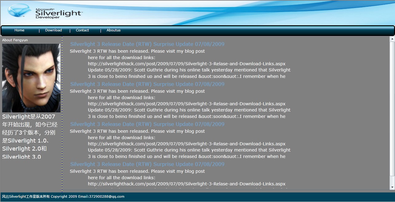
4 程序运行结果:
5 总结
5.1 LinearGradientBrush的应用
LinearGradientBrush使用线性渐变绘制区域。该直线的终点由线性渐变的StartPoint和EndPoint属性定义。LinearGradientBrush沿此直线绘制其 GradientStops。
默认的线性渐变是沿对角方向进行的。默认情况下,线性渐变的StartPoint是被绘制区域的左上角值为 0,0 的 Point,其 EndPoint是被绘制区域的右下角值为 1,1 的 Point。所得渐变的颜色是沿着对角方向路径插入的。
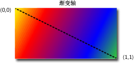
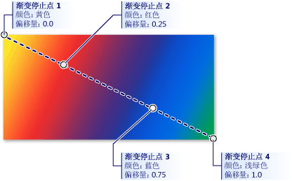
具有突出显示的渐变停止点的对角线性渐变
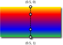
<StackPanel>
<!-- This rectangle is painted with a vertical linear gradient. -->
<Rectangle Width="200" Height="100">
<Rectangle.Fill>
<LinearGradientBrush StartPoint="0.5,0" EndPoint="0.5,1">
<GradientStop Color="Yellow" Offset="0.0" />
<GradientStop Color="Red" Offset="0.25" />
<GradientStop Color="Blue" Offset="0.75" />
<GradientStop Color="LimeGreen" Offset="1.0" />
</LinearGradientBrush>
</Rectangle.Fill>
</Rectangle>
</StackPanel>
效果如下:
5.2 命名空间
代码中的xmlns:uc="clr-namespace:silverlight_website.element_xaml"> 就是引用名为silverlight_website.element_xaml的命名空间。这样一来,凡是属于此空间的UserControl均可以在FYWorkShop.xaml文件中引用,在Silverlight中,这种做法是十分推荐的。
5.3 TextWrapping使用
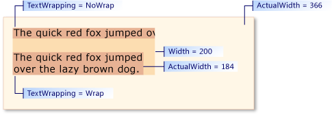
TextWrapping 属性指示文本在 TextBlock 中如何换行。TextWrapping枚举定义两个值:NoWrap 和 Wrap。
6 相关资料参考
银光志Silverlight 3.0 开发详解与最佳实践
英文:
http://msdn.microsoft.com/en-us/library/
中文:


【推荐】国内首个AI IDE,深度理解中文开发场景,立即下载体验Trae
【推荐】编程新体验,更懂你的AI,立即体验豆包MarsCode编程助手
【推荐】抖音旗下AI助手豆包,你的智能百科全书,全免费不限次数
【推荐】轻量又高性能的 SSH 工具 IShell:AI 加持,快人一步