
CSS
目录
CSS
CSS的3种导入方式
<!-- 优先级:就近原则,谁离元素近就用谁-->
1.
<!--外部样式-->
<link rel="stylesheet" href="css/style.css" >

2.
<!--内部样式-->
<style>
    h1{
        color: red;
    }
</style>

3.
<!--行内样式:在标签元素中,编写一个style属性,编写样式即可-->
<h1 style="color: red;"></h1>
外部样式两种写法:
- 链接式:(推荐)
html
<link rel="stylesheet" href="css/style.css" >
- 导入式:
@import是CSS2.1特有的!
<style>
    @import url("css/style.css");
</style>
选择器
作用:选择页面上的某一个或者某一类元素
基本选择器
优先级:不遵循就近原则,固定的
Id选择器 > 类选择器 clss > 标签选择器
- 标签选择器
<style>
    /*标签选择器,会选择到页面上所有的这个标签的元素*/
    h1{
        color: red;
    }
</style>

<body>
    <h1>标签选择器</h1>
    <h1>标签选择器2</h1>
</body>
- 类选择器 clss
<style>
    /*类选择器的格式 .class的名称{}
    好处,可以多个标签归类,是同一个class,可以复用
    */
    .selector{
        color: red;
    }
    .selector2{
        color: green;
    }
</style>

<body>
    <h1 class="selector">类选择器</h1>
    <h1 class="selector2">类选择器2</h1>
    <h1 class="selector">类选择器3</h1>
</body>
- Id选择器
<style>
    /*  id选择器  : id必须保证全局唯一!
        #id名称{}
    */
    #Id{
        color: red;
    }
    #Id2{
        color: green;
    }
</style>

<body>
    <h1 id="Id">Id选择器</h1>
    <h1 id="Id2">Id选择器2</h1>
</body>
层次选择器
- 后代选择器:在某个元素的后面 祖爷爷-->爷爷-->爸爸-->你
/*后代选择器*/
body p{
    background:red;
}
- 子选择器:一代,儿子
/*子选择器*/
body>p{
    background:red;
}
- 相邻兄弟选择器
/*相邻兄弟选择器:只有一个,相邻(向下)*/
.active + p{
    background:red;
}

<!-- 只有p2变红色 -->
<body>
	<p>p0</p>
	<p class="active">p1</p>
	<p>p2</p>
	<p>p3</p>
</body>
- 通用选择器
/*通用兄弟选择器:当前选中元素的向下的所有兄弟元素*/
.active~p{
    background:red;
}

<!-- p2和p3变红色:p1以下全部变 -->
<body>
	<p>p0</p>
	<p class="active">p1</p>
	<p>p2</p>
	<p>p3</p>
</body>
结构伪类选择器
伪类:条件
<style type="text/css">
	/*ul的第一个子元素*/
	ul li:first-child{
		background: green;
	}
	/*ul的最后一个子元素*/
	ul li:last-child{
		background: red;
	}
    /*选中 p0 :定位到父元素,选择当前的第一个元素
	选择当前p元素的父级元素,选中父级元素的第一个,并且是当前元素才生效! 顺序
	*/
	p:nth-child(1){
		background: yellow;
	}
    /*选中父元素,下的p元素的第一个,类型*/
	p:nth-of-type(1){
		background: blue;
	}
</style>

<body>
	<p>p0</p>
	<p class="active">p1</p>
	<p>p2</p>
	<ul>
		<li>li1</li>
		<li>li2</li>
		<li>li3</li>
	</ul>
</body>
属性选择器(常用)
- a[]{}
属性名,属性名 = 属性值(正则)  a[]{}

= 绝对等于
*= 包含这个元素
^= 以这个开头
$= 以这个结尾
- id + class 结合
<style type="text/css">
    .demo a{
        float: left;
        display: block;
        height: 50px;
        width: 50px;
        border-radius: 10px;
        background: #2700ff;
        text-align: center;
        color: gainsboro;
        text-decoration: none;
        margin-right: 5px;
        font: bold 20px/50px Arial;
	}
</style>

<body>
	<p class="demo">
        <a href="http://www.baidu.com" class="links item first" id="first">1</a>
        <a href="http://blog.kuangstudy.com" class="links item active" target="_blank" title="test">2</a>
        <a href="images/123.html" class="links item">3</a>
        <a href="images/123.png" class="links item">4</a>
        <a href="images/123.jpg" class="links item">5</a>
        <a href="abc" class="links item">6</a>
        <a href="/a.pdf" class="links item">7</a>
        <a href="/abc.pdf" class="links item">8</a>
        <a href="abc.doc" class="links item">9</a>
        <a href="abcd.doc" class="links item last">10</a>
    </p>
</body>
<style type="text/css">
	/*属性名,属性名 = 属性值(正则)  a[]{}
	= 绝对等于
	*= 包含这个元素
	^= 以这个开头
	$= 以这个结尾
	*/

	/*存在id属性的元素*/
	a[id]{
		background: yellow;
	}

	/*id=first的元素*/
	a[id=first]{
		background: red;
	}

	/*class 中有links的元素*/
	a[class*="links"]{
		background: yellow;
	}

	/*选中href中以http开头的元素*/
	a[href^=http]{
		background: gray;
	}

	/*选中href中以pdf结尾的元素*/
	a[href$=pdf]{
		background: green;
	}
</style>
美化网页元素
span标签:重点要突出的字,使用span套起来
字体样式
/*
font:字体风格 字体粗细 字体大小 字体样式
font:oblique bold 16px "楷体";

font-family  字体
font-size    字体大小
font-weight  字体粗细  最粗:bolder,粗:bold,细:lighter,数字也可以最大900
color        颜色
*/
文本样式
- 颜色
/*颜色
	RGB 0~F
	RGBA  A:0~1
*/
color:rgba(0,255,255,0.5);
- 文本对齐的方式:文字左右居中
/*文本
居中 :center
居右 :right
居左 :left
*/
text-align: center;
- 首行缩进
/*1em代表一个字,1px表示一个像素*/
text-indent:2em;
- 行高:文字上下居中
/*高度要一致*/
height:300px;
line-height:300px;
- 装饰
/*下划线*/
text-decoration: underline;
/*中划线*/
text-decoration: line-through;
/*上划线*/
text-decoration: overline;
/*去下划线*/
text-decoration: none;
- 文本图片水平对齐
/* 水平对齐参照物, a, b */
img,span{
    vertical-align: middle;
}
超链接伪类
/*默认的状态*/
a{
	text-decoration: none;
	color: #000000;
}
/*鼠标悬停的状态 (只需要记住:hover)*/
a:hover{
	color: orange;
}
/*鼠标按住未释放的状态*/
a:active{
	color: green;
}
/*未访问的链接*/
a:link{
	color: gray;
}
/*已访问的链接*/
a:visited{
	color: yellow;
}
文字阴影
/* 阴影
text-shadow: 阴影颜色,水平偏移,垂直偏移,阴影半径
*/
#price{
	text-shadow: red 10px 10px 2px;
}
列表
/*ul li
list-style:
	none    去掉原点
	circle  空心圆
	decimal 数字
	square  正方形
*/
ul li{
	list-style: none;
}
背景
- 背景图片
/*默认是全部平铺的 repeat*/
background-image: url("../image/1.jpg");

/*水平平铺*/
background-repeat: repeat-x;
/*垂直平铺*/
background-repeat: repeat-y;
/*不平铺*/
background-repeat: no-repeat;

/*位置
background-position:关键字 | 百分比 | 像素值
*/
background-position: 200px 10px;

/*颜色*/
background-color: red;

/* 综合
颜色,图片,图片位置,平铺方式
*/
background: red url("../image/1.jpg") 200px 10px no-repeat;
渐变
- 渐变网站
- 线性渐变
/*
background-image: linear-gradient(角度值 || to 方向,颜色1 百分比,颜色2 百分比);
			重复:repeating-linear-gradient(角度值 || to 方向,颜色1 百分比,颜色2 百分比);
*/
background-image: linear-gradient(239deg, #4158D0 0%, #C850C0 46%, #FFCC70 100%);
background-image: linear-gradient(to top, #4158D0 0%, #C850C0 46%, #FFCC70 100%);
- 径向渐变
/* 至少两个颜色
background: radial-gradient(形状 || 大小  at 位置,颜色1,颜色2);
		重复:repeating-radial-gradient(形状 || 大小  at 位置,颜色1,颜色2);
*/
background: radial-gradient(circle at 50%,red,yellow);
background: radial-gradient(150px at 50%,red,yellow);
图片居中
第一种:margin:0 auto;
- img 标签不但是一个行内元素,还是一个可替换元素,所以img 标签就是一个可以设置宽高的行内元素。
- 而
margin:0 auto;生效的条件是:- 该元素是一个块级元素
- 元素具有宽度
- 因此,少了
display: block;无法实现居中!
img {
     /*不用刻意添加 width 是因为 img 标签是可替换元素有内置的宽度*/
     display: block;   /*将行内元素转为块级元素*/
     margin: 0 auto;
}
第二种:text-align:center;
text-align:center;是将所有被包含的元素都居中显示,而text-align:center; 只是将 元素下面的内联元素 居中显示。- 对img标签设置一个div标签。
<style>
/* 定义一个类标签 */
    .center{
        text-align: center;
    }
</style>

<body>
<div class="center">
    <img  src="../images/1.jpg" >
   </div>
</body>
盒子模型
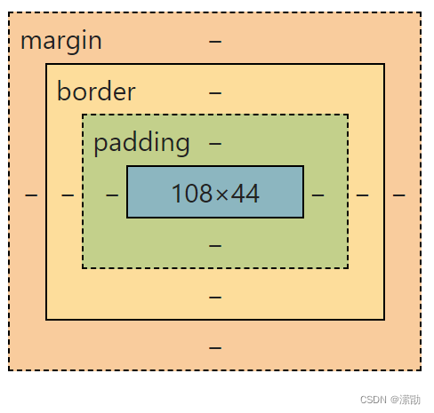
- margin:外边距
- padding:内边距
- border:边框
边框
- 边框的粗细
- 边框的样式
- 边框的颜色
/*border:粗细 样式 颜色;
solid  实线
dashed 虚线
none   无边框
*/
border:1px solid red;
margin:外边距
/*上下为1px,左右为2px
auto:居中
居中要求:该元素是一个块级元素,元素具有宽度
display: block;将元素变成块级元素
*/
margin:1px 2px;
margin:0 auto;
/*margin:上 右 下 左   顺时针*/
margin:1px 2px 3px 4px;
     		/*top 上*/
/*left 左*/     			/*right 右*/
			/*bottom 下*/
padding:内边距
/*上下为1px,左右为2px
auto:居中
居中要求:该元素是一个块级元素,元素具有宽度
display: block;将元素变成块级元素
*/
padding:1px 2px;
padding:0 auto;
/*padding:上 右 下 左   顺时针*/
padding:1px 2px 3px 4px;
     		/*top 上*/
/*left 左*/     			/*right 右*/
			/*bottom 下*/
盒子模型原理
计算方式
- margin + border + padding + 内容宽度(width,height)
盒子实际大小
- 实际宽 = 左右边框 + 左右内边距 + 宽度
- 实际高 = 上下边框 + 上下内边距 + 高度
盒子所占空间
- 盒子所占空间 = 盒子实际大小 + 边距
圆角边框
/*左上和右下为40px,右上左下为30px*/
border-radius: 40px 30px;
/*border-radius: 左上 右上 右下 左下   顺时针*/
border-radius: 40px 30px 20px 10px;
/*圆圈 : 圆角 = 半径 + 边框 */
height: 100px;
width: 100px;
border:1px dashed red;
border-radius: 51px;
盒子阴影
/*box-shadow:水平偏移 垂直偏移 模糊半径 阴影大小 颜色*/
box-shadow: 10px 10px 100px 0px red;
浮动
标准文档流
- 块级元素:独占一行 ,默认宽度一整行,可以设置宽和高,从上至下
h1~h6 p div 列表...
- 行内元素:不独占一行 ,默认同行显示,宽和高由内容决定,从左至右
span a img strong...
- 行内元素可以被包含在块级元素中,反之,则不可以~
display
/*display:
block  块级元素
inline 行内元素
none   隐藏元素
inline-block  是块元素,但是可以内联,在一行!
*/
display:block;
这个也是一种实现行内元素排列的方式,但是我们很多情况都是用float
float浮动
- 浮动float
/*float:
none  清除浮动
left  左浮动
right 右浮动
*/
float:left;
overflow:解决溢出问题
当高度超过了设置的大小时
overflow:scroll; 出现滚动条
- 浮动塌陷:父级元素里所有子元素都浮动
/* 清除浮动塌陷 三种方法:
1.在子元素最添加一层:clear:both;
2.增加父级元素高度
3.设置父级元素:overflow:hidden;
4.在父类添加一个伪类:after   和下面标准方法差不多
	#father:after{
		content: '';
		display: block;
		clear: both;
	}
*/

/*clear:
both   两侧不允许有浮动元素(常用)
left   左侧不允许有浮动元素
right  右侧不允许有浮动元素
*/
标准方法1:增加一个空的div标签,清除浮动
<style>
    .clear{
        clear: both;
        margin:0px;
        padding: 0px;
    }
</style>

<div class="clear"></div>
标准方法2:在父类添加一个伪类:after
#father{
    float:left;
}

#father:after{
	content: '';
	display: block;
	clear: both;
}
小结:
-
浮动元素后面增加空div
- 优缺点:简单,但代码中尽量避免空div
-
增加父级元素高度
- 优缺点:简单,元素假设有了固定的高度,就会被限制
-
overflow
- 优缺点:简单,下拉的一些场景避免使用
-
在父类添加一个伪类:after (推荐使用)
- 优缺点:写法稍微复杂一点,但是没有副作用,推荐使用!
display和float对比
-
display
方向不可以控制
-
float
浮动起来的话会脱离标准文档流,所以要解决父级边框塌陷的问题
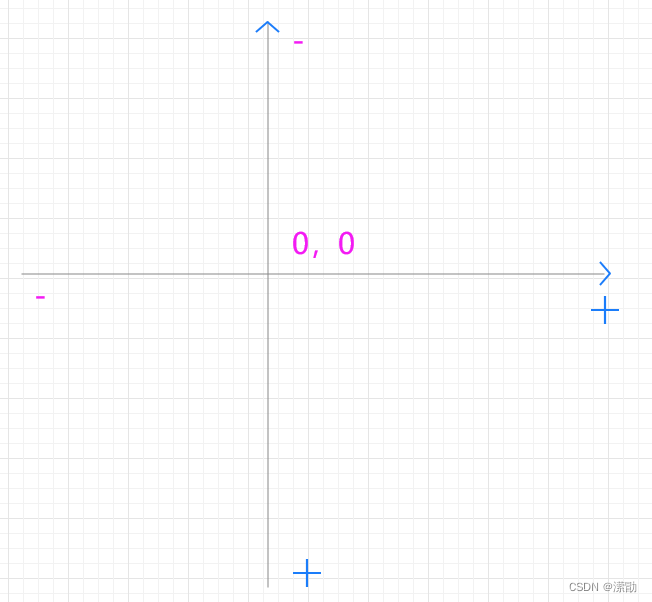
position定位
position:static; (静态,默认的)
相对定位
position:relative; (相对定位)
相对于原来的位置,进行指定的偏移。
相对定位的话,它任然在标准文档流中!
原来的位置会被保留
/*
相对定位:相对于自己原来的位置
*/
position:relative;

top:-20px;/*向上移动20px*/
bottom:-20px;/*向下移动20px*/
left:-20px;/*向左移动20px*/
right:-20px;/*向右移动20px*/
绝对定位
position:absolute; (绝对定位)
1、没有父级元素定位的前提下,相对于浏览器定位
2、假设父级元素存在定位,会相对于父级元素进行偏移
3、在父级元素范围内移动
/* 绝对定位:
1、没有父级元素定位的前提下,相对于浏览器定位
2、假设父级元素存在定位,会相对于父级元素进行偏移
3、在父级元素范围内移动(一般没有负数)
*/
position:absolute;

top:20px;/*离上面20px*/
bottom:20px;/*离下面20px*/
left:20px;/*离左面20px*/
right:20px;/*离右面20px*/
固定定位
position:fixed; (固定定位)
/*
固定定位:一直在那里不动,例如 返回顶部
*/
position:fixed;

top:20px;/*离上面20px*/
bottom:20px;/*离下面20px*/
left:20px;/*离左面20px*/
right:20px;/*离右面20px*/
z-index
图层~
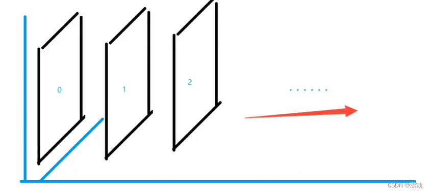
z-index 默认是0,最高无限~
/*默认是0,最高无限~*/
z-index:0;

/*设置透明度*/
opacity: 0.5;
/*与opacity: 0.5;效果一样*/
filter: opacity(0.5);


【推荐】国内首个AI IDE,深度理解中文开发场景,立即下载体验Trae
【推荐】编程新体验,更懂你的AI,立即体验豆包MarsCode编程助手
【推荐】抖音旗下AI助手豆包,你的智能百科全书,全免费不限次数
【推荐】轻量又高性能的 SSH 工具 IShell:AI 加持,快人一步
· 25岁的心里话
· 闲置电脑爆改个人服务器(超详细) #公网映射 #Vmware虚拟网络编辑器
· 基于 Docker 搭建 FRP 内网穿透开源项目(很简单哒)
· 零经验选手,Compose 一天开发一款小游戏!
· 一起来玩mcp_server_sqlite,让AI帮你做增删改查!!