使用伪元素after实现带渐变的底边框
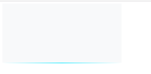
效果如图:
代码如下:
<!DOCTYPE html>
<html lang="en">
<head>
    <meta charset="UTF-8">
    <title>Title</title>
  <style type="text/css">
      .div-wrap {
        width: 400px;
        height: 200px;
        background: rgba(220, 223, 230, 0.2);
        position: relative;
      }
      .div-wrap::after {
        position: absolute;
        content: "";
        left: 0;
        bottom: 0;
        width: 100%;
        height: 2px;
        background: linear-gradient(90deg,rgba(255, 255, 255, 1) 0%, #08E8FF 50%, rgba(255, 255, 255, 1) 100%);
      }
  </style>
</head>
<body>
<div class="div-wrap"></div>
</body>
</html>

 浙公网安备 33010602011771号