css 折角效果/切角效果
首先我们先创建一个图案为100像素的斜面切角的图案
html
<div class="one">12345</div>
css
.one{
    width: 100px;
    height: 100px;
    margin: 0 auto;
    background: yellowgreen;
    background: linear-gradient(-135deg,transparent 15px ,yellowgreen 0 );
  }
效果图

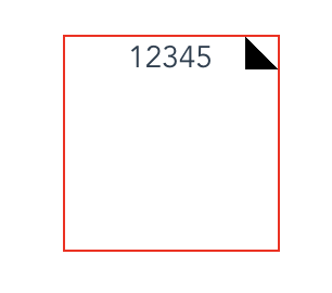
然后我们在生成一个我们需要的折角三角形
css
.one{
    width: 100px;
    height: 100px;
    margin: 0 auto;
    border: 1px solid red;
    background: linear-gradient( to left bottom ,transparent 50%,rgba(0,0,0,.4) 0 )no-repeat 100% 0 / 15px 15px ;
  }
效果图
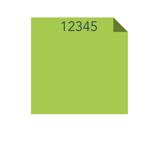
最后我们只需要合并一下就可以得出我们想要的折角效果
css
.one{
    width: 100px;
    height: 100px;
    margin: 0 auto;
    background: yellowgreen;
    background: linear-gradient( to left bottom ,transparent 50%,rgba(0,0,0,.4) 0 )no-repeat 100% 0 / 15px 15px,
    linear-gradient(-135deg,transparent 10.5px ,yellowgreen 0 );
  }
效果图
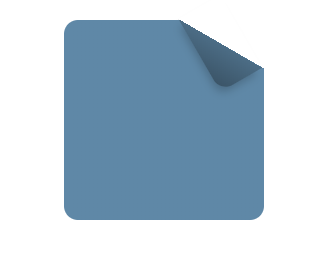
当然如果需要更美观的话可以用下面
  .one{
    width: 100px;
    height: 100px;
    margin: 0 auto;
    position: relative;
    background: #58a;
    background: linear-gradient(-150deg,transparent 1.5em,#58a 0);
    border-radius:.5em;
  }
  .one::before{
    content: '';
    position: absolute;
    top: 0;right: 0;
    background: linear-gradient(to left bottom ,transparent 50%,rgba(0,0,0,.2) 0,rgba(0,0,0,.4))  100% 0 no-repeat;
    width: 1.73em;
    height: 3em;
    transform: translateY(-1.3em)
                rotate(-30deg);
    transform-origin: bottom right;
    border-bottom-left-radius: inherit;
    box-shadow: -.2em .2em .3em -.1em rgba(0,0,0,.2);
  }
效果图