

[06] 盒模型 + auto 居中 + 垂直合并
1.盒模型
盒子模型有两种,分别是 ie 盒子模型和标准 w3c 盒子模型。
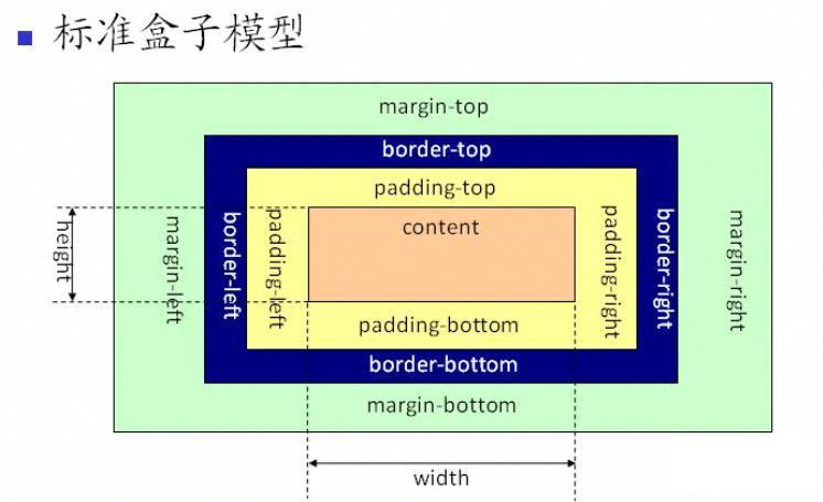
标准(W3C)模型中:CSS中的宽(width) = 内容 (content)的宽
CSS中的宽(width) = 内容(content)的宽+(border+padding)*2
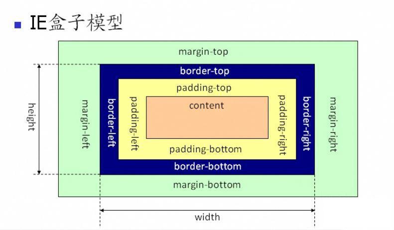
结论:IE盒模型是陈旧知识点,除了帮助理解css3 box-sizing: border-box(等分宽度布局)外没什么用。不加文档声明的情况下,只有特别旧的低版本IE浏览器(测试IE8浏览器IE7-模式)才以IE盒子模型渲染,其他浏览都是标准模式。
结论引用:http://www.cnblogs.com/wenhandi/p/7778757.html
2.auto使用
auto在盒模型中,只能用于:margin-left, with, margin-righ. margin-top , height, margin-bottom
2.1 水平:margin-left, with, margin-righ.
a.全部设置为auto,一般默认为0
b.margin-left,margin-right为auto, with为父容器宽度并居中
c.with具体宽度,margin-left 具体宽度,margin-right为auto,这为auto的宽度为: 父容器with - 元素with - 元素margin-left = 元素margin-right
2.2 垂直: margin-top , height, margin-bottom
a.设置为auto,一般默认为0
b.height:没有设置时,高度 = 内容的高度。
2.3 替换元素auto
img这种图片元素,当设置height or with 为auto时,会根据 heigth = 图片实际高度。
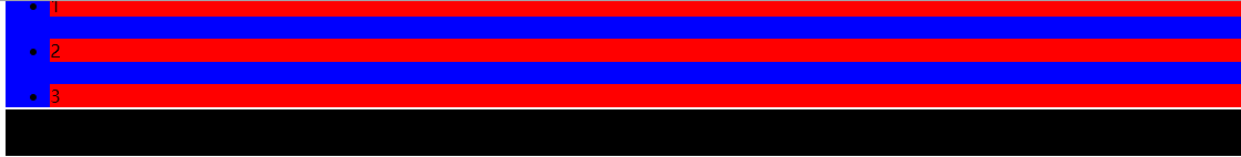
3.合并垂直外边距
当对li元素设置了margin-top, margin-bottom时,我们期望的是li元素之间相隔25px.但是实际为15px.取值为合并内容最大的那个值。
//css
ul li{
    margin-top: 10px;
    margin-bottom: 15px;
}
//html
<ul>
  <li>1</li>
  <li>2</li>
  <li>3</li>
  <li>4</li>
  <li>5</li>
</ul>
负外边距:
a.如果合并的外边距全为负值,取绝对值最大的
b.一正一负: 正数 - 负外边距绝对值
// css: 两个负值:-18,-15取值-18.和正值相减:20-(|-18|) =2.最终只有2像素
ul li{
	margin-bottom: 20px;
	background: red;
}
ul {
    margin-top: -15px;
    background: blue;
}
h1 {
    margin-top: -18px;
    background: black;
}
//html
<ul>
  <li>1</li>
  <li>2</li>
  <li>3</li>
</ul>
<h1>dfdfdf</h1>
结果:

 浙公网安备 33010602011771号