CSS 伪类的应用
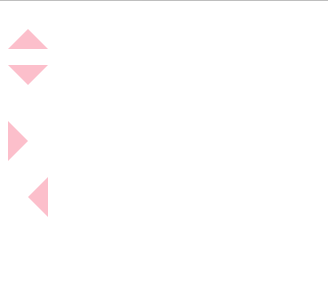
实现三角形
CSS 部分
#top-triangle {
        width: 0px;
        height: 0px;
        border: 20px solid transparent;
        border-bottom: 20px solid pink;
      }
      #right-triangle {
        width: 0px;
        height: 0px;
        border: 20px solid transparent;
        border-left: 20px solid pink;
      }
      #bottom-triangle {
        width: 0px;
        height: 0px;
        border: 20px solid transparent;
        border-top: 20px solid pink;
      }
      #left-triangle {
        width: 0px;
        height: 0px;
        border: 20px solid transparent;
        border-right: 20px solid pink;
      }
HTML 部分
 <div id="top-triangle"></div>
    <p></p>
    <div id="bottom-triangle"></div>
    <p></p>
    <div id="right-triangle"></div>
    <p></p>
    <div id="left-triangle"></div>
    <p></p>
效果预览
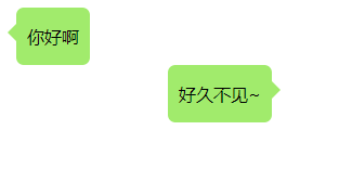
实现对话框
CSS部分
.left,
      .right {
        position: relative; /*后面移动会盒子位置*/
        display: table;
        min-height: 40px;
        text-align: center;
        background-color: #9eea6a;
        margin: 0;
        border-radius: 7px;
      }
      .left {
        left: 10px;
      }
      .left::before,
      .right::after {
        position: absolute;
        display: inline-block;
        content: "";
        width: 0px;
        height: 0px;
        border: 8px solid transparent;
        top: 15px; /*移到中间*/
      }
      .left::before {
        border-right-color: #9eea6a;
        left: -16px;
      }
      .right::after {
        border-left-color: #9eea6a;
        right: -16px;
      }
      .left p,
      .right p {
        padding: 0px 10px;
      }
      .right {
        right: -150px;
      }
HTML 部分
<div class="left">
      <p>你好啊</p>
    </div>
    <div class="right">
      <p>好久不见~</p>
    </div>
效果预览
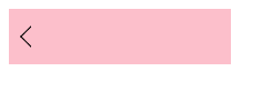
实现箭头
CSS 部分
.box {
        position: relative;
        width: 200px;
        height: 50px;
        background-color: pink;
      }
      .box::before {
        position: absolute;
        content: "";
        width: 12px;
        height: 12px;
        border: 1px solid black;
        border-bottom-color: transparent;
        border-right-color: transparent;
        transform: translate(-50%, -50%) rotate(-45deg);
        left: 20px;
        top: 50%;
      }
HTML 部分
<div class="box"></div>
效果预览
画分割线:画一条分割线
CSS 部分
* {
      padding: 0;
      margin: 0;
    }
    .spliter::before, .spliter::after {
      content: '';
      display: inline-block;
      border-top: 1px solid black;
      width: 200px;
      margin: 5px;
    }
HTML 部分
<p class="spliter">分割线</p>
效果预览


 浙公网安备 33010602011771号