Vue重用组件
1、是什么?
这里主要是简单入门使用一下,复杂高阶的用法笔者暂时还没了解到
Vue重用组件是指可以被多个Vue实例重复使用的组件。这些组件可以包含自定义的状态和事件处理程序,并且可以在整个应用程序中共享。重用组件可以减少代码冗余,提高开发效率,并使代码更加模块化和可维护。
在Vue中,可以使用<component>标签来定义重用组件。
2、怎么玩?
组件页面1:MyButton.vue
友情提示:一般情况下组件都放在Component下
<template>
  <div class="button" :class="[type,size]">
    <!--标签内的文本动态替代插槽中的内容-->
    a
    <slot></slot>
    b
  </div>
</template>

<script>
const options = {
  name: 'MyButton',
  props: ['type', 'size']
}

export default options
</script>

<style scoped>
.button {
  display: inline-block;
  text-align: center;
  border-radius: 30px;
  margin: 5px;
  font: bold 12px/25px Arial, sans-serif;
  padding: 0 2px;
  text-shadow: 1px 1px 1px rgba(255, 255, 255, .22);
  box-shadow: 1px 1px 1px rgba(0, 0, 0, .29), inset 1px 1px 1px rgba(255, 255, 255, .44);
  transition: all 0.15s ease;
}

.button:hover {
  box-shadow: 1px 1px 1px rgba(0, 0, 0, .29), inset 1px 1px 2px rgba(0, 0, 0, .5);
}

.button:active {
  box-shadow: inset 1px 1px 2px rgba(0, 0, 0, .8);
}

.primary {
  background-color: #1d6ef9;
  color: #b5e3f1;
}

.danger {
  background-color: rgb(196, 50, 50);
  color: white;
}

.success {
  background-color: #a5cd4e;;
  color: #3e5706;
}

.small {
  width: 40px;
  height: 20px;
  font-size: 10px;
  line-height: 20px;
}

.middle {
  width: 50px;
  height: 25px;
  font-size: 14px;
  line-height: 25px;
}

.large {
  width: 60px;
  height: 30px;
  font-size: 18px;
  line-height: 30px;
}
</style>
props : 自定义组件属性
slot : 插槽,用户
组件页面2:MyTamplate.vue
<template>
  <div>
    <header>
      <h1>{{ message }}</h1>
    </header>
    <section>
      <p>{{ content }}</p>
    </section>
  </div>
</template>

<script>
const options = {
  name: "MyTemplate", // 指定组件名称
  data() {
    return {
      message: 'Hello World',
      content: 'This is my content.'
    }
  }
}
export default options
</script>

<style scoped>

</style>
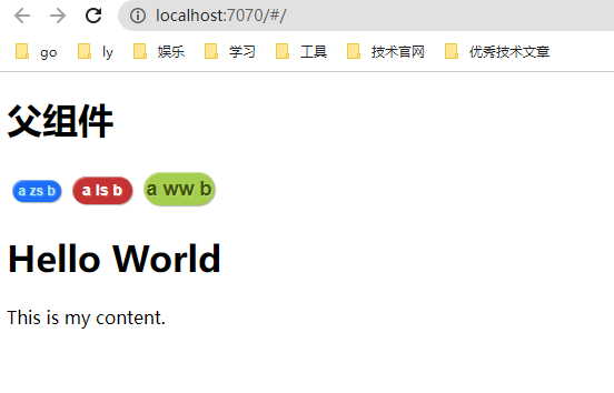
使用自定义组件和自定义属性
<template>
  <div class="app-container">
    <h1>父组件</h1>
    <my-button type="primary" size="small">zs</my-button>
    <my-button type="danger" size="middle">ls</my-button>
    <my-button type="success" size="large">ww</my-button>

    <my-template></my-template>
  </div>
</template>

<script>
import MyButton from "@/components/MyButton";
import MyTemplate from "@/components/MyTemplate";
const options = {
  components: {
    MyButton,
    MyTemplate
  }
}
export default options
</script>

<style scoped> /*scoped : 只影响当前页面*/
</style>
3、效果

 浙公网安备 33010602011771号