CSS实现各种形状
.trapzoid {
    width: 40px;
    height: 100px;
    border: 50px solid blue;
    border-color: transparent transparent blue transparent;
}

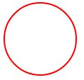
2.圆形:设置宽高相等、border-radius:50%
    .circle {
      width: 100px;
      height: 100px;
      border-radius: 50%;
      border: 2px solid red;
    }
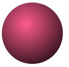
3.球体:border-radius:50%,background:radial-gradient函数
   .sphere {
      height: 200px;
      width: 200px;
      border-radius: 50%;
      /*  radial-gradient参数:shape size @ position,开始颜色,结束颜色 */
      background: radial-gradient(circle at 80px 70px, #ff5c8d, #000);
    }
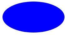
4.椭圆:高为宽的一半,border-radius:50%
 .ellipse {
    width: 200px;
    height: 100px;
    border-radius: 50%;
    background: blue;
}
5.半圆: border-radius: 50px 0 0 50px;
    .semicircle {
      width: 50px;
      height: 100px;
      /*  "/"前四个值表示圆角的水平半径,后四个值表示圆角的垂直半径*/
      border-radius: 100% 0 0 100% / 50% 0 0 50%;
      /* 效果和用%一样 */
      /* border-radius: 50px 0 0 50px; */
      background: pink;
    }

6.菱形
   .rhombus {
      margin-top: 100px;;
      width: 100px;
      height: 100px;
      /*  skew(30deg, 30deg);倾斜(水平方向的倾斜角度,垂直方向的倾斜角度) */
      transform: rotateZ(45deg) skew(30deg, 30deg);
      background: blue;
    }

7.心形:由两个圆形和一个矩形进行组合得到的。
   .heart {
      margin: 50px;
      width: 100px;
      height: 100px;
      transform: rotateZ(45deg);
      background: red;
    }
    .heart::after,
    .heart::before {
      content: "";
      width: 100%;
      height: 100%;
      border-radius: 50%;
      display: block;
      background: red;
      position: absolute;
      top: -50%;
      left: 0;
    }
    .heart::before {
      top: 0;
      left: -50%;
    }

参考:https://juejin.im/post/5c9cbddc5188252d812c6526
