diy-select(开箱即用)
自定义组件select,实现了一个自定义的下拉选择器功能。
<!-- 使用 -->
<DiySelect
    v-model="state.searchInfo.streetName"
    placeholder="请选择街道"
    @change="changeStreet"
    :list="state.streetList"
    label="streetName"
    value="value"
    >
</DiySelect>
DiySelect.vue:
<template>
    <div class="diy__select">
        <button
            class="diy__select__button"
            @click="toggleOpen"
            @mouseenter="handleMouseEnter"
            @mouseleave="handleMouseLeave"
            :disabled="props.disabled"
            :class="{ disabled: props.disabled }"
        >
            <span
                class="diy__select__text"
                :class="{ 'is-transparent': !props.modelValue }"
            >
                {

  { value }}</span
            >

            <el-icon v-if="state.isOpen" class="icon">
                <ArrowUpBold />
            </el-icon>
            <el-icon v-else class="icon">
                <ArrowDownBold />
            </el-icon>

            <div
                @click.stop
                class="diy__select__container"
                :style="{ pointerEvents: state.isOpen ? 'auto' : 'none' }"
            >
                <ul class="diy__select__list" :class="{ active: state.isOpen }">
                    <li
                        class="diy__select__item"
                        v-for="(item, index) in props.list"
                        @click="selectItem(item, index)"
                        :class="{ active: isItemActive(item) }"
                    >
                        {

  { getItemLabel(item) }}
                    </li>
                </ul>
            </div>
        </button>
    </div>
</template>

<script setup>
import { computed, reactive, watch } from "vue";
const props = defineProps({
    modelValue: {
        //绑定值
        type: [String, Object],
    },
    placeholder: {
        type: String,
        default: "请选择",
    },
    list: {
        type: Array,
        default: () => {
            return [];
        },
    },
    label: null,
    value: null,
    valueKey: null,
    height: {
        type: String,
        default: "100%",
    },
    disabled: {
        type: Boolean,
        default: false,
    },
});
const emits = defineEmits(["update:modelValue", "change", "visible-change"]);
const state = reactive({
    isOpen: false,
});

watch(
    () => state.isOpen,
    (isOpen) => {
        emits("visible-change", isOpen);
    }
);

const value = computed(() => {
    return props.modelValue
        ? props.valueKey
            ? props.modelValue[props.valueKey]
            : props.modelValue
        : props.placeholder;
});

const getItemLabel = (item) => {
    return props.label ? item[props.label] : item;
};

const getSelectedValue = (item) => {
    return props.value ? item[props.value] : item;
};

const isItemActive = (item) => {
    return getItemLabel(item) === props.modelValue;
};

function toggleOpen() {
    if (!props.disabled) {
        state.isOpen = !state.isOpen;
    }
}

function handleMouseEnter() {
    if (!props.disabled) {
        setTimeout(() => {
            //  添加延迟防止误触避免快速滑过鼠标导致打开和关闭
            state.isOpen = true;
        }, 500);
    }
}

function handleMouseLeave() {
    state.isOpen = false;
}

function selectItem(item, index) {
    const selectedValue = getSelectedValue(item);
    emits("update:modelValue", selectedValue);
    emits("change", selectedValue);
    state.isOpen = false;
}
</script>

<style lang="less" scoped>
@select-bg-color: rgba(1, 26, 68, 0.4);
@select-border-color: rgba(255, 255, 255, 0.4);
@select-text-color: #ffffff;
@select-hover-color: #3472d4;
@select-list-bg-color: #0b264e;

.diy__select {
    position: relative;
    width: 100%;
    height: 100%;
    .diy__select__button {
        position: relative;
        display: flex;
        align-items: center;
        width: 100%;
        height: 100%;
        box-sizing: border-box;
        cursor: pointer;
        font-size: 14px;
        line-height: 20px;
        color: @select-text-color;
        background: @select-bg-color;
        border-radius: 4px;
        border: 1px solid @select-border-color;
        padding: 5px 20px 5px 8px;
        .diy__select__text {
            height: 100%;
            overflow: hidden;
            // display: -webkit-box;
            -webkit-line-clamp: 1; /* 控制显示的行数 */
            white-space: nowrap;
            text-overflow: ellipsis;
        }
        .is-transparent {
            color: rgba(255, 255, 255, 0.6);
        }
        .icon {
            font-size: 10px;
            position: absolute;
            right: 8px;
            top: 50%;
            line-height: 20px;
            transform: translate(0, -50%);
        }
    }
    .diy__select__button.disabled {
        cursor: not-allowed;
    }
    .diy__select__container {
        position: absolute;
        left: 0;
        top: 100%;
        min-width: 100%;
        white-space: nowrap;
        box-sizing: border-box;
        z-index: 2001;
        .diy__select__list {
            font-size: 14px;
            line-height: 20px;
            background: @select-list-bg-color;
            border-radius: 4px;
            border: 1px solid @select-border-color;
            margin-top: 8px;
            transition: all 0.3s;
            clip-path: polygon(0 0, 100% 0, 100% 0, 0 0);
            padding: 4px 0;
            .diy__select__item {
                cursor: pointer;
                padding: 4px 8px;
            }
            .diy__select__item:hover,
            .diy__select__item.active {
                background: @select-hover-color;
                border-radius: 4px;
            }
        }
        .diy__select__list.active {
            clip-path: polygon(0 0, 100% 0, 100% 100%, 0 100%);
        }
    }
}
</style>
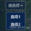
成果图片:

 浙公网安备 33010602011771号