diy-select-v2(新增多选功能)
自定义select的v2版本,新增了多选功能。
技术栈:vue3.js+js+element-plus。
目录
使用方式:
<template>
<div>
<!-- 单选示例 -->
<DiySelect
:options="options"
v-model="singleSelectedValue"
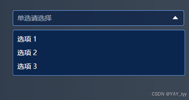
placeholder="单选请选择"
@change="handleChange"
/>
<p>单选选中的值: {{ singleSelectedValue }}</p>
<!-- 多选示例 -->
<DiySelect
:options="options"
v-model="multipleSelectedValues"
multiple
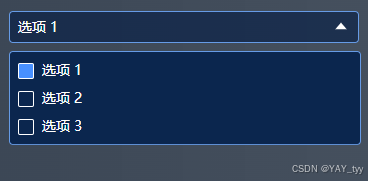
placeholder="多选请选择"
@change="handleChange"
/>
<p>多选选中的值: {{ multipleSelectedValues }}</p>
</div>
</template>
<script setup>
import { ref } from "vue";
import DiySelect from "@/components/common/diy-select-v2/index.vue";
// 选项列表
const options = ref([
{ value: "option1", label: "选项 1" },
{ value: "option2", label: "选项 2" },
{ value: "option3", label: "选项 3" },
]);
// 单选选中的值
const singleSelectedValue = ref(null);
// 多选选中的值
const multipleSelectedValues = ref([]);
function handleChange(value) {
console.log("value:", value);
}
</script>
<style scoped>
</style>
主要代码:
<template>
    <div class="diy-select-v2" @click.stop>
        <div
            class="select-input"
            @click="toggleDropdown"
            @mouseenter="showClearButtonIfNeeded"
            @mouseleave="hideClearButton"
            :style="{
                cursor: 'pointer',
                borderColor: buttonBorderColor,
                backgroundColor: buttonBackgroundColor,
            }"
        >
            <!-- 单选显示 -->
            <span
                v-if="!multiple"
                :class="{ 'placeholder-text': !selectedValue && !multiple }"
                >{{
                    selectedValue ? getLabel(selectedValue) : placeholder
                }}</span
            >
            <!-- 多选显示 -->
            <span v-else>
                <span v-if="selectedValues.length > 0">
                    {{
                        selectedValues
                            .map((value) => getLabel(value))
                            .join(", ")
                    }}
                </span>
                <span v-else class="placeholder-text">{{ placeholder }}</span>
            </span>
            <!-- 箭头图标,根据条件显示 -->
            <el-icon
                class="arrow"
                :class="{ rotate: isDropdownVisible }"
                v-if="!showClearIcon"
            >
                <component :is="buttonIconType" />
            </el-icon>
            <!-- 新增的 clear 按钮,根据条件显示 -->
            <el-icon class="close" v-if="showClearIcon" @click="clearOptions">
                <CircleClose />
            </el-icon>
        </div>
        <ul class="dropdown-list" :class="{ active: isDropdownVisible }">
            <li
                class="dropdown-item"
                v-for="option in options"
                :key="option[valueProp]"
                @click="handleOptionClick(option)"
            >
                <!-- 多选时显示勾选框 -->
                <span
                    class="custom-checkbox-wrapper"
                    v-if="multiple"
                    @click.stop
                >
                    <input
                        type="checkbox"
                        :checked="isOptionSelected(option)"
                        @change="handleCheckboxChange(option)"
                        class="custom-checkbox"
                    />
                </span>
                <span>{{ option[labelProp] }}</span>
            </li>
        </ul>
    </div>
</template>

<script setup>
import {
    ref,
    onMounted,
    onUnmounted,
    defineProps,
    defineEmits,
    computed,
} from "vue";

// 定义组件的 props
const props = defineProps({
    // 是否多选
    multiple: {
        type: Boolean,
        default: false,
    },
    // 选项列表
    options: {
        type: Array,
        default: () => [],
    },
    // 初始选中的值,支持对象和字符串
    modelValue: {
        type: [Object, Array, String],
        default: "",
    },
    // 占位符文本
    placeholder: {
        type: String,
        default: "请选择",
    },
    // 按钮边框色
    buttonBorderColor: {
        type: String,
        default: "rgba(102, 155, 230, 1)",
    },
    // 按钮背景色
    buttonBackgroundColor: {
        type: String,
        default: "rgba(1, 26, 68, 0.6)",
    },
    // 按钮图标类型
    buttonIconType: {
        type: String,
        default: "CaretBottom",
    },
    // 用于显示的属性名
    labelProp: {
        type: String,
        default: "label",
    },
    // 用于值比较的属性名
    valueProp: {
        type: String,
        default: "value",
    },
});

// 定义组件的事件
const emits = defineEmits(["update:modelValue", "change"]);

// 控制下拉框是否显示
const isDropdownVisible = ref(false);

// 单选时的选中值
const selectedValue = ref(null);
// 多选时的选中值数组
const selectedValues = ref([]);

// 初始化选中值的函数
const initializeSelectedValues = () => {
    if (props.multiple) {
        if (Array.isArray(props.modelValue)) {
            selectedValues.value = props.modelValue
                .map((item) => {
                    if (typeof item === "string") {
                        return props.options.find(
                            (option) => option[props.valueProp] === item
                        );
                    }
                    return item;
                })
                .filter(Boolean);
        }
    } else {
        if (typeof props.modelValue === "string") {
            selectedValue.value = props.options.find(
                (option) => option[props.valueProp] === props.modelValue
            );
            if (!selectedValue.value) {
                // 如果没找到匹配选项,将 selectedValue 初始化为 null
                selectedValue.value = null;
            }
        } else {
            selectedValue.value = props.modelValue;
        }
    }
};
// 切换下拉框显示状态
const toggleDropdown = () => {
    isDropdownVisible.value = !isDropdownVisible.value;
};

// 根据值获取标签
const getLabel = (value) => {
    if (!value) return "";
    let option;
    if (typeof value === "string") {
        option = props.options.find(
            (option) => option[props.valueProp] === value
        );
    } else {
        option = props.options.find(
            (option) => option[props.valueProp] === value[props.valueProp]
        );
    }
    return option ? option[props.labelProp] : "";
};
// 判断两个选项是否相等的函数
const isOptionEqual = (item, option) => {
    if (typeof item === "string") {
        return item === option[props.valueProp];
    }
    return item[props.valueProp] === option[props.valueProp];
};
// 判断选项是否被选中
const isOptionSelected = (option) => {
    if (props.multiple) {
        return selectedValues.value.some((item) => isOptionEqual(item, option));
    }
    if (typeof selectedValue.value === "string") {
        return selectedValue.value === option[props.valueProp];
    }
    return (
        selectedValue.value &&
        selectedValue.value[props.valueProp] === option[props.valueProp]
    );
};
// 处理选项点击事件
const handleOptionClick = (option) => {
    if (props.multiple) {
        const index = selectedValues.value.findIndex((item) =>
            isOptionEqual(item, option)
        );
        if (index > -1) {
            selectedValues.value.splice(index, 1);
        } else {
            selectedValues.value.push(option);
        }
        emits(
            "update:modelValue",
            selectedValues.value.map((item) => item[props.valueProp])
        );
        // 触发 change 事件,传递多选时的选中值数组
        emits(
            "change",
            selectedValues.value.map((item) => item[props.valueProp])
        );
    } else {
        selectedValue.value = option;
        emits("update:modelValue", option[props.valueProp]);
        // 触发 change 事件,传递单选时的选中值
        emits("change", option[props.valueProp]);
        isDropdownVisible.value = false;
    }
};

// 处理多选时的勾选框变化事件
const handleCheckboxChange = (option) => {
    handleOptionClick(option);
};

// 监听文档点击事件,实现失焦收起功能
const handleDocumentClick = (event) => {
    const selectElement = document.querySelector(".diy-select-v2");
    if (selectElement && !selectElement.contains(event.target)) {
        isDropdownVisible.value = false;
    }
};

// 判断是否有选中的值
const hasSelectedValues = computed(() => {
    console.log(selectedValues.value, selectedValue.value);
    if (props.multiple) {
        return selectedValues.value.length > 0;
    } else {
        return selectedValue.value !== null;
    }
});

// 清空选项的方法
const clearOptions = () => {
    if (props.multiple) {
        selectedValues.value = [];
        emits("update:modelValue", []);
        emits("change", []);
    } else {
        selectedValue.value = null;
        emits("update:modelValue", "");
        emits("change", "");
    }
};

// 控制清空按钮是否显示的变量
const showClearIcon = ref(false);

// 鼠标进入时判断是否显示清空按钮
const showClearButtonIfNeeded = () => {
    if (hasSelectedValues.value) {
        showClearIcon.value = true;
    }
};

// 鼠标离开时隐藏清空按钮
const hideClearButton = () => {
    showClearIcon.value = false;
};

onMounted(() => {
    initializeSelectedValues();
    document.addEventListener("click", handleDocumentClick);
});

onUnmounted(() => {
    document.removeEventListener("click", handleDocumentClick);
});
</script>

<style scoped lang="less">
// 定义颜色变量
@select-bg-color: rgba(1, 26, 68, 0.6);
@select-border-color: rgba(102, 155, 230, 1);
@select-text-color: #ffffff;
@select-hover-color: #3472d4;
@select-list-bg-color: #0b264e;

.diy-select-v2 {
    position: relative;
    .select-input {
        position: relative;
        width: 100%;
        height: 100%;
        box-sizing: border-box;
        cursor: pointer;
        font-weight: 500;
        font-size: 14px;
        line-height: 20px;
        color: @select-text-color;
        border-radius: 4px;
        padding: 5px 8px;
        display: flex;
        justify-content: space-between;
        align-items: center;
        border: 1px solid @select-border-color;
        .arrow {
            font-size: 18px;
        }
        .arrow.rotate {
            transform: rotate(180deg);
        }
        .close {
            font-size: 18px;
            cursor: pointer;
        }
    }

    .dropdown-list {
        position: absolute;
        top: 100%;
        left: 0;
        min-width: 100%;
        font-size: 14px;
        line-height: 20px;
        background: @select-list-bg-color;
        border-radius: 4px;
        border: 1px solid @select-border-color;
        margin-top: 8px;
        transition: all 0.3s;
        clip-path: polygon(0 0, 100% 0, 100% 0, 0 0);
        padding: 4px 0;
        z-index: 99;
        .dropdown-item {
            line-height: 20px;
            cursor: pointer;
            padding: 4px 8px;
            border-radius: 2px;
            display: flex;
            align-items: center;
        }
        .dropdown-item:hover,
        .dropdown-item.active {
            background: @select-hover-color;
        }
    }
    .dropdown-list.active {
        clip-path: polygon(0 0, 100% 0, 100% 100%, 0 100%);
    }
}

.placeholder-text {
    color: rgba(255, 255, 255, 0.6);
}
.custom-checkbox {
    appearance: none;
    -webkit-appearance: none;
    -moz-appearance: none;
    width: 16px;
    height: 16px;
    border: 1px solid #ffffff;
    background-color: transparent;
    margin-right: 8px;
    cursor: pointer;
    /* 调整多选框的垂直对齐方式 */
    vertical-align: middle;
    /* 去除可能影响对齐的外边距和内边距 */
    margin: 0 8px 0 0;
    padding: 0;
    /* 设置 box-sizing 为 border-box,确保边框包含在宽度和高度内 */
    box-sizing: border-box;
    border-radius: 2px;
}
.custom-checkbox:checked {
    background-color: #4890ff;
    border: 1px solid #ffffff;
}
</style>
成果展示:

 浙公网安备 33010602011771号