背景小实例
1.背景颜色

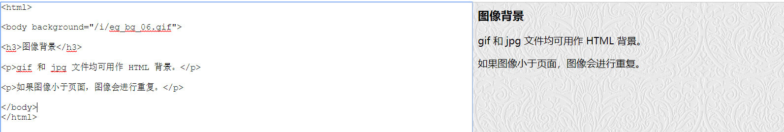
2.可用性强的背景图片
3.背景图片小案列
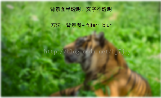
1.毛玻璃效果:背景图 + 伪类 + flite:blur(3px)
.demo1{
width: 500px;
height: 300px;
line-height: 50px;
text-align: center;
}
.demo1:before{
background: url(http://csssecrets.io/images/tiger.jpg) no-repeat;
background-size: cover;
width: 500px;
height: 300px;
content: "";
position: absolute;
top: 0;
left: 0;
z-index: -1;/*-1 可以当背景*/
-webkit-filter: blur(3px);
filter: blur(3px);
}
<div class="demo1">背景图半透明,文字不透明<br />方法:背景图+ filter:blur</div>
---------------------
作者:Joker_Ye
来源:CSDN
原文:https://blog.csdn.net/hj7jay/article/details/73480609
版权声明:本文为博主原创文章,转载请附上博文链接!


