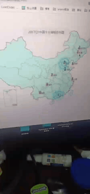
动画案列之热点图
如图所示:显示如下功能:
代码如下:
<!DOCTYPE html>
<html lang="en">
<head>
    <meta charset="UTF-8">
    <meta http-equiv="X-UA-Compatible" content="IE=edge">
    <meta name="viewport" content="width=device-width, initial-scale=1.0">
    <title>Document</title>
    <style>
        .map {
            background-image: url(https://gimg2.baidu.com/image_search/src=http%3A%2F%2Fn.sinaimg.cn%2Ftranslate%2F20171128%2FItfQ-fypathz6689301.jpg&refer=http%3A%2F%2Fn.sinaimg.cn&app=2002&size=f9999,10000&q=a80&n=0&g=0n&fmt=auto?sec=1650590963&t=9ff5b79072356b77673a7a13c41903ea);
            background-repeat: no-repeat;
            width: 700px;
            height: 400px;
            margin: 0 auto;
            position: relative;
        }

        .city {
            position: absolute;
            top: 150px;
            left: 260px;
            color: red;
        }

        .gz {
            top: 277px;
            left: 245px;
        }

        .dotted {
            width: 4px;
            height: 4px;
            background-color: #09f;
            border-radius: 50%;
        }


       div[class *="pulse"] {
           position: absolute;
           top: 50%;
           left: 50%;
            /* 这个transform的使用很重要,因为此时移动top和left是没有用哪个的
            top和left是相对左上角的移动 */
            transform: translate(-50%, -50%);
            width: 8px;
            height: 8px;
            /* 设置阴影 */
            box-shadow: 0 0 12px #009dfd;
            border-radius: 50%;
            animation: pulse 1.5s linear infinite;
        }

        /* 因为有权重关系,所以这里加上important */
        .pulse2 {
            animation-delay: 0.4s !important;
        }

        .pulse3 {
            animation-delay: 0.8s !important;
        }
        @keyframes pulse {
            0% {

            }
            /* 不要用sacle 因为它会让阴影变大 */
            70% {
                width: 40px;
                height: 40px;
                opacity: 1;
            }

            100% {
                width: 70px;
                height: 70px;
                opacity: 0;
            }
        }
    </style>
</head>
<body>
    <div class="map">
        <div class="city">
            <!-- 放一个小圆圈 放波纹 -->
            <div class="dotted"></div>
            <div class="pulse1"></div>
            <div class="pulse2"></div>
            <div class="pulse3"></div>
        </div>
        <div class="city gz">
            <!-- 放一个小圆圈 放波纹 -->
            <div class="dotted"></div>
            <div class="pulse1"></div>
            <div class="pulse2"></div>
            <div class="pulse3"></div>
        </div>
    </div>
</body>
</html>

 浙公网安备 33010602011771号