css3系列之过渡transition
transition
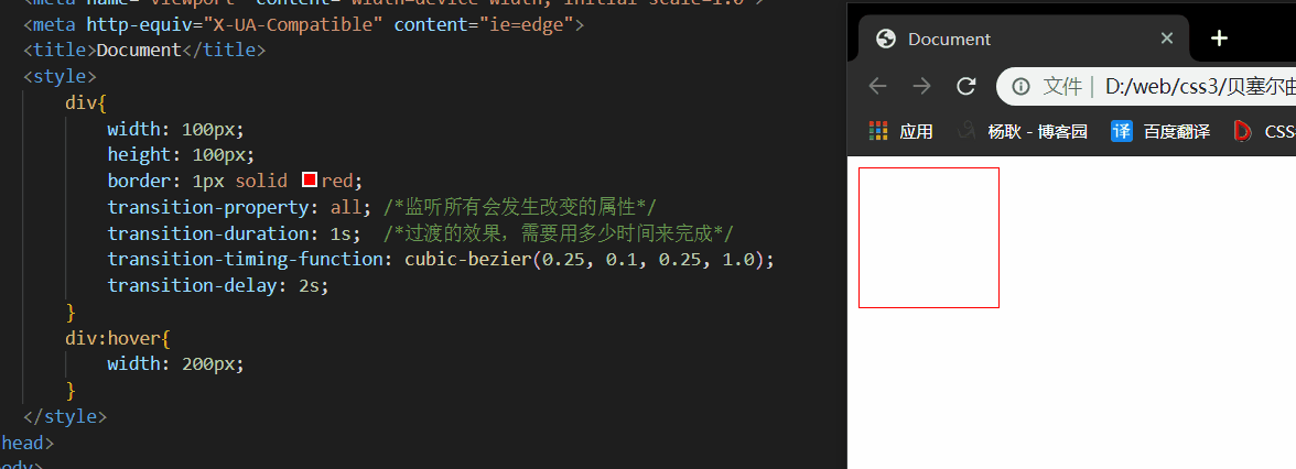
设置变换属性的过渡效果,举个例子,也就是说, 如果从width100px 变成 width200px,要以什么方式进行变换,速度,时间,类型等。
指定参与过渡的属性。
参数:
none:默认值,也是没有
all:监测所有变换属性的属性。
支持过渡效果的属性有以下:(可以单独设置,如果设置多个属性值,用逗号分隔)
| 属性名称 | 类型 |
|---|---|
| transform | all |
| background-color | color |
| background-image | only gradients |
| background-position | percentage, length |
| border-bottom-color | color |
| border-bottom-width | length |
| border-color | color |
| border-left-color | color |
| border-left-width | length |
| border-right-color | color |
| border-right-width | length |
| border-spacing | length |
| border-top-color | color |
| border-top-width | length |
| border-width | length |
| bottom | length, percentage |
| color | color |
| crop | rectangle |
| font-size | length, percentage |
| font-weight | number |
| grid-* | various |
| height | length, percentage |
| left | length, percentage |
| letter-spacing | length |
| line-height | number, length, percentage |
| margin-bottom | length |
| margin-left | length |
| margin-right | length |
| margin-top | length |
| max-height | length, percentage |
| max-width | length, percentage |
| min-height | length, percentage |
| min-width | length, percentage |
| opacity | number |
| outline-color | color |
| outline-offset | integer |
| outline-width | length |
| padding-bottom | length |
| padding-left | length |
| padding-right | length |
| padding-top | length |
| right | length, percentage |
| text-indent | length, percentage |
| text-shadow | shadow |
| top | length, percentage |
| vertical-align | keywords, length, percentage |
| visibility | visibility |
| width | length, percentage |
| word-spacing | length, percentage |
| z-index | integer |
| zoom | number |

设置过渡的需要时间,(也就是说,需要多久才能完成这个 过渡效果)
参数:
0:默认值
1s, 2.5s 等等
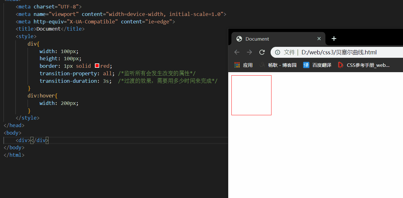
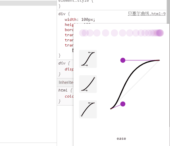
设置过渡动画的类型,举个例子: 匀速动画, 加速动画。
参数:
linear:匀速过渡。等同于贝塞尔曲线(0.0, 0.0, 1.0, 1.0)
ease:平滑过渡。等同于贝塞尔曲线(0.25, 0.1, 0.25, 1.0) (默认值)
ease-in:由慢到快。等同于贝塞尔曲线(0.42, 0, 1.0, 1.0)
ease-out:由快到慢。等同于贝塞尔曲线(0, 0, 0.58, 1.0)
ease-in-out:由慢到快再到慢。等同于贝塞尔曲线(0.42, 0, 0.58, 1.0)
cubic-bezier:特定的贝塞尔曲线类型。
step-start::等同于 steps(1, start)
step-end:等同于steps(1, end)
steps(第一个参数必须为正数,指定动画会以几步的方式来分割总时长
看不懂什么叫做贝塞尔曲线的话,没关系,我们知道怎么设置就行了,下面:
设置好后,在控制台就可以看见他了。

通过调节这两个小球,就会出现不一样的运动效果,上面有个小球,是给你预览效果的。
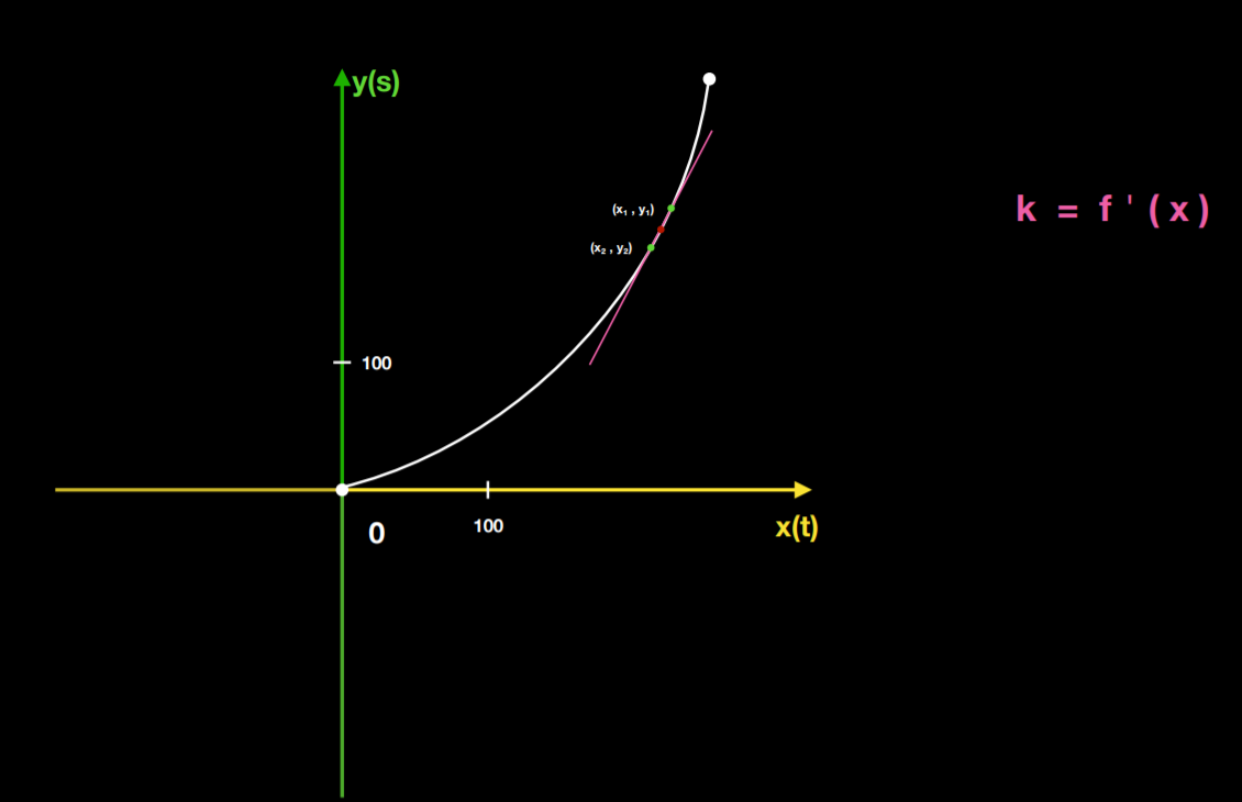
简单来说一下就可以了,比如下面的小红点的位置,那么在前后各取一个点
y1 - y2
----------- = 以下面的图为例,x1 和 y1 是大于 x2 和 y2 的,那么得出来的结果是正数,
x1 - x2 这个数呢,就是速度,而且是正的,代表了是往前进的方向运动,负的,会往后退。
steps(60, start) steps(60, end)
先来看看,没有加 steps 和 有加的区别。
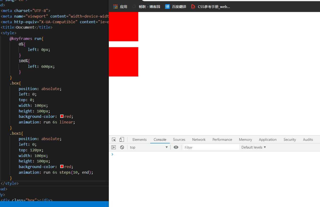
会明显的看到效果,因为我填的是 steps(10, end) ,end先不要管他,先来看看 第一个参数,这个参数呢,会把总时长,6s 分成 10部分, 6/10 =0.6,0.6秒执行一次,所以,这个动画,会分成 10 步执行。
如果仔细观看的同学,你会发现,他好像只执行了 9次,那么差一次呢? 问题就出现在 end 这个参数,如果你填了 end 那么就会忽略掉最后一步, 填start,就会忽略掉 第一步。
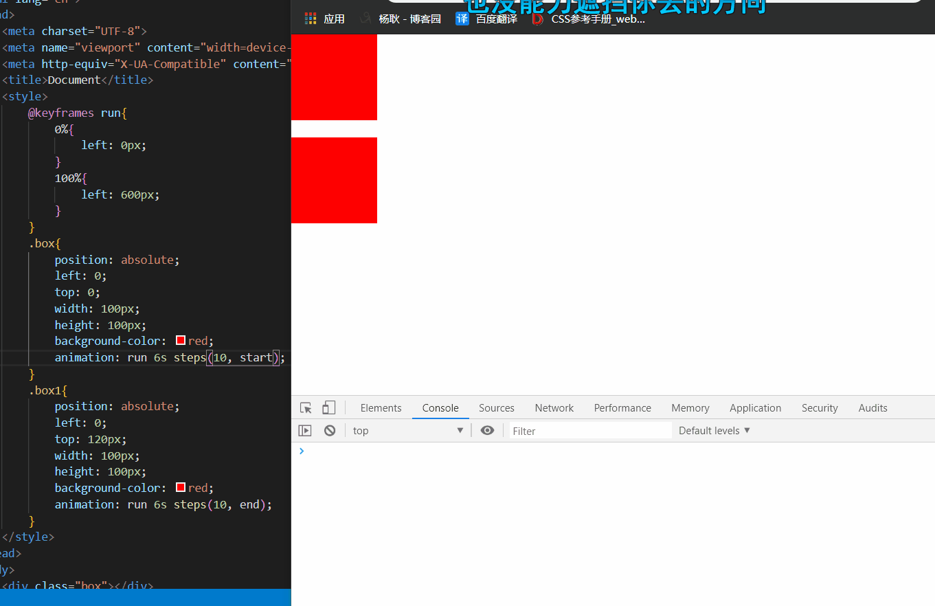
那么利用这个参数可以干嘛呢? 可以完成 逐帧动画 →css3系列之animation实现逐帧动画
这个属性吧,像setTimeout,延迟,延迟多少时间后,执行这个动画。
默认值是0。 还是一样,如果要设置多个属性,用逗号隔开。
上面几个属性的简写:
第一个值为:property
第二个值为:duration
第三个值为:timing-function
第四个值为:delay
transition: width 1s linear 1s
上面的表示了,我要监听 该元素width的变化, 如果他改变了,那么 在等待1s后,执行这个动画,用linear效果,1s的时间内完成

 浙公网安备 33010602011771号