


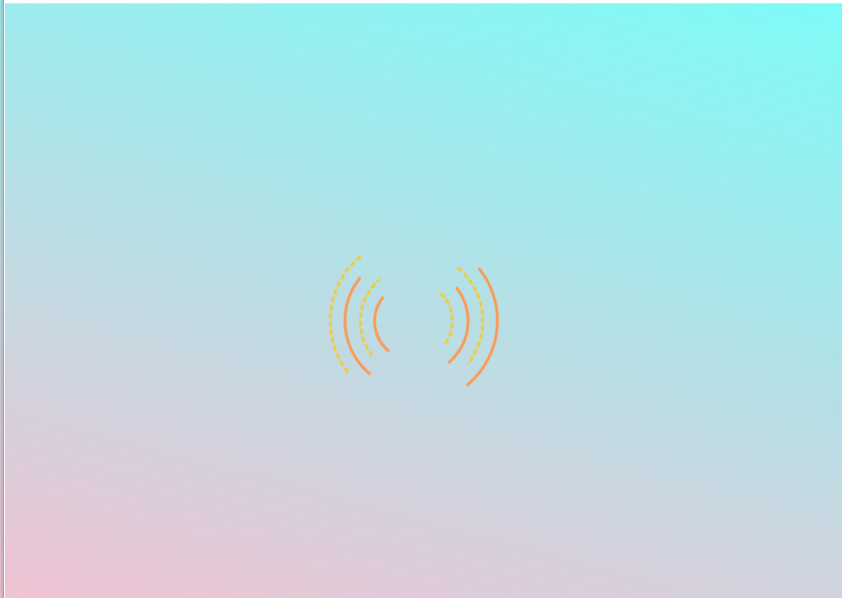
简单的环形
HTML代码
<!DOCTYPE html>
<html>

<head>
    <meta http-equiv="content-type" content="text/html; charset=utf-8">
    <meta name="viewport" content="width=device-width,initial-scale=1,maximum-scale=1,user-scalable=no">

    <title>简单又别致的环形加载动画</title>
    <link rel="stylesheet" href="huanhuan.css">
</head>

<body>
<div class="loader">
    <div></div>
    <div></div>
    <div></div>
    <div></div>
</div>
</body>

</html>
CSS代码
*{
    margin: 0;
    padding: 0;
}
body{
    /* 100%窗口高度 */
    height: 100vh;
    /* 弹性布局 水平+垂直居中 */
    display: flex;
    justify-content: center;
    align-items: center;
    /* 渐变背景 */
    background: linear-gradient(15deg,#f7bfd1,#7efbf7);
}
.loader{
    width: 200px;
    height: 200px;
    /* 相对定位 */
    position: relative;
}
.loader div{
    border-width: 2px;
    /*border-style: solid;*/
    border-style:dotted solid double dashed;
    border-left-color: #f8c92b;
    border-right-color: #ff964e;
    border-top-color: transparent;
    border-bottom-color: transparent;
    border-radius: 70%;
    /* 绝对定位 */
    position: absolute;
    /* 执行动画:动画名 时长 慢速开始然后变快然后慢速结束 无限次播放 */
    animation: spin 2s ease infinite;
}
/* 为每一个圆环设置大小、定位、动画延迟时间 */
.loader div:nth-child(1){
    width: 50px;
    height: 50px;
    left: 70px;
    top: 70px;
}
.loader div:nth-child(2){
    width: 70px;
    height: 70px;
    left: 60px;
    top: 60px;
    /* 动画延迟时间 */
    animation-delay: 1s;
}
.loader div:nth-child(3){
    width: 90px;
    height: 90px;
    left: 50px;
    top: 50px;
    animation-delay:2s;
}
.loader div:nth-child(4){
    width: 110px;
    height: 110px;
    left: 40px;
    top: 40px;
    animation-delay: 3s;
}

/* 定义动画 */
@keyframes spin {
    50%{
        transform: rotate(180deg);
    }
    100%{
        transform: rotate(0);
    }
}


【推荐】国内首个AI IDE,深度理解中文开发场景,立即下载体验Trae
【推荐】编程新体验,更懂你的AI,立即体验豆包MarsCode编程助手
【推荐】抖音旗下AI助手豆包,你的智能百科全书,全免费不限次数
【推荐】轻量又高性能的 SSH 工具 IShell:AI 加持,快人一步
· 无需6万激活码!GitHub神秘组织3小时极速复刻Manus,手把手教你使用OpenManus搭建本
· Manus爆火,是硬核还是营销?
· 终于写完轮子一部分:tcp代理 了,记录一下
· 别再用vector<bool>了!Google高级工程师:这可能是STL最大的设计失误
· 单元测试从入门到精通