在Windows系统中matplotlib绘图时中文出现乱码
解决方法:
加入代码
设置中文字体显示(如果系统支持)
plt.rcParams['font.sans-serif'] = ['SimHei'] # Windows系统
plt.rcParams['axes.unicode_minus'] = False # 正确显示负号
原始代码:
点击查看代码
import numpy as np
import matplotlib.pyplot as plt
# 设置中文字体显示(如果系统支持)
# plt.rcParams['font.sans-serif'] = ['SimHei'] # Windows系统
# plt.rcParams['axes.unicode_minus'] = False # 正确显示负号
# 模拟数据
user_nums = np.array([10, 50, 100, 200, 300, 400, 500]) # 用户数量
latency = 100 + 0.5 * user_nums + 0.002 * user_nums**2 # 网络延迟(非线性增长)
success_rate = 100 - 0.1 * user_nums - 0.0003 * user_nums**2 # 任务成功率(百分比)
# 绘制双Y轴图表
fig, ax1 = plt.subplots(figsize=(10, 6))
# 左侧Y轴:网络延迟
ax1.plot(user_nums, latency, 'b-o', linewidth=2, markersize=8, label='网络延迟')
ax1.set_xlabel('用户数量', fontsize=12)
ax1.set_ylabel('网络延迟 (ms)', color='b', fontsize=12)
ax1.tick_params(axis='y', labelcolor='b')
ax1.grid(linestyle='--', alpha=0.7)
# 右侧Y轴:任务成功率
ax2 = ax1.twinx()
ax2.plot(user_nums, success_rate, 'r--s', linewidth=2, markersize=8, label='任务成功率')
ax2.set_ylabel('任务成功率 (%)', color='r', fontsize=12)
ax2.tick_params(axis='y', labelcolor='r')
# 标题和图例
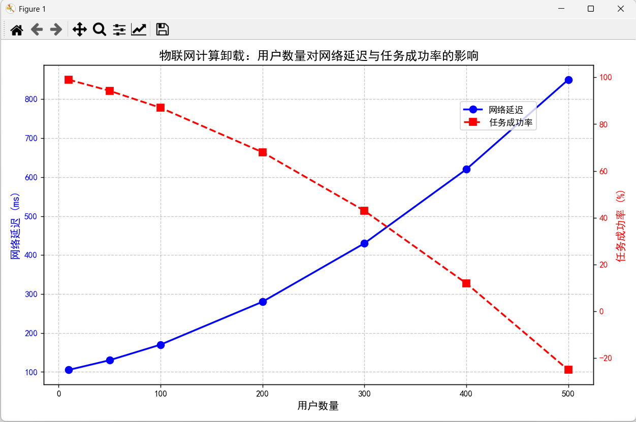
plt.title('物联网计算卸载:用户数量对网络延迟与任务成功率的影响', fontsize=14)
fig.legend(loc='upper right', bbox_to_anchor=(0.85, 0.85), fontsize=10)
plt.tight_layout()
plt.show()
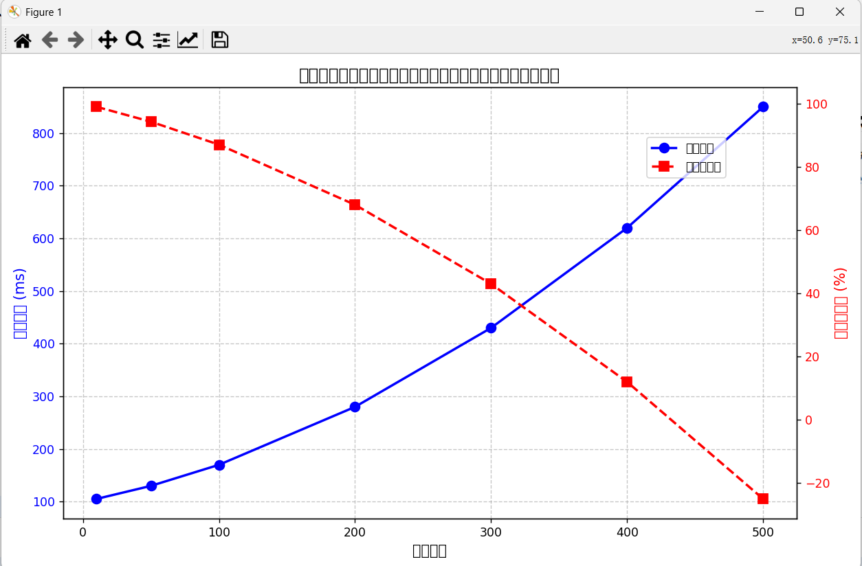
绘图:
修改后的代码:
点击查看代码
import numpy as np
import matplotlib.pyplot as plt


# 设置中文字体显示(如果系统支持)
plt.rcParams['font.sans-serif'] = ['SimHei']  # Windows系统
plt.rcParams['axes.unicode_minus'] = False   # 正确显示负号


# 模拟数据
user_nums = np.array([10, 50, 100, 200, 300, 400, 500])  # 用户数量
latency = 100 + 0.5 * user_nums + 0.002 * user_nums**2    # 网络延迟(非线性增长)
success_rate = 100 - 0.1 * user_nums - 0.0003 * user_nums**2  # 任务成功率(百分比)

# 绘制双Y轴图表
fig, ax1 = plt.subplots(figsize=(10, 6))

# 左侧Y轴:网络延迟
ax1.plot(user_nums, latency, 'b-o', linewidth=2, markersize=8, label='网络延迟')
ax1.set_xlabel('用户数量', fontsize=12)
ax1.set_ylabel('网络延迟 (ms)', color='b', fontsize=12)
ax1.tick_params(axis='y', labelcolor='b')
ax1.grid(linestyle='--', alpha=0.7)

# 右侧Y轴:任务成功率
ax2 = ax1.twinx()
ax2.plot(user_nums, success_rate, 'r--s', linewidth=2, markersize=8, label='任务成功率')
ax2.set_ylabel('任务成功率 (%)', color='r', fontsize=12)
ax2.tick_params(axis='y', labelcolor='r')

# 标题和图例
plt.title('物联网计算卸载:用户数量对网络延迟与任务成功率的影响', fontsize=14)
fig.legend(loc='upper right', bbox_to_anchor=(0.85, 0.85), fontsize=10)

plt.tight_layout()
plt.show()
本博客是博主个人学习时的一些记录,不保证是为原创,个别文章加入了转载的源地址,还有个别文章是汇总网上多份资料所成,在这之中也必有疏漏未加标注处,如有侵权请与博主联系。
如果未特殊标注则为原创,遵循 CC 4.0 BY-SA 版权协议。
posted on 2025-03-02 14:04 Angry_Panda 阅读(125) 评论(0) 收藏 举报


 浙公网安备 33010602011771号