

【转载】Matplotlib中如何调整图形的x轴或y轴间隔
原文:
参考:Change the x or y interval of a Matplotlib figure
Matplotlib是 Python中最常用的数据可视化库之一,它提供了丰富的功能来创建各种类型的图表和图形。在使用Matplotlib绘图时,我们经常需要调整x轴或y轴的间隔,以便更好地展示数据或改善图形的可读性。本文将详细介绍如何在Matplotlib中改变图形的x轴或y轴间隔,包括多种方法和技巧,并提供易于理解的示例代码。
1. 使用set_xticks()和set_yticks()方法
最直接的方法是使用set_xticks()和set_yticks()方法来设置x轴和y轴的刻度位置。这些方法允许我们明确指定我们想要显示的刻度位置。
import matplotlib.pyplot as plt import numpy as np # 创建数据 x = np.linspace(0, 10, 100) y = np.sin(x) # 创建图形 plt.figure(figsize=(10, 6)) plt.plot(x, y, label='sin(x)') # 设置x轴刻度 plt.xticks(np.arange(0, 11, 2)) # 设置y轴刻度 plt.yticks(np.arange(-1, 1.1, 0.5)) plt.title('How to change axis interval - how2matplotlib.com') plt.xlabel('X axis') plt.ylabel('Y axis') plt.legend() plt.grid(True) plt.show()
Output:
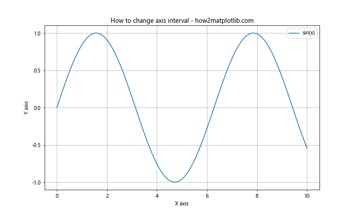
在这个例子中,我们使用np.arange()函数来生成等间隔的刻度值。对于x轴,我们设置了从0到10,间隔为2的刻度;对于y轴,我们设置了从-1到1,间隔为0.5的刻度。
2. 使用set_xlim()和set_ylim()方法
set_xlim()和set_ylim()方法用于设置坐标轴的范围。虽然这些方法本身不直接设置刻度间隔,但它们可以与set_xticks()和set_yticks()结合使用,以达到调整间隔的效果。
import matplotlib.pyplot as plt import numpy as np x = np.linspace(0, 20, 100) y = x**2 plt.figure(figsize=(10, 6)) plt.plot(x, y, label='x^2') # 设置x轴范围和刻度 plt.xlim(0, 20) plt.xticks(np.arange(0, 21, 4)) # 设置y轴范围和刻度 plt.ylim(0, 400) plt.yticks(np.arange(0, 401, 100)) plt.title('Adjusting axis limits and ticks - how2matplotlib.com') plt.xlabel('X axis') plt.ylabel('Y axis') plt.legend() plt.grid(True) plt.show()
Output:
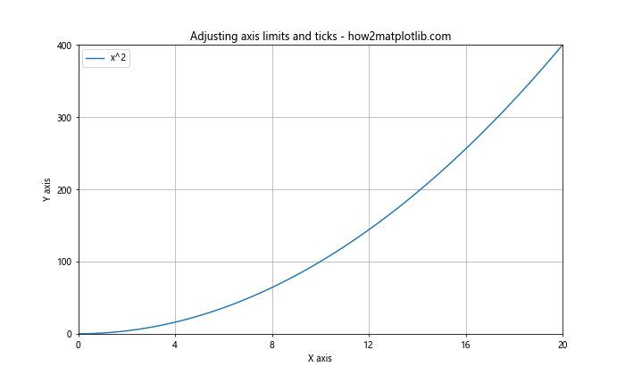
在这个例子中,我们首先使用xlim()和ylim()设置了坐标轴的范围,然后使用xticks()和yticks()设置了相应的刻度。这种方法可以让我们更精确地控制图形的显示范围和刻度间隔。
3. 使用MultipleLocator类
MultipleLocator类是 Matplotlib中的一个强大工具,它可以帮助我们轻松地设置等间隔的刻度。这个类位于matplotlib.ticker模块中。
import matplotlib.pyplot as plt from matplotlib.ticker import MultipleLocator import numpy as np x = np.linspace(0, 10, 100) y = np.exp(x) fig, ax = plt.subplots(figsize=(10, 6)) ax.plot(x, y, label='exp(x)') # 设置x轴主刻度间隔为1 ax.xaxis.set_major_locator(MultipleLocator(1)) # 设置y轴主刻度间隔为5000 ax.yaxis.set_major_locator(MultipleLocator(5000)) ax.set_title('Using MultipleLocator - how2matplotlib.com') ax.set_xlabel('X axis') ax.set_ylabel('Y axis') ax.legend() ax.grid(True) plt.show()
Output:
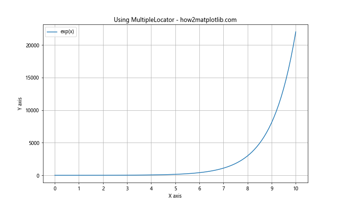
在这个例子中,我们使用MultipleLocator类来设置x轴的主刻度间隔为1,y轴的主刻度间隔为5000。这种方法特别适合当我们想要固定间隔的刻度时使用。
4. 使用MaxNLocator类
MaxNLocator类允许我们指定最大刻度数,Matplotlib会自动选择合适的间隔。这在我们不确定最佳间隔是多少,但知道我们想要大约多少个刻度时非常有用。
import matplotlib.pyplot as plt from matplotlib.ticker import MaxNLocator import numpy as np x = np.linspace(0, 100, 1000) y = np.sin(x) * np.exp(-x/10) fig, ax = plt.subplots(figsize=(10, 6)) ax.plot(x, y, label='sin(x) * exp(-x/10)') # 设置x轴最多有10个刻度 ax.xaxis.set_major_locator(MaxNLocator(10)) # 设置y轴最多有8个刻度 ax.yaxis.set_major_locator(MaxNLocator(8)) ax.set_title('Using MaxNLocator - how2matplotlib.com') ax.set_xlabel('X axis') ax.set_ylabel('Y axis') ax.legend() ax.grid(True) plt.show()
Output:
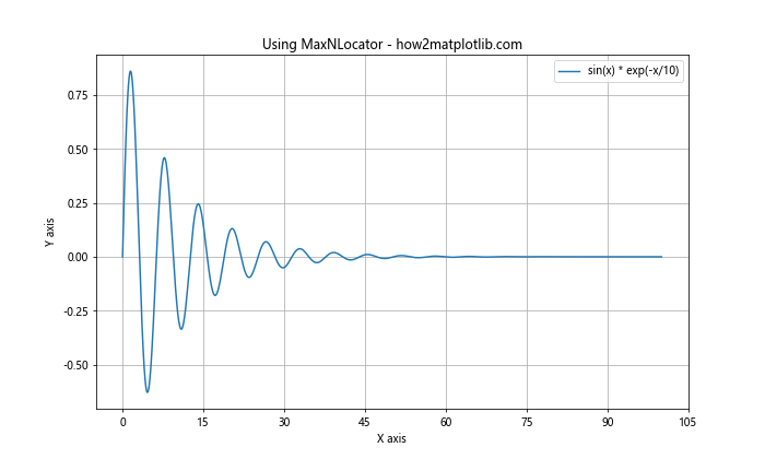
在这个例子中,我们使用MaxNLocator来设置x轴最多有10个刻度,y轴最多有8个刻度。 Matplotlib会自动选择合适的间隔来满足这个要求。
5. 使用LogLocator类
当我们处理跨越多个数量级的数据时,对数刻度可能更合适。LogLocator类可以帮助我们创建对数间隔的刻度。
import matplotlib.pyplot as plt from matplotlib.ticker import LogLocator import numpy as np x = np.logspace(0, 5, 100) y = x**2 fig, ax = plt.subplots(figsize=(10, 6)) ax.plot(x, y, label='x^2') # 设置x轴为对数刻度 ax.set_xscale('log') ax.xaxis.set_major_locator(LogLocator(base=10)) # 设置y轴为对数刻度 ax.set_yscale('log') ax.yaxis.set_major_locator(LogLocator(base=10)) ax.set_title('Using LogLocator - how2matplotlib.com') ax.set_xlabel('X axis (log scale)') ax.set_ylabel('Y axis (log scale)') ax.legend() ax.grid(True) plt.show()
Output:
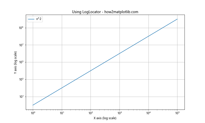
在这个例子中,我们使用LogLocator来设置x轴和y轴的对数刻度。这对于可视化指数增长或跨越多个数量级的数据特别有用。
6. 使用FuncFormatter类自定义刻度标签
有时,我们可能想要自定义刻度标签的格式。FuncFormatter类允许我们定义一个函数来格式化刻度标签。
import matplotlib.pyplot as plt from matplotlib.ticker import FuncFormatter import numpy as np def currency_formatter(x, p): return f'${x:,.0f}' x = np.linspace(0, 10, 11) y = x * 1000000 fig, ax = plt.subplots(figsize=(10, 6)) ax.plot(x, y, label='Sales') # 设置y轴刻度格式为货币 ax.yaxis.set_major_formatter(FuncFormatter(currency_formatter)) # 设置x轴刻度间隔 ax.xaxis.set_major_locator(plt.MultipleLocator(1)) ax.set_title('Custom Tick Formatter - how2matplotlib.com') ax.set_xlabel('Years') ax.set_ylabel('Sales') ax.legend() ax.grid(True) plt.show()
Output:
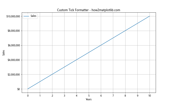
在这个例子中,我们定义了一个currency_formatter函数来将y轴的刻度标签格式化为货币形式。这种方法可以让我们非常灵活地自定义刻度标签的显示方式。
7. 使用FixedLocator类设置不规则间隔
有时,我们可能需要设置不规则的刻度间隔。FixedLocator类允许我们明确指定刻度的位置。
import matplotlib.pyplot as plt from matplotlib.ticker import FixedLocator import numpy as np x = np.linspace(0, 10, 100) y = np.sin(x) fig, ax = plt.subplots(figsize=(10, 6)) ax.plot(x, y, label='sin(x)') # 设置不规则的x轴刻度 irregular_ticks = [0, 0.5, 1, 2, 3, 5, 8, 10] ax.xaxis.set_major_locator(FixedLocator(irregular_ticks)) ax.set_title('Irregular Tick Intervals - how2matplotlib.com') ax.set_xlabel('X axis') ax.set_ylabel('Y axis') ax.legend() ax.grid(True) plt.show()
Output:
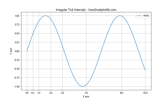
在这个例子中,我们使用FixedLocator来设置不规则的x轴刻度位置。这种方法在我们需要强调特定数据点或区间时特别有用。
8. 使用AutoMinorLocator类添加次要刻度
次要刻度可以帮助读者更精确地解读图表。AutoMinorLocator类可以自动添加次要刻度。
import matplotlib.pyplot as plt from matplotlib.ticker import AutoMinorLocator import numpy as np x = np.linspace(0, 10, 100) y = np.cos(x) fig, ax = plt.subplots(figsize=(10, 6)) ax.plot(x, y, label='cos(x)') # 添加x轴次要刻度 ax.xaxis.set_minor_locator(AutoMinorLocator()) # 添加y轴次要刻度 ax.yaxis.set_minor_locator(AutoMinorLocator()) ax.set_title('Adding Minor Ticks - how2matplotlib.com') ax.set_xlabel('X axis') ax.set_ylabel('Y axis') ax.legend() ax.grid(True, which='both', linestyle=':', linewidth=0.5) plt.show()
Output:
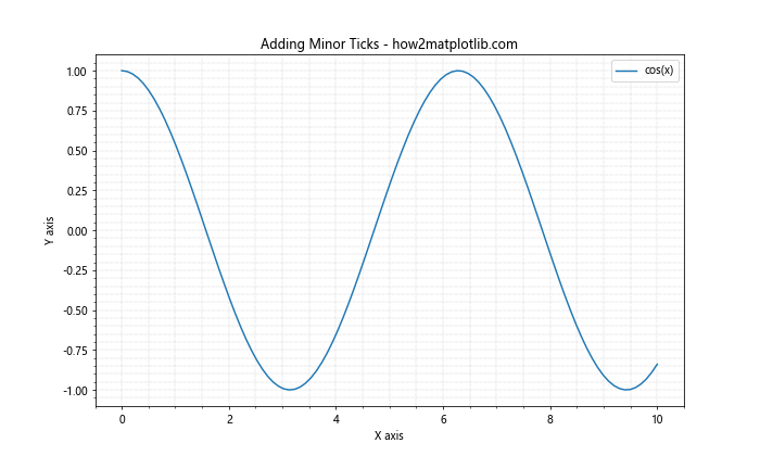
在这个例子中,我们使用AutoMinorLocator为x轴和y轴添加了次要刻度。我们还调整了网格线的样式,以区分主要和次要刻度。
9. 使用ScalarFormatter类控制刻度标签的格式
ScalarFormatter类可以帮助我们控制刻度标签的格式,例如小数点后的位数。
import matplotlib.pyplot as plt from matplotlib.ticker import ScalarFormatter import numpy as np x = np.linspace(0, 1, 11) y = x**2 fig, ax = plt.subplots(figsize=(10, 6)) ax.plot(x, y, label='x^2') # 设置y轴刻度格式 formatter = ScalarFormatter(useOffset=False) formatter.set_scientific(False) formatter.set_powerlimits((-1,1)) ax.yaxis.set_major_formatter(formatter) ax.set_title('Controlling Tick Label Format - how2matplotlib.com') ax.set_xlabel('X axis') ax.set_ylabel('Y axis') ax.legend() ax.grid(True) plt.show()
Output:
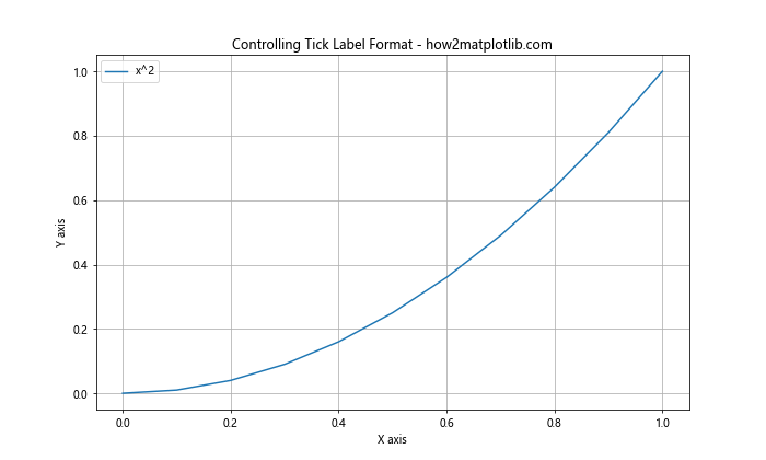
在这个例子中,我们使用ScalarFormatter来控制y轴刻度标签的格式。我们禁用了偏移和科学记数法,并设置了幂限制。
10. 在极坐标系中调整刻度间隔
在极坐标系中,我们可能需要调整角度和半径的刻度间隔。
import matplotlib.pyplot as plt import numpy as np r = np.arange(0, 2, 0.01) theta = 2 * np.pi * r fig, ax = plt.subplots(figsize=(10, 10), subplot_kw=dict(projection='polar')) ax.plot(theta, r) # 设置角度刻度 ax.set_xticks(np.linspace(0, 2*np.pi, 8, endpoint=False)) # 设置半径刻度 ax.set_yticks(np.arange(0.5, 2, 0.5)) ax.set_title('Adjusting Ticks in Polar Coordinates - how2matplotlib.com') plt.show()
Output:
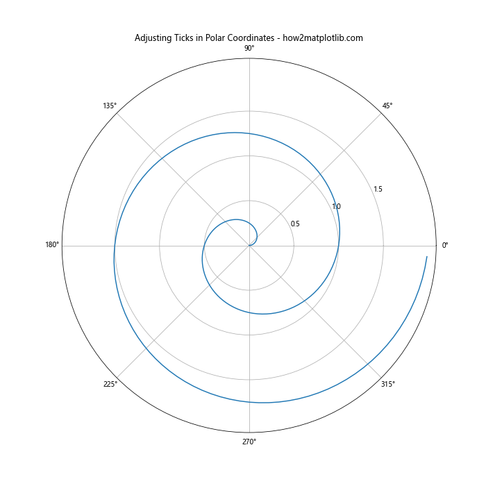
在这个例子中,我们使用set_xticks和set_yticks来分别设置极坐标系中的角度和半径刻度。
11. 在3D图中调整刻度间隔
对于3D图,我们需要分别调整x、y和z轴的刻度间隔。
import matplotlib.pyplot as plt from mpl_toolkits.mplot3d import Axes3D import numpy as np fig = plt.figure(figsize=(10, 8)) ax = fig.add_subplot(111, projection='3d') # 创建数据 x = np.arange(-5, 5, 0.25) y = np.arange(-5, 5, 0.25) x, y = np.meshgrid(x, y) r = np.sqrt(x**2 + y**2) z = np.sin(r) # 绘制曲面 surf = ax.plot_surface(x, y, z) # 设置x轴刻度 ax.set_xticks(np.arange(-5, 6, 2)) # 设置y轴刻度ax.set_yticks(np.arange(-5, 6, 2)) # 设置z轴刻度 ax.set_zticks(np.arange(-1, 1.1, 0.5)) ax.set_title('Adjusting Ticks in 3D Plot - how2matplotlib.com') ax.set_xlabel('X axis') ax.set_ylabel('Y axis') ax.set_zlabel('Z axis') plt.show()
Output:
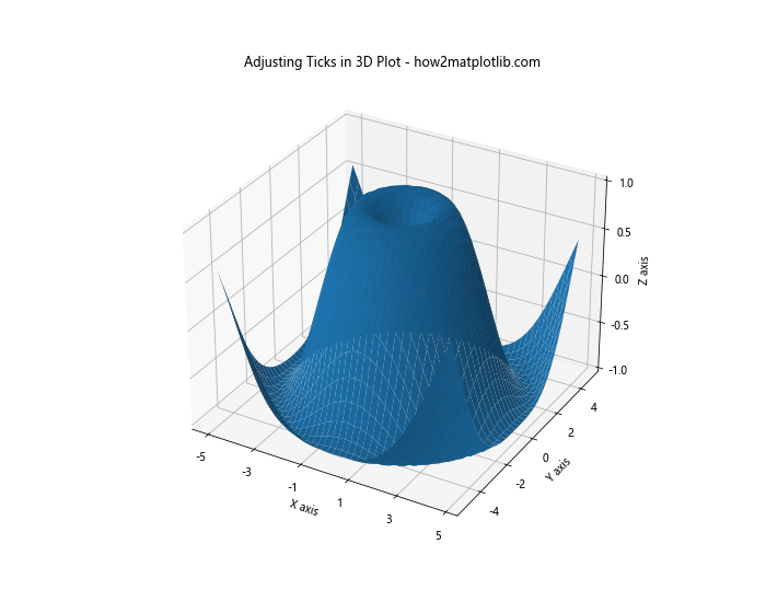
在这个3D图例子中,我们分别为x、y和z轴设置了刻度间隔。这样可以让3D图更加清晰易读。
12. 使用SymmetricalLogLocator类创建对称对数刻度
当数据包含正负值且跨越多个数量级时,对称对数刻度可能会很有用。
import matplotlib.pyplot as plt from matplotlib.ticker import SymmetricalLogLocator import numpy as np x = np.linspace(-1000, 1000, 1000) y = x**3 - x fig, ax = plt.subplots(figsize=(10, 6)) ax.plot(x, y) # 设置y轴为对称对数刻度 ax.set_yscale('symlog') ax.yaxis.set_major_locator(SymmetricalLogLocator(base=10, linthresh=10)) ax.set_title('Symmetrical Log Scale - how2matplotlib.com') ax.set_xlabel('X axis') ax.set_ylabel('Y axis (symlog)') ax.grid(True) plt.show()
Output:
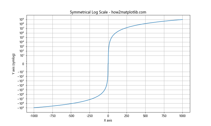
在这个例子中,我们使用SymmetricalLogLocator来创建一个对称的对数刻度。这对于 可视化包含正负值的宽范围数据特别有用。
13. 使用IndexLocator类基于索引设置刻度
当我们的x轴表示的是索引而不是实际的数值时,IndexLocator类可能会很有用。
import matplotlib.pyplot as plt from matplotlib.ticker import IndexLocator import numpy as np data = np.random.randn(20) fig, ax = plt.subplots(figsize=(10, 6)) ax.plot(data, marker='o') # 设置x轴刻度为索引 ax.xaxis.set_major_locator(IndexLocator(base=5, offset=0)) ax.set_title('Using IndexLocator - how2matplotlib.com') ax.set_xlabel('Index') ax.set_ylabel('Value') ax.grid(True) plt.show()
Output:
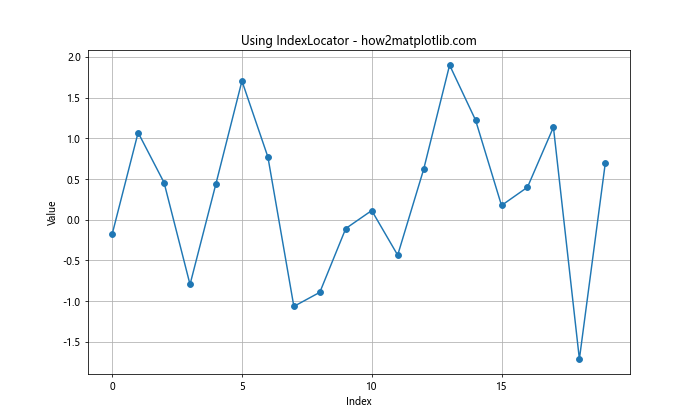
在这个例子中,我们使用IndexLocator来每隔5个索引设置一个刻度。这在处理时间序列或其他基于索引的数据时特别有用。
14. 使用LinearLocator类设置固定数量的刻度
如果我们想要在轴上设置固定数量的刻度,而不关心具体的间隔值,LinearLocator类会很有用。
import matplotlib.pyplot as plt from matplotlib.ticker import LinearLocator import numpy as np x = np.linspace(0, 10, 100) y = np.sin(x) * np.exp(-x/10) fig, ax = plt.subplots(figsize=(10, 6)) ax.plot(x, y) # 在x轴上设置6个刻度 ax.xaxis.set_major_locator(LinearLocator(6)) # 在y轴上设置8个刻度 ax.yaxis.set_major_locator(LinearLocator(8)) ax.set_title('Using LinearLocator - how2matplotlib.com') ax.set_xlabel('X axis') ax.set_ylabel('Y axis') ax.grid(True) plt.show()
Output:
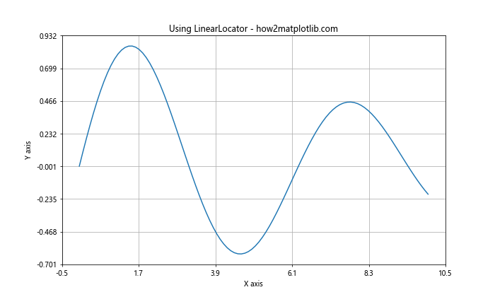
在这个例子中,我们使用LinearLocator在x轴上设置了6个刻度,在y轴上设置了8个刻度。 Matplotlib会自动计算合适的间隔来满足这个要求。
15. 使用FormatStrFormatter类格式化刻度标签
FormatStrFormatter类允许我们使用字符串格式化语法来自定义刻度标签的显示方式。
import matplotlib.pyplot as plt from matplotlib.ticker import FormatStrFormatter import numpy as np x = np.linspace(0, 5, 10) y = x**2 fig, ax = plt.subplots(figsize=(10, 6)) ax.plot(x, y) # 设置x轴刻度标签格式 ax.xaxis.set_major_formatter(FormatStrFormatter('%.1f')) # 设置y轴刻度标签格式 ax.yaxis.set_major_formatter(FormatStrFormatter('%.2f')) ax.set_title('Using FormatStrFormatter - how2matplotlib.com') ax.set_xlabel('X axis') ax.set_ylabel('Y axis') ax.grid(True) plt.show()
Output:
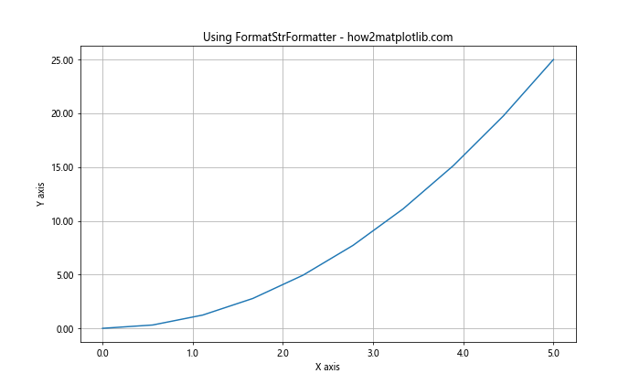
在这个例子中,我们使用FormatStrFormatter来设置x轴刻度标签显示一位小数,y轴刻度标签显示两位小数。
结论
调整Matplotlib图形的x轴或y轴间隔是数据可视化过程中的一个重要步骤。通过适当地设置刻度间隔,我们可以使图表更加清晰、易读,并更好地突出数据的关键特征。本文介绍了多种方法来调整轴的间隔,包括使用内置的函数如set_xticks()和set_yticks(),以及更高级的定位器类如MultipleLocator、MaxNLocator和LogLocator等。
每种方法都有其特定的用途和优势。例如,set_xticks()和set_yticks()方法适用于简单的刻度调整;MultipleLocator适合设置固定间隔的刻度;MaxNLocator则在我们想要控制刻度数量而不是具体间隔时很有用。对于处理跨越多个数量级的数据,LogLocator和SymmetricalLogLocator可能会更合适。
此外,我们还学习了如何自定义刻度标签的格式,如使用FuncFormatter和FormatStrFormatter。这些技术可以帮助我们创建更专业、更具信息量的图表。
在实际应用中,选择哪种方法取决于你的具体需求和数据特征。通常,你可能需要尝试几种不同的方法,并根据图表的视觉效果和可读性来选择最佳的方案。记住,好的数据可视化不仅要准确地表示数据,还要让观众能够轻松理解和解释数据。


posted on 2025-02-03 22:54 Angry_Panda 阅读(47) 评论(0) 编辑 收藏 举报


【推荐】国内首个AI IDE,深度理解中文开发场景,立即下载体验Trae
【推荐】编程新体验,更懂你的AI,立即体验豆包MarsCode编程助手
【推荐】抖音旗下AI助手豆包,你的智能百科全书,全免费不限次数
【推荐】轻量又高性能的 SSH 工具 IShell:AI 加持,快人一步
· 无需6万激活码!GitHub神秘组织3小时极速复刻Manus,手把手教你使用OpenManus搭建本
· Manus爆火,是硬核还是营销?
· 终于写完轮子一部分:tcp代理 了,记录一下
· 别再用vector<bool>了!Google高级工程师:这可能是STL最大的设计失误
· 单元测试从入门到精通
2024-02-03 作为国产深度学习框架中分布式计算特性最强大的OneFlow的最大缺点是什么?
2024-02-03 OneFlow框架0.9.1dev版本,成功安装并运行
2024-02-03 python运行报错:ImportError: libcudnn_cnn_infer.so.8: cannot open shared object file
2024-02-03 OneFlow计算框架的OneAgent是不是一个子虚乌有的东西?
2024-02-03 国产深度学习框架 OneFlow 是否靠谱?
2022-02-03 【观察网视频】 不是中国也不是社会主义,美国害怕的是别的东西
2019-02-03 Anaconda 的基本使用