【转载】 机器学习数据可视化 (t-SNE 使用指南)—— Why You Are Using t-SNE Wrong
原文地址:
https://towardsdatascience.com/why-you-are-using-t-sne-wrong-502412aab0c0
=====================================
Source: https://datascienceplus.com/multi-dimensional-reduction-and-visualisation-with-t-sne/
t-SNE has become a very popular technique for visualizing high dimensional data. It’s extremely common to take the features from an inner layer of a deep learning model and plot them in 2-dimensions using t-SNE to reduce the dimensionality. Unfortunately, most people just use scikit-learn’s implementation without actually understanding the results and misinterpreting what they mean.
While t-SNE is a dimensionality reduction technique, it is mostly used for visualization and not data pre-processing (like you might with PCA). For this reason, you almost always reduce the dimensionality down to 2 with t-SNE, so that you can then plot the data in two dimensions.
The reason t-SNE is common for visualization is that the goal of the algorithm is to take your high dimensional data and represent it correctly in lower dimensions — thus points that are close in high dimensions should remain close in low dimensions. It does this in a non-linear and local way, so different regions of data could be transformed differently.
t-SNE has a hyper-parameter called perplexity. Perplexity balances the attention t-SNE gives to local and global aspects of the data and can have large effects on the resulting plot. A few notes on this parameter:
- It is roughly a guess of the number of close neighbors each point has. Thus, a denser dataset usually requires a higher perplexity value.
- It is recommended to be between 5 and 50.
- It should be smaller than the number of data points.
The biggest mistake people make with t-SNE is only using one value for perplexity and not testing how the results change with other values. If choosing different values between 5 and 50 significantly change your interpretation of the data, then you should consider other ways to visualize or validate your hypothesis.
It is also overlooked that since t-SNE uses gradient descent, you also have to tune appropriate values for your learning rate and the number of steps for the optimizer. The key is to make sure the algorithm runs long enough to stabilize.
There is an incredibly good article on t-SNE that discusses much of the above as well as the following points that you need to be aware of:
- You cannot see the relative sizes of clusters in a t-SNE plot. This point is crucial to understand as t-SNE naturally expands dense clusters and shrinks spares ones. I often see people draw inferences by comparing the relative sizes of clusters in the visualization. Don’t make this mistake.
- Distances between well-separated clusters in a t-SNE plot may mean nothing. Another common fallacy. So don’t necessarily be dismayed if your “beach” cluster is closer to your “city” cluster than your “lake” cluster.
- Clumps of points — especially with small perplexity values — might just be noise. It is important to be careful when using small perplexity values for this reason. And to remember to always test many perplexity values for robustness.
Now — as promised some code! A few things of note with this code:
- I first reduce the dimensionality to 50 using PCA before running t-SNE. I have found that to be good practice (when having over 50 features) because otherwise, t-SNE will take forever to run.
- I don’t show various values for perplexity as mentioned above. I will leave that as an exercise for the reader. Just run the t-SNE code a few more times with different perplexity values and compare visualizations.
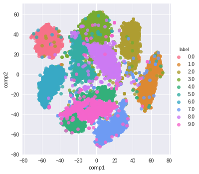
from sklearn.datasets import fetch_mldata
from sklearn.manifold import TSNE
from sklearn.decomposition import PCA
import seaborn as sns
import numpy as np
import matplotlib.pyplot as plt
# get mnist data
mnist = fetch_mldata("MNIST original")
X = mnist.data / 255.0
y = mnist.target
# first reduce dimensionality before feeding to t-sne
pca = PCA(n_components=50)
X_pca = pca.fit_transform(X)
# randomly sample data to run quickly
rows = np.arange(70000)
np.random.shuffle(rows)
n_select = 10000
# reduce dimensionality with t-sne
tsne = TSNE(n_components=2, verbose=1, perplexity=50, n_iter=1000, learning_rate=200)
tsne_results = tsne.fit_transform(X_pca[rows[:n_select],:])
# visualize
df_tsne = pd.DataFrame(tsne_results, columns=['comp1', 'comp2'])
df_tsne['label'] = y[rows[:n_select]]sns.lmplot(x='comp1', y='comp2', data=df_tsne, hue='label', fit_reg=False)
And here is the resulting visualization:
=========================================
posted on 2022-01-22 15:29 Angry_Panda 阅读(249) 评论(0) 收藏 举报


 浙公网安备 33010602011771号