


css3总结(一)属性选择器、伪类、伪元素、盒模型、边框圆角、文本阴影、边框阴影
1、属性选择器
2、兄弟伪类
3、相对于父元素的结构伪类
4、伪类样式target
5、伪元素选择器before after
6、::first-letter ::first-line ::selection的使用
7、opacity设置透明度及RGBA的使用
8、文本阴影text-shadow
9、盒模型
10、边框圆角
11、边框阴影
1、属性选择器 <--返回目录
p[style]{    有style属性的p标签
    color:red;
}
p[class=red]{   class的值为red的p标签
    background-color: blue;
}
p[class='red']{   class的值为red的p标签
    background-color: blue;
}
p[class*='red']{   class的值包含red就可以,class=darkred也匹配
    background-color: blue;
}
p[class^='red']{   class的值以red开头
    background-color: blue;
}
p[class$='red']{   class的值以red结尾
    background-color: blue;
}

p[class=red][style]{}   可以同时指定多个属性
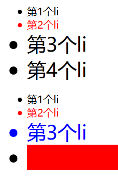
2、兄弟伪类 <--返回目录
* +: 获取当前元素的相邻的满足条件的兄弟元素
* ~:获取当前元素的满足条件的兄弟元素
* 例子:
.first + li{} 添加了first类样式,后面的相邻li元素,如果先相邻的不是li元素,返回空(注意:获取的是E后面的指定相邻li)
.first ~ li{} 添加了first类样式的,后面的其他兄弟li元素(注意:获取的是E后面的指定li)
<!DOCTYPE html>
<html>
<head>
<title>标题</title>
<meta charset="utf-8">
<style type="text/css">
    .one + li {
        color :red;
    }
    .two + li {
        color :red;
    }
    .three + li {
        background-color: #ccc;   /* 只有第4个li背景色变了,说明 + 获取之后的相邻指兄弟定元素 */
    }
    .one ~ li {
        font-size: 20px;  /* 第2、3、4 li字体变大 */
    }
    .two ~ li {
        color :blue;  /* 第3、4 li元素颜色变蓝,说明~获取之后的所有指定兄弟元素 */
    }
</style>
</head>
<body>
    <div>
        <ul>
            <li class="one">第1个li</li>
            <span>span文本</span>
            <li class="two">第2个li</li>
            <li class="three">第3个li</li>
            <li>第4个li</li>
        </ul>
    </div>
</body>
</html>
3、相对于父元素的结构伪类 <--返回目录
* E:first-child: 查找E元素的父级元素的第一个E元素,如果第一个子元素不是E元素,就匹配不上
* E:last-child: 查找E元素的父级元素的最后一个E元素,如果最后一个子元素不是E元素,就匹配不上
* E:first-of-type: 查找E元素的父级元素的第一个E元素,如果第一个子元素不是E元素,过滤掉,总之选择第一个E元素
* E:last-of-type: 查找E元素的父级元素的最后一个E元素,如果最后一个子元素不是E元素,过滤掉,总之选择最后一个E元素
* E:nth-child(索引||even||odd)
- 索引从1开始
- even 偶数,第2、4···
- odd 奇数,第1、3···
* E:nth-of-type(索引||even||odd||-n+5)
- 取前5个
* E:nth-last-of-type(-n+5)
- 取后5个
* E:empty{} 文本为空,空格都没有
demo1
<!DOCTYPE html>
<html>
<head>
<title>标题</title>
<meta charset="utf-8">
<style type="text/css">
    li:nth-of-type(2) {
        color :red;
    }
    li:nth-last-of-type(-n+2) {  /*获取后两个li*/
        font-size: 30px;
    }
    li:empty {
        background-color: red;
    }
    .ul2 li:nth-of-type(3) {   /* .ul2限定了<ul class="ul2"> */
        color: blue;
    }
</style>
</head>
<body>
    <div>
        <ul>
            <li class="one">第1个li</li>
            <li class="two">第2个li</li>
            <li class="three">第3个li</li>
            <li>第4个li</li>
        </ul>
        <ul class="ul2">
            <li class="one">第1个li</li>
            <li class="two">第2个li</li>
            <li class="three">第3个li</li>
            <li></li>
        </ul>
    </div>
</body>
</html>
demo2
<!DOCTYPE html>
<html>
<head>
    <title>标题</title>
    <meta charset="utf-8">
    <style type="text/css">
        .a:nth-of-type(-n+2) {
            color: blue;
        }
    </style>
</head>
<body>
    <div>
        <ul>
            <li class="a">第1个li</li>
            <li class="a">第2个li</li>
            <li class="a">第3个li</li>
            <li>第4个li</li>
        </ul>
        <ul>
            <li class="a">第1个li</li>
            <li class="a">第2个li</li>
            <li class="a">第3个li</li>
            <li></li>
        </ul>
    </div>
</body>
</html>

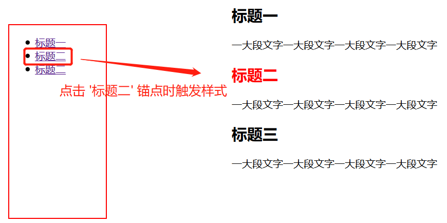
4、伪类样式target <--返回目录
* E:target{} 当目标元素作为锚点触发时,调用此样式
<!DOCTYPE html>
<html>
<head>
    <meta charset="utf-8">
    <style type="text/css">
        #divId{
            position: fixed;
            left: 20px;
            top:50px;
            width: 150px;
            height: 300px;
            border: 2px solid red;
        }
        #content{
            width: 800px;
            margin:0 auto;
        }
        h2:target{
            color: red;
        }
    </style>
</head>
<body>

    <div id="divId">
        <ul>
            <li><a href="#h1Id">标题一</a></li>
            <li><a href="#h2Id">标题二</a></li>
            <li><a href="#h3Id">标题二</a></li>
        </ul>
    </div>

    <div id="content">
        <h2 id="h1Id">标题一</h2>
        <p>一大段文字一大段文字一大段文字一大段文字</p>

        <h2 id="h2Id">标题二</h2>
        <p>一大段文字一大段文字一大段文字一大段文字</p>

        <h2 id="h3Id">标题三</h2>
        <p>一大段文字一大段文字一大段文字一大段文字</p>
    </div>
</body>
</html>
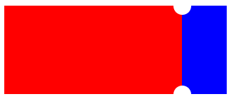
5、伪元素选择器before after <--返回目录
* 是一个行内元素,如果想设置宽高需要转换成块display:block,float:*,position:*
* 必须添加content,哪怕不设置内容,也需要设置 context:""
* E:after E:before在旧版本里是伪类,新版本是伪元素,新版本里E:after E:before会被自动
识别为E::after E::before,按伪元素来对待,这样做的目的是用来做兼容处理。
<!DOCTYPE html>
<html>
<head>
    <meta charset="utf-8">
    <style type="text/css">
        div:nth-of-type(1){
            width: 200px;
            height: 100px;
            background-color: red;
            float: left;
        }
        div:nth-of-type(2){
            position: relative;
            width: 50px;
            height: 100px;
            background-color: blue;
            float: left;
        }
        div:nth-of-type(2)::before{
            content: "";
            position: absolute;
            width: 20px;
            height: 20px;
            background-color: #fff;
            border-radius: 10px;
            left: -10px;
            top:-10px;
        }
        div:nth-of-type(2)::after{
            content: "";
            position: absolute;
            width: 20px;
            height: 20px;
            background-color: #fff;
            border-radius: 10px;
            left: -10px;
            bottom:-10px;
        }
    </style>
</head>
<body>
    <div></div>
    <div></div>
</body>
</html>
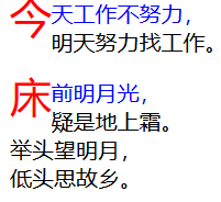
6、::first-letter ::first-line ::selection的使用 <--返回目录
* p::first-letter 获取第一字母或文字
* P::first-line 获取第一行文本
* p::selection 设置鼠标选中的文本的样式,不能设置文字大小等,可以设置颜色,背景 /*谷歌有用,火狐不支持(新版本也支持)*/
* 注意:当设置了P::first-letter后,P::first-line对第一个字母或第一个文字不起作用了。
<!DOCTYPE html>
<html>
<head>
    <meta charset="utf-8">
    <style type="text/css">
        p::first-letter {   /*首字下沉,使用float:left文本环绕实现*/
            color: red;
            font-size: 30px;
            float: left;
        }
        p::first-line {  /*设置第一行文本的样式*/
            color: blue;
        }
        p::selection {  /*谷歌有用,火狐不支持(新版本也支持)*/
            background-color: #ccc;
            color: red;
        }
    </style>
</head>
<body>
    <p>今天工作不努力,<br/>明天努力找工作。</p>
    <p>床前明月光,<br/>疑是地上霜。<br/>举头望明月,<br/>低头思故乡。</p>
</body>
</html>
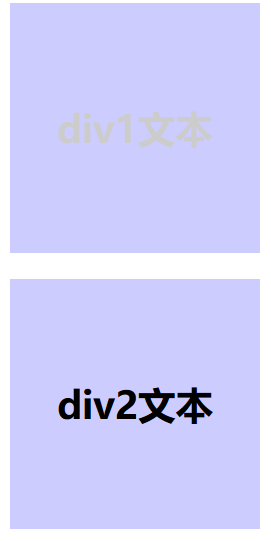
7、opacity设置透明度及RGBA的使用 <--返回目录
* 通过background-color: rgba(0,0,255,0.3);背景透明了,但是里面的文本不受影响。
* 通过opacity设置透明度:如果设置父容器,那么父容器中所有子元素都受影响。
<!DOCTYPE html>
<html>
<head>
    <title></title>
    <meta charset="utf-8">
    <style type="text/css">
        div {
            width: 200px;
            height: 200px;
            color: black;
            background-color: blue;
            line-height: 200px;
            font-size: 30px;
            font-weight: 700;
            text-align: center;
        }
        .div1 {
            opacity: 0.2;

        }
        .div2 {
            background-color: rgba(0,0,255,0.2);
        }
    </style>
</head>
<body>
    <div class="div1">div1文本</div>
    <br/>
    <div class="div2">div2文本</div>
</body>
</html>
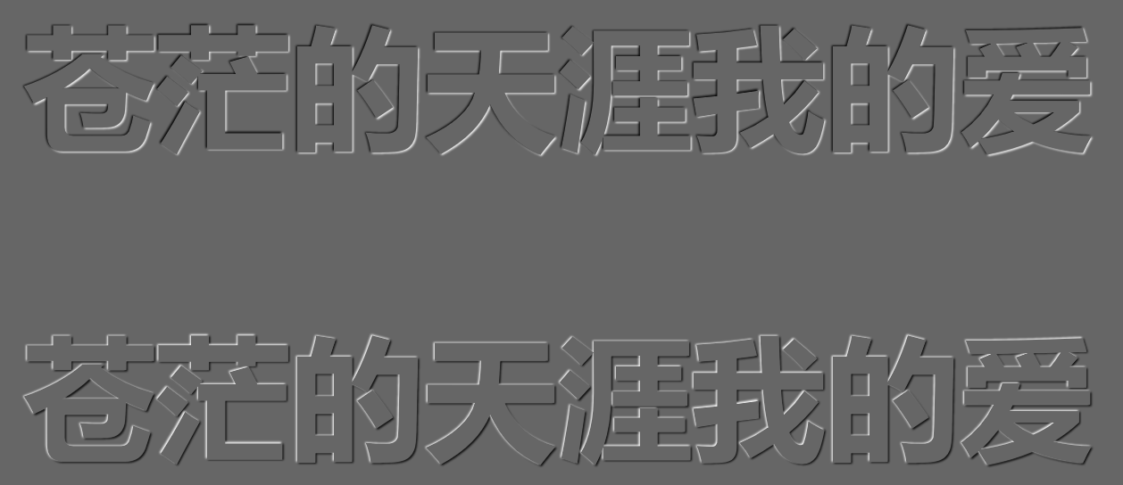
8、文本阴影text-shadow <--返回目录
* text-shadow: 2px 3px 2px #000
- x方向偏移 y方向偏移 阴影模糊效果的作用距离(值越大,越模糊) 阴影颜色
凹凸文字效果:
<!DOCTYPE html>
<html>
<head lang="en">
<meta charset="UTF-8">
<title></title>
<style>
    body{
        background-color: #666;
    }

    p{
        font-size:120px;
        text-align: center;
        font-weight: bold;
        font-family: "Microsoft Yahei";
        color:#666;
    }
    /* text-shadow :文字阴影
        可以设置多个阴影
       每个阴影之间使用逗号隔开
        text-shadow: -1px -1px 1px #fff, 1px 1px 1px #000;
     */
    .tu{
        text-shadow: -1px -1px 1px #fff, 1px 1px 1px #000;
    }

    .ao{
        text-shadow: -1px -1px 1px #000, 1px 1px 1px #fff;
    }
</style>
</head>
<body>
    <p class="ao">苍茫的天涯我的爱</p>
    <p class="tu">苍茫的天涯我的爱</p>
</body>
</html>
9、盒模型 <--返回目录
* box-sizing:content-box
- 盒子宽[高]=width+padding+border
* box-sizing:border-box
- 盒子宽[高]=width
10、边框圆角 <--返回目录
* border-radius:10px; 四个角的圆角值为10px
* border-radius:10px 20px; 左上 右下10px 右上 左下20px
* border-radius:10px 20px 30px; 左上10px 右上 左下20px 右下30px
* border-radius:10px 20px 30px 40px; 左上10px 右上20px 右下30px 左下40px
* border-radius:100px/50px; 水平移100px 垂直移50px,划线形成圆心
* border-radius:100px 0 0 0/50px 0 0 0;
11、边框阴影 <--返回目录
* box-shadow:h v [blur] [spread] [color] [inset]
- h:水平方向的偏移值
- v:垂直方向的偏移值
- blur:模糊,可选,默认0
- spread:阴影的尺寸,扩展阴影,可选,默认0
- color:颜色,可选,默认黑色
- inset:内阴影,可选,默认外阴影
---
posted on 2020-02-23 17:02 wenbin_ouyang 阅读(532) 评论(0) 编辑 收藏 举报
