DAY49-前端入门-浮动布局案例、z-index、flex布局、响应式布局、过渡与动画
一、浮动布局
案例一
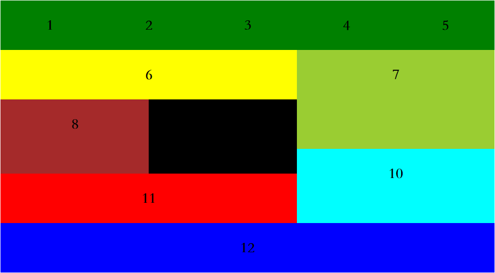
<!DOCTYPE html>
<html lang="en">
<head>
	<meta charset="UTF-8">
	<title>Document</title>
	<style>
		.box{
			width: 1000px;
			margin: 0 auto;
		}
		div div{
			font:900 30px/100px 'STsong';
			float: left;
			text-align: center;
			background-color: green;
			width:200px;
			height: 100px;
		}
		.b6{
			width: 600px;
			background-color: yellow;
			float: left;
		}
		.b7{
			width: 400px;
			height: 200px;
			background-color: yellowgreen;
			float: right;
		}
		.b8{
			width: 300px;
			height: 150px;
			background-color: brown;
			float: left;
		}
		.b9{
			width: 300px;
			height: 150px;
			background-color: black;
			float: left;
		}
		.b10{
			width: 400px;
			height: 150px;
			background-color: cyan;
			float: right;
		}
		.b11{
			width: 600px;
			height: 100px;
			background-color: red;
			float: left;
		}
		.b12{
			width: 1000px;
			height: 100px;
			background-color: blue;
			float: left;
		}
	</style>
</head>
<body>
	<div class="box">
		<div class="b1">1</div>
		<div class="b2">2</div>
		<div class="b3">3</div>
		<div class="b4">4</div>
		<div class="b5">5</div>
		<div class="b6">6</div>
		<div class="b7">7</div>
		<div class="b8">8</div>
		<div class="b9">9</div>
		<div class="b10">10</div>
		<div class="b11">11</div>
		<div class="b12">12</div>
	</div>
</body>
</html>
案例2
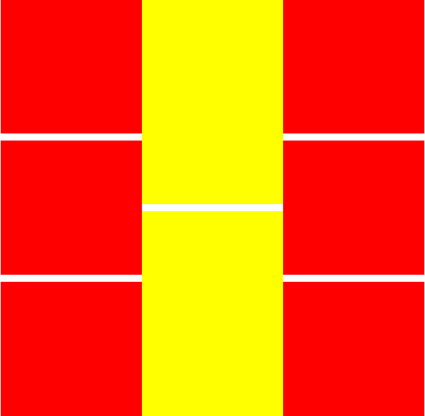
<!DOCTYPE html>
<html lang="en">
<head>
	<meta charset="UTF-8">
	<title>Document</title>
	<style>
		.box{
			width: 600px;
			margin: 0 auto;
		}
		.l ,.m ,.r{
			width: 200px;
			float: left;
		}
		.l div , .r div{
			background-color: red;
			height: 190px;
		}
		.m div{
			background-color: yellow;
			height: 290px
		}
		div div div:not(:first-child){
			margin-top: 10px;
		}
	</style>
</head>
<body>
	<div class="box">
		<div class="l">
			<div></div>
			<div></div>
			<div></div>
		</div>
		<div class="m">
			<div></div>
			<div></div>
		</div>
		<div class="r">
			<div></div>
			<div></div>
			<div></div>
		</div>
	</div>
</body>
</html>
二、z-index
脱离文档流的标签,具有z-index属性,可以用来控制显示层次的优先级,值任意正整数
案例
需求1: d1 d2 d3,均为box的一半
需求2:d1左上角 d2居中 d3右下角
需求3:d2区域在最上方(会覆盖d1,d3的重叠部分)
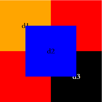
<!DOCTYPE html>
<html lang="en">
<head>
	<meta charset="UTF-8">
	<title>z_inex</title>
	<style>
		.box{
			position: relative;
			width: 400px;
			height: 400px;
			background-color: red;
			margin: 0 auto;
		}
		.d1,.d2,.d3{
			width: 200px;
			height: 200px;
			position: absolute;
			text-align: center;
			font:900 30px/200px 'STsong';
		}
		.d1{
			background-color: orange;

		}
		.d2{
			background-color: blue;
			top:calc(50% - 100px);
			left:calc(50% - 100px);
		}
		.d3{
			background-color: black;
			color: #fff;
			right: 0;
			bottom: 0;
		}
		.d2{
			z-index: 1;
		}
	</style>
</head>
<body>
	<div class="box">
		<div class="d1">d1</div>
		<div class="d2">d2</div>
		<div class="d3">d3</div>
	</div>
</body>
</html>
三、flex布局
概念
之前学习的盒模型布局(display) float布局 position布局都不能很好的解决block垂直居中的问题,flex布局擅长。
采用Flex布局的元素,称为Flex容器(flex container),简称”容器”。它的所有子元素自动成为容器成员,称为Flex项目(flex item),简称”项目”。
容器默认存在两根轴:水平的主轴(main axis)和垂直的交叉轴(cross axis)。主轴的开始位置(与边框的交叉点)叫做main start,结束位置叫做main end;交叉轴的开始位置叫做cross start,结束位置叫做cross end。
项目默认沿主轴排列。单个项目占据的主轴空间叫做main size,占据的交叉轴空间叫做cross size。
容器属性
-
flex-direction:决定主轴的方向(即项目的排列方向)。
row(默认值):主轴为水平方向,起点在左端。
row-reverse:主轴为水平方向,起点在右端。
column:主轴为垂直方向,起点在上沿。
column-reverse:主轴为垂直方向,起点在下沿。
-
flex-wrap:决定了如何换行
nowrap(默认):不换行。
wrap:换行,第一行在上方。
wrap-reverse:换行,第一行在下方。
-
flex-flow:flex-direction和flex-wrap的简写,默认值为row nowrap。
-
justify-content:定义了项目在主轴上的对齐方式。
flex-start:默认,左对齐
flex-end:右对齐
center:水平居中
space-between:两端对齐,项目之间的间隔都相等
space-around:每个项目两侧的间隔相等
-
align-items:定义项目在交叉轴上如何对齐。
flex-start:交叉轴的起点对齐
flex-end:交叉轴的终点对齐
center:交叉轴的中点对齐
baseline: 项目的第一行文字的基线对齐
stretch(默认值):如果项目未设置高度或设为auto,将占满整个容器的高度
-
align-content:定义了多根轴线的对齐方式。如果项目只有一根轴线,该属性不起作用。
stretch(默认值):轴线占满整个交叉轴
flex-start:与交叉轴的起点对齐
flex-end:与交叉轴的终点对齐
center:与交叉轴的中点对齐
space-between:与交叉轴两端对齐,轴线之间的间隔平均分布
space-around:每根轴线两侧的间隔都相等。所以,轴线之间的间隔比轴线与边框的间隔大一倍。
项目的属性
-
order:定义项目的排列顺序。数值越小,排列越靠前,默认为0
-
flex-grow:定义项目的放大比例,默认为0,即如果存在剩余空间,也不放大。
-
flex-shrink:定义了项目的缩小比例,默认为1,即如果空间不足,该项目将缩小
-
flex-basis:定义了在分配多余空间之前,项目占据的主轴空间(main size)。浏览器根据这个属性,计算主轴是否有多余空间。它的默认值为auto,即项目的本来大小。
-
flex:是flex-grow, flex-shrink 和 flex-basis的简写,默认值为0 1 auto。后两个属性可选
-
align-self:允许单个项目有与其他项目不一样的对齐方式,可覆盖align-items属性。默认值为auto,表示继承父元素的align-items属性,如果没有父元素,则等同于stretch
四、响应式布局
1.在响应式布局内,css语法不变
2.响应式布局之间存在不同屏幕尺寸的限制,使用样式互相不影响
解释:满足当前屏幕尺寸时,该样式块起作用,不满足时,则样式块失效。当响应式布局中样式块其作用时,会与正常样式块协同设置布局,遵循选择器的优先级规则
原则:
1.采用响应式布局的页面,基本样式块只做共性样式设置,需要根据页面尺寸进行适应变化的样式均有响应式布局处理
2.要进行响应式布局的页面要处理所有屏幕尺寸下的样式
案例
<!DOCTYPE html>
<html lang="en">
<head>
	<meta charset="UTF-8">
	<title>响应式布局</title>
	<style>
        html,body{
			margin: 0;
		}
		.it{
			height: 300px;
			background-color: orange;
			font:900 50px/300px 'STsong';
			text-align: center;
			float: left;
			border-radius: 50%;
		}
		.box:after{
			content: '';
			display: block;
			clear: both;
		}
		/*屏幕宽度超出1200px*/
		@media only screen and (min-width:1200px ){
			.box{
				background-color: pink;
			}
			.it{
				width: 25%;
			}
		}
		@media only screen and (min-width:600px ) and (max-width:1200px ){
			.box{
				background-color: brown;
			}
			.it{
				width: 30%;
				margin: 0 calc(10% / 6);
			}
		}
		@media only screen and (max-width:600px ){
			.box{
				background-color: cyan;
			}
			.it{
				width: 80%;
				margin-left:10%;
				min-width: 300px;
			}
		}

	</style>
</head>
<body>
	<div class="box">
		<div class="it">1</div>
		<div class="it">2</div>
		<div class="it">3</div>
		<div class="it">4</div>
		<div class="it">5</div>
		<div class="it">6</div>
		<div class="it">7</div>
		<div class="it">8</div>
		<div class="it">9</div>
		<div class="it">10</div>
		<div class="it">11</div>
		<div class="it">12</div>
	</div>
</body>
</html>
五、过渡
过渡:从一个状态以动画方式变成另一个状态的这种变化过程称作过渡
过渡效果通过hover产生可以制作一层hover层
处理方式:与显示层同等区域大小。同样可以将显示层的位置交于hover处理
<!DOCTYPE html>
<html lang="en">
<head>
	<meta charset="UTF-8">
	<title>过渡</title>
	<style>
		/*初始状态*/
		.box{
			width: 200px;
			height: 200px;
			background-color: orange;
			/*过渡*/
			/*持续时间*/
			/*放在显示层,来去均具有效果*/
			transition-duration: .1s;

			/*延迟时间*/
			/*transition-delay: 1s;*/

			/*过渡属性:all,或者只对某些属性做过渡效果*/
			/*transition-property: all;*/

			/*过渡曲线*/
			/*transition-timing-function: cubic-bezier(0, 1.21, 0,-0.07);*/

			/*整体设置*/
			/*transition:  持续时间 延迟时间 贝塞尔曲线;*/
			transition: .3s cubic-bezier(0 .99 0 .99);

		}
		.hover{
			width: 200px;
			height: 200px;
			margin: 0 auto;
		}
		/*可以制造第二种状态的处理方式*/
		.hover:hover .box{
			width: 210px;
			height: 190px;
			background-color: red;
			/*放在hover层,去向第二状态才具有效果*/
			/*transition-duration: .1s;*/
		}
		.box:visited{

		}
	</style>
</head>
<body>
	<div class="hover">
		<div class="box"></div>
	</div>
</body>
</html>
案例
柱状图
<!DOCTYPE html>
<html lang="en">
<head>
	<meta charset="UTF-8">
	<title>过渡案例</title>
	<style>
		.box{
			width: 300px;
			height: 300px;
			margin: 0 auto;
			border-bottom: 1px solid black;
			position: relative;
		}
		.line{
			width: 30px;
			height: 30px;
			background-color: orange;
			position: absolute;
			bottom: 0;
			left: 120px;
			transition: .2s
		}
		.line:hover{
			height: 200px;

		}
		.b{
			width: 30px;
			height: 10px;
			border-radius: 50%;
			background-color: #333;
			position: absolute;
			bottom: -5px;
		}
		.t{
			width: 30px;
			height: 10px;
			border-radius: 50%;
			background-color: #333;
			position: absolute;
			top: -5px;
		}
	</style>
</head>
<body>
	<div class="box">
		<div class="line">
			<div class="t"></div>
			<div class="b"></div>
		</div>
	</div>
</body>
</html>
六、动画
案例
<!DOCTYPE html>
<html lang="en">
<head>
	<meta charset="UTF-8">
	<title>动画</title>
	<style>
		.box{
			width: 200px;
			height: 200px;
			background-color: orange;
		}
		/*动画样式*/
		.box{
			animation-name: wasai;
			animation-duration: 1s;
			/*animation-delay: 1s;*/

			/*
			  动画结束位置
			  forwards:动画结束在终点停留
			  backwards:动画结束返回起点
			animation-fill-mode:backwards;*/

			/*运动次数*/
			animation-iteration-count:4;

			/*多次运动方向的规则
			  alternate:初始为起点来回
			  reverse:初始为终点来回;
			animation-direction: reverse;*/


			/*动画状态
			paused:暂停
			running:运动
            animation-play-state: paused;*/

			/*整体设置
            animation: 动画名 持续时间 次数  贝塞尔曲线 运动方向;*/
			animation: wasai 1s 2 linear alternate;
		}

		/*动画体*/
		@keyframes wasai{
			0%{
				width: 200px;
			}

			100%{
				width: 400px;
			}
		}
	</style>
</head>
<body>
	<div class="box"></div>
</body>
</html>

 浙公网安备 33010602011771号