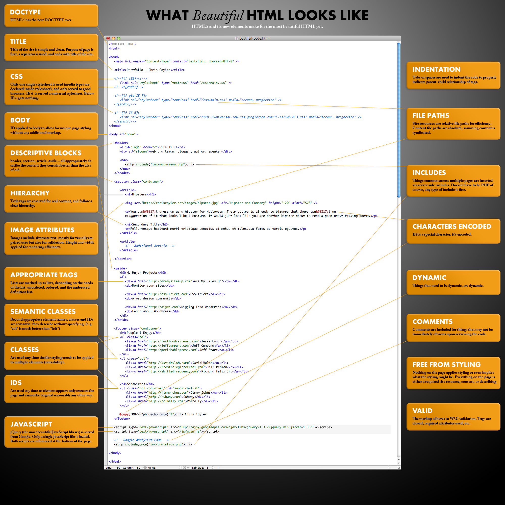
What Beautiful HTML Code Looks Like
By Chris Coyier
I can’t help but view source on every nice looking website I see. It’s like if you had x-ray glasses that allowed you to see any person you ever saw in their underwear at will. How could you not? It’s just so tempting to see if a beautiful website is built with beautiful code as well, or if its beauty if only skin-deep. Code? Beautiful? Sure. After all, Code is Poetry. This is just HTML, so it can’t be quite as intricate and elegant as a dynamic language, but it still bears the brush strokes of its creator.
It gets me to thinking, what makes beautiful code? In HTML, it comes down to craftsmanship. Let’s take a look at some markup written they way markup should be written and see how beautiful it can be.
It’s big enough to print out and tape up inside your locker to impress your friends. Well, it might be a bit of an awkward size. I’ll make the PSD available in case you want to alter it.
- HTML5 – HTML5 and it’s new elements make for the most beautiful HTML yet.
- DOCTYPE – HTML5 has the best DOCTYPE ever
- Indentation – Code is indented to show parent/child relationships and emphasize hierarchy.
- Charset – Declared as first thing in the head, before any content.
- Title – Title of the site is simple and clean. Purpose of page is first, a separator is used, and ends with title of the site.
- CSS – Only one single stylesheet is used (media types declared inside stylesheet), and only served to good browsers. IE 6 and below are served a universal stylesheet.
- Body – ID applied to body to allow for unique page styling without any additional markup.
- JavaScript – jQuery (the most beautiful JavaScript library) is served from Google. Only a single JavaScript file is loaded. Both scripts are referenced at the bottom of the page.
- File Paths – Site resources use relative file paths for efficiency. Content file paths are absolute, assuming content is syndicated.
- Image Attributes – Images include alternate text, mostly for visually impaired uses but also for validation. Height and width applied for rendering efficiency.
- Main Content First – The main content of the page comes after basic identity and navigation but before any ancillary content like sidebar material.
- Appropriate Descriptive Block-Level Elements – Header, Nav, Section, Article, Aside… all appropriately describe the content they contain better than the divs of old.
- Hierarchy – Title tags are reserved for real content, and follow a clear hierarchy.
- Appropriate Descriptive Tags – Lists are marked up as lists, depending on the needs of the list: unordered, ordered, and the underused definition list.
- Common Content Included – Things common across multiple pages are inserted via server side includes (via whatever method, language, or CMS that works for you)
- Semantic Classes – Beyond appropriate element names, classes and IDs are semantic: they describe without specifying. (e.g. “col” is much better than “left”)
- Classes – Are used any time similar styling needs to be applied to multiple elements.
- IDs – Are used any time an element appears only once on the page and cannot be targeted reasonably any other way.
- Dynamic Elements – Things that need to be dynamic, are dynamic.
- Characters Encoded – If it’s a special character, it’s encoded.
- Free From Styling – Nothing on the page applies styling or even implies what the styling might be. Everything on the page is either a required site resource, content, or describing content.
- Comments – Comments are included for things that may not be immediately obvious upon reviewing the code.
- Valid – The code should adhere to W3C guidelines. Tags are closed, required attributes used, nothing deprecated, etc.


