css特效
1.页面淡入淡出
<html style="background:#0086b5">
<!--简易loading-->
<div id="loading" style="z-index:-999;font-size:24px;width:100%;height:24px;text-align:center;position:absolute;top:50%;margin-top:-12px"><b>加载中...</b></div>
<head>
<style>/*页面淡入淡出效果*/
@-webkit-keyframes fadeIn {
0% {opacity: 0; /*初始状态 透明度为0*/}
50% {opacity: 0.5; /*中间状态 透明度为0*/}
100% {opacity: 1; /*结尾状态 透明度为1*/}
}
body{ font-family:"微软雅黑"; background:#f0f0f0; height:100%;
-webkit-animation-name: fadeIn; /*动画名称*/
-webkit-animation-duration: 5s; /*动画持续时间*/
-webkit-animation-iteration-count: 1; /*动画次数*/
-webkit-animation-delay: 0s; /*延迟时间*/
}
</style>
</head>
</html>
2.左右反转loading
<html>
<head>
<style>
#loading
{
z-index:-999;
background-color: #0098fc;
font-size:24px;
width:60px;
height:60px;
text-align:center;
position:absolute;
top:50%;
left:50%;
margin-top:-30px;
margin-left:-30px;
-webkit-animation: rotateplane 1.2s infinite ease-in-out;
animation: rotateplane 1.2s infinite ease-in-out;
}
@-webkit-keyframes rotateplane {
0%{ -webkit-transform: perspective(120px) }
50%{ -webkit-transform: perspective(120px) rotateY(180deg) }
100%{ -webkit-transform: perspective(120px) rotateY(180deg) rotateX(180deg) }
}
@keyframes rotateplane {
0% {
transform: perspective(120px) rotateX(0deg) rotateY(0deg);
-webkit-transform: perspective(120px) rotateX(0deg) rotateY(0deg)
} 50% {
transform: perspective(120px) rotateX(-180.1deg) rotateY(0deg);
-webkit-transform: perspective(120px) rotateX(-180.1deg) rotateY(0deg)
} 100% {
transform: perspective(120px) rotateX(-180deg) rotateY(-179.9deg);
-webkit-transform: perspective(120px) rotateX(-180deg) rotateY(-179.9deg);
}
}
</style>
</head>
<body style="width:100%;height:100%;">
<div id="loading"></div>
</body>
</html>

背景图自适应拉伸
<div style="width:100%;height:80px;background-image:url('bg.png');background-repeat:no-repeat;background-size:100% 100%;"></div>


flex左固定右自适应
<div style="display:flex">
<div style="width:200px;background-color:green">1</div>
<div style="flex:100;background-color:red">2</div>
</div>

flex布局实现div水平垂直居中
<div style="background:green;width:100%;height:200px; display:flex;flex-wrap: wrap ;align-items:center/*垂直居中*/; justify-content:center;/*内容水平居中*/">
<div style="width:50%;height:80px;background-color:red;background-image:url('title.png');background-repeat:no-repeat;background-size:100% 100%;"></div>
</div>

flex布局自动换行取消空白行间距
<!DOCTYPE html>
<html>
<head>
<meta charset="utf-8">
<title>W3Cschool教程(w3cschool.cn)</title>
<style>
#main {
width: 200px;
height: 200px;
border: 1px solid #c3c3c3;
display: -webkit-flex; /* Safari */
-webkit-flex-wrap: wrap; /* Safari 6.1+ */
display: flex;
flex-wrap: wrap;
align-content:flex-start; //取消空白行间距
}
#main div {
width: 50px;
height: 50px;
}
</style>
</head>
<body>
<div id="main">
<div style="background-color:coral;">A</div>
<div style="background-color:lightblue;">B</div>
<div style="background-color:khaki;">C</div>
<div style="background-color:pink;">D</div>
<div style="background-color:lightgrey;">E</div>
<div style="background-color:lightgreen;">F</div>
</div>
<p><b>注意:</b> Internet Explorer 10 及更早版本浏览器不支持 flex-wrap 属性。</p>
<p><b>注意:</b> Safari 6.1 及更新版本通过 -webkit-flex-wrap 属性支持该属性。</p>
</body>
</html>
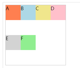
未加align-content:flex-start;之前效果(空白行间距)
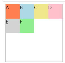
加了之后效果
详解:https://blog.csdn.net/txfyteen/article/details/82663029
align-items,align-content详解:https://blog.csdn.net/cc18868876837/article/details/88138057
转自其他文章:css3 loading
http://www.cnblogs.com/lhb25/p/loading-spinners-animated-with-css3.html
Loading 动画效果一
HTML 代码:
|
1
2
3
4
5
6
7
|
<div class="spinner"> <div class="rect1"></div> <div class="rect2"></div> <div class="rect3"></div> <div class="rect4"></div> <div class="rect5"></div></div> |
CSS 代码:
|
1
2
3
4
5
6
7
8
9
10
11
12
13
14
15
16
17
18
19
20
21
22
23
24
25
26
27
28
29
30
31
32
33
34
35
36
37
38
39
40
41
42
43
44
45
46
47
48
49
50
51
52
|
.spinner { margin: 100px auto; width: 50px; height: 60px; text-align: center; font-size: 10px;}.spinner > div { background-color: #67CF22; height: 100%; width: 6px; display: inline-block; -webkit-animation: stretchdelay 1.2s infinite ease-in-out; animation: stretchdelay 1.2s infinite ease-in-out;}.spinner .rect2 { -webkit-animation-delay: -1.1s; animation-delay: -1.1s;}.spinner .rect3 { -webkit-animation-delay: -1.0s; animation-delay: -1.0s;}.spinner .rect4 { -webkit-animation-delay: -0.9s; animation-delay: -0.9s;}.spinner .rect5 { -webkit-animation-delay: -0.8s; animation-delay: -0.8s;}@-webkit-keyframes stretchdelay { 0%, 40%, 100% { -webkit-transform: scaleY(0.4) } 20% { -webkit-transform: scaleY(1.0) }}@keyframes stretchdelay { 0%, 40%, 100% { transform: scaleY(0.4); -webkit-transform: scaleY(0.4); } 20% { transform: scaleY(1.0); -webkit-transform: scaleY(1.0); }} |
Loading 动画效果二
HTML 代码:
|
1
|
<div class="spinner"></div> |
CSS 代码:
|
1
2
3
4
5
6
7
8
9
10
11
12
13
14
15
16
17
18
19
20
21
22
23
24
25
26
27
28
|
.spinner { width: 60px; height: 60px; background-color: #67CF22; margin: 100px auto; -webkit-animation: rotateplane 1.2s infinite ease-in-out; animation: rotateplane 1.2s infinite ease-in-out;}@-webkit-keyframes rotateplane { 0% { -webkit-transform: perspective(120px) } 50% { -webkit-transform: perspective(120px) rotateY(180deg) } 100% { -webkit-transform: perspective(120px) rotateY(180deg) rotateX(180deg) }}@keyframes rotateplane { 0% { transform: perspective(120px) rotateX(0deg) rotateY(0deg); -webkit-transform: perspective(120px) rotateX(0deg) rotateY(0deg) } 50% { transform: perspective(120px) rotateX(-180.1deg) rotateY(0deg); -webkit-transform: perspective(120px) rotateX(-180.1deg) rotateY(0deg) } 100% { transform: perspective(120px) rotateX(-180deg) rotateY(-179.9deg); -webkit-transform: perspective(120px) rotateX(-180deg) rotateY(-179.9deg); }} |
Loading 动画效果三
HTML 代码:
|
1
2
3
4
|
<div class="spinner"> <div class="double-bounce1"></div> <div class="double-bounce2"></div></div> |
CSS 代码:
|
1
2
3
4
5
6
7
8
9
10
11
12
13
14
15
16
17
18
19
20
21
22
23
24
25
26
27
28
29
30
31
32
33
34
35
36
37
38
39
40
41
|
.spinner { width: 60px; height: 60px; position: relative; margin: 100px auto;}.double-bounce1, .double-bounce2 { width: 100%; height: 100%; border-radius: 50%; background-color: #67CF22; opacity: 0.6; position: absolute; top: 0; left: 0; -webkit-animation: bounce 2.0s infinite ease-in-out; animation: bounce 2.0s infinite ease-in-out;}.double-bounce2 { -webkit-animation-delay: -1.0s; animation-delay: -1.0s;}@-webkit-keyframes bounce { 0%, 100% { -webkit-transform: scale(0.0) } 50% { -webkit-transform: scale(1.0) }}@keyframes bounce { 0%, 100% { transform: scale(0.0); -webkit-transform: scale(0.0); } 50% { transform: scale(1.0); -webkit-transform: scale(1.0); }} |
Loading 动画效果四
HTML 代码:
|
1
2
3
4
|
<div class="spinner"> <div class="cube1"></div> <div class="cube2"></div></div> |
CSS 代码:
|
1
2
3
4
5
6
7
8
9
10
11
12
13
14
15
16
17
18
19
20
21
22
23
24
25
26
27
28
29
30
31
32
33
34
35
36
37
38
39
40
41
42
43
44
45
46
47
48
49
|
.spinner { margin: 100px auto; width: 32px; height: 32px; position: relative;}.cube1, .cube2 { background-color: #67CF22; width: 30px; height: 30px; position: absolute; top: 0; left: 0; -webkit-animation: cubemove 1.8s infinite ease-in-out; animation: cubemove 1.8s infinite ease-in-out;}.cube2 { -webkit-animation-delay: -0.9s; animation-delay: -0.9s;}@-webkit-keyframes cubemove { 25% { -webkit-transform: translateX(42px) rotate(-90deg) scale(0.5) } 50% { -webkit-transform: translateX(42px) translateY(42px) rotate(-180deg) } 75% { -webkit-transform: translateX(0px) translateY(42px) rotate(-270deg) scale(0.5) } 100% { -webkit-transform: rotate(-360deg) }}@keyframes cubemove { 25% { transform: translateX(42px) rotate(-90deg) scale(0.5); -webkit-transform: translateX(42px) rotate(-90deg) scale(0.5); } 50% { transform: translateX(42px) translateY(42px) rotate(-179deg); -webkit-transform: translateX(42px) translateY(42px) rotate(-179deg); } 50.1% { transform: translateX(42px) translateY(42px) rotate(-180deg); -webkit-transform: translateX(42px) translateY(42px) rotate(-180deg); } 75% { transform: translateX(0px) translateY(42px) rotate(-270deg) scale(0.5); -webkit-transform: translateX(0px) translateY(42px) rotate(-270deg) scale(0.5); } 100% { transform: rotate(-360deg); -webkit-transform: rotate(-360deg); }} |
Loading 动画效果五
HTML 代码:
|
1
2
3
4
|
<div class="spinner"> <div class="dot1"></div> <div class="dot2"></div></div> |
CSS 代码:
|
1
2
3
4
5
6
7
8
9
10
11
12
13
14
15
16
17
18
19
20
21
22
23
24
25
26
27
28
29
30
31
32
33
34
35
36
37
38
39
40
41
42
43
44
45
46
47
48
|
.spinner { margin: 100px auto; width: 90px; height: 90px; position: relative; text-align: center; -webkit-animation: rotate 2.0s infinite linear; animation: rotate 2.0s infinite linear;}.dot1, .dot2 { width: 60%; height: 60%; display: inline-block; position: absolute; top: 0; background-color: #67CF22; border-radius: 100%; -webkit-animation: bounce 2.0s infinite ease-in-out; animation: bounce 2.0s infinite ease-in-out;}.dot2 { top: auto; bottom: 0px; -webkit-animation-delay: -1.0s; animation-delay: -1.0s;}@-webkit-keyframes rotate { 100% { -webkit-transform: rotate(360deg) }}@keyframes rotate { 100% { transform: rotate(360deg); -webkit-transform: rotate(360deg) }}@-webkit-keyframes bounce { 0%, 100% { -webkit-transform: scale(0.0) } 50% { -webkit-transform: scale(1.0) }}@keyframes bounce { 0%, 100% { transform: scale(0.0); -webkit-transform: scale(0.0); } 50% { transform: scale(1.0); -webkit-transform: scale(1.0); }} |
Loading 动画效果六
HTML 代码:
|
1
2
3
4
5
|
<div class="spinner"> <div class="bounce1"></div> <div class="bounce2"></div> <div class="bounce3"></div></div> |
CSS 代码:
|
1
2
3
4
5
6
7
8
9
10
11
12
13
14
15
16
17
18
19
20
21
22
23
24
25
26
27
28
29
30
31
32
33
34
35
36
37
38
39
40
41
42
43
44
|
.spinner { margin: 100px auto 0; width: 150px; text-align: center;}.spinner > div { width: 30px; height: 30px; background-color: #67CF22; border-radius: 100%; display: inline-block; -webkit-animation: bouncedelay 1.4s infinite ease-in-out; animation: bouncedelay 1.4s infinite ease-in-out; /* Prevent first frame from flickering when animation starts */ -webkit-animation-fill-mode: both; animation-fill-mode: both;}.spinner .bounce1 { -webkit-animation-delay: -0.32s; animation-delay: -0.32s;}.spinner .bounce2 { -webkit-animation-delay: -0.16s; animation-delay: -0.16s;}@-webkit-keyframes bouncedelay { 0%, 80%, 100% { -webkit-transform: scale(0.0) } 40% { -webkit-transform: scale(1.0) }}@keyframes bouncedelay { 0%, 80%, 100% { transform: scale(0.0); -webkit-transform: scale(0.0); } 40% { transform: scale(1.0); -webkit-transform: scale(1.0); }} |
Loading 动画效果七
HTML 代码:
|
1
|
<div class="spinner"></div> |
CSS 代码:
|
1
2
3
4
5
6
7
8
9
10
11
12
13
14
15
16
17
18
19
20
21
22
23
24
25
26
27
28
29
|
.spinner { width: 40px; height: 40px; margin: 100px auto; background-color: #333; border-radius: 100%; -webkit-animation: scaleout 1.0s infinite ease-in-out; animation: scaleout 1.0s infinite ease-in-out;}@-webkit-keyframes scaleout { 0% { -webkit-transform: scale(0.0) } 100% { -webkit-transform: scale(1.0); opacity: 0; }}@keyframes scaleout { 0% { transform: scale(0.0); -webkit-transform: scale(0.0); } 100% { transform: scale(1.0); -webkit-transform: scale(1.0); opacity: 0; }} |
Loading 动画效果八
HTML 代码:
|
1
2
3
4
5
6
7
8
9
10
11
12
13
14
15
16
17
18
19
20
|
<div class="spinner"> <div class="spinner-container container1"> <div class="circle1"></div> <div class="circle2"></div> <div class="circle3"></div> <div class="circle4"></div> </div> <div class="spinner-container container2"> <div class="circle1"></div> <div class="circle2"></div> <div class="circle3"></div> <div class="circle4"></div> </div> <div class="spinner-container container3"> <div class="circle1"></div> <div class="circle2"></div> <div class="circle3"></div> <div class="circle4"></div> </div></div> |
CSS 代码:
|
1
2
3
4
5
6
7
8
9
10
11
12
13
14
15
16
17
18
19
20
21
22
23
24
25
26
27
28
29
30
31
32
33
34
35
36
37
38
39
40
41
42
43
44
45
46
47
48
49
50
51
52
53
54
55
56
57
58
59
60
61
62
63
64
65
66
67
68
69
70
71
72
73
74
75
76
77
78
79
80
81
82
83
84
85
86
87
88
89
90
91
92
93
94
95
96
97
98
99
100
101
102
103
104
105
106
107
108
109
110
|
.spinner { margin: 100px auto; width: 20px; height: 20px; position: relative;}.container1 > div, .container2 > div, .container3 > div { width: 6px; height: 6px; background-color: #333; border-radius: 100%; position: absolute; -webkit-animation: bouncedelay 1.2s infinite ease-in-out; animation: bouncedelay 1.2s infinite ease-in-out; -webkit-animation-fill-mode: both; animation-fill-mode: both;}.spinner .spinner-container { position: absolute; width: 100%; height: 100%;}.container2 { -webkit-transform: rotateZ(45deg); transform: rotateZ(45deg);}.container3 { -webkit-transform: rotateZ(90deg); transform: rotateZ(90deg);}.circle1 { top: 0; left: 0; }.circle2 { top: 0; right: 0; }.circle3 { right: 0; bottom: 0; }.circle4 { left: 0; bottom: 0; }.container2 .circle1 { -webkit-animation-delay: -1.1s; animation-delay: -1.1s;}.container3 .circle1 { -webkit-animation-delay: -1.0s; animation-delay: -1.0s;}.container1 .circle2 { -webkit-animation-delay: -0.9s; animation-delay: -0.9s;}.container2 .circle2 { -webkit-animation-delay: -0.8s; animation-delay: -0.8s;}.container3 .circle2 { -webkit-animation-delay: -0.7s; animation-delay: -0.7s;}.container1 .circle3 { -webkit-animation-delay: -0.6s; animation-delay: -0.6s;}.container2 .circle3 { -webkit-animation-delay: -0.5s; animation-delay: -0.5s;}.container3 .circle3 { -webkit-animation-delay: -0.4s; animation-delay: -0.4s;}.container1 .circle4 { -webkit-animation-delay: -0.3s; animation-delay: -0.3s;}.container2 .circle4 { -webkit-animation-delay: -0.2s; animation-delay: -0.2s;}.container3 .circle4 { -webkit-animation-delay: -0.1s; animation-delay: -0.1s;}@-webkit-keyframes bouncedelay { 0%, 80%, 100% { -webkit-transform: scale(0.0) } 40% { -webkit-transform: scale(1.0) }}@keyframes bouncedelay { 0%, 80%, 100% { transform: scale(0.0); -webkit-transform: scale(0.0); } 40% { transform: scale(1.0); -webkit-transform: scale(1.0); }} |
vw布局实现垂直居中
| <div style="background:red;width:50vw;height:50vh;margin: 25vh auto; ">aa<div/> |
From:http://www.cnblogs.com/xuejianxiyang/p/5522534.html
作者:xuejianxiyang
出处:http://xuejianxiyang.cnblogs.com
关于作者:Heaven helps those who help themselves.
本文版权归原作者和博客园共有,欢迎转载,但未经原作者同意必须保留此段声明,且在文章页面明显位置给出原文连接,否则保留追究法律责任的权利。
