
R语言低级绘图函数-axis
axis函数用来在一张图表上添加轴线,区别于传统的x轴和y轴,axis 允许在上,下,左, 右4个方向添加轴线
以x轴为例,一条轴线包含3个元素,水平的一条横线,叫做axis line , 刻度线, 叫做tick line, 对应的标签 labels
基本用法:
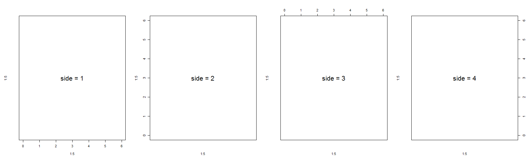
通过side 参数设置需要添加的轴线的方向,从下边开始,沿逆时针方向,数字为1到4
代码示例:

par(oma = c(1, 1, 1, 1), mfrow = c(1, 4))
plot(1:5, 1:5, xlim = c(0,6), ylim = c (0,6), type = "n", axes = F)
text(x = 3, y = 3, labels = "side = 1", cex = 2)
box()
axis(side = 1)
plot(1:5, 1:5, xlim = c(0,6), ylim = c (0,6), type = "n", axes = F)
text(x = 3, y = 3, labels = "side = 2", cex = 2)
box()
axis(side = 2)
plot(1:5, 1:5, xlim = c(0,6), ylim = c (0,6), type = "n", axes = F)
text(x = 3, y = 3, labels = "side = 3", cex = 2)
box()
axis(side = 3)
plot(1:5, 1:5, xlim = c(0,6), ylim = c (0,6), type = "n", axes = F)
text(x = 3, y = 3, labels = "side = 4", cex = 2)
box()
axis(side = 4)
效果图如下:
参数设置:
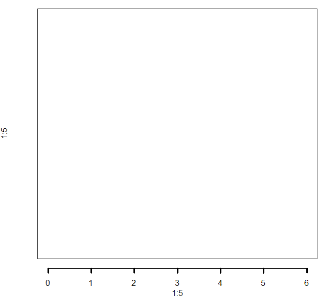
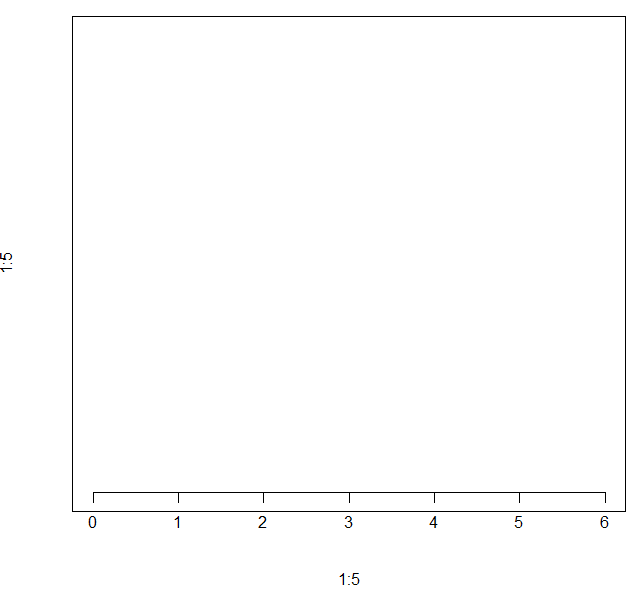
at : 需要添加刻度的数值,默认会根据变量的取值范围计算几个合适的刻度,也可以手工指定
代码示例:
plot(1:5, 1:5, xlim = c(0,6), ylim = c (0,6), type = "n", axes = F)
box()
axis(side = 1, at = c(0, 2, 4, 6))
效果图如下:

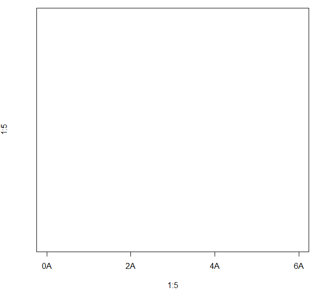
lables : 指定在刻度上需要标记的内容,默认就是刻度对应的值
代码示例:
plot(1:5, 1:5, xlim = c(0,6), ylim = c (0,6), type = "n", axes = F)
box()
axis(side = 1, at = c(0, 2, 4, 6), labels = paste(c(0, 2, 4, 6), "A", sep = ""))
效果图如下:
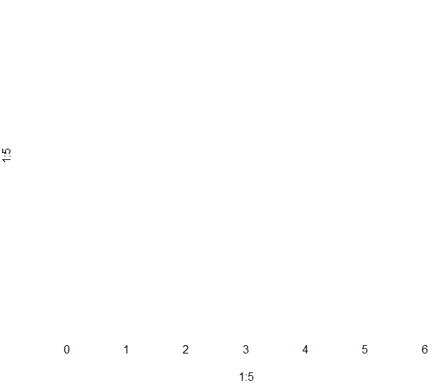
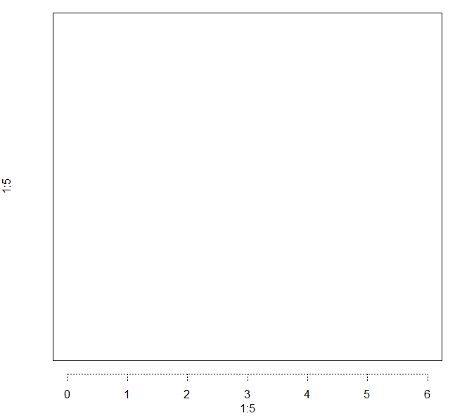
tick : 逻辑值,是否显示轴线,包括刻度线和对应的轴线, FALSE 表示不显示
代码示例:
plot(1:5, 1:5, xlim = c(0,6), ylim = c (0,6), type = "n", axes = F)
axis(side = 1, tick = F)
效果图:
line : 轴线的位置
代码示例:
plot(1:5, 1:5, xlim = c(0,6), ylim = c (0,6), type = "n", axes = F)
box()
axis(side = 1, line = 1)
效果图如下:

lwd : 设置 axis line 和 tick line 的宽度
代码示例:
plot(1:5, 1:5, xlim = c(0,6), ylim = c (0,6), type = "n", axes = F)
box()
axis(side = 1, line = 1, lwd = 2)
效果图如下:

lwd.tick : 设置tick line的宽度
代码示例:
plot(1:5, 1:5, xlim = c(0,6), ylim = c (0,6), type = "n", axes = F)
box()
axis(side = 1, line = 1, lwd = 1, lwd.tick = 2)
效果图如下:
lty : 设置axis line 和tick line的线条类型
代码示例:
plot(1:5, 1:5, xlim = c(0,6), ylim = c (0,6), type = "n", axes = F)
box()
axis(side = 1, line = 1, lty = 3)
效果图如下:
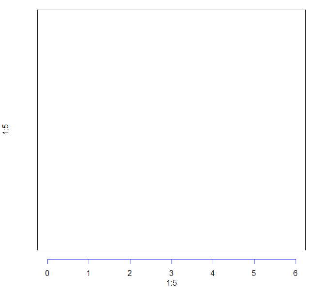
col : 设置axis line 和 tick.line 的线条颜色
代码示例:
plot(1:5, 1:5, xlim = c(0,6), ylim = c (0,6), type = "n", axes = F)
box()
axis(side = 1, line = 1, col = "blue")
效果图如下:
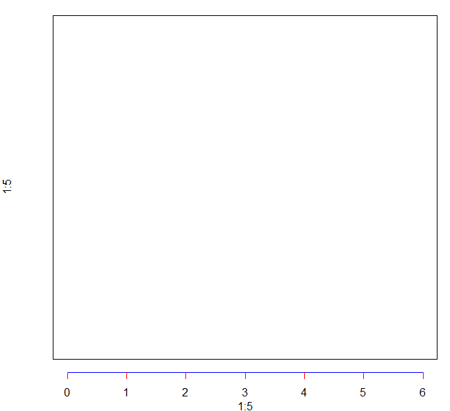
col.ticks : 设置tick line的颜色
代码示例:
plot(1:5, 1:5, xlim = c(0,6), ylim = c (0,6), type = "n", axes = F)
box()
axis(side = 1, line = 1, col = "blue", col.ticks = "red")
效果图如下:
pos : 对轴线的位置进行调整,当pos 设置了对应的值之后会覆盖line 参数的值
代码示例:
plot(1:5, 1:5, xlim = c(0,6), ylim = c (0,6), type = "n", axes = F)
box()
axis(side = 1, pos = 1)
效果图如下:
欢迎关注微信公众号<生信修炼手册>


【推荐】国内首个AI IDE,深度理解中文开发场景,立即下载体验Trae
【推荐】编程新体验,更懂你的AI,立即体验豆包MarsCode编程助手
【推荐】抖音旗下AI助手豆包,你的智能百科全书,全免费不限次数
【推荐】轻量又高性能的 SSH 工具 IShell:AI 加持,快人一步
· 10年+ .NET Coder 心语,封装的思维:从隐藏、稳定开始理解其本质意义
· .NET Core 中如何实现缓存的预热?
· 从 HTTP 原因短语缺失研究 HTTP/2 和 HTTP/3 的设计差异
· AI与.NET技术实操系列:向量存储与相似性搜索在 .NET 中的实现
· 基于Microsoft.Extensions.AI核心库实现RAG应用
· 10年+ .NET Coder 心语 ── 封装的思维:从隐藏、稳定开始理解其本质意义
· 地球OL攻略 —— 某应届生求职总结
· 提示词工程——AI应用必不可少的技术
· Open-Sora 2.0 重磅开源!
· 周边上新:园子的第一款马克杯温暖上架