
js实现环形菜单效果
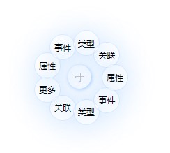
点击中间的圆点,会弹出环形菜单,效果图:
代码:
<!DOCTYPE html>
<html>

<head>
    <meta charset="UTF-8">
    <title>javascript ring menu</title>
    <style media="screen">
        html,body {
            height: 99%;
            width: 99%;
        }
        .plus {
            position: relative;
            margin: 100px;
        }

        .plus::after,
        .plus::before {
            position: absolute;
            content: '';
            display: inline-block;
            border: 1px solid silver;
            opacity: 0.8;
        }

        .plus::before {
            width: 11px;
            height: 1px;
            left: 11px;
            top: 16px;
        }

        .plus::after {
            width: 1px;
            height: 11px;
            left: 16px;
            top: 11px;
        }

        .ring {
            width: 10px;
            height: 10px;
            position: relative;
            display: inline-block;
            padding: 1em;
            font-size: 12px;
            border-radius: 50% 50%;
            box-shadow: 1px 1px 5px 0 rgba(89, 167, 255, 0.5);
        }

        .ring:hover {
            box-shadow: 1px 1px 5px 0 rgba(89, 167, 255, 0.8);
        }

        .circle {
            position: absolute;
            cursor: pointer;
            padding: 0.8em 0.5em;
            display: inline-block;
            border-radius: 50% 50%;
            border: 1px solid rgba(89, 167, 255, 0.2);
            box-shadow: 1px 3px 40px 0 rgba(89, 167, 255, 0.3);
            overflow: hidden;
            word-break: keep-all;
            transition: left 0.5s linear, top 0.5s linear, color 0.5s linear, background-color 0.5s linear, box-shadow 0.5s linear;
        }

        .circle:hover {
            color: #fff;
            background-color: rgba(89, 167, 255, 0.8);
            box-shadow: 1px 3px 40px 0 rgba(89, 167, 255, 1);
            z-index: 100;
        }

        .ring.selected>.circle {
            display: inline-block;
            opacity: 1;
            z-index: 10;
        }

        .node-hide {
            width: 0px;
            height: 0px;
            opacity: 0;
            left: calc(30%) !important;
            top: calc(30%) !important;
        }
    </style>
</head>

<body>
    <div class="ring plus">
        <div class="circle">
            属性
        </div>
        <div class="circle">
            事件
        </div>
        <div class="circle">
            类型
        </div>
        <div class="circle">
            关联
        </div>
        <div class="circle">
            更多
        </div>
    </div>
</body>
<script type="text/javascript">
    var data = [{
            title: '属性'
        },
        {
            title: '事件'
        },
        {
            title: '类型'
        },
        {
            title: '关联'
        }
    ];

    /**
     * R 可以考虑通过传参动态设置
     **/
    function initRing(ctn, data) {
        initByData(data);

        var items = ctn.querySelectorAll('.circle'),
            R = 50, // 圆半径
            angle = 360 / (items.length),
            offsetX = getStyle(ctn).width / 2, // 中心点x轴偏移值
            offsetY = getStyle(ctn).height / 2; // 中心点y轴偏移值
        Array.from(items).map(function(item, index) {
            var dw = getStyle(item).width / 2,
                dh = getStyle(item).height / 2; // 计算菜单坐标
            var hudu = (2 * Math.PI / 360) * angle * index,
                left = (Math.cos(hudu) * R + offsetX - dw).toFixed(2),
                top = (Math.sin(hudu) * R + offsetY - dh).toFixed(2);

            item.style.setProperty('left', left + 'px');
            item.style.top = top + 'px';
            item.classList.add('node-hide');
        });

        ctn.addEventListener('click', function() {
            var cls = Array.from(this.classList),
                ctnr = this,
                items = Array.from(ctnr.querySelectorAll('.circle'));
            if (cls.includes('selected')) {
                this.classList.remove('selected');
                items.map(function(item) {
                    item.classList.add('node-hide');
                });
            } else {
                this.classList.add('selected');
                items.map(function(item) {
                    item.classList.remove('node-hide');
                });
            }
            event.stopPropagation();
        });

        function initByData(data) {
            if (data) {
                data.map(function(item) {
                    var divDom = document.createElement('div');
                    divDom.classList.add('circle');
                    divDom.innerText = item.title;
                    ctn.appendChild(divDom);
                });
            }
        }

        function getStyle(domObj) {
            var style = document.defaultView.getComputedStyle(domObj);
            var width = style.width.replace('px', '') * 1 + style['padding-left'].replace('px', '') * 1 + style['padding-right'].replace('px', '') * 1,
                height = style.height.replace('px', '') * 1 + style['padding-top'].replace('px', '') * 1 + style['padding-bottom'].replace('px', '') * 1;
            return {
                width: width,
                height: height
            };
        }
    }

    initRing(document.querySelector('.ring'), data)
</script>

</html>

 浙公网安备 33010602011771号