效果图(这里没办法显示动态,具体动态自己复制代码去网页看):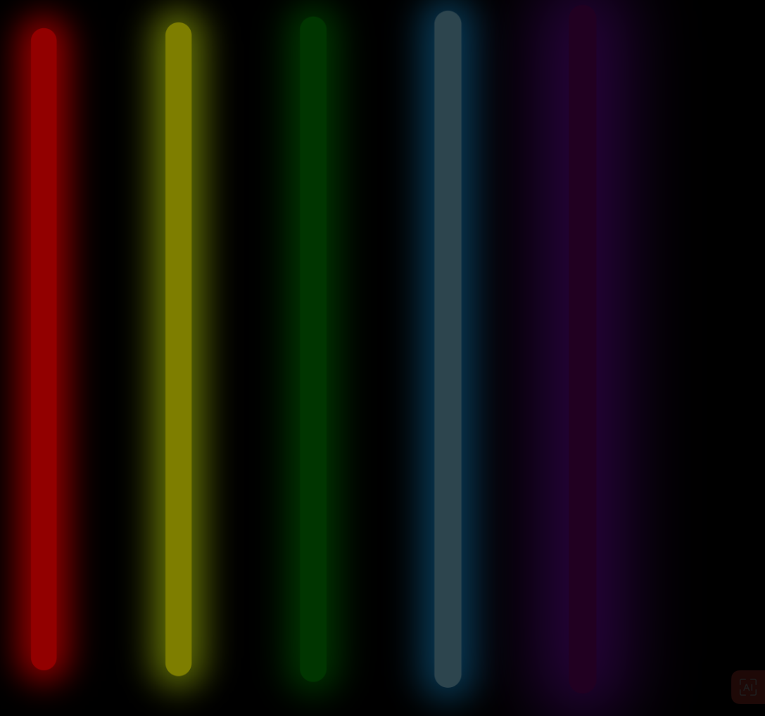
<!DOCTYPE html>
<html lang="en">
<head>
    <meta charset="UTF-8">
    <meta http-equiv="X-UA-Compatible" content="IE=edge">
    <meta name="viewport" content="width=device-width, initial-scale=1.0">
    <title>荧光效果</title>
    <style>
        body{
            background-color: black;
            /* 背景 颜色 */
        }
        .box{
            width: 900px;/* 宽度 */
            height: 700px;/* 高度 */
            /* background-color: green; */
            /* 绿色 */
            margin: 200px auto;
            /* 居上200px 左右居中 */
        }

        .list{
            float: left;
            /* 同一行排列 */
            margin: 50px;
            /* 外边距 */
            width: 20px;
            height: 500px;
            border-radius: 20px ;
            /* 圆角 */
            animation: run 2s infinite linear;
            /* 实现动画 动画名 动画时间 循环*/
        }

        .red{
            background-color: red;
            box-shadow: 0px 0 25px 10px red ;
            /* X轴偏移量、Y轴偏移量、模糊半径、扩散半径和颜色。 */
            animation-delay: 0.1s;/* 在过渡效果开始前等待 */
        }
        .yellow{
            background-color: yellow;
            box-shadow: 0px 0 25px 10px rgb(195, 223, 12) ;
            animation-delay: 0.2s;/* 在过渡效果开始前等待 */
        }
        .green{
            background-color: green;
            box-shadow: 0 0 25px 10px green;
                /* X轴偏移量、Y轴偏移量、模糊半径、扩散半径和颜色。 */
                animation-delay: 0.3s;/* 在过渡效果开始前等待 */

        }
        .blue{
            background-color: skyblue;
            box-shadow: 0 0 25px 10px rgb(23, 170, 255);
                /* X轴偏移量、Y轴偏移量、模糊半径、扩散半径和颜色。 */
                animation-delay: 0.4s;/* 在过渡效果开始前等待 */

        }
        .purple{
            background-color: purple;
            box-shadow: 0 0 50px 20px rgb(166, 13, 255);
                /* X轴偏移量、Y轴偏移量、模糊半径、扩散半径和颜色。 */
                animation-delay: 0.5s;/* 在过渡效果开始前等待 */

        }

        @keyframes run { /*创建动画 动画名*/
            0%{
                opacity: 1;
                /* 透明度 */
                transform: translateX(0) scale(1);
                /* 变形 移动x轴的值 伸缩 */
            }
            50% {
                opacity: 0.2;
                transform: translateX(200%) scale(1.2);

            }
            100% {
                opacity: 1;
                transform: translateX(400%) scale(1);
            }
        }
    </style>
</head>
<body>
    <div class="box"> <!-- 盒子标签  -->
        <div class="list red"></div>
        <div class="list yellow"></div>
        <div class="list green"></div>
        <div class="list blue"></div>
        <div class="list purple"></div>
    </div>
</body>
</html>


【推荐】国内首个AI IDE,深度理解中文开发场景,立即下载体验Trae
【推荐】编程新体验,更懂你的AI,立即体验豆包MarsCode编程助手
【推荐】抖音旗下AI助手豆包,你的智能百科全书,全免费不限次数
【推荐】轻量又高性能的 SSH 工具 IShell:AI 加持,快人一步
· TypeScript + Deepseek 打造卜卦网站:技术与玄学的结合
· 阿里巴巴 QwQ-32B真的超越了 DeepSeek R-1吗?
· 【译】Visual Studio 中新的强大生产力特性
· 10年+ .NET Coder 心语 ── 封装的思维:从隐藏、稳定开始理解其本质意义
· 【设计模式】告别冗长if-else语句:使用策略模式优化代码结构