32、flex布局
html:
      <div class="parent">
            <div class="son">1</div>
            <div class="son">2</div>
            <div class="son">3</div>
            <div class="son">4</div>
        </div>
css:
         .parent{
             width: 600px;
             height: auto;
             border: 10px solid black;
             display: flex;
             /*flex-direction: row; //水平排列(默认)*/
             /*flex-direction: column; //垂直排列*/
             /*flex-wrap: wrap;//换行*/
             /*flex-wrap: nowrap;//不换行(默认)*/
             /*justify-content: center;//居中排列*/
             /*justify-content: flex-start //靠左排列*/
             /*justify-content: flex-end //靠右排列*/
             /*justify-content: space-between; //两端对齐,中间间隔相等*/
             /*justify-content: space-around; //每个元素两侧间隔相等,所以中间比两端间隔大一倍*/
             /*align-items: center; //在竖直方向居中*/
             /*align-items: flex-start;//在竖直方向顶部*/
             /*align-items: flex-end;//在竖直方向底部*/

         }
         .son{
             width: 100px;
             height: 100px;
             background: peachpuff;
             border: 1px solid black;
         }
css解析:
.parent{ flex-direction:row(默认) | row-reverse | column | column-reverse; }
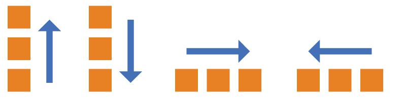
.parent{
   flex-wrap: nowrap(默认不换行) |wrap;
}
不换行效果图:
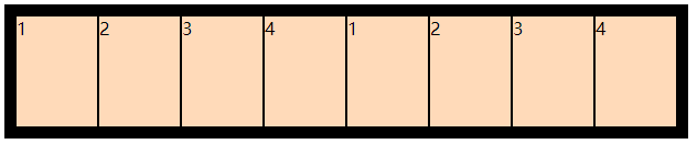
换行效果图:

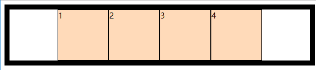
.parent{
   justify-content: center;//居中排列
}
居中排列效果图:
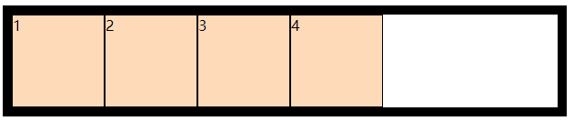
.parent{
   justify-content: flex-start //靠左排列
}
flex-start:
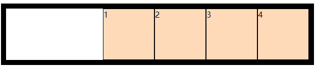
.parent{
   justify-content: flex-end //靠右排列
}
flex-end:
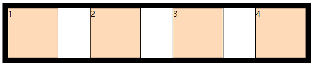
.parent{
   justify-content: space-between; //两端对齐,中间间隔相等
}
space-between:
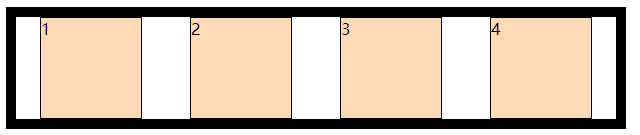
.parent{
   justify-content: space-around; //每个元素两侧间隔相等,所以中间比两端间隔大一倍
}
space-around:
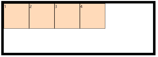
.parent{
  align-items: center; //在竖直方向居中
}
效果图:
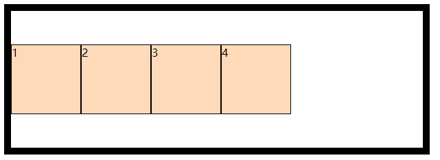
.parent{
   align-items: flex-start;//在竖直方向顶部
}
flex-start:
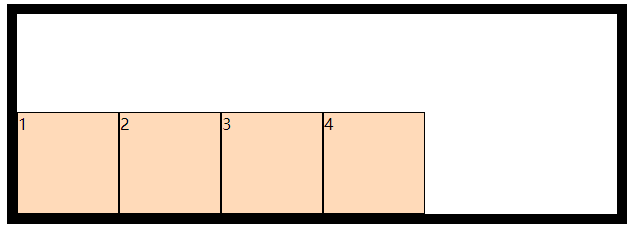
.parent{
   align-items: flex-end;//在竖直方向底部
}
flex-end:
不存在一劳永逸的技术,唯有坚持不懈的努力.
