
vue——组件
一、组件概念
vue的核心基础就是组件的使用,玩好了组件才能将前面学的基础更好的运用起来。组件的使用更使我们的项目解耦合。更加符合vue的设计思想MVVM。
// 定义一个名为 button-counter 的新组件
Vue.component('button-counter', {
  data: function () {
    return {
      count: 0
    }
  },
  template: '<button v-on:click="count++">You clicked me {{ count }} times.</button>'
})
1、组件是可复用的Vue实例
组件是可复用的 Vue 实例,且带有一个名字:在这个例子中是 <button-counter>。我们可以在一个通过 new Vue 创建的 Vue 根实例中,把这个组件作为自定义元素来使用:
<div id="components-demo">
  <button-counter></button-counter>
</div>

new Vue({ el: '#components-demo' })
因为组件是可复用的 Vue 实例,所以它们与 new Vue 接收相同的选项,例如 data、computed、watch、methods 以及生命周期钩子等。仅有的例外是像 el 这样根实例特有的选项。
2、组件可多次复用
可以将组件进行任意次数的复用:
<div id="components-demo">
  <button-counter></button-counter>
  <button-counter></button-counter>
  <button-counter></button-counter>
</div>

点击按钮时,每个组件都会各自独立维护它的count。因为你每用一次组件,都会有它的新实例被创建。
3、组件中data必须是一个函数
定义这个 <button-counter> 组件时,你可能会发现它的 data 并不是像这样直接提供一个对象:
data: {
  count: 0
}
取而代之的是,一个组件的 data 选项必须是一个函数,因此每个实例可以维护一份被返回对象的独立的拷贝:
data: function () {
  return {
    count: 0
  }
}
如果 Vue 没有这条规则,点击一个按钮就可能会影响到其它所有实例。
二、组件的组织
通常一个应用会以一棵嵌套的组件树的形式来组织:
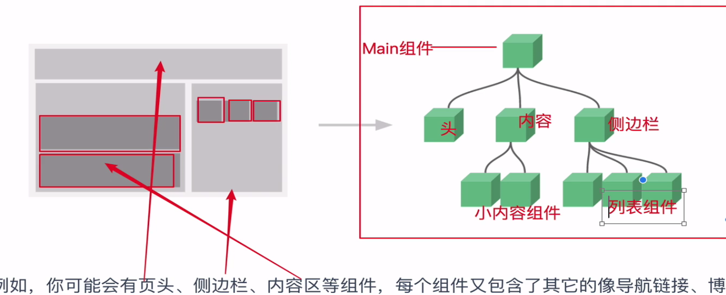
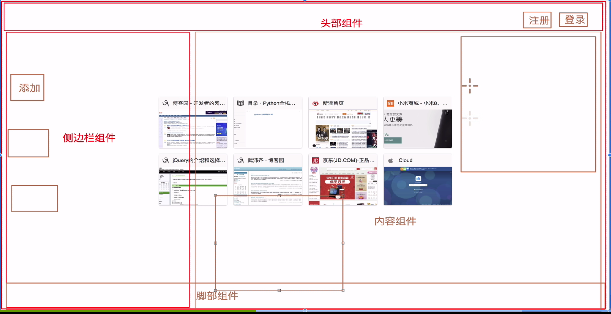
例如,你可能会有页头、侧边栏、内容区等组件,每个组件又包含了其它的像导航链接、博文之类的组件。
为了能在模板中使用,这些组件必须先注册以便 Vue 能够识别。这里有两种组件的注册类型:全局注册和局部注册。
1、vue中全局组件使用
通过 Vue.component 全局注册:
Vue.component('my-component-name', {
  // ... options ...
})
全局注册的组件可以用在其被注册之后的任何 (通过 new Vue) 新创建的 Vue 根实例,也包括其组件树中的所有子组件的模板中。
2、vue中局部组件的使用
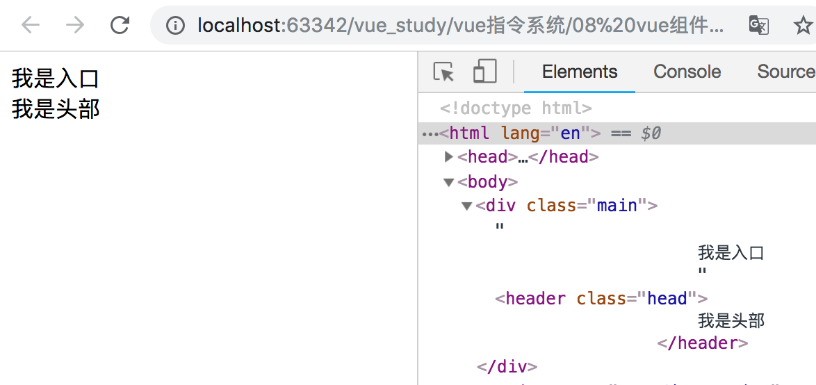
(1)局部组件简单示例
<body>
    <div id="app"></div>
    <script type="text/javascript" src="./node_modules/vue/dist/vue.js"></script>
    <script type="text/javascript">
        // 声明头部组件
        var Vheader = {
            template: `
                <header class="head">
                    我是头部
                </header>
            `
        };

        // 1.声明入口组件
        /*
            1.头部组件
            2.侧边栏
            3.内容组件
            4.脚本组件
         */
        var Vmain = {
            template: `
                <div class="main">
                    我是入口
                    <Vheader></Vheader>
                </div>
            `,
            components:{
                // 挂载子组件
                Vheader,   // 等价于Vheader:Vheader
            }
        };

        new Vue({
            el: '#app',
            // 3.使用子组件
            template: `<Vmain/>`,   // 单闭合
            data: {

            },
            components: {
                // 2.声明变量,挂载子组件
                Vmain: Vmain
            }
        });
    </script>
</body>
显示效果如下所示:
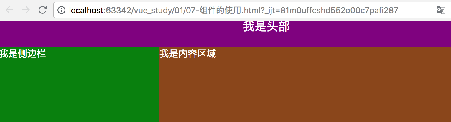
(2)局部组件复杂示例
注意:先声明子组件、再挂载子组件、最后使用子组件。
<head>
    <meta charset="UTF-8">
    <title>Title</title>
    <style type="text/css">
        * {
            padding: 0;
            margin: 0;
        }

        .main {
            width: 100%;
        }

        body {
            color: #fff;
        }

        .head {
            width: 100%;
            height: 70px;
            background-color: purple;
            text-align: center;
            font-size: 20px;
            line-height: 70px;
        }

        .wrap {
            width: 100%;
            height: 1200px;
        }

        .wrap .aside {
            width: 30%;
            height: 1200px;
            background-color:green;
            float: left;    /*侧边栏浮动*/
        }

        .wrap .content {
            width: 70%;
            height: 1200px;
            background-color: saddlebrown;
            float: left;    /*内容区浮动*/
        }
    </style>
</head>
<body>
    <div id="app">

    </div>
<script type="text/javascript" src="./vue.js"></script>
<script type="text/javascript">
    // 打油诗:先声子再挂子再用子
    var Vheader = {     // 先声明头部组件
        template:`
            <header class="head">
                我是头部
            </header>
        `
    };

    var Vaside = {     // 声明侧边栏组件
        template:`
            <div class="aside">
                我是侧边栏
            </div>
        `
    };

    var Vcontent = {     // 声明内容区组件
        template:`
            <div class="content">
                我是内容区域
            </div>
        `
    };

    // 第一步.声明入口组件
    /*
        1.头部组件
        2.侧边栏
        3.内容组件
        4.脚步组件
        以上组件分别挂载到入口组件里面去。
     */

    var Vmain = {       // 局部组件
        template:`
            <div class='main'>
                <Vheader></Vheader>
                <div class="wrap">
                    <Vaside/>
                    <Vcontent/>
                </div>
            </div>
        `,
        components:{
            // 等价于Vheader:Vheader,当两个词一模一样时可以这样简写:
            Vheader,     // 挂载子组件:头部组件
            Vaside,      // 挂载子组件:侧边栏组件
            Vcontent
        }
    };

    new Vue({
        el:"#app",   // 注意一个vue里面只有一个el
        //第三步.使用子组件
        template:"<Vmain></Vmain>",
        data: {

        },
        components:{
            //第二步.声明变量,挂载子组件  key表示组件名  value表示组件对象
            Vmain:Vmain
        }
    });
</script>
</body>
组件是可复用的Vue实例,并且带有一个名字:在这个例子中是 <Vheader>。我们可以在一个通过 new Vue 创建的 Vue 根实例中,把这个组件作为自定义元素来使用。
显示效果如下:
3、组件使用的总结
组件使用打油诗:1.声子 2.挂子 3.用子。
<!-- 1.声子 -->
var App = {
    template:`
        <div class='app'></div>
    `
};

<!-- 2.挂子 -->
new Vue({
    el:"#app",
    template:"<App/>"
    components:{
        App
    }
})
三、通过Prop向子组件传递数据
Prop 是你可以在子组件上注册的一些自定义特性。当一个值传递给一个 prop 特性的时候,它就变成了那个组件实例的一个属性。那么就可以像访问data中的值一样来访问。
为了给博文组件传递一个标题,我们可以用一个 props 选项将其包含在该组件可接受的 prop 列表中:
// 全局组件
Vue.component('blog-post', {
    props: ['title'],
    template: '<h3>{{ title }}</h3>'
})
一个组件默认可以拥有任意数量的 prop,任何值都可以传递给任何 prop。在上述模板中,你会发现我们能够在组件实例中访问这个值,就像访问 data 中的值一样。
一个 prop 被注册之后,你就可以像这样把数据作为一个自定义特性传递进来:
<blog-post title="My journey with Vue"></blog-post>
<blog-post title="Blogging with Vue"></blog-post>
<blog-post title="Why Vue is so fun"></blog-post>
1、向子组件传递数据示例
<script type="text/javascript">
var Vheader = { // 先声明头部组件
template:`
<header class="head">
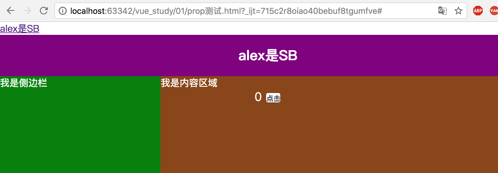
<h3>{{title}}</h3> // 模板语法渲染title
<span>{{count}}</span>
<button @click = 'count+=1'>点击</button>
</header>
`,
data(){
return {
count: 0
}
},
props:['title'], // props接收title
methods:{
}
};
var Vmain = { // 局部组件
template:`
<div class='main'>
<a href="#">{{title}}</a>
<Vheader v-bind:title = 'title'></Vheader>
<div class="wrap">
<Vaside/>
<Vcontent/>
</div>
</div>
`,
components:{
// 等价于Vheader:Vheader,当两个词一模一样时可以这样简写:
Vheader, // 挂载子组件:头部组件
Vaside, // 挂载子组件:侧边栏组件
Vcontent
},
props:['title'] // 自定义的属性
};
new Vue({
el:"#app", // 注意一个vue里面只有一个el
//第三步.使用子组件
template:"<Vmain v-bind:title='text'/>", // title是属性名,'text'是数据属性的名字
data: {
text:"alex是SB" // 在data中设置text,这是数据
},
components:{
//第二步.挂载子组件 key表示组件名 value表示组件对象
Vmain:Vmain
}
});
</script>
显示效果如下所示:
2、总结流程
(1)在子组件中自定义特性
props:['自定义的属性']
当一个值传递给一个prop特性的时候,它就变成了那个组件实例的一个属性,可以像访问data中的值一样。
(2)要在父组件中导入子组件内部
需要绑定自定义的属性<Vheader :title = '父组件中data声明的数据属性'/>
(3)注意
一个组件默认可以拥有任意数量的prop,任何值都可以传递任何prop。
在上述模板中,会发现我们能够在组件实例中访问这个值,就像访问data中的值一样。
3、父组件向子组件传递博客信息示例
<script type="text/javascript">
var Vcontent = { // 声明内容区组件
template:`
<div class="content">
<ul>
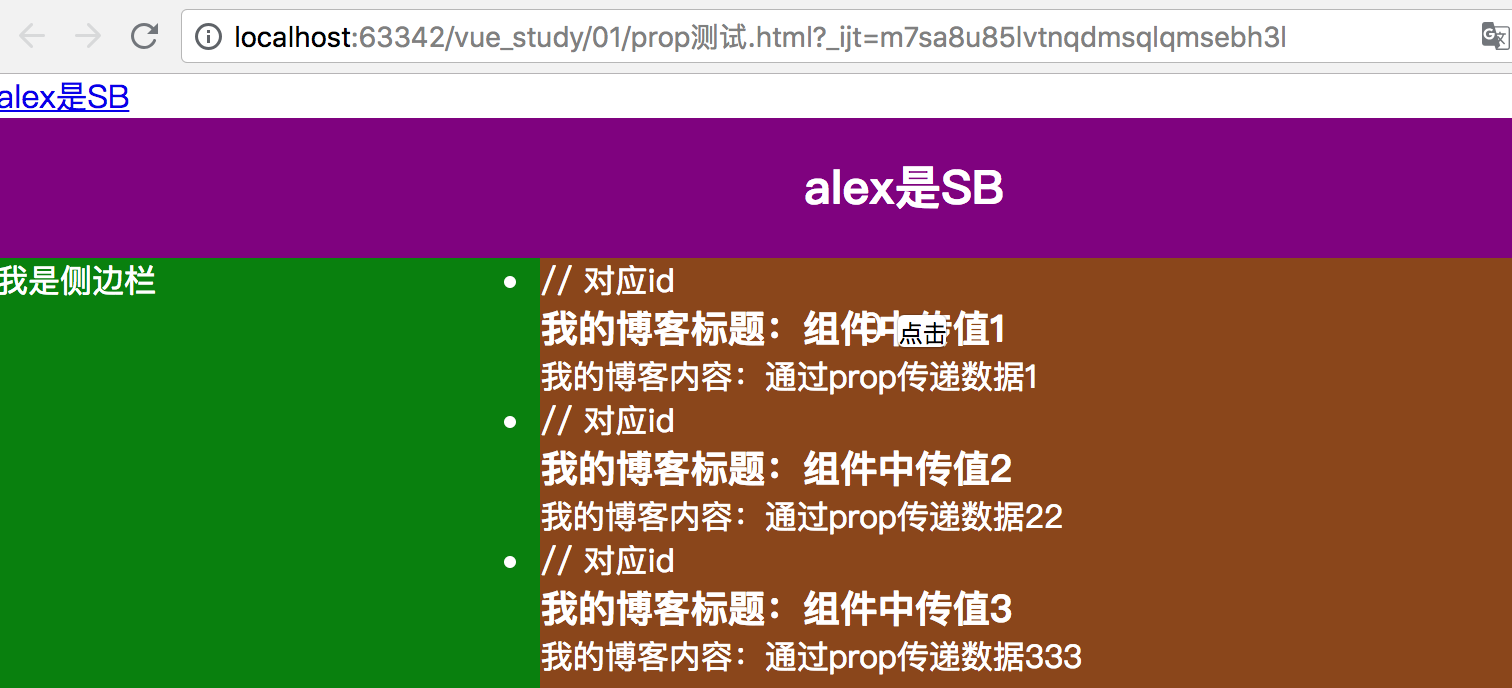
<li v-for="post in posts" :key="post.id"> // 对应id
<h3>我的博客标题:{{post.title}}</h3>
<p>我的博客内容:{{post.content}}</p>
</li>
</ul>
</div>
`,
props:['posts']
};
var Vmain = { // 局部组件
template:`
<div class='main'>
<a href="#">{{title}}</a>
<Vheader v-bind:title = 'title'></Vheader>
<div class="wrap">
<Vaside/>
<Vcontent v-bind:posts = 'appPosts' />
</div>
</div>
`,
components:{
// 等价于Vheader:Vheader,当两个词一模一样时可以这样简写:
Vheader, // 挂载子组件:头部组件
Vaside, // 挂载子组件:侧边栏组件
Vcontent
},
props:['title', 'appPosts']
};
new Vue({
el:"#app", // 注意一个vue里面只有一个el
//第三步.使用子组件
template:"<Vmain v-bind:title='text' :appPosts = 'posts'/>", // title对应属性名
data: {
text:"alex是SB",
posts:[
{id:1, title:"组件中传值1", content:"通过prop传递数据1"},
{id:2, title:"组件中传值2", content:"通过prop传递数据22"},
{id:3, title:"组件中传值3", content:"通过prop传递数据333"}
]
},
components:{
//第二步.挂载子组件 key表示组件名 value表示组件对象
Vmain:Vmain
}
});
</script>
显示效果:
四、子组件通过事件向父级组件发送消息
开发 <blog-post> 组件时,它的一些功能可能要求我们和父级组件进行沟通。例如我们可能会引入一个可访问性的功能来放大博文的字号,同时让页面的其它部分保持默认的字号。
在其父组件中,我们可以通过添加一个 postFontSize 数据属性来支持这个功能:
new Vue({
  el: '#blog-posts-events-demo',
  data: {
    posts: [/* ... */],
    postFontSize: 1
  }
})
它可以在模板中用来控制所有博文的字号:
<div id="blog-posts-events-demo">
  <div :style="{ fontSize: postFontSize + 'em' }">
    <blog-post
      v-for="post in posts"
      v-bind:key="post.id"
      v-bind:post="post"
    ></blog-post>
  </div>
</div>
在每篇文章正文前添加一个按钮来放大字号。
当点击这个按钮时,我们需要告诉父级组件放大所有博文的文本。幸好 Vue 实例提供了一个自定义事件的系统来解决这个问题。我们可以调用内建的 $emit 方法并传入事件的名字,来向父级组件触发一个事件:
Vue.component('blog-post', {
    props: ['post'],
    template: `
        <div class="blog-post">
            <h3>{{ post.title }}</h3>
            /*<button>
                Enlarge text
            </button>*/
            <button v-on:click="$emit('enlarge-text')">
                Enlarge text
            </button>
            <div v-html="post.content"></div>
        </div>
    `
})
1、通过自定义事件向父级组件发送消息示例
<script type="text/javascript">
var Vcontent = { // 声明内容区组件
template:`
<div class="content">
<ul>
<li v-for="post in posts" :key="post.id"> // 对应id
<h3>我的博客标题:{{post.title}}</h3>
<p>我的博客内容:{{post.content}}</p>
</li>
</ul>
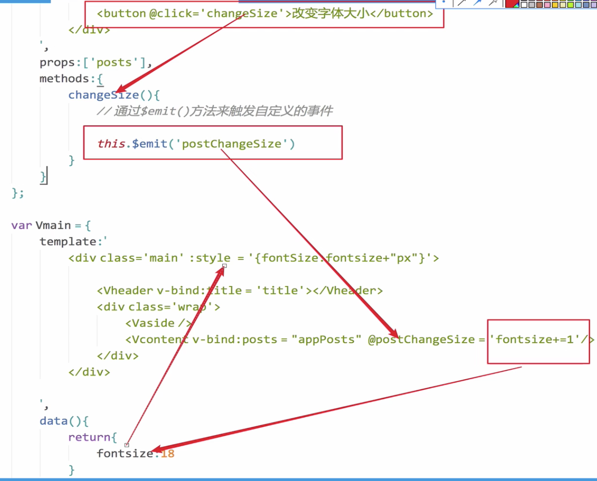
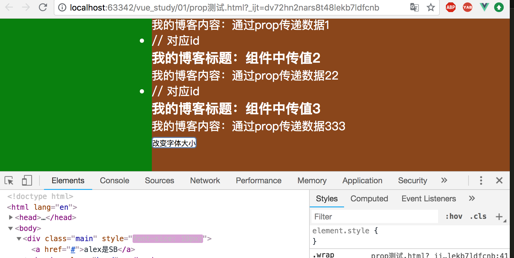
<button @click="changeSize">改变字体大小</button>
</div>
`,
props:['posts'],
methods:{ // 声明方法
changeSize(){
// 通过$emit()方法传入事件名字,来触发自定义的事件
this.$emit('postChangeSize')
}
}
};
var Vmain = { // 局部组件
template:`
<div class='main' :style="{fontSize:fontsize+'px'}">
<a href="#">{{title}}</a>
<Vheader v-bind:title = 'title'></Vheader>
<div class="wrap">
<Vaside/>
<Vcontent v-bind:posts = 'appPosts' @postChangeSize="fontsize+=1" /> // 绑定自定义属性和自定义事件
</div>
</div>
`,
data(){
return {
fontsize:14 // 默认字体大小为14
}
},
components:{
// 等价于Vheader:Vheader,当两个词一模一样时可以这样简写:
Vheader, // 挂载子组件:头部组件
Vaside, // 挂载子组件:侧边栏组件
Vcontent
},
props:['title', 'appPosts']
};
new Vue({...)};
</script>
通过点击按钮可以不断修改字体大小,具体驱动流程如下所示:
页面显示效果如下所示:
2、利用$emit第二个参数传值修改示例如下
$emit第一个参数是自定义的事件名字,第二个参数就是传递的值。
    var Vcontent = {     // 声明内容区组件
        template:`
            <div class="content">
                <ul>
                    <li v-for="post in posts" :key="post.id">   // 对应id
                        <h3>我的博客标题:{{post.title}}</h3>
                        <p>我的博客内容:{{post.content}}</p>
                    </li>
                </ul>
                <button @click="changeSize">改变字体大小</button>
            </div>
        `,
        props:['posts'],
        methods:{   // 声明方法
            changeSize(){
                // 通过$emit()方法来触发自定义的事件
                // 第一个参数是自定义的事件名字;第二个参数就是传递的值。
          // this指的是vue实例化对象的子类
                this.$emit('postChangeSize', 1)
            }
        }
    };

    var Vmain = {       // 局部组件
        template:`
            <div class='main' :style="{fontSize:fontsize+'px'}">
                <a href="#">{{title}}</a>
                <Vheader v-bind:title = 'title'></Vheader>
                <div class="wrap">
                    <Vaside/>
                    <Vcontent v-bind:posts = 'appPosts' @postChangeSize="clickHandler" />    // 绑定自定义属性和自定义事件
                </div>
            </div>
        `,
        methods:{
            clickHandler(value){
                this.fontsize += this.fontsize+1;
            }
        },
        data(){
            return {
                fontsize:14   // 默认字体大小为14
            }
        },
        components:{
            // 等价于Vheader:Vheader,当两个词一模一样时可以这样简写:
            Vheader,     // 挂载子组件:头部组件
            Vaside,      // 挂载子组件:侧边栏组件
            Vcontent
        },
        props:['title', 'appPosts']
    };
组件传值是vue中最重要的知识点。
3、从子组件传递数据到父组件总结
(1)给子组件中的某个按钮绑定原生事件,可以调用内建方法this.$emit('自定义事件名','传递的数据'),来向父级组件触发一个自定义的事件。
(2)在父组件中的子组件标签中要绑定自定义的事件。
五、全局组件(公共组件)的创建和使用
全局注册的组件可以用在其被注册之后的任何(通过 new Vue)新创建的 Vue 根实例,也包括其组件树中的所有子组件的模板中。
1、公共组件示例
<!DOCTYPE html>
<html lang="en">
<head>
<meta charset="UTF-8">
<title>Title</title>
<style>
* {
padding:0;
margin:0;
}
#head {
width: 100%;
height: 80px;
background-color: purple;
}
</style>
</head>
<body>
<div id="app"></div>
<script type="text/javascript" src="./node_modules/vue/dist/vue.min.js"></script>
<script type="text/javascript">
// 创建公共组件
// 第一个参数是公共组件的名字;第二个参数options(与局部组件相同)
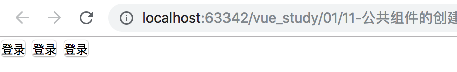
Vue.component('Vbtn', {
template:`<button>登录</button>`
});
var Vheader = { // 这里使用Vheader的缘故是,html5中有header标签
template:`<div id="header">
<Vbtn></Vbtn>
<Vbtn></Vbtn>
<Vbtn></Vbtn>
</div>`
};
// 局部组件的使用
var App = {
template:`<div>
<Vheader></Vheader>
</div>`,
components: {
Vheader
}
};
new Vue({
el: '#app',
data(){ // 组件中一定是函数
},
template:'<App/>', // 注意一定是闭合标签
components: {
App // App组件
}
})
</script>
</body>
</html>
页面显示效果如下:
2、公共组件使用总结
全局组件的使用:
Vue.component('全局组件的名称', {
    跟new.Vue()实例化对象中的options是一样的,但是要注意是:
    不管是公共组件还是局部组件,data必须是一个函数,函数一定要有返回值(哪怕是一个空对象{})
})
六、内置组件slot(插槽)的用法
Vue 实现了一套内容分发的 API,这套 API 基于当前的 Web Components 规范草案,将 <slot> 元素作为承载分发内容的出口。
1、修改上面公共组件实例,实现内容分发
<head>代码省略</head>
<body>
<div id="app"></div>
<script type="text/javascript" src="./vue.js"></script>
<script type="text/javascript">
// 创建公共组件
// 第一个参数是公共组件的名字;第二个参数options
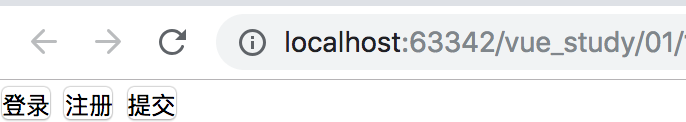
Vue.component('Vbtn', {
template:`<button>
<slot></slot>
</button>`
});
var Vheader = { // 这里使用Vheader的缘故是,html5中有header标签
template:`<div id="header">
<Vbtn>登录</Vbtn>
<Vbtn>注册</Vbtn>
<Vbtn>提交</Vbtn>
</div>`
};
"""代码省略"""
</script>
</body>
</html>
如果不使用slot,像上面这么在模板中添加不同的信息是不显示的。使用vue内置组件slot后显示效果如下:
2、封装按钮添加样式
<script type="text/javascript">
    // 创建公共组件
    // 第一个参数是公共组件的名字;第二个参数options
    Vue.component('Vbtn', {
        template: `<button class="default" :class="type">
                <slot></slot>
            </button>`,
        props: ['type']
    });


    var Vheader = {   // 这里使用Vheader的缘故是,html5中有header标签
        template: `<div id="header">
                <Vbtn>登录</Vbtn>
                <Vbtn>注册</Vbtn>
                <Vbtn>提交</Vbtn>
                <Vbtn>默认按钮</Vbtn>
                <Vbtn type="primary">主要按钮</Vbtn>
                <Vbtn type="success">成功按钮</Vbtn>
           </div>`
    };

    """代码省略"""
</script>
(1)给按钮绑定class
这里应用了vue的v-bind:class来给每个标签元素添加class。
props:一个 prop 被注册之后,可以把数据作为一个自定义特性传递进来。
因此在“<Vbtn type="success">成功按钮</Vbtn> ”,中给type定义了一个属性,通过props组件传值传递到公共组件中,由此就可以对网页中所有的按钮进行一个修饰。
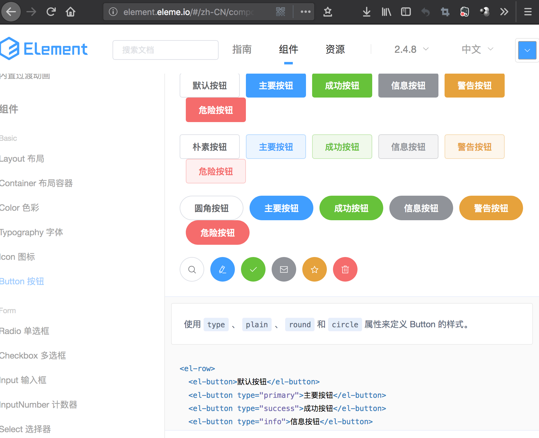
(2)使用elementUI,调整按钮样式
Element - 网站快速成型工具:http://element-cn.eleme.io/#/zh-CN
添加css代码如下所示:
    <style>
        * {
            padding: 0;
            margin: 0;
        }

        #head {
            width: 100%;
            height: 80px;
            background-color: purple;
        }

        button {
            display: inline-block;
            line-height: 1;
            white-space: nowrap;
            cursor: pointer;
            background: #fff;
            border: 1px solid #dcdfe6;
            border-top-color: rgb(220, 223, 230);
            border-right-color: rgb(220, 223, 230);
            border-bottom-color: rgb(220, 223, 230);
            border-left-color: rgb(220, 223, 230);
            border-color: #dcdfe6;
            color: #606266;
            text-align: center;
            box-sizing: border-box;
            outline: none;
            margin: 0;
            transition: .1s;
            font-weight: 500;
            padding: 12px 20px;
            font-size: 14px;
            border-radius: 4px;
        }

        .primary {
            color: #fff;
            background-color: #409eff;
            border-color: #409eff;
        }

        .success {
            color: #fff;
            background-color: #67c23a;
            border-color: #67c23a;
        }
    </style>
(3)显示效果如下所示


 浙公网安备 33010602011771号