


Seaborn结构化图形绘制(FacetGrid)
结构化图形绘制(FacetGrid)
可实现多行多列个性化绘制图形。
sns.FacetGrid(
    data,
    row=None,
    col=None,
    hue=None,
    col_wrap=None,
    sharex=True,
    sharey=True,
    height=3,
    aspect=1,
    palette=None,
    row_order=None,
    col_order=None,
    hue_order=None,
    hue_kws=None,
    dropna=True,
    legend_out=True,
    despine=True,
    margin_titles=False,
    xlim=None,
    ylim=None,
    subplot_kws=None,
    gridspec_kws=None,
    size=None,
)
Docstring:      Multi-plot grid for plotting conditional relationships.
Init docstring:
Initialize the matplotlib figure and FacetGrid object.

This class maps a dataset onto multiple axes arrayed in a grid of rows
and columns that correspond to *levels* of variables in the dataset.
The plots it produces are often called "lattice", "trellis", or
"small-multiple" graphics.

It can also represent levels of a third varaible with the ``hue``
parameter, which plots different subets of data in different colors.
This uses color to resolve elements on a third dimension, but only
draws subsets on top of each other and will not tailor the ``hue``
parameter for the specific visualization the way that axes-level
functions that accept ``hue`` will.

When using seaborn functions that infer semantic mappings from a
dataset, care must be taken to synchronize those mappings across
facets. In most cases, it will be better to use a figure-level function
(e.g. :func:`relplot` or :func:`catplot`) than to use
:class:`FacetGrid` directly.

The basic workflow is to initialize the :class:`FacetGrid` object with
the dataset and the variables that are used to structure the grid. Then
one or more plotting functions can be applied to each subset by calling
:meth:`FacetGrid.map` or :meth:`FacetGrid.map_dataframe`. Finally, the
plot can be tweaked with other methods to do things like change the
axis labels, use different ticks, or add a legend. See the detailed
code examples below for more information.

See the :ref:`tutorial <grid_tutorial>` for more information.

Parameters
----------
data : DataFrame
    Tidy ("long-form") dataframe where each column is a variable and each
    row is an observation.
row, col, hue : strings
    Variables that define subsets of the data, which will be drawn on
    separate facets in the grid. See the ``*_order`` parameters to
    control the order of levels of this variable.
col_wrap : int, optional
    "Wrap" the column variable at this width, so that the column facets
    span multiple rows. Incompatible with a ``row`` facet.
share{x,y} : bool, 'col', or 'row' optional
    If true, the facets will share y axes across columns and/or x axes
    across rows.
height : scalar, optional
    Height (in inches) of each facet. See also: ``aspect``.
aspect : scalar, optional
    Aspect ratio of each facet, so that ``aspect * height`` gives the width
    of each facet in inches.
palette : palette name, list, or dict, optional
    Colors to use for the different levels of the ``hue`` variable. Should
    be something that can be interpreted by :func:`color_palette`, or a
    dictionary mapping hue levels to matplotlib colors.
{row,col,hue}_order : lists, optional
    Order for the levels of the faceting variables. By default, this
    will be the order that the levels appear in ``data`` or, if the
    variables are pandas categoricals, the category order.
hue_kws : dictionary of param -> list of values mapping
    Other keyword arguments to insert into the plotting call to let
    other plot attributes vary across levels of the hue variable (e.g.
    the markers in a scatterplot).
legend_out : bool, optional
    If ``True``, the figure size will be extended, and the legend will be
    drawn outside the plot on the center right.
despine : boolean, optional
    Remove the top and right spines from the plots.
margin_titles : bool, optional
    If ``True``, the titles for the row variable are drawn to the right of
    the last column. This option is experimental and may not work in all
    cases.
{x, y}lim: tuples, optional
    Limits for each of the axes on each facet (only relevant when
    share{x, y} is True.
subplot_kws : dict, optional
    Dictionary of keyword arguments passed to matplotlib subplot(s)
    methods.
gridspec_kws : dict, optional
    Dictionary of keyword arguments passed to matplotlib's ``gridspec``
    module (via ``plt.subplots``). Requires matplotlib >= 1.4 and is
    ignored if ``col_wrap`` is not ``None``.

See Also
--------
PairGrid : Subplot grid for plotting pairwise relationships.
relplot : Combine a relational plot and a :class:`FacetGrid`.
catplot : Combine a categorical plot and a :class:`FacetGrid`.
lmplot : Combine a regression plot and a :class:`FacetGrid`.
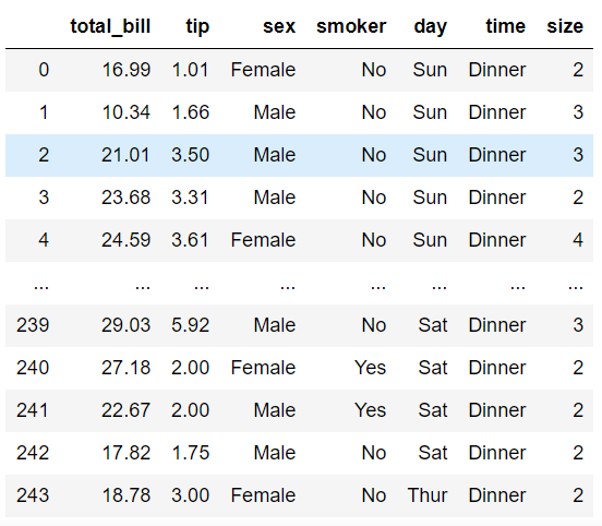
#导入数据
tips = sns.load_dataset('tips', data_home='./seaborn-data')
tips
#设置风格
sns.set_style('white')
#col设置网格的分类列,row设置分类行
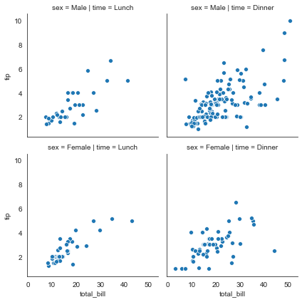
ax = sns.FacetGrid(tips, col='time', row='sex')
散点图
ax = sns.FacetGrid(tips, col='time', row='sex')
#利用map方法在网格内绘制散点图sns.scatterplot = plt.scatter,sns的散点图更美观
ax = ax.map(sns.scatterplot, 'total_bill', 'tip')
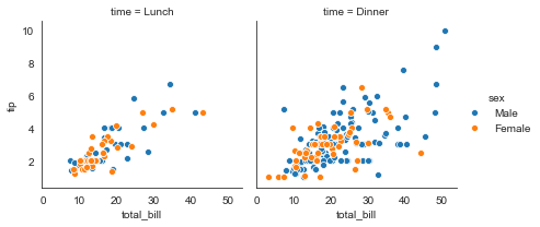
#hue设置分类绘制
ax = sns.FacetGrid(tips, col='time', hue='sex')
ax = ax.map(sns.scatterplot, 'total_bill', 'tip')
#添加图例
ax = ax.add_legend()
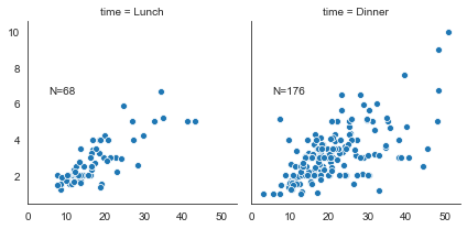
#定义一个文本函数
def annotate(data, **kws):
    n = len(data)
    ax = plt.gca()
    ax.text(.1, .6, f"N={n}", transform=ax.transAxes)

ax = sns.FacetGrid(tips, col='time')
ax = ax.map(sns.scatterplot, 'total_bill', 'tip')
#添加文本标签
ax = ax.map_dataframe(annotate)
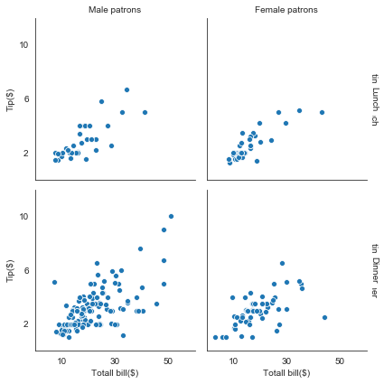
#其它参数
#margin_titles设置边缘标头
ax = sns.FacetGrid(tips, col='sex', row='time', margin_titles=True)
ax.map(sns.scatterplot, 'total_bill', 'tip')
#set_axis_labels设置x轴和y轴标签
ax.set_axis_labels('Totall bill($)', 'Tip($)')
#set_titles设置标头(会出现重叠现象)
ax.set_titles(col_template='{col_name} patrons', row_template='{row_name}')
#坐标上下限和刻度设置
ax.set(xlim=(0,60), ylim=(0, 12), xticks=[10, 30, 50], yticks=[2, 6, 10])
#存储图片
ax.savefig('facet_plot.png')
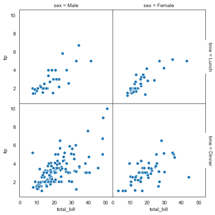
#despine设置是否显示上和右边框线
ax = sns.FacetGrid(tips, col='sex', row='time', margin_titles=True, despine=False)
ax.map(sns.scatterplot, 'total_bill', 'tip')
#设置图形间隔
ax.fig.subplots_adjust(wspace=0, hspace=0)
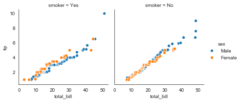
#QQ图:检验样本数据概率分布(例如正态分布)的方法,直观的表示观测值与预测值之间的差异,或两个数之间的差异
from scipy import stats
#定义QQ图函数
def qqplot(x, y, **kwargs):
    _, xr = stats.probplot(x, fit=False)         #拟合概率图
    _, yr = stats.probplot(y, fit=False)
    sns.scatterplot(xr, yr, **kwargs)            #**kwargs表示关键字参数,可以用字典形式传入参数

g = sns.FacetGrid(tips, col='smoker', hue='sex')
g = g.map(qqplot, 'total_bill', 'tip')
g = g.add_legend()
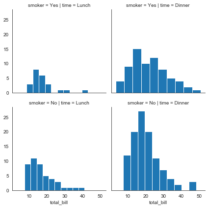
直方图
#直方图
g = sns.FacetGrid(tips, col='time', row='smoker')
g = g.map(plt.hist, 'total_bill')
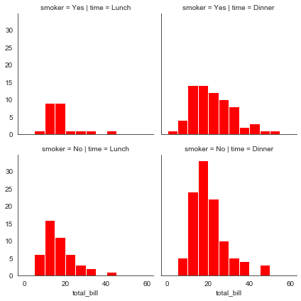
#bins设置直方图个数,color设置颜色
bins = np.arange(0, 65, 5)
g = sns.FacetGrid(tips, col='time', row='smoker')
g = g.map(plt.hist, 'total_bill', bins=bins, color='r')
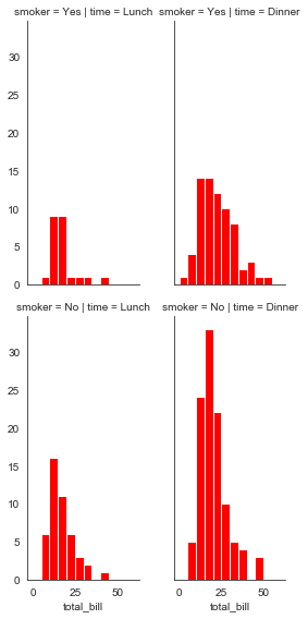
#height设置高度,aspece设宽高比
bins = np.arange(0, 65, 5)
g = sns.FacetGrid(tips, col='time', row='smoker', height=4, aspect=.5)
g = g.map(plt.hist, 'total_bill', bins=bins, color='r')
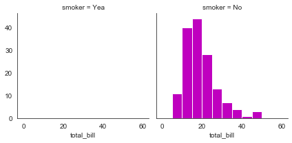
#col_order设置显示顺序
bins = np.arange(0, 65, 5)
g = sns.FacetGrid(tips, col='smoker', col_order=['Yea', 'No'])
g = g.map(plt.hist, 'total_bill', bins=bins, color='m')
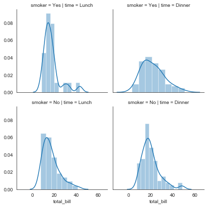
直方密度图
#直方密度图
g = sns.FacetGrid(tips, col='time', row='smoker')
g = g.map(sns.distplot, 'total_bill')
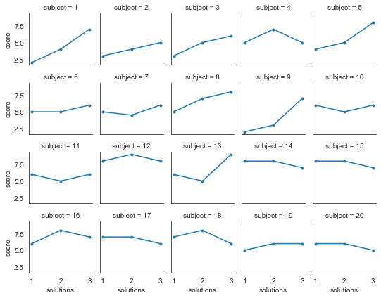
折线图
#导入数据
att = sns.load_dataset('attention', data_home='./seaborn-data')
#col_wrap设置列数,height设置高度,marker设置标记点样式
g = sns.FacetGrid(att, col='subject', col_wrap=5, height=1.5)
g = g.map(plt.plot, 'solutions', 'score', marker='.')


【推荐】国内首个AI IDE,深度理解中文开发场景,立即下载体验Trae
【推荐】编程新体验,更懂你的AI,立即体验豆包MarsCode编程助手
【推荐】抖音旗下AI助手豆包,你的智能百科全书,全免费不限次数
【推荐】轻量又高性能的 SSH 工具 IShell:AI 加持,快人一步
· 震惊!C++程序真的从main开始吗?99%的程序员都答错了
· 【硬核科普】Trae如何「偷看」你的代码?零基础破解AI编程运行原理
· 单元测试从入门到精通
· 上周热点回顾(3.3-3.9)
· winform 绘制太阳,地球,月球 运作规律