


Seaborn时间线图和热图
lineplot()
绘制与时间相关性的线图。
sns.lineplot(
    x=None,
    y=None,
    hue=None,
    size=None,
    style=None,
    data=None,
    palette=None,
    hue_order=None,
    hue_norm=None,
    sizes=None,
    size_order=None,
    size_norm=None,
    dashes=True,
    markers=None,
    style_order=None,
    units=None,
    estimator='mean',
    ci=95,
    n_boot=1000,
    sort=True,
    err_style='band',
    err_kws=None,
    legend='brief',
    ax=None,
    **kwargs,
)
Docstring:
Draw a line plot with possibility of several semantic groupings.

The relationship between ``x`` and ``y`` can be shown for different subsets
of the data using the ``hue``, ``size``, and ``style`` parameters. These
parameters control what visual semantics are used to identify the different
subsets. It is possible to show up to three dimensions independently by
using all three semantic types, but this style of plot can be hard to
interpret and is often ineffective. Using redundant semantics (i.e. both
``hue`` and ``style`` for the same variable) can be helpful for making
graphics more accessible.

See the :ref:`tutorial <relational_tutorial>` for more information.

By default, the plot aggregates over multiple ``y`` values at each value of
``x`` and shows an estimate of the central tendency and a confidence
interval for that estimate.

Parameters
----------
x, y : names of variables in ``data`` or vector data, optional
    Input data variables; must be numeric. Can pass data directly or
    reference columns in ``data``.
hue : name of variables in ``data`` or vector data, optional
    Grouping variable that will produce lines with different colors.
    Can be either categorical or numeric, although color mapping will
    behave differently in latter case.
size : name of variables in ``data`` or vector data, optional
    Grouping variable that will produce lines with different widths.
    Can be either categorical or numeric, although size mapping will
    behave differently in latter case.
style : name of variables in ``data`` or vector data, optional
    Grouping variable that will produce lines with different dashes
    and/or markers. Can have a numeric dtype but will always be treated
    as categorical.
data : DataFrame
    Tidy ("long-form") dataframe where each column is a variable and each
    row is an observation.
palette : palette name, list, or dict, optional
    Colors to use for the different levels of the ``hue`` variable. Should
    be something that can be interpreted by :func:`color_palette`, or a
    dictionary mapping hue levels to matplotlib colors.
hue_order : list, optional
    Specified order for the appearance of the ``hue`` variable levels,
    otherwise they are determined from the data. Not relevant when the
    ``hue`` variable is numeric.
hue_norm : tuple or Normalize object, optional
    Normalization in data units for colormap applied to the ``hue``
    variable when it is numeric. Not relevant if it is categorical.
sizes : list, dict, or tuple, optional
    An object that determines how sizes are chosen when ``size`` is used.
    It can always be a list of size values or a dict mapping levels of the
    ``size`` variable to sizes. When ``size``  is numeric, it can also be
    a tuple specifying the minimum and maximum size to use such that other
    values are normalized within this range.
size_order : list, optional
    Specified order for appearance of the ``size`` variable levels,
    otherwise they are determined from the data. Not relevant when the
    ``size`` variable is numeric.
size_norm : tuple or Normalize object, optional
    Normalization in data units for scaling plot objects when the
    ``size`` variable is numeric.
dashes : boolean, list, or dictionary, optional
    Object determining how to draw the lines for different levels of the
    ``style`` variable. Setting to ``True`` will use default dash codes, or
    you can pass a list of dash codes or a dictionary mapping levels of the
    ``style`` variable to dash codes. Setting to ``False`` will use solid
    lines for all subsets. Dashes are specified as in matplotlib: a tuple
    of ``(segment, gap)`` lengths, or an empty string to draw a solid line.
markers : boolean, list, or dictionary, optional
    Object determining how to draw the markers for different levels of the
    ``style`` variable. Setting to ``True`` will use default markers, or
    you can pass a list of markers or a dictionary mapping levels of the
    ``style`` variable to markers. Setting to ``False`` will draw
    marker-less lines.  Markers are specified as in matplotlib.
style_order : list, optional
    Specified order for appearance of the ``style`` variable levels
    otherwise they are determined from the data. Not relevant when the
    ``style`` variable is numeric.
units : {long_form_var}
    Grouping variable identifying sampling units. When used, a separate
    line will be drawn for each unit with appropriate semantics, but no
    legend entry will be added. Useful for showing distribution of
    experimental replicates when exact identities are not needed.

estimator : name of pandas method or callable or None, optional
    Method for aggregating across multiple observations of the ``y``
    variable at the same ``x`` level. If ``None``, all observations will
    be drawn.
ci : int or "sd" or None, optional
    Size of the confidence interval to draw when aggregating with an
    estimator. "sd" means to draw the standard deviation of the data.
    Setting to ``None`` will skip bootstrapping.
n_boot : int, optional
    Number of bootstraps to use for computing the confidence interval.
sort : boolean, optional
    If True, the data will be sorted by the x and y variables, otherwise
    lines will connect points in the order they appear in the dataset.
err_style : "band" or "bars", optional
    Whether to draw the confidence intervals with translucent error bands
    or discrete error bars.
err_band : dict of keyword arguments
    Additional paramters to control the aesthetics of the error bars. The
    kwargs are passed either to ``ax.fill_between`` or ``ax.errorbar``,
    depending on the ``err_style``.
legend : "brief", "full", or False, optional
    How to draw the legend. If "brief", numeric ``hue`` and ``size``
    variables will be represented with a sample of evenly spaced values.
    If "full", every group will get an entry in the legend. If ``False``,
    no legend data is added and no legend is drawn.
ax : matplotlib Axes, optional
    Axes object to draw the plot onto, otherwise uses the current Axes.
kwargs : key, value mappings
    Other keyword arguments are passed down to ``plt.plot`` at draw time.

Returns
-------
ax : matplotlib Axes
    Returns the Axes object with the plot drawn onto it.

See Also
--------
scatterplot : Show the relationship between two variables without
              emphasizing continuity of the ``x`` variable.
pointplot : Show the relationship between two variables when one is
            categorical.
#设置风格
sns.set_style('whitegrid')
#导入数据
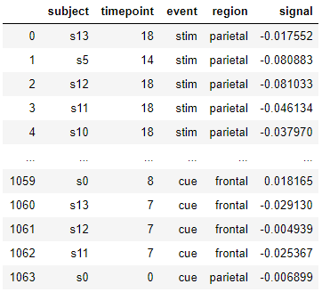
fmri = sns.load_dataset("fmri" , data_home='seaborn-data')
fmri
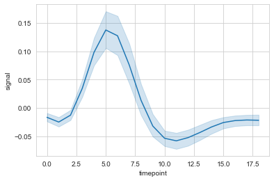
#时间线图
ax = sns.lineplot(data=fmri, x="timepoint", y="signal")
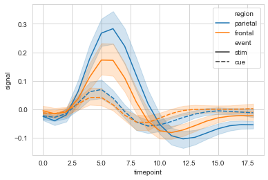
#hue设置分类
ax = sns.lineplot(data=fmri, x="timepoint", y="signal", hue="region")

#style使用线性进行再分类
ax = sns.lineplot(data=fmri, x="timepoint", y="signal", hue="region", style="event")
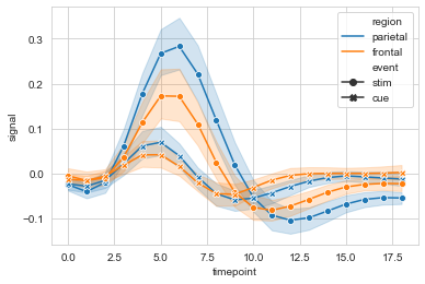
#markers设置是否显示散点,dashses设置是否显示虚线
sx = sns.lineplot(data=fmri, x="timepoint", y="signal",
             hue="region", style="event",
             markers=True, dashes=False
            )
#err_style设置误差线类型,默认band; ci设置置信区间,默认95%
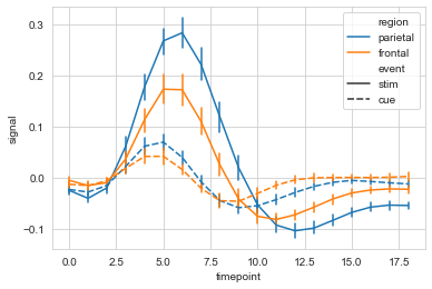
ax = sns.lineplot(data=fmri, x="timepoint", y="signal",
hue="region", style="event",
err_style='bars', ci=68
)
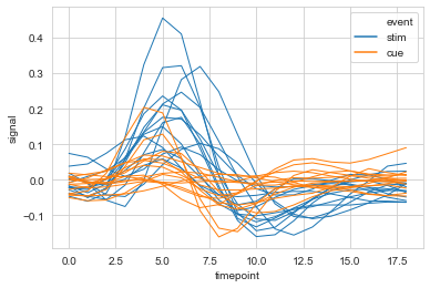
#选取部分数据,多条线显示
ax = sns.lineplot(data=fmri.query("region=='frontal'"),
                  x="timepoint", y='signal',
                  hue='event', units='subject',
                  estimator=None,lw=1
                 )
relplot()
用于分列绘制时间相关线图,relplot() = lineplot() + FaceGrid
sns.relplot(
    x=None,
    y=None,
    hue=None,
    size=None,
    style=None,
    data=None,
    row=None,
    col=None,
    col_wrap=None,
    row_order=None,
    col_order=None,
    palette=None,
    hue_order=None,
    hue_norm=None,
    sizes=None,
    size_order=None,
    size_norm=None,
    markers=None,
    dashes=None,
    style_order=None,
    legend='brief',
    kind='scatter',
    height=5,
    aspect=1,
    facet_kws=None,
    **kwargs,
)
Docstring:
Figure-level interface for drawing relational plots onto a FacetGrid.

This function provides access to several different axes-level functions
that show the relationship between two variables with semantic mappings
of subsets. The ``kind`` parameter selects the underlying axes-level
function to use:

- :func:`scatterplot` (with ``kind="scatter"``; the default)
- :func:`lineplot` (with ``kind="line"``)

Extra keyword arguments are passed to the underlying function, so you
should refer to the documentation for each to see kind-specific options.

The relationship between ``x`` and ``y`` can be shown for different subsets
of the data using the ``hue``, ``size``, and ``style`` parameters. These
parameters control what visual semantics are used to identify the different
subsets. It is possible to show up to three dimensions independently by
using all three semantic types, but this style of plot can be hard to
interpret and is often ineffective. Using redundant semantics (i.e. both
``hue`` and ``style`` for the same variable) can be helpful for making
graphics more accessible.

See the :ref:`tutorial <relational_tutorial>` for more information.

After plotting, the :class:`FacetGrid` with the plot is returned and can
be used directly to tweak supporting plot details or add other layers.

Note that, unlike when using the underlying plotting functions directly,
data must be passed in a long-form DataFrame with variables specified by
passing strings to ``x``, ``y``, and other parameters.

Parameters
----------
x, y : names of variables in ``data``
    Input data variables; must be numeric.
hue : name in ``data``, optional
    Grouping variable that will produce elements with different colors.
    Can be either categorical or numeric, although color mapping will
    behave differently in latter case.
size : name in ``data``, optional
    Grouping variable that will produce elements with different sizes.
    Can be either categorical or numeric, although size mapping will
    behave differently in latter case.
style : name in ``data``, optional
    Grouping variable that will produce elements with different styles.
    Can have a numeric dtype but will always be treated as categorical.
data : DataFrame
    Tidy ("long-form") dataframe where each column is a variable and each
    row is an observation.
row, col : names of variables in ``data``, optional
    Categorical variables that will determine the faceting of the grid.
col_wrap : int, optional
    "Wrap" the column variable at this width, so that the column facets
    span multiple rows. Incompatible with a ``row`` facet.
row_order, col_order : lists of strings, optional
    Order to organize the rows and/or columns of the grid in, otherwise the
    orders are inferred from the data objects.
palette : palette name, list, or dict, optional
    Colors to use for the different levels of the ``hue`` variable. Should
    be something that can be interpreted by :func:`color_palette`, or a
    dictionary mapping hue levels to matplotlib colors.
hue_order : list, optional
    Specified order for the appearance of the ``hue`` variable levels,
    otherwise they are determined from the data. Not relevant when the
    ``hue`` variable is numeric.
hue_norm : tuple or Normalize object, optional
    Normalization in data units for colormap applied to the ``hue``
    variable when it is numeric. Not relevant if it is categorical.
sizes : list, dict, or tuple, optional
    An object that determines how sizes are chosen when ``size`` is used.
    It can always be a list of size values or a dict mapping levels of the
    ``size`` variable to sizes. When ``size``  is numeric, it can also be
    a tuple specifying the minimum and maximum size to use such that other
    values are normalized within this range.
size_order : list, optional
    Specified order for appearance of the ``size`` variable levels,
    otherwise they are determined from the data. Not relevant when the
    ``size`` variable is numeric.
size_norm : tuple or Normalize object, optional
    Normalization in data units for scaling plot objects when the
    ``size`` variable is numeric.
legend : "brief", "full", or False, optional
    How to draw the legend. If "brief", numeric ``hue`` and ``size``
    variables will be represented with a sample of evenly spaced values.
    If "full", every group will get an entry in the legend. If ``False``,
    no legend data is added and no legend is drawn.
kind : string, optional
    Kind of plot to draw, corresponding to a seaborn relational plot.
    Options are {``scatter`` and ``line``}.
height : scalar, optional
    Height (in inches) of each facet. See also: ``aspect``.
aspect : scalar, optional
    Aspect ratio of each facet, so that ``aspect * height`` gives the width
    of each facet in inches.
facet_kws : dict, optional
    Dictionary of other keyword arguments to pass to :class:`FacetGrid`.
kwargs : key, value pairings
    Other keyword arguments are passed through to the underlying plotting
    function.

Returns
-------
g : :class:`FacetGrid`
    Returns the :class:`FacetGrid` object with the plot on it for further
    tweaking.
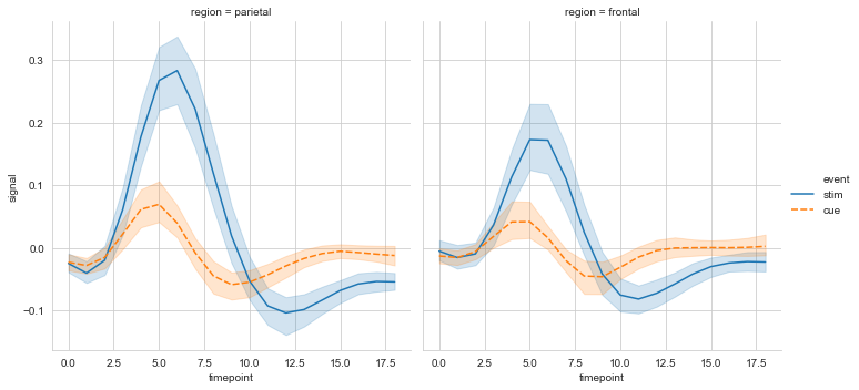
#col设置分栏绘制
ax = sns.relplot(data=fmri, x='timepoint', y='signal',
                 col='region', hue='event', style='event',
                 kind='line'
                )
heatmap()
用于绘制热点图。
sns.heatmap(
    data,
    vmin=None,
    vmax=None,
    cmap=None,
    center=None,
    robust=False,
    annot=None,
    fmt='.2g',
    annot_kws=None,
    linewidths=0,
    linecolor='white',
    cbar=True,
    cbar_kws=None,
    cbar_ax=None,
    square=False,
    xticklabels='auto',
    yticklabels='auto',
    mask=None,
    ax=None,
    **kwargs,
)
Docstring:
Plot rectangular data as a color-encoded matrix.

This is an Axes-level function and will draw the heatmap into the
currently-active Axes if none is provided to the ``ax`` argument.  Part of
this Axes space will be taken and used to plot a colormap, unless ``cbar``
is False or a separate Axes is provided to ``cbar_ax``.

Parameters
----------
data : rectangular dataset
    2D dataset that can be coerced into an ndarray. If a Pandas DataFrame
    is provided, the index/column information will be used to label the
    columns and rows.
vmin, vmax : floats, optional
    Values to anchor the colormap, otherwise they are inferred from the
    data and other keyword arguments.
cmap : matplotlib colormap name or object, or list of colors, optional
    The mapping from data values to color space. If not provided, the
    default will depend on whether ``center`` is set.
center : float, optional
    The value at which to center the colormap when plotting divergant data.
    Using this parameter will change the default ``cmap`` if none is
    specified.
robust : bool, optional
    If True and ``vmin`` or ``vmax`` are absent, the colormap range is
    computed with robust quantiles instead of the extreme values.
annot : bool or rectangular dataset, optional
    If True, write the data value in each cell. If an array-like with the
    same shape as ``data``, then use this to annotate the heatmap instead
    of the raw data.
fmt : string, optional
    String formatting code to use when adding annotations.
annot_kws : dict of key, value mappings, optional
    Keyword arguments for ``ax.text`` when ``annot`` is True.
linewidths : float, optional
    Width of the lines that will divide each cell.
linecolor : color, optional
    Color of the lines that will divide each cell.
cbar : boolean, optional
    Whether to draw a colorbar.
cbar_kws : dict of key, value mappings, optional
    Keyword arguments for `fig.colorbar`.
cbar_ax : matplotlib Axes, optional
    Axes in which to draw the colorbar, otherwise take space from the
    main Axes.
square : boolean, optional
    If True, set the Axes aspect to "equal" so each cell will be
    square-shaped.
xticklabels, yticklabels : "auto", bool, list-like, or int, optional
    If True, plot the column names of the dataframe. If False, don't plot
    the column names. If list-like, plot these alternate labels as the
    xticklabels. If an integer, use the column names but plot only every
    n label. If "auto", try to densely plot non-overlapping labels.
mask : boolean array or DataFrame, optional
    If passed, data will not be shown in cells where ``mask`` is True.
    Cells with missing values are automatically masked.
ax : matplotlib Axes, optional
    Axes in which to draw the plot, otherwise use the currently-active
    Axes.
kwargs : other keyword arguments
    All other keyword arguments are passed to ``ax.pcolormesh``.

Returns
-------
ax : matplotlib Axes
    Axes object with the heatmap.

See also
--------
clustermap : Plot a matrix using hierachical clustering to arrange the
             rows and columns.
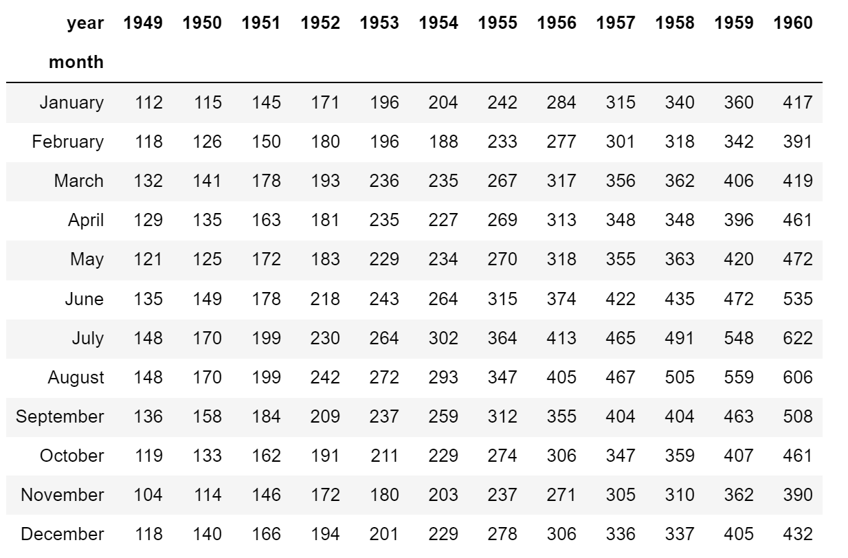
# 导入数据
flights = sns.load_dataset('flights', data_home='seaborn-data')
flights = flights.pivot('month', 'year', 'passengers')
flights
#简易热图
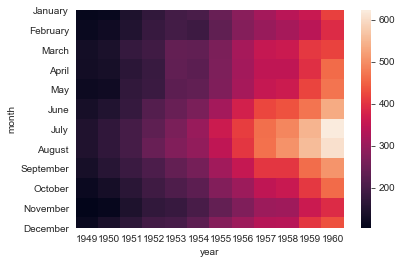
ax = sns.heatmap(flights)
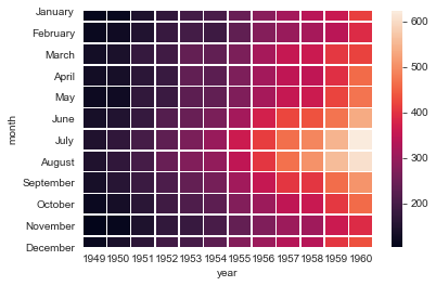
#linewidths设置线宽
ax = sns.heatmap(flights, linewidth=.5)
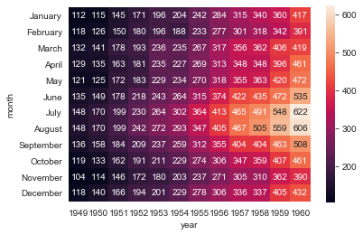
#annot设置是否显示数据,fmt设置数据显示的格式
ax = sns.heatmap(flights, annot=True, fmt='d')
#解决上下两行显示不全
ax = ax.set_ylim(len(flights)+0.1, -0.1)
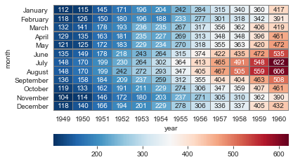
#cmap设置调色板,linewidths设置方格间隔, linecolor设置间隔线颜色, cbar_kws设置颜色条参数
ax = sns.heatmap(flights, annot=True, fmt='d', cmap='RdBu_r',
                 linewidths=0.3, linecolor='grey',
                 cbar_kws={'orientation': 'horizontal'}
                )
ax = ax.set_ylim(len(flights)+0.1, -0.1)
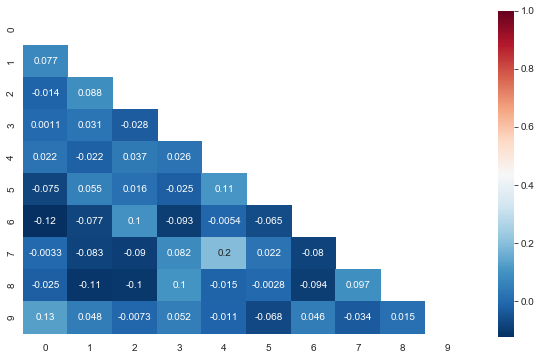
三角热力图
#布尔矩阵热图,若为矩阵内为True,则热力图相应的位置的数据将会被屏蔽掉(常用在绘制相关系数矩阵图)
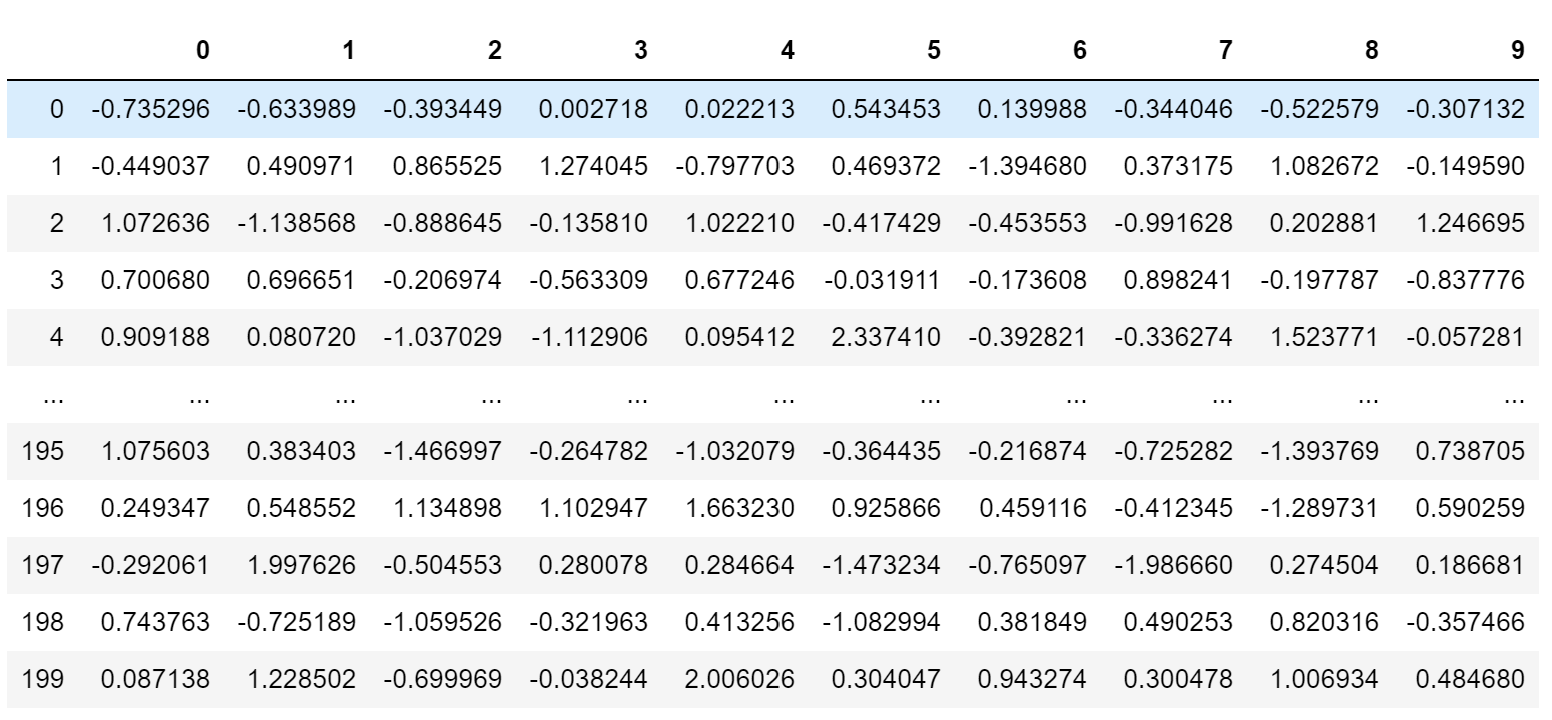
data_new = np.random.randn(200, 10)
pd.DataFrame(data_new)
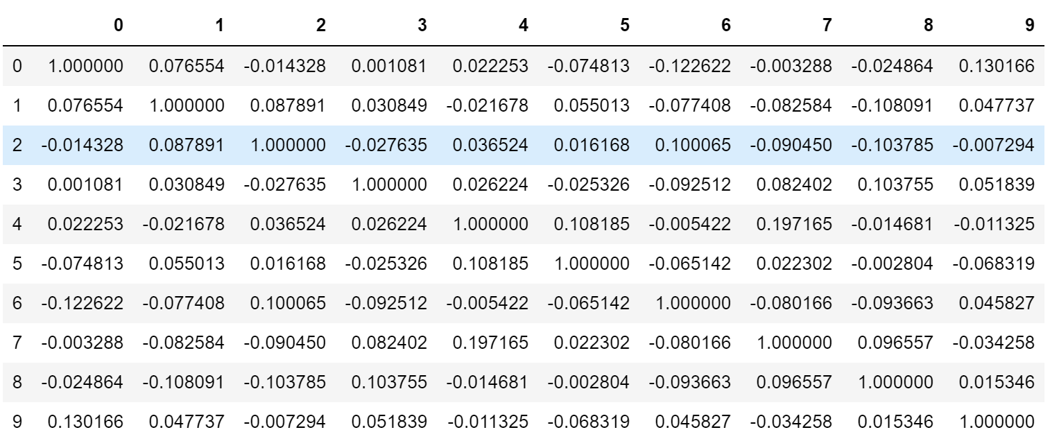
#相关系数矩阵(对称矩阵)
corr = np.corrcoef(data_new, rowvar=False)
pd.DataFrame(corr)
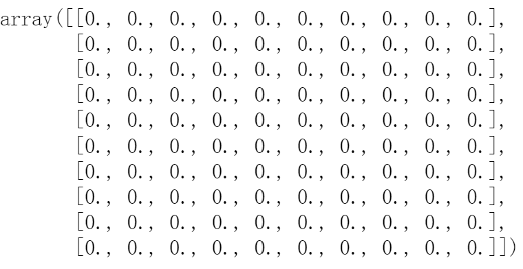
#以corr的形状生成一个零矩阵
mask = np.zeros_like(corr)
mask
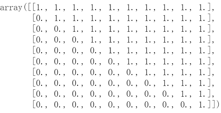
#设置mask对角线以上为True
mask[np.triu_indices_from(mask)] = True
mask
#绘制对称矩阵数据的热图
plt.figure(figsize=(10,6))
ax = sns.heatmap(corr, mask=mask, annot=True, cmap='RdBu_r')
ax.set_ylim(len(corr)+0.1, -0.1)


【推荐】国内首个AI IDE,深度理解中文开发场景,立即下载体验Trae
【推荐】编程新体验,更懂你的AI,立即体验豆包MarsCode编程助手
【推荐】抖音旗下AI助手豆包,你的智能百科全书,全免费不限次数
【推荐】轻量又高性能的 SSH 工具 IShell:AI 加持,快人一步
· 全程不用写代码,我用AI程序员写了一个飞机大战
· DeepSeek 开源周回顾「GitHub 热点速览」
· MongoDB 8.0这个新功能碉堡了,比商业数据库还牛
· 记一次.NET内存居高不下排查解决与启示
· 白话解读 Dapr 1.15:你的「微服务管家」又秀新绝活了