
Seaborn分布数据可视化---直方图/密度图
直方图\密度图
直方图和密度图一般用于分布数据的可视化。
distplot
用于绘制单变量的分布图,包括直方图和密度图。
sns.distplot(
    a,
    bins=None,
    hist=True,
    kde=True,
    rug=False,
    fit=None,
    hist_kws=None,
    kde_kws=None,
    rug_kws=None,
    fit_kws=None,
    color=None,
    vertical=False,
    norm_hist=False,
    axlabel=None,
    label=None,
    ax=None,
)
Docstring:
Flexibly plot a univariate distribution of observations.

This function combines the matplotlib ``hist`` function (with automatic
calculation of a good default bin size) with the seaborn :func:`kdeplot`
and :func:`rugplot` functions. It can also fit ``scipy.stats``
distributions and plot the estimated PDF over the data.

Parameters
----------

a : Series, 1d-array, or list.
    Observed data. If this is a Series object with a ``name`` attribute,
    the name will be used to label the data axis.
bins : argument for matplotlib hist(), or None, optional
    Specification of hist bins, or None to use Freedman-Diaconis rule.
hist : bool, optional
    Whether to plot a (normed) histogram.
kde : bool, optional
    Whether to plot a gaussian kernel density estimate.
rug : bool, optional
    Whether to draw a rugplot on the support axis.
fit : random variable object, optional
    An object with `fit` method, returning a tuple that can be passed to a
    `pdf` method a positional arguments following an grid of values to
    evaluate the pdf on.
{hist, kde, rug, fit}_kws : dictionaries, optional
    Keyword arguments for underlying plotting functions.
color : matplotlib color, optional
    Color to plot everything but the fitted curve in.
vertical : bool, optional
    If True, observed values are on y-axis.
norm_hist : bool, optional
    If True, the histogram height shows a density rather than a count.
    This is implied if a KDE or fitted density is plotted.
axlabel : string, False, or None, optional
    Name for the support axis label. If None, will try to get it
    from a.namel if False, do not set a label.
label : string, optional
    Legend label for the relevent component of the plot
ax : matplotlib axis, optional
    if provided, plot on this axis

Returns
-------
ax : matplotlib Axes
    Returns the Axes object with the plot for further tweaking.

See Also
--------
kdeplot : Show a univariate or bivariate distribution with a kernel
          density estimate.
rugplot : Draw small vertical lines to show each observation in a
          distribution.
kdeplot
用于绘制单变量或双变量的核密度图。
sns.kdeplot(
    data,
    data2=None,
    shade=False,
    vertical=False,
    kernel='gau',
    bw='scott',
    gridsize=100,
    cut=3,
    clip=None,
    legend=True,
    cumulative=False,
    shade_lowest=True,
    cbar=False,
    cbar_ax=None,
    cbar_kws=None,
    ax=None,
    **kwargs,
)
Docstring:
Fit and plot a univariate or bivariate kernel density estimate.

Parameters
----------
data : 1d array-like
    Input data.
data2: 1d array-like, optional
    Second input data. If present, a bivariate KDE will be estimated.
shade : bool, optional
    If True, shade in the area under the KDE curve (or draw with filled
    contours when data is bivariate).
vertical : bool, optional
    If True, density is on x-axis.
kernel : {'gau' | 'cos' | 'biw' | 'epa' | 'tri' | 'triw' }, optional
    Code for shape of kernel to fit with. Bivariate KDE can only use
    gaussian kernel.
bw : {'scott' | 'silverman' | scalar | pair of scalars }, optional
    Name of reference method to determine kernel size, scalar factor,
    or scalar for each dimension of the bivariate plot. Note that the
    underlying computational libraries have different interperetations
    for this parameter: ``statsmodels`` uses it directly, but ``scipy``
    treats it as a scaling factor for the standard deviation of the
    data.
gridsize : int, optional
    Number of discrete points in the evaluation grid.
cut : scalar, optional
    Draw the estimate to cut * bw from the extreme data points.
clip : pair of scalars, or pair of pair of scalars, optional
    Lower and upper bounds for datapoints used to fit KDE. Can provide
    a pair of (low, high) bounds for bivariate plots.
legend : bool, optional
    If True, add a legend or label the axes when possible.
cumulative : bool, optional
    If True, draw the cumulative distribution estimated by the kde.
shade_lowest : bool, optional
    If True, shade the lowest contour of a bivariate KDE plot. Not
    relevant when drawing a univariate plot or when ``shade=False``.
    Setting this to ``False`` can be useful when you want multiple
    densities on the same Axes.
cbar : bool, optional
    If True and drawing a bivariate KDE plot, add a colorbar.
cbar_ax : matplotlib axes, optional
    Existing axes to draw the colorbar onto, otherwise space is taken
    from the main axes.
cbar_kws : dict, optional
    Keyword arguments for ``fig.colorbar()``.
ax : matplotlib axes, optional
    Axes to plot on, otherwise uses current axes.
kwargs : key, value pairings
    Other keyword arguments are passed to ``plt.plot()`` or
    ``plt.contour{f}`` depending on whether a univariate or bivariate
    plot is being drawn.

Returns
-------
ax : matplotlib Axes
    Axes with plot.

See Also
--------
distplot: Flexibly plot a univariate distribution of observations.
jointplot: Plot a joint dataset with bivariate and marginal distributions.
rugplot
用于在坐标轴上绘制数据点,显示数据分布情况,一般结合distplot和kdeplot一起使用。
sns.rugplot(a, height=0.05, axis='x', ax=None, **kwargs)
Docstring:
Plot datapoints in an array as sticks on an axis.

Parameters
----------
a : vector
    1D array of observations.
height : scalar, optional
    Height of ticks as proportion of the axis.
axis : {'x' | 'y'}, optional
    Axis to draw rugplot on.
ax : matplotlib axes, optional
    Axes to draw plot into; otherwise grabs current axes.
kwargs : key, value pairings
    Other keyword arguments are passed to ``LineCollection``.

Returns
-------
ax : matplotlib axes
    The Axes object with the plot on it.
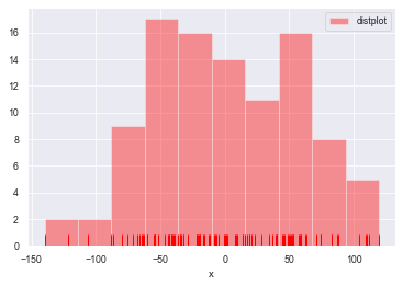
一维数据可视化
distplot()
#直方图distplot()
#参数:bins->箱数, hist->是否显示箱曲线, kde->是否显示密度曲线, norm_hist->直方图是否按照密度来表示
#rug->是否显示数据分布情况, vertical->是否水平显示,label->设置图例, axlabel->设置x轴标注

rs = np.random.RandomState(123)             #设定随机种子
datas = pd.Series(rs.randn(100))            #创建包含100个随机数据的Series
sns.distplot(a=datas, bins=10, hist=True, kde=False, norm_hist=False,
             rug=True, vertical=False, color='r', label='distplot', axlabel='x')
plt.legend()
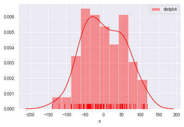
#kde=True设置密度曲线
sns.distplot(a=datas, bins=10, hist=True, kde=True, norm_hist=False,
             rug=True, vertical=False, color='r', label='distplot', axlabel='x')
plt.legend()

#norm_hist设置直方图按照密度曲线显示,实现hist=True 加 kde=True 共同的效果
sns.distplot(a=datas, bins=10, norm_hist=True,
             rug=True, vertical=False, color='r', label='distplot', axlabel='x')
plt.legend()
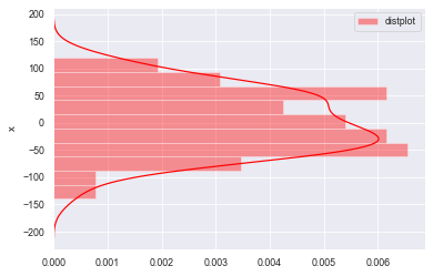
#rug=False不显示频率分布,vertical=False横向放置图形
sns.distplot(a=datas, bins=10, norm_hist=True,
             rug=False, vertical=False, color='r', label='distplot', axlabel='x')
plt.legend()
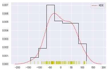
#总体参数设置
sns.distplot(datas, rug=True,
             #rug_kws设置数据频率分布颜色
             rug_kws={'color':'y'},
             #kde_kws设置密度曲线颜色、线宽、标注、线型
             kde_kws={'color':'r', 'lw':1, 'label':'KDE', 'linestyle':'--'},
             #hist_kws设置箱子的风格、线宽、透明度、颜色
             #histtype包括’bar'、‘barstacked’,'step','stepfilled'
             hist_kws={'histtype':'step', 'linewidth':1, 'alpha':1, 'color':'k'})
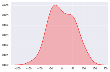
kdeplot()
#密度图 -- kdeplot()

#shade--> 填充设置
sns.kdeplot(datas, shade=True, color='r', vertical=False)
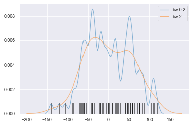
#bw --> 拟合参数
sns.kdeplot(datas, bw=5, label='bw:0.2',
            linestyle='-', linewidth=1.2, alpha=0.5)

sns.kdeplot(datas, bw=20, label='bw:2',
            linestyle='-', linewidth=1.2, alpha=0.5)

#rugplot()设置频率分布图
sns.rugplot(datas, height=0.1, color='k', alpha=0.5)
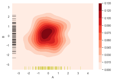
二维数据可视化
kdeplot()
#二维数据密度图
rs = np.random.RandomState(12345)
df = pd.DataFrame(rs.randn(100,2),
columns=['A','B'])
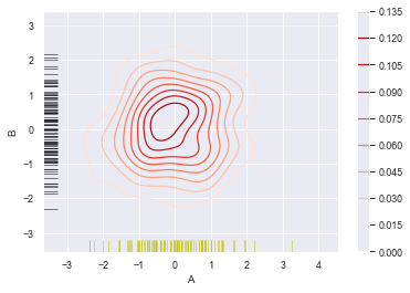
sns.kdeplot(df['A'],df['B'],
cbar = True, #设置显示颜色图例条
shade = True, #是否填充
cmap = 'Reds', #设置调色盘
shade_lowest = 'False', #设置最外围颜色是否显示
n_levels = 10) #设置曲线个数(越多越平滑)
#分别设置x,y轴的频率分布图
sns.rugplot(df['A'], color='y', axis='x', alpha=0.5)
sns.rugplot(df['B'], color='k', axis='y', alpha=0.5)
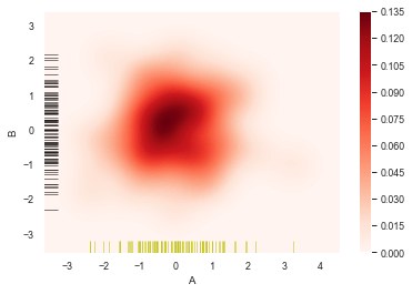
sns.kdeplot(df['A'],df['B'],
            cbar = True,
            shade = False,            #不填充
            cmap = 'Reds',
            shade_lowest = 'False',
            n_levels = 10)

#分别设置x,y轴的频率分布图
sns.rugplot(df['A'], color='y', axis='x', alpha=0.5)
sns.rugplot(df['B'], color='k', axis='y', alpha=0.5)
sns.kdeplot(df['A'],df['B'],
            cbar = True,
            shade = True,
            cmap = 'Reds',
#             shade_lowest = 'False',  #设置最外围颜色是否显示,与shade配合使用
            n_levels = 10)           #设置曲线个数(越多越平滑)

#分别设置x,y轴的频率分布图
sns.rugplot(df['A'], color='y', axis='x', alpha=0.5)
sns.rugplot(df['B'], color='k', axis='y', alpha=0.5)

sns.kdeplot(df['A'],df['B'],
            cbar = True,
            shade = True,
            cmap = 'Reds',
#             shade_lowest = 'False',  #设置最外围颜色是否显示,与shade配合使用
            n_levels = 100)           #设置曲线个数(越多则边界渐变越平滑)

#分别设置x,y轴的频率分布图
sns.rugplot(df['A'], color='y', axis='x', alpha=0.5)
sns.rugplot(df['B'], color='k', axis='y', alpha=0.5)
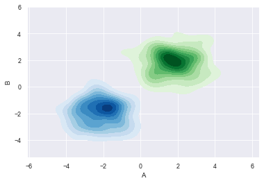
#多个密度图

#创建两个DataFrame数组
rs1 = np.random.RandomState(12)
rs2 = np.random.RandomState(21)
df1 = pd.DataFrame(rs1.randn(100,2)+2, columns=['A','B'])
df2 = pd.DataFrame(rs2.randn(100,2)-2, columns=['A','B'])

#创建密度图
sns.kdeplot(df1['A'], df1['B'], cmap='Greens',
            shade=True, shade_lowest=False)
sns.kdeplot(df2['A'], df2['B'], cmap='Blues',
            shade=True, shade_lowest=False)