两栏布局,左边固定宽度,右边自适应
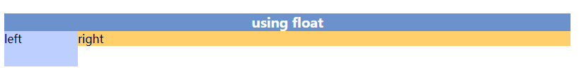
NO.1 使用浮动:float
<section>
    <h3>using float</h3>
    <!--<hr style="margin: 30px 0">-->
    <div class="use-float">
        <div class="left">left</div>
        <div class="right">right</div>
    </div>
</section>
 .use-float .left {
     float: left;
     width: 13%;
     height: 50px;
     background-color: #bccfff;;
}

 .use-float .right {
     overflow: hidden;
     background-color: #ffcf6b;;
}
实现效果:
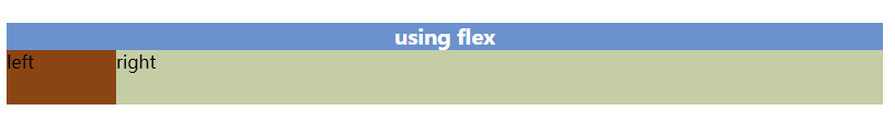
NO.2 使用浮动:flex
<section>
    <h3>using flex</h3>
    <!--<hr style="margin: 30px 0">-->
    <div class="use-flex">
        <div class="flex-left">left</div>
        <div class="flex-right">right</div>
    </div>
</section>
 .use-flex {
     display: flex;
     height: 50px;
 }

  .use-flex .flex-left {
      flex: none;
      width: 100px;
      background-color: saddlebrown;
}

 .use-flex .flex-right {
      flex: 1;
      background-color: #c5cda5;
}
实现效果:
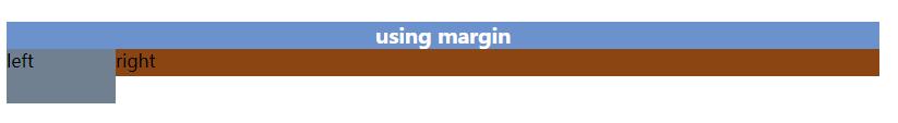
NO.3 使用浮动:margin
<section>
    <h3>using margin</h3>
    <!--<hr style="margin: 20px 0">-->
    <div class="use-margin">
        <div class="tleft">left</div>
        <div class="tright">right</div>
    </div>
</section>
.use-margin .tleft {
    float: left;
    width: 100px;
    height: 50px;
    background-color: slategray;
}

.use-margin .tright {
    margin-left: 100px;
    height: 25px;
    background-color: saddlebrown;
}
实现效果:
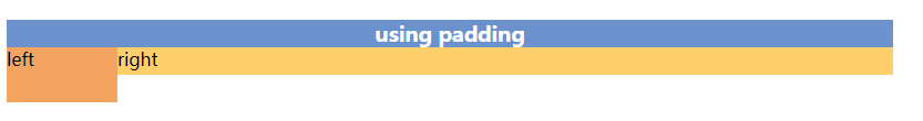
NO.4 使用浮动:padding
<section>
    <h3>using padding</h3>
    <!--<hr style="margin: 20px 0">-->
    <div class="use-padding">
        <div class="l">left</div>
        <div class="r">right</div>
    </div>
</section>
.use-padding .l {
    float: left;
    width: 100px;
    height: 50px;
    background-color: sandybrown;
}

.use-padding .r {
    padding-left: 100px;
    height: 25px;
    background-color: #ffcf6b;;
}
实现效果:
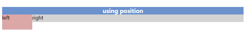
NO.5 使用浮动:position
<section>
    <h3>using position</h3>
    <!--<hr style="margin: 30px 0">-->
    <div class="use-position">
        <div class="lef">left</div>
        <div class="rig">right</div>
    </div>
    <!--<hr style="margin: 30px 0">-->
</section>
.use-position {
    position: relative;
}

.use-position .lef {
    position: absolute;
    top: 0;
    left: 0;
    width: 100px;
    height: 50px;
    background-color: #dca7a7;
}

.use-position .rig {
    position: absolute;
    top: 0;
    left: 100px;
    right: 0;
    height: 25px;
    background-color: #d3d3d3;;
}
实现效果:
NO.6 使用浮动:table
<section>
    <h3>using table</h3>
    <!--<hr style="margin: 30px 0">-->
    <table class="use-table">
        <tr>
            <td>left</td>
            <td>right</td>
        </tr>
    </table>
</section>
.use-table {
    border-collapse: collapse; /*合并表格*/
    width: 100%;
    height: 25px;
    background: #cdc3be;
}

.use-table > tbody > tr > td:first-child {
    width: 100px;
    height: 25px;
    background-color: sandybrown;
}
实现效果:
NO.7 使用浮动:float+display:block
<section>
    <h3>using disblok</h3>
    <!--<hr style="margin: 20px 0">-->
    <div class="use-to">
        <div class="le">left</div>
        <div class="ri">right</div>
    </div>
</section>
.use-to .le {
    float: left;
    width: 100px;
    height: 50px;
    background-color: #000;;
}

.use-to .ri {
    display: block;
    height: 25px;
    background-color: #14B9FF;
}
实现效果:


 浙公网安备 33010602011771号