
三行代码实现垂直居中和cube
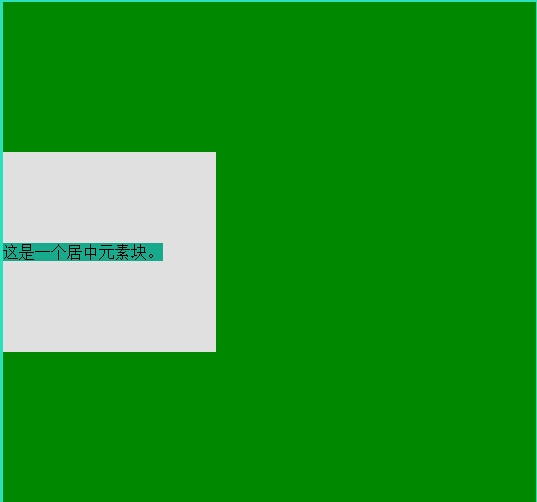
三行代码实现上下居中
position: relative;
top: 50%;
transform: translateY(-50%);
<!DOCTYPE html>
<html>
<head lang="en">
<meta charset="UTF-8">
<title>css123</title>
<style>
body {
background: #2ae0bb;
}
.box {
width: 40%;
height: 500px;
background: #008800;
}
.text {
width: 40%;
height: 200px;
background: #e0e0e0;
position: relative;
top: 50%;
transform: translateY(-50%);
-webkit-transform: translateY(-50%);
-ms-transform: translateY(-50%);
}
.text span{
position: absolute;
top: 50%;
transform: translateY(-50%);
-webkit-transform: translateY(-50%);
-ms-transform: translateY(-50%);
background: #18aa8c;
}
</style>
</head>
<body>
<div class="box">
<div class="text">
<span>这是一个居中元素块。</span>
</div>
</div>
<div class="pool">
<div class="text-dec">
<span>Look!I'm here.while just you know.</span>
</div>
</div>
</body>
</html>
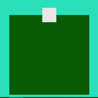
height: 0;
padding-bottom: 20%;
<!DOCTYPE html>
<html>
<head lang="en">
<meta charset="UTF-8">
<title>square</title>
<style>
body {
background: #2ae0bb;
}
.aa {
width: 20%;
height: 0;
padding-bottom: 20%;
background: #095c05;
margin: 0 auto;
}
.aa .cc{
position: relative;
top: 50%;
transform: translateY(50%);
-webkit-transform: translateY(-50%);
-ms-transform: translateY(-50%);
width: 18%;
height: 0;
padding-bottom: 18%;
background: #E6E6E6;
margin: 0 auto;
}
</style>
</head>
<body>
<div class="aa">
<div class="cc"></div>
</div>
</body>
</html>


【推荐】国内首个AI IDE,深度理解中文开发场景,立即下载体验Trae
【推荐】编程新体验,更懂你的AI,立即体验豆包MarsCode编程助手
【推荐】抖音旗下AI助手豆包,你的智能百科全书,全免费不限次数
【推荐】轻量又高性能的 SSH 工具 IShell:AI 加持,快人一步
· 如何编写易于单元测试的代码
· 10年+ .NET Coder 心语,封装的思维:从隐藏、稳定开始理解其本质意义
· .NET Core 中如何实现缓存的预热?
· 从 HTTP 原因短语缺失研究 HTTP/2 和 HTTP/3 的设计差异
· AI与.NET技术实操系列:向量存储与相似性搜索在 .NET 中的实现
· 地球OL攻略 —— 某应届生求职总结
· 周边上新:园子的第一款马克杯温暖上架
· Open-Sora 2.0 重磅开源!
· 提示词工程——AI应用必不可少的技术
· .NET周刊【3月第1期 2025-03-02】