
Vue3编写一个可以用js调用的组件
项目开发中基本都会用到组件库,但是设计稿样式和功能不一定和组件库相同,尤其像是消息提示弹窗、确认弹窗,各个项目都有自己的一套风格。
如何封装一个自己的弹窗组件,且不需要每个用到弹窗的组件都需要引入这个弹窗组件,然后传参等等这些繁琐的步骤。而只需要使用简单的js就可以直接调用
// Confirm.vue

<!-- Confirm.vue -->
<template>
<div class="confirm">
<div class="confirm-content">
<div class="confirm-title">{{ title }}</div>
<div class="confirm-message">{{ message }}</div>
<div class="btns van-hairline--top">
<div class="btn cancel" @click="onCancel">{{ cancelText }}</div>
<div class="btn sure van-hairline--left" @click="onConfirm">
{{ confirmText }}
</div>
</div>
</div>
</div>
</template>
<script setup lang="ts" name="Confirm">
const props = defineProps({
title: {
type: String,
default: "",
},
message: {
type: String,
default: "",
},
cancelText: {
type: String,
default: "取消",
},
confirmText: {
type: String,
default: "确定",
},
onCancel: {
type: Function,
default: () => {},
},
onConfirm: {
type: Function,
default: () => {},
},
});
</script>
<style lang="less" scoped>
.confirm{
position: fixed;
top: 0;
left: 0;
width: 100%;
height: 100%;
background-color: rgba(0, 0, 0, 0.3);
display: flex;
justify-content: center;
align-items: center;
z-index: 9999;
.confirm-content {
width: 300px;
height: 150px;
background-color: #fff;
border-radius: 10px;
padding: 20px;
.confirm-title {
font-size: 20px;
font-weight: bold;
margin-bottom: 10px;
}
.confirm-message {
font-size: 16px;
margin-bottom: 20px;
}
.btns {
display: flex;
justify-content: space-between;
margin-top: 20px;
}
.btn {
width: 100px;
height: 30px;
line-height: 30px;
text-align: center;
border-radius: 5px;
cursor: pointer;
&.cancel {
background-color: #ccc;
}
&.sure {
background-color: #007AFF;
color: #fff;
}
}
}
}
</style>
然后紧跟着这个Confirm.vue书写它的js
//Confirm/index.js
import { createApp } from "vue";
import Confirm from './Confirm.vue';
function confirm ({ title, message, confirmBtnText, cancelBtnText }) {
  return new Promise((resolve, reject) => {
    // 实例化组件,createApp第二个参数是props
    const confirmInstance = createApp(Confirm, {
      title: title || '提示',
      message: message || '确认消息',
      confirmBtnText: confirmBtnText || '确定',
      cancelBtnText: cancelBtnText || '取消',
      onConfirm: () => {
        unmount()
        resolve()
      },
      onCancel: () => {
        unmount()
        reject(new Error())
      }
    })
    // 卸载组件
    const unmount = () => {
      confirmInstance.unmount()
      document.body.removeChild(parentNode)
    }
    // 创建一个挂载容器
    const parentNode = document.createElement('div')
    document.body.appendChild(parentNode)
    // 挂载组件
    confirmInstance.mount(parentNode)
  })
}

export default confirm
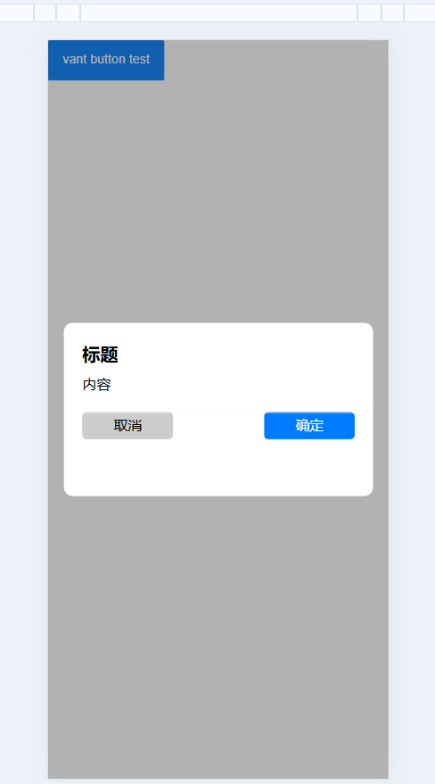
然后就是使用这个组件了,我这里只是局部的调用,
1 2 3 4 5 6 7 8 9 10 11 12 13 14 15 16 17 18 19 20 21 22 | <template> <div> <van-button type="primary" @click="testFn">vant button test</van-button> </div></template><script setup>import confirm from "./index"; const testFn = () => { confirm({ title: "标题", message: "内容", }) .then(() => { console.log("点击确认"); }) .catch(() => { console.log("点击取消"); }); };</script> |
使用效果如下,此示例仅为一个简单的demo


【推荐】国内首个AI IDE,深度理解中文开发场景,立即下载体验Trae
【推荐】编程新体验,更懂你的AI,立即体验豆包MarsCode编程助手
【推荐】抖音旗下AI助手豆包,你的智能百科全书,全免费不限次数
【推荐】轻量又高性能的 SSH 工具 IShell:AI 加持,快人一步
· TypeScript + Deepseek 打造卜卦网站:技术与玄学的结合
· Manus的开源复刻OpenManus初探
· AI 智能体引爆开源社区「GitHub 热点速览」
· 从HTTP原因短语缺失研究HTTP/2和HTTP/3的设计差异
· 三行代码完成国际化适配,妙~啊~
2018-08-18 小程序中对计算金额进行截取
2018-08-18 微信小程序购物车功能