【半圆环阴影效果】
效果图
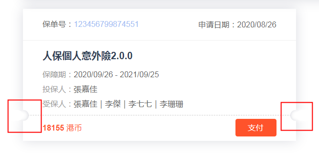
- HTML结构
1         <div class="user-bottom">
2           <i class="left"></i>
3           <div class="user-div user-div-teshu">
4             <span class="user-div-money user-div-suml">18155</span><span class="user-div-money user-div-sumr"> 港币</span>
5             <el-button class="user-div-pay" type="info">支付</el-button>
6           </div>
7           <i class="right"></i>
8         </div>
- CSS结构
.user {
  &-bottom {
    padding: 18px 40px;
    margin-bottom: 18px;
    padding-bottom: 0;
    position: relative;
    border-top: 1px dashed #ccc;
    i {
      position: absolute;
      top: 0;
      &:before,
      &:after {
        content: '';
        display: block;
        position: absolute;
        border-radius: 0 22px 22px 0;
        background-color: #fff;
        height: 22px;
        top: -11px;
      }
      &:before {
        box-shadow: 3px 0 10px #fff;
        left: -49px;
        width: 50px;
        z-index: 2;
      }
      &:after {
        box-shadow: inset -2px 0 7px rgba(55, 63, 93, .18);
        left: -49px;
        width: 60px;
      }
      &.left {
        left: 0;
      }
      &.right {
        right: 0;
        &:before,
        &:after {
          border-radius: 22px 0 0 22px;
        }
        &:before {
          box-shadow: -3px 0 10px #fff;
          left: -1px;
        }
        &:after {
          box-shadow: inset 2px 0 7px rgba(55, 63, 93, .18);
          left: -11px;
        }
      }
    }
  }
  &-div {
    margin-bottom: 14px;
    position: relative;
    color: #999;
    span {
      font-size: 16px;
      line-height: 16px;
    }
    &-money {
      color: #ff532b;
    }
    &-suml,
    &-sumr {
      color: #ff532b;
    }
    &-suml {
      font-size: 20px;
      font-weight: bold;
    }
    &-sumr {
      font-size: 18px;
    }
    &-down,
    &-pay {
      position: absolute;
      top: 0;
      right: 0;
      cursor: pointer;
    }
    &-pay {
      color: #fff;
      padding: 9px 25px;
      background-color: #ff532b;
      border-color: #ff532b;
      top: 50%;
      margin-top: -19px;
    }
  }
}
