HTML&&CSS
HTML标签:表单标签
* 表单:
	* 概念:用于采集用户输入的数据的。用于和服务器进行交互。
	* form:用于定义表单的。可以定义一个范围,范围代表采集用户数据的范围
        * 属性:
            * action:指定提交数据的URL
            * method:指定提交方式
                * 分类:一共7种,2种比较常用
                   * get:
                        1. 请求参数会在地址栏中显示。会封装到请求行中(HTTP协议后讲解)。
                        2. 请求参数大小是有限制的。
                        3. 不太安全。
                   * post:
                        1. 请求参数不会再地址栏中显示。会封装在请求体中(HTTP协议后讲解)
                        2. 请求参数的大小没有限制。
                        3. 较为安全。

        * 表单项中的数据要想被提交:必须指定其name属性
	* 表单项标签:
		* input:可以通过type属性值,改变元素展示的样式
			* type属性:
				* text:文本输入框,默认值
					* placeholder:指定输入框的提示信息,当输入框的内容发生变化,会自动清空提示信息
				* password:密码输入框
				* radio:单选框
                                            如:        <input type="radio" name="gender" value="female"checked="checked">女
					* 注意:
						1. 要想让多个单选框实现单选的效果,则多个单选框的name属性值必须一样。
						2. 一般会给每一个单选框提供value属性,指定其被选中后提交的值
						3. checked属性,可以指定默认值
				* checkbox:复选框
					* 注意:
						1. 一般会给每一个单选框提供value属性,指定其被选中后提交的值
						2. checked属性,可以指定默认值

				* file:文件选择框
				* hidden:隐藏域,用于提交一些信息。
				* 按钮:
					* submit:提交按钮。可以提交表单
					* button:普通按钮
					* image:图片提交按钮
						* src属性指定图片的路径
                                *取色器:<input type="color" name="color">
                                *日期:例:生日:<input type="date" name="birthday">
                                *时间:例:生日:<input type="datetime-local" name="birthday">
                                *邮箱:(正则校验)例:邮箱:<input type="email" name="email">
                                *数字:例:年龄:<input type="number" name="age">
		   * label:指定输入项的文字描述信息
			   * 注意:
				   * label的for属性一般会和 input 的 id属性值 对应。如果对应了,则点击label区域,会让input输入框获取焦点。
		* select: 下拉列表
			* 子元素:option,指定列表项

		* textarea:文本域
			* cols:指定列数,每一行有多少个字符
			* rows:默认多少行。
CSS:页面美化和布局控制
1. 概念: Cascading Style Sheets 层叠样式表
	* 层叠:多个样式可以作用在同一个html的元素上,同时生效

2. 好处:
	1. 功能强大
	2. 将内容展示和样式控制分离
		* 降低耦合度。解耦
		* 让分工协作更容易
		* 提高开发效率
3. CSS的使用:CSS与html结合方式
	1. 内联样式
		 * 在标签内使用style属性指定css代码
		 * 如:<div style="color:red;">hello css</div>
	2. 内部样式
		* 在head标签内,定义style标签,style标签的标签体内容就是css代码
		* 如:
			<style>
		        div{
		            color:blue;
		        }

		    </style>
			<div>hello css</div>
	3. 外部样式
		1. 定义css资源文件。
		2. 在head标签内,定义link标签,引入外部的资源文件
		* 如:
    		* a.css文件:
				div{
				    color:green;
				}
			<link rel="stylesheet" href="css/a.css">
			<div>hello css</div>
			<div>hello css</div>

	* 注意:
		* 1,2,3种方式 css作用范围越来越大
		* 1方式不常用,后期常用2,3
		* 第3种格式可以写为:
			<style>
		        @import "css/a.css";
		    </style>
                        来代替link
4. css语法:
	* 格式:
		选择器 {
			属性名1:属性值1;
			属性名2:属性值2;
			...
		}
	* 选择器:筛选具有相似特征的元素
	* 注意:
		* 每一对属性需要使用;隔开,最后一对属性可以不加;

5. 选择器:筛选具有相似特征的元素
	* 分类:
		1. 基础选择器
			1. id选择器:选择具体的id属性值的元素.建议在一个html页面中id值唯一
		        * 语法:#id属性值{}
		    2. 元素选择器:选择具有相同标签名称的元素
		        * 语法: 标签名称{}
		        * 注意:id选择器优先级高于元素选择器
		    3. 类选择器:选择具有相同的class属性值的元素。
		        * 语法:.class属性值{}
		        * 注意:类选择器选择器优先级高于元素选择器
                                扩展:      .rg_left > p:first-child{}
                                            .rg_left > p:last-child{}
		2. 扩展选择器:
			1. 选择所有元素:
				* 语法: *{}
			2. 并集选择器:
				* 选择器1,选择器2{}

			3. 父子选择器:
				* 语法:  选择器1 选择器2{}
                                      如:div a{}//div下的所有a,包括儿子,孙子
			4. 直接后代选择器:
				* 语法:  选择器1 > 选择器2{}
                                   如:div > a{}//div下的儿子才能被使用
			5. 属性选择器:选择元素名称,属性名=属性值的元素
				* 语法:  元素名称[属性名="属性值"]{}

			6. 伪类选择器:选择一些元素具有的状态
                                        清除浏览器缓存的快捷键:ctrl + shift +del
				* 语法: 元素:状态{}
				* 如: <a>
					* 状态:
						* link:初始化的状态
						* visited:被访问过的状态
						* active:正在访问状态
						* hover:鼠标悬浮状态
                                        针对于非a标签。伪类选择器中只有:hover与:active可以使用
                        7 交集选择器
                          交集选择器由两个选择器构成,其中第一个为标签选择器,第二个为class选择器,两个选择器之间不能有空格,如h3.special。
6. 属性
	1. 字体、文本
		* font-size:字体大小
		* color:文本颜色
		* text-align:对其方式  center(水平居中)
		* line-height:行高  文本垂直居中 属性值与height的属性值保持一致
                * font-family:字体
                * font-weight:字体粗细     属性: normal、bold、bolder、lighter、100~900(100的整数倍)。
                * font-style:字体风格      属性: normal:默认值,浏览器会显示标准的字体样式。
                                              italic:浏览器会显示斜体的字体样式。
                                              oblique:浏览器会显示倾斜的字体样式。
                * font:综合设置字体样式    选择器{font: font-style  font-weight  font-size/line-height  font-family;}
                * text-decoration: underline(下划线)  overline(上划线)  line-through(删除线)
                * text-indent: 2em 首行缩进两字符
	2. 背景
		* background:如:url("img/logo.jpg" ) no-repeat center;(no-repeat不重复)
	3. 边框
		* border:设置边框,符合属性(solid实线)
                    */*设置边框圆角*/ border-radius: 5px;
	4. 尺寸
		* width:宽度
		* height:高度
	5. 盒子模型:控制布局
		* margin:外边距 扩展:margin-left,margin-top
                          margin: auto:水平居中
                          vertical-align: middle;垂直居中
		* padding:内边距
			* 默认情况下内边距会影响整个盒子的大小
			* box-sizing: border-box;  设置盒子的属性,让width和height就是最终盒子的大小

		* float:浮动
			* left
			* right
         6 列表去圆点: list-style: none;
标签的显示模式
块状元素、行内元素、行内块元素
块状元素:h1-h6/p/div/ul/ol/dl/li/dd/dt/form
块状元素:h1-h6/p/div/ul/ol/dl/li/dd/dt/form
块状元素的特点:
          1、有默认的宽高,宽度是父元素的100%,高度是内容所撑起来的高度
          2、可以设置宽高
          3、可以包含任意的元素(注意:h不能包含h,p不能包含块状元素 )
          4、独占一行
行内元素:span/b/strong/i/em/u/ins/s/del/a
行内元素:span/b/strong/i/em/u/ins/s/del/a
行内元素的特点:
        1、有默认的宽高,都是内容所撑起来的宽高
        2、不能设置宽高
        3、只能包含行内元素
        4、相邻的行内元素在同一行上显示


      /* 转化为块状元素 */
      display: block;
行内块元素:img/label/input/select/option/textarea
行内块元素:img/label/input/select/option/textarea
行内块元素的特点:
      1、有默认宽高
      2、可以设置宽高
      3、一般不包含其他元素(有特殊情况只包含行内块或者行内元素)
      4、相邻的行内块元素在同一行上显示
标签显示模式转换 display
标签显示模式转换 display
块转行内:display:inline;
行内转块:display:block;
块、行内元素转换为行内块: display: inline-block;
<!DOCTYPE html>
<html lang="en">

<head>
  <meta charset="UTF-8">
  <meta http-equiv="X-UA-Compatible" content="IE=edge">
  <meta name="viewport" content="width=device-width, initial-scale=1.0">
  <title>标签的分类(标签的显示模式)</title>
  <style>
    form {
      width: 1000px;
    }

    #list>li {
      font-size: 50px;
      list-style: none;
      width: 600px;
      height: 100px;
    }

    .s1 {
      font-size: 50px;
      width: 8000px;
      height: 2000px;
    }

    .img1 {
      width: 600px;
      height: 400px;
    }

    input {
      width: 600px;
      height: 100px;
    }

    .link {
      width: 600px;
      height: 400px;
      /* 转化为块状元素 */
      display: block;
    }
  </style>
</head>

<body>
  <!-- 标签<==>元素 -->
  <!-- 块状元素、行内元素、行内块元素 -->
  <!-- 块状元素:h1-h6/p/div/ul/ol/dl/li/dd/dt/form -->
  <!-- 块状元素的特点:
          1、有默认的宽高,宽度是父元素的100%,高度是内容所撑起来的高度
          2、可以设置宽高
          3、可以包含任意的元素(注意:h不能包含h,p不能包含块状元素 )
          4、独占一行
    -->
  <h1>我是标题标签也是块状元素!
    <h3>我是h3 </h3>
  </h1>
  <h5>我是标题5也是块状元素</h5>
  <div>我是最典型的块状元素</div>
  <form action="">
    <h4>上课了京东数科的事件的</h4>
  </form>
  <ul id="list">
    <li>我是hi无序列表的第一行</li>
    <li>
      <div>我是li中的div</div>
      <span>我是li中的span</span>
    </li>
  </ul>
  <p>
    我是段落
    <b>加粗</b>
  <div></div>
  <ol></ol>
  </p>
  <!-- 行内元素:span/b/strong/i/em/u/ins/s/del/a -->
  <!-- 行内元素的特点:
        1、有默认的宽高,都是内容所撑起来的宽高
        2、不能设置宽高
        3、只能包含行内元素
        4、相邻的行内元素在同一行上显示
  -->
  <span style="font-size: 50px;width: 500px;height: 100px;">我是最典型的行内元素!</span>
  <strong class="s1">我要加粗啦!!!!</strong>
  <p></p>
  <b>
    <!-- <div style="height: 100px;">111</div> -->
    6566666666666666
  </b>
  <a href="#">百度一下</a>
  <!-- 行内块元素:img/label/input/select/option/textarea -->
  <!-- 行内块元素的特点:
      1、有默认宽高
      2、可以设置宽高
      3、一般不包含其他元素(有特殊情况只包含行内块或者行内元素)
      4、相邻的行内块元素在同一行上显示
  -->
  <a href="https://www.baidu.com" class="link ">
    <img src="images/img1.jfif" alt="" class="img1">
  </a>
  <input type="text">
</body>

</html>
背景
      /* 背景色 */
      background-color: #0000ff;
      /* 背景图 */
      background-image: url(images/xiyang.jpeg);
      /* 背景图的平铺属性 */
      background-repeat: no-repeat;
      /* 背景图的尺寸:x轴 y轴 */
      background-size: 100% 100%;
      /* 背景图的方向属性:x轴 y轴 */
      background-position: right top;
      background-position: left bottom;
CSS的三大特性
- 层叠性: 就近原则
- 继承性: 子承父业
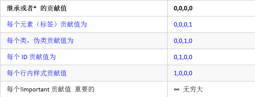
- 优先级:
1、在同一个元素中,通配符选择器 < 标签选择器 < 类名选择器 < id选择器 < style < !important
2、元素本身的样式是大于继承过来的
定义CSS样式时,经常出现两个或更多规则应用在同一元素上,这时就会出现优先级的问题。在考虑权重时,初学者还需要注意一些特殊的情况,具体如下:
- 继承样式的权重为0。即在嵌套结构中,不管父元素样式的权重多大,被子元素继承时,他的权重都为0,也就是说子元素定义的样式会覆盖继承来的样式。
- 行内样式优先。应用style属性的元素,其行内样式的权重非常高,可以理解为远大于100。总之,他拥有比上面提高的选择器都大的优先级。
- 权重相同时,CSS遵循就近原则。也就是说靠近元素的样式具有最大的优先级,或者说排在最后的样式优先级最大。
- CSS定义了一个!important命令,该命令被赋予最大的优先级。也就是说不管权重如何以及样式位置的远近,!important都具有最大优先级。
CSS特殊性(Specificity)
关于CSS权重,我们需要一套计算公式来去计算,这个就是 CSS Specificity,我们称为CSS 特性或称非凡性,它是一个衡量CSS值优先级的一个标准 具体规范入如下:
specificity用一个四位的数字串(CSS2是三位)来表示,更像四个级别,值从左到右,左面的最大,一级大于一级,数位之间没有进制,级别之间不可超越。
例:
div ul  li   ------>      0,0,0,3
.nav ul li   ------>      0,0,1,2
a:hover      -----—>      0,0,1,1
.nav a       ------>      0,0,1,1
#nav p       ----->       0,1,0,1
- 数位之间没有进制比如说: 0,0,0,5 + 0,0,0,5 =0,0,0,10 而不是 0,0, 1, 0, 所以不会存在10个div能赶上一个类选择器的情况。
- 继承的权重是0
<!DOCTYPE html>
<html lang="en">

<head>
  <meta charset="UTF-8">
  <meta http-equiv="X-UA-Compatible" content="IE=edge">
  <meta name="viewport" content="width=device-width, initial-scale=1.0">
  <title>CSS的三大特性</title>
  <style>
    /*     * {
      color: red;
    } */

    /* 层叠性
        就近原则
    */
    h1 {
      color: red;
      color: blue;
    }

    h1 {
      color: purple;
    }

    /* 继承性
      子承父业
    */
    #box {
      color: pink;
      font-size: 50px;
      text-decoration: underline;
    }

    h2 {
      color: purple !important;
    }

    .head_2 {
      color: gray;
    }

    #h_2 {
      color: green;
    }

    .s1 {
      color: blue;
    }
  </style>
</head>

<body>
  <!-- 层叠性、继承性、优先级 -->
  <h1>我是标题啦</h1>
  <div id="box">
    <p>我是div中的p元素
      <span class="s1">我是div的孙子</span>
    </p>
  </div>
  <h2 class="head_2" id="h_2" style="color: blue;">
    我是标题2标签
  </h2>
  <!-- 优先级:
    1、在同一个元素中,通配符选择器 < 标签选择器 < 类名选择器 < id选择器 < style < !important
    2、元素本身的样式是大于继承过来的
    -->
</body>

</html>
盒子模型的边框和边距
CSS的三大重点:盒子模型、浮动、定位
网页布局的本质:拼接盒子的过程
盒子模型包括:宽高、边框、内边距、外边距
什么是盒子? 狭义:div 广义:块状元素
边框与内边距
边框 border : border-left(左) order-right(右) border-top(上) border-bottom(下)
solid :实线 dashed:虚线 dotted:点线 double:双实线
内边距:内容与边框之间的距离 padding : padding-left padding-right padding-top padding-bottom
      /* 综合设置内边距 */
      /* 上、右、下、左 */
      padding: 20px 40px 60px 80px;
      /* 上、左右、下  */
      padding: 20px 40px 60px;
      /* 上下、左右 */
      padding: 20px 40px;
      /* 上下左右 */
      padding: 50px;
注: 边框和内边距都会影响盒子的尺寸
例:
<!DOCTYPE html>
<html lang="en">

<head>
  <meta charset="UTF-8">
  <meta http-equiv="X-UA-Compatible" content="IE=edge">
  <meta name="viewport" content="width=device-width, initial-scale=1.0">
  <title>盒子模型之边框与内边距</title>
  <style>
    .box1 {
      width: 600px;
      height: 300px;
      /* background-color: red; */
      /* 边框 border */
      /*
        solid :实线
        dashed:虚线
        dotted:点线
        double:双实线
      */
      /* 左边框:尺寸 形状 颜色 */
      border-left: 10px solid black;
      border-right: 20px dashed #4547ff;
      border-top: 20px dotted rgb(0, 255, 0);
      border-bottom: 10px double purple;
    }

    .box2 {
      width: 300px;
      height: 200px;
      border: 2px solid orangered;
      font-size: 30px;
      /* 内边距:内容与边框之间的距离  padding*/
      /*  padding-left: 100px;
      padding-right: 50px;
      padding-top: 50px;
      padding-bottom: 30px; */
      /* 综合设置内边距 */
      /* 上、右、下、左 */
      padding: 20px 40px 60px 80px;
      /* 上、左右、下  */
      padding: 20px 40px 60px;
      /* 上下、左右 */
      padding: 20px 40px;
      /* 上下左右 */
      padding: 50px;
    }

    /* 结论:边框和内边距都会影响盒子的尺寸 */
  </style>
</head>

<body>
  <!-- CSS的三大重点:盒子模型、浮动、定位 -->
  <!-- 网页布局的本质:拼接盒子的过程 -->
  <!-- 盒子模型包括:宽高、边框、内边距、外边距 -->
  <!-- 狭义:div  广义:块状元素 -->
  <div class="box1"></div>
  <div class="box2">今天是9月1日,开学鸡谁看得见上课交达克赛德就数控刀具数控刀具上课的目瞪口呆及时看大数据的</div>
</body>

</html>
外边距
外边距:margin margin-left margin-top margin-bottom margin-right
  /* 上、右、下、左 */
      margin: 20px 40px 60px 80px;
      /* 上、左右、下 */
      margin: 20px 40px 60px;
      /* 上下、左右 */
      margin: 20px 60px;
      /*  */
      margin: 100px;
例:
<!DOCTYPE html>
<html lang="en">

<head>
  <meta charset="UTF-8">
  <meta http-equiv="X-UA-Compatible" content="IE=edge">
  <meta name="viewport" content="width=device-width, initial-scale=1.0">
  <title>外边距</title>
  <style>
    * {
      /* 先去清空所有元素默认的内边距和外边距 */
      margin: 0;
      padding: 0;
    }

    .box1 {
      width: 600px;
      height: 300px;
      border: 5px solid red;
      background-color: black;
      /* 外边距:margin */
      margin-left: 100px;
      margin-top: 60px;
      margin-bottom: 200px;
      margin-right: 30px;
      /* 上、右、下、左 */
      margin: 20px 40px 60px 80px;
      /* 上、左右、下 */
      margin: 20px 40px 60px;
      /* 上下、左右 */
      margin: 20px 60px;
      /*  */
      margin: 100px;
    }

    .box2 {
      width: 500px;
      height: 300px;
      border: 10px solid red;
      font-size: 30px;
      text-align: center;
      /* 如何让盒子相对于父元素的宽度水平居中
        1、必须是块状元素
        2、必须设置宽度
      */
      /* margin: 0 auto; */
      margin-bottom: 70px;
    }

    .box2>p {
      width: 200px;
      height: 100px;
      background-color: blue;
      margin: 0 auto;
    }

    .box3 {
      /* 外边距合并:是margin-top与margin-bottom的中的最大值 */
      margin-top: 60px;
      width: 200px;
      height: 100px;
      background-color: black;
      margin-bottom: 3000000px;
    }
  </style>
</head>

<body>
  <!-- 外边距:盒子与其他元素或者与浏览器之间的距离 -->
  <div class="box1" id="box1"></div>
  <h1>我是标题一标签</h1>
  <p>我是段落标签</p>
  <ul>
    <li>第一行</li>
    <li>第二行</li>
    <li>第三行</li>
  </ul>
  <div class="box2">我是box2中的内容
    <p></p>
  </div>
  <div class="box3"></div>
</body>

</html>
浮动
浮动 float
左浮动 left
右浮动 right
float: left;
标准流:元素按照本身的特性进行排列布局
浮动:元素脱离标准流,漂浮在其他元素之上
- 浮动的特点:
1、浮动后的元素会漂浮在其他元素之上
2、浮动后的元素是不占位置的
3、浮动后的多个元素在同一行上显示
4、浮动后的元素永远不会超出父元素的范围
5、浮动后的元素自动的转换为行内块元素
例
<!DOCTYPE html>
<html lang="en">

<head>
  <meta charset="UTF-8">
  <meta http-equiv="X-UA-Compatible" content="IE=edge">
  <meta name="viewport" content="width=device-width, initial-scale=1.0">
  <title>浮动</title>
  <style>
    .box1 {
      width: 500px;
      height: 300px;
      background-color: red;
      /* 浮动 float
        左浮动 left
        右浮动 right
      */
      float: left;
    }

    .box2 {
      width: 500px;
      height: 300px;
      background-color: blue;
      float: left;
      float: right;
    }

    .outer {
      width: 800px;
      height: 300px;
      border: 10px solid black;
      margin: 500px auto;
    }

    .inner1,
    .inner2 {
      width: 100px;
      height: 100px;
      background-color: purple;
    }

    .inner1 {
      float: left;
    }

    .inner2 {
      background-color: pink;
      float: left;
      float: right;
    }
  </style>
</head>

<body>
  <!-- 标准流:元素按照本身的特性进行排列布局 -->
  <!-- 浮动:元素脱离标准流,漂浮在其他元素之上 -->
  <div style="overflow: hidden;">
    <div class="box1"></div>
    <div class="box2"></div>
  </div>

  <div class="outer">
    <div class="inner1"></div>
    <div class="inner2"></div>
  </div>
  <!-- 浮动的特点:
      1、浮动后的元素会漂浮在其他元素之上
      2、浮动后的元素是不占位置的
      3、浮动后的多个元素在同一行上显示
      4、浮动后的元素永远不会超出父元素的范围
      5、浮动后的元素自动的转换为行内块元素
  -->
</body>

</html>
清除浮动
清除浮动:清除浮动并不是清除浮动,而是清除浮动所带来的影响,也叫闭合浮动
浮动的影响:浮动后的元素是不占位置的,所以撑不开父元素的高度
- 清除浮动的方式:
1、给父元素添加overflow:hidden
2、在父元素里边的最后边添加额外的元素
    <!-- clear:left 清除左浮动  clear:right清除右浮动  clear:both 清除左右浮动 -->
    <div style="clear: left;"></div>
例
<!DOCTYPE html>
<html lang="en">

<head>
  <meta charset="UTF-8">
  <meta http-equiv="X-UA-Compatible" content="IE=edge">
  <meta name="viewport" content="width=device-width, initial-scale=1.0">
  <title>Document</title>
  <style>
    .outer {
      margin: 0 auto;
      width: 800px;
      /* height: 200px; */
      /* 默认:子元素会撑开父元素的高度 */
      background-color: purple;
      /* overflow:溢出  hidden:隐藏*/
      /* overflow: hidden; */
    }

    .inner1,
    .inner2 {
      width: 100px;
      height: 100px;
      float: left;
    }

    .inner1 {
      background-color: blue;
    }

    .inner2 {
      background-color: red;
    }
  </style>
</head>

<body>
  <!-- 清除浮动:清除浮动并不是清除浮动,而是清除浮动所带来的影响,也叫闭合浮动 -->
  <!-- 浮动的影响:浮动后的元素是不占位置的,所以撑不开父元素的高度 -->
  <div class="outer">
    <div class="inner1"></div>
    <div class="inner2"></div>
    <!-- clear:left 清除左浮动  clear:right清除右浮动  clear:both 清除左右浮动 -->
    <div style="clear: left;"></div>
  </div>
  <!-- 清除浮动的方式:
      1、给父元素添加overflow:hidden
      2、在父元素里边的最后边添加额外的元素
  -->
</body>

</html>
定位
定位:把元素固定到某一个位置上
定位的分类:相对定位、绝对定位、固定定位
边偏移量:
left:距离左侧距离
right:右
top:上
bottom:下
在研究定位是需注意以下四个问题
1、相对于谁定位 2、是否能使用边偏移量 3、是否脱标 4、是否占位置
相对定位
position: relative;
- 相对定位的特点:
1、相对于元素原来的位置定位
2、可以使用边偏移量
3、没有脱标
4、不占位置
5、可以超出父元素的范围,只跟本身的位置相关!
例
<!DOCTYPE html>
<html lang="en">

<head>
  <meta charset="UTF-8">
  <meta http-equiv="X-UA-Compatible" content="IE=edge">
  <meta name="viewport" content="width=device-width, initial-scale=1.0">
  <title>定位</title>
  <style>
    * {
      margin: 0;
      padding: 0;
    }

    .box1 {
      width: 300px;
      height: 200px;
      background-color: red;
      /* 定位属性 position */
      /* 相对定位 */
      position: relative;
      left: 300px;
      /* top: 100px; */
      bottom: 100px;
    }

    .box2 {
      width: 300px;
      height: 200px;
      background-color: blue;
      position: relative;
      right: 200px;
    }

    .outer {
      width: 600px;
      height: 300px;
      border: 10px solid black;
      margin: 0 auto;
    }

    .inner {
      width: 100px;
      height: 100px;
      background-color: purple;
      /* position: relative; */
      /* left: 100px; */
      /* top: 100px; */
      /* bottom: 100px; */
      /* margin-left: 100px; */
      /* margin-top: 100px; */
      margin-right: 100px;
      float: left;
    }

    .inner2 {
      width: 100px;
      height: 100px;
      background-color: blue;
      float: left;
    }
  </style>
</head>

<body>
  <!-- 元素===标签 -->
  <!-- 定位:把元素固定到某一个位置上 -->
  <!-- 定位的分类:相对定位、绝对定位、固定定位 -->
  <!-- 边偏移量:
      left:距离左侧距离
      right:右
      top:上
      bottom:下
  -->
  <div class="box1"></div>
  <div class="box2"></div>
  <div class="outer">
    <div class="inner"></div>
    <div class="inner2"></div>
  </div>
  <!-- 1、相对于谁定位   2、是否能使用边偏移量  3、是否脱标 4、是否占位置-->

  <!-- 相对定位的特点:
      1、相对于元素原来的位置定位
      2、可以使用边偏移量
      3、没有脱标
      4、不占位置
      5、可以超出父元素的范围,只跟本身的位置相关!
  -->
</body>

</html>
绝对定位
position: absolute;
- 绝对定位的特点:
1、错误的猜想:相对于浏览器定位
(1)、如果父元素没有相对定位,相对于浏览的视口(可视区域)
(2)、如果父元素有相对定位,相对于父元素定位
2、可以使用边偏移量
3、脱标
4、不占位置的
5、可以超出父元素的范围
例
<!DOCTYPE html>
<html lang="en">

<head>
  <meta charset="UTF-8">
  <meta http-equiv="X-UA-Compatible" content="IE=edge">
  <meta name="viewport" content="width=device-width, initial-scale=1.0">
  <title>绝对定位</title>
  <style>
    * {
      margin: 0;
      padding: 0;
    }

    .box1 {
      width: 300px;
      height: 200px;
      background-color: red;
      /* 绝对定位 */
      position: absolute;
      left: 100px;
      /* top: 100px; */
      bottom: 100px;
    }

    .box2 {
      width: 300px;
      height: 200px;
      background-color: blue;
    }

    .outer {
      width: 800px;
      height: 300px;
      border: 10px solid black;
      margin: 500px auto;
      position: relative;
    }

    .inner {
      width: 100px;
      height: 100px;
      background-color: blue;
      position: absolute;
      /* left: 100px; */
      right: 100px;
      bottom: 50px;
    }
  </style>
</head>

<body style="height: 2000px;">
  <div class="box1"></div>
  <div class="box2"></div>
  <div class="outer">
    <div class="inner"></div>
    <!-- <p style="height: 100px; width: 100px;background-color: brown;"></p> -->
  </div>
  <!-- 绝对定位的特点:
      1、错误的猜想:相对于浏览器定位
        (1)、如果父元素没有相对定位,相对于浏览的视口(可视区域)
        (2)、如果父元素有相对定位,相对于父元素定位
      2、可以使用边偏移量
      3、脱标
      4、不占位置的
      5、可以超出父元素的范围
    -->

</body>

</html>
固定定位
position: fixed;
- 固定的定位特点:
1、相对于浏览器定位
2、可以使用边偏移量
3、脱标
4、不占位置
      /* 层叠数 */
      /* 层数越大。越靠上,默认是0 */
      z-index: 10;
例
<!DOCTYPE html>
<html lang="en">

<head>
  <meta charset="UTF-8">
  <meta http-equiv="X-UA-Compatible" content="IE=edge">
  <meta name="viewport" content="width=device-width, initial-scale=1.0">
  <title>固定定位</title>
  <style>
    * {
      margin: 0;
      padding: 0;
    }

    .box1 {
      width: 300px;
      height: 200px;
      background-color: red;
      /* 固定定位 */
      position: fixed;
      right: 50px;
      bottom: 50px;
    }

    .box2 {
      width: 300px;
      height: 200px;
      background-color: blue;
    }

    .box {
      width: 600px;
      height: 300px;
      font-size: 30px;
    }

    .box3 {
      background-color: pink;
      position: relative;
      /* 层叠数 */
      /* 层数越大。越靠上,默认是0 */
      z-index: 10;
    }

    .box4 {
      background-color: brown;
      position: relative;
      left: 100px;
      bottom: 200px;
      z-index: 11;
    }

    .box5 {
      background-color: orange;
      position: relative;
      left: 200px;
      bottom: 400px;
      z-index: 12;
    }
  </style>
</head>

<body style="height: 2000px;">
  <div class="box1"></div>
  <div class="box2"></div>
  <!-- 固定的定位特点:
    1、相对于浏览器定位
    2、可以使用边偏移量
    3、脱标
    4、不占位置
  -->
  <div class="box3 box">我是box3</div>
  <div class="box4 box">我是box4</div>
  <div class="box5 box">我是box5</div>
</body>

</html>
案例:
	<!DOCTYPE html>
	<html lang="en">
	<head>
	    <meta charset="UTF-8">
	    <title>注册页面</title>
	<style>
	    *{
	        margin: 0px;
	        padding: 0px;
	        box-sizing: border-box;
	    }
	    body{
	        background: url("img/register_bg.png") no-repeat center;
	        padding-top: 25px;
	    }

	    .rg_layout{
	        width: 900px;
	        height: 500px;
	        border: 8px solid #EEEEEE;
	        background-color: white;
	        /*让div水平居中*/
	        margin: auto;
	    }

	    .rg_left{
	        /*border: 1px solid red;*/
	        float: left;
	        margin: 15px;
	    }
	    .rg_left > p:first-child{
	        color:#FFD026;
	        font-size: 20px;
	    }

	    .rg_left > p:last-child{
	        color:#A6A6A6;
	        font-size: 20px;

	    }
	    .rg_center{
	        float: left;
	       /* border: 1px solid red;*/

	    }

	    .rg_right{
	        /*border: 1px solid red;*/
	        float: right;
	        margin: 15px;
	    }

	    .rg_right > p:first-child{
	        font-size: 15px;

	    }
	    .rg_right p a {
	        color:pink;
	    }

	    .td_left{
	        width: 100px;
	        text-align: right;
	        height: 45px;
	    }
	    .td_right{
	        padding-left: 50px ;
	    }

	    #username,#password,#email,#name,#tel,#birthday,#checkcode{
	        width: 251px;
	        height: 32px;
	        border: 1px solid #A6A6A6 ;
	        /*设置边框圆角*/
	        border-radius: 5px;
	        padding-left: 10px;
	    }
	    #checkcode{
	        width: 110px;
	    }

	    #img_check{
	        height: 32px;
	        vertical-align: middle;
	    }

	    #btn_sub{
	        width: 150px;
	        height: 40px;
	        background-color: #FFD026;
	        border: 1px solid #FFD026 ;
	    }

	</style>

	</head>
	<body>

	<div class="rg_layout">
	    <div class="rg_left">
	        <p>新用户注册</p>
	        <p>USER REGISTER</p>

	    </div>

	    <div class="rg_center">
	        <div class="rg_form">
	            <!--定义表单 form-->
	            <form action="#" method="post">
	                <table>
	                    <tr>
	                        <td class="td_left"><label for="username">用户名</label></td>
	                        <td class="td_right"><input type="text" name="username" id="username" placeholder="请输入用户名"></td>
	                    </tr>

	                    <tr>
	                        <td class="td_left"><label for="password">密码</label></td>
	                        <td class="td_right"><input type="password" name="password" id="password" placeholder="请输入密码"></td>
	                    </tr>

	                    <tr>
	                        <td class="td_left"><label for="email">Email</label></td>
	                        <td class="td_right"><input type="email" name="email" id="email" placeholder="请输入邮箱"></td>
	                    </tr>

	                    <tr>
	                        <td class="td_left"><label for="name">姓名</label></td>
	                        <td class="td_right"><input type="text" name="name" id="name" placeholder="请输入姓名"></td>
	                    </tr>

	                    <tr>
	                        <td class="td_left"><label for="tel">手机号</label></td>
	                        <td class="td_right"><input type="text" name="tel" id="tel" placeholder="请输入手机号"></td>
	                    </tr>

	                    <tr>
	                        <td class="td_left"><label>性别</label></td>
	                        <td class="td_right">
	                            <input type="radio" name="gender" value="male"> 男
	                            <input type="radio" name="gender" value="female"> 女
	                        </td>
	                    </tr>

	                    <tr>
	                        <td class="td_left"><label for="birthday">出生日期</label></td>
	                        <td class="td_right"><input type="date" name="birthday" id="birthday" placeholder="请输入出生日期"></td>
	                    </tr>

	                    <tr>
	                        <td class="td_left"><label for="checkcode" >验证码</label></td>
	                        <td class="td_right"><input type="text" name="checkcode" id="checkcode" placeholder="请输入验证码">
	                            <img id="img_check" src="img/verify_code.jpg">
	                        </td>
	                    </tr>
	                    <tr>
	                        <td colspan="2" align="center"><input type="submit" id="btn_sub" value="注册"></td>
	                    </tr>
	                </table>
	            </form>
	        </div>

	    </div>

	    <div class="rg_right">
	        <p>已有账号?<a href="#">立即登录</a></p>
	    </div>
	</div>
	</body>
	</html>
