CSS——导航栏
1. 垂直导航栏
-
常见导航栏
<!DOCTYPE html>
<html>
<head>
<style>
ul {
  list-style-type: none;
  margin: 0;
  padding: 0;
  width: 200px;
  background-color: #f1f1f1;
}

li a {
  display: block;
  color: #000;
  padding: 8px 16px;
  text-decoration: none;
}

li a.active {
  background-color: #4CAF50;
  color: white;
}

li a:hover:not(.active) {
  background-color: #555;
  color: white;
}
</style>
</head>
<body>

<h1>垂直导航栏</h1>
<p>在此例中,我们创建一个具有绿色背景色和白色文本的 "active" 类。该类将添加到 "Home" 链接。</p>

<ul>
  <li><a class="active" href="#home">Home</a></li>
  <li><a href="#news">News</a></li>
  <li><a href="#contact">Contact</a></li>
  <li><a href="#about">About</a></li>
</ul>

</body>
</html>
-
全高固定垂直导航栏
即在左侧或者右侧将导航栏固定,即使滚动也保持原样。
<!DOCTYPE html>
<html>
<head>
<style>
body {
  margin: 0;
}

ul {
  list-style-type: none;
  margin: 0;
  padding: 0;
  width: 25%;
  background-color: #f1f1f1;
  position: fixed;
  height: 100%;
  overflow: auto;
}

li a {
  display: block;
  color: #000;
  padding: 8px 16px;
  text-decoration: none;
}

li a.active {
  background-color: #4CAF50;
  color: white;
}

li a:hover:not(.active) {
  background-color: #555;
  color: white;
}
</style>
</head>
<body>

<ul>
  <li><a class="active" href="#home">Home</a></li>
  <li><a href="#news">News</a></li>
  <li><a href="#contact">Contact</a></li>
  <li><a href="#about">About</a></li>
</ul>

<div style="margin-left:25%;padding:1px 16px;height:1000px;">
  <h1>全高的固定侧导航栏</h1>
  <h2>请尝试滚动此区域,并查看 sidenav 如何粘在页面上。</h2>
  <p>请注意,此 div 元素的左外边距为 25%。这是因为侧导航栏被设置为 25% 宽。如果删除这个外边距,则 sidenav 将叠加到该 div 上。</p>
  <p>还要注意,我们已为 sidenav 设置 overflow:auto。如果 sidenav 太长时(例如,如果其中有超过 50 个链接),会添加滚动条。</p>
  <p>Some text..</p>
  <p>Some text..</p>
  <p>Some text..</p>
  <p>Some text..</p>
  <p>Some text..</p>
  <p>Some text..</p>
  <p>Some text..</p>
</div>

</body>
</html>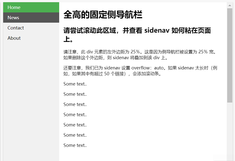
2. 水平导航栏
-
常见水平导航栏
<!DOCTYPE html>
<html>
<head>
<style>
ul {
  list-style-type: none;
  margin: 0;
  padding: 0;
  overflow: hidden;
  background-color: #333;
}

li {
  float: left;
}

li a {
  display: block;
  color: white;
  text-align: center;
  padding: 14px 16px;
  text-decoration: none;
}

li a:hover {
  background-color: #111;
}
</style>
</head>
<body>

<ul>
  <li><a class="active" href="#home">Home</a></li>
  <li><a href="#news">News</a></li>
  <li><a href="#contact">Contact</a></li>
  <li><a href="#about">About</a></li>
</ul>

</body>
</html>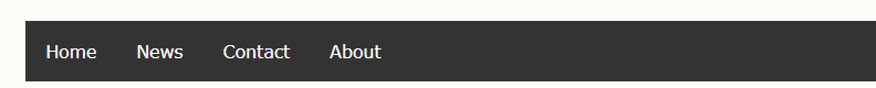
-
活动标签加亮导航栏
<!DOCTYPE html>
<html>
<head>
<style>
ul {
  list-style-type: none;
  margin: 0;
  padding: 0;
  overflow: hidden;
  background-color: #333;
}

li {
  float: left;
}

li a {
  display: block;
  color: white;
  text-align: center;
  padding: 14px 16px;
  text-decoration: none;
}

li a:hover:not(.active) {
  background-color: #111;
}

.active {
  background-color: #4CAF50;
}
</style>
</head>
<body>

<ul>
  <li><a class="active" href="#home">Home</a></li>
  <li><a href="#news">News</a></li>
  <li><a href="#contact">Contact</a></li>
  <li><a href="#about">About</a></li>
</ul>

</body>
</html>
-
固定的导航栏
<!DOCTYPE html>
<html>
<head>
<style>
body {margin:0;}

ul {
  list-style-type: none;
  margin: 0;
  padding: 0;
  overflow: hidden;
  background-color: #333;
  position: fixed;
  top: 0;
  width: 100%;
}

li {
  float: left;
}

li a {
  display: block;
  color: white;
  text-align: center;
  padding: 14px 16px;
  text-decoration: none;
}

li a:hover:not(.active) {
  background-color: #111;
}

.active {
  background-color: #4CAF50;
}
</style>
</head>
<body>

<ul>
  <li><a class="active" href="#home">Home</a></li>
  <li><a href="#news">News</a></li>
  <li><a href="#contact">Contact</a></li>
  <li><a href="#about">About</a></li>
</ul>

<div style="padding:20px;margin-top:30px;background-color:#1abc9c;height:1500px;">
  <h1>固定的顶部导航栏</h1>
  <h2>请滚动页面以查看效果。</h2>
  <h2>页面滚动时导航栏将位于页面顶部。</h2>

  <p>Some text some text some text some text..</p>
  <p>Some text some text some text some text..</p>
  <p>Some text some text some text some text..</p>
  <p>Some text some text some text some text..</p>
  <p>Some text some text some text some text..</p>
  <p>Some text some text some text some text..</p>
  <p>Some text some text some text some text..</p>
  <p>Some text some text some text some text..</p>
  <p>Some text some text some text some text..</p>
  <p>Some text some text some text some text..</p>
  <p>Some text some text some text some text..</p>
  <p>Some text some text some text some text..</p>
  <p>Some text some text some text some text..</p>
  <p>Some text some text some text some text..</p>
  <p>Some text some text some text some text..</p>
  <p>Some text some text some text some text..</p>
  <p>Some text some text some text some text..</p>
  <p>Some text some text some text some text..</p>
  <p>Some text some text some text some text..</p>
  <p>Some text some text some text some text..</p>
</div>

</body>
</html>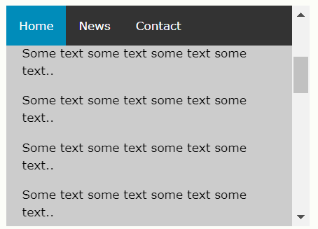
-
带粘性的导航栏
1. Internet Explorer、Edge 15 和更早版本不支持粘性定位
<!DOCTYPE html>
<html>
<head>
<style>
body {
  font-size: 28px;
}

ul {
  list-style-type: none;
  margin: 0;
  padding: 0;
  overflow: hidden;
  background-color: #333;
  position: -webkit-sticky; /* Safari */
  position: sticky;
  top: 0;
}

li {
  float: left;
}

li a {
  display: block;
  color: white;
  text-align: center;
  padding: 14px 16px;
  text-decoration: none;
}

li a:hover {
  background-color: #111;
}

.active {
  background-color: #4CAF50;
}
</style>
</head>
<body>

<div class="header">
  <h1>向下滚动</h1>
  <p>请向下滚动以查看粘性效果。</p>
</div>

<ul>
  <li><a class="active" href="#home">Home</a></li>
  <li><a href="#news">News</a></li>
  <li><a href="#contact">Contact</a></li>
</ul>

<h2>粘性导航栏实例</h2>
<p>如果导航栏到了滚动位置,它会<strong>粘</strong>到顶部。</p>
<p><b>注释:</b>Internet Explorer 不支持粘性定位并且 Safari 需要 -webkit- 前缀。</p>
<p>Some text to enable scrolling. Lorem ipsum dolor sit amet, illum definitiones no quo, maluisset concludaturque et eum, altera fabulas ut quo. Atqui causae gloriatur ius te, id agam omnis evertitur eum. Affert laboramus repudiandae nec et. Inciderint efficiantur his ad. Eum no molestiae voluptatibus.</p>
<p>Some text to enable scrolling. Lorem ipsum dolor sit amet, illum definitiones no quo, maluisset concludaturque et eum, altera fabulas ut quo. Atqui causae gloriatur ius te, id agam omnis evertitur eum. Affert laboramus repudiandae nec et. Inciderint efficiantur his ad. Eum no molestiae voluptatibus.</p>
<p>Some text to enable scrolling. Lorem ipsum dolor sit amet, illum definitiones no quo, maluisset concludaturque et eum, altera fabulas ut quo. Atqui causae gloriatur ius te, id agam omnis evertitur eum. Affert laboramus repudiandae nec et. Inciderint efficiantur his ad. Eum no molestiae voluptatibus.</p>
<p>Some text to enable scrolling. Lorem ipsum dolor sit amet, illum definitiones no quo, maluisset concludaturque et eum, altera fabulas ut quo. Atqui causae gloriatur ius te, id agam omnis evertitur eum. Affert laboramus repudiandae nec et. Inciderint efficiantur his ad. Eum no molestiae voluptatibus.</p>
<p>Some text to enable scrolling. Lorem ipsum dolor sit amet, illum definitiones no quo, maluisset concludaturque et eum, altera fabulas ut quo. Atqui causae gloriatur ius te, id agam omnis evertitur eum. Affert laboramus repudiandae nec et. Inciderint efficiantur his ad. Eum no molestiae voluptatibus.</p>
<p>Some text to enable scrolling. Lorem ipsum dolor sit amet, illum definitiones no quo, maluisset concludaturque et eum, altera fabulas ut quo. Atqui causae gloriatur ius te, id agam omnis evertitur eum. Affert laboramus repudiandae nec et. Inciderint efficiantur his ad. Eum no molestiae voluptatibus.</p>
<p>Some text to enable scrolling. Lorem ipsum dolor sit amet, illum definitiones no quo, maluisset concludaturque et eum, altera fabulas ut quo. Atqui causae gloriatur ius te, id agam omnis evertitur eum. Affert laboramus repudiandae nec et. Inciderint efficiantur his ad. Eum no molestiae voluptatibus.</p>

</body>
</html>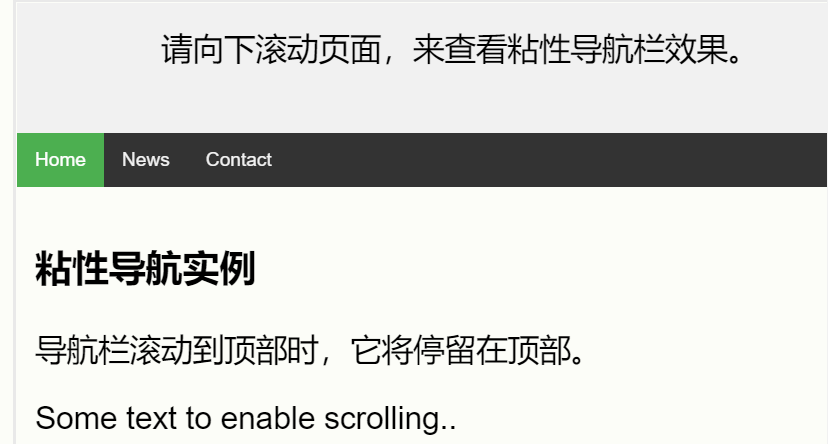

 浙公网安备 33010602011771号