页面布局之一边固定一边自适应
项目开发过程中我们常用的布局一边固定一边自适应。常见的是左边固定,右边自适应。
主体内容在右边
<div class="container">
  <div class="left"></div>
  <div class="right"></div>
</div>
1.浮动
  <style>
    .left{
      width: 100px;
      background-color: red;
      float: left;
    }
    .right{
      background-color: green;
      margin-left: 100px;
    }
    .container:after {
      clear: both;/*清除浮动*/
    }

  </style>
2.定位
  <style>
    .left {
      width: 100px;
      background-color: red;
      position: absolute;
    }
    .right {
      background-color: green;
      margin-left: 100px;
    }


  </style>
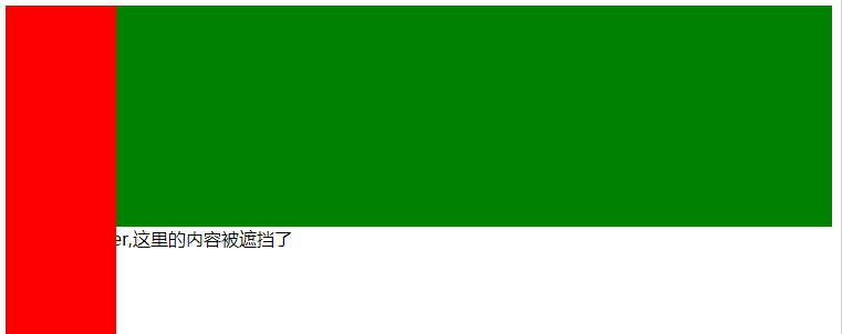
这种布局方式有一定的缺陷,当内容的高度大于父元素时,会影响下面的布局,出现下面的情况。这种方式不建议在不知道内容高度的情况下使用.
3.flex
flex 是css3的特性,有兼容性.
  <style>
    .container {
      display: flex;
    }
    .left {
      width: 100px;
      background-color: red;
    }
    .right {
      background-color: green;
      flex: 1;
    }

  </style>
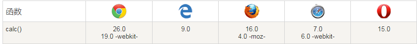
4.calc
calc()不是所有的都兼容.
  <style>
    .container {
      font-size: 0; /*消除间距*/
    }
    .left,.right {
      display: inline-block;
    }
    .left {
      width: 100px;
      background-color: red;
    }
    .right {
      background-color: green;
      width: calc(100% - 100px);
    }


  </style>
主体内容在右边
<div class="container">
  <div class="main">
    <div class="main_container">主体内容显示区域</div>
  </div>
  <div class="sidebar">导航区域</div>
</div>
<style>
  .main {
    float: left;
    width: 100%;
    margin-left: -320px;
  }

  .main_container {
    margin-left: 320px;
    background-color: red;
  }

  .sidebar {
    float: right;
    width: 320px;
    background-color: green;
  }
</style>