Animate.css 前端动画开发教程
1.首先下载animate.css文件;
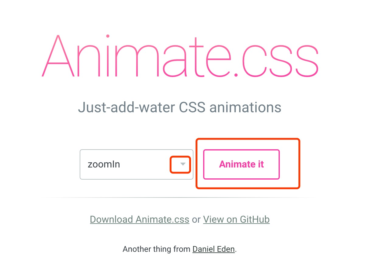
2.打开动画预览地址选择想要的动画,地址:https://daneden.github.io/animate.css/ ,选择好后记住动画的名字在你下载的animate.css中搜索,把该动画的css复制出来;
3.复制出的代码如下:
/*悬浮层跳出动画*/
@-webkit-keyframes zoomInDown {
0% {
opacity: 0;
-webkit-transform: scale3d(.1, .1, .1) translate3d(0, -1000px, 0);
transform: scale3d(.1, .1, .1) translate3d(0, -1000px, 0);
-webkit-animation-timing-function: cubic-bezier(0.55, .055, .675, .19);
animation-timing-function: cubic-bezier(0.55, .055, .675, .19)
}
60% {
opacity: 1;
-webkit-transform: scale3d(.475, .475, .475) translate3d(0, 60px, 0);
transform: scale3d(.475, .475, .475) translate3d(0, 60px, 0);
-webkit-animation-timing-function: cubic-bezier(0.175, .885, .32, 1);
animation-timing-function: cubic-bezier(0.175, .885, .32, 1)
}
}
@keyframes zoomInDown {
0% {
opacity: 0;
-webkit-transform: scale3d(.1, .1, .1) translate3d(0, -1000px, 0);
-ms-transform: scale3d(.1, .1, .1) translate3d(0, -1000px, 0);
transform: scale3d(.1, .1, .1) translate3d(0, -1000px, 0);
-webkit-animation-timing-function: cubic-bezier(0.55, .055, .675, .19);
animation-timing-function: cubic-bezier(0.55, .055, .675, .19)
}
60% {
opacity: 1;
-webkit-transform: scale3d(.475, .475, .475) translate3d(0, 60px, 0);
-ms-transform: scale3d(.475, .475, .475) translate3d(0, 60px, 0);
transform: scale3d(.475, .475, .475) translate3d(0, 60px, 0);
-webkit-animation-timing-function: cubic-bezier(0.175, .885, .32, 1);
animation-timing-function: cubic-bezier(0.175, .885, .32, 1)
}
}
.zoomInDown {
-webkit-animation-name: zoomInDown;
animation-name: zoomInDown
}
4.只需修改上面红色部分为绿色部分,然后将如下css复制到页面就可以直接用了(只需在你想要动的div上加class 这个zoomInDown);
/*悬浮层跳出动画*/
@-webkit-keyframes zoomInDown {
0% {
opacity: 0;
-webkit-transform: scale3d(.1, .1, .1) translate3d(0, -1000px, 0);
transform: scale3d(.1, .1, .1) translate3d(0, -1000px, 0);
-webkit-animation-timing-function: cubic-bezier(0.55, .055, .675, .19);
animation-timing-function: cubic-bezier(0.55, .055, .675, .19)
}
60% {
opacity: 1;
-webkit-transform: scale3d(.475, .475, .475) translate3d(0, 60px, 0);
transform: scale3d(.475, .475, .475) translate3d(0, 60px, 0);
-webkit-animation-timing-function: cubic-bezier(0.175, .885, .32, 1);
animation-timing-function: cubic-bezier(0.175, .885, .32, 1)
}
}
@keyframes zoomInDown {
0% {
opacity: 0;
-webkit-transform: scale3d(.1, .1, .1) translate3d(0, -1000px, 0);
-ms-transform: scale3d(.1, .1, .1) translate3d(0, -1000px, 0);
transform: scale3d(.1, .1, .1) translate3d(0, -1000px, 0);
-webkit-animation-timing-function: cubic-bezier(0.55, .055, .675, .19);
animation-timing-function: cubic-bezier(0.55, .055, .675, .19)
}
60% {
opacity: 1;
-webkit-transform: scale3d(.475, .475, .475) translate3d(0, 60px, 0);
-ms-transform: scale3d(.475, .475, .475) translate3d(0, 60px, 0);
transform: scale3d(.475, .475, .475) translate3d(0, 60px, 0);
-webkit-animation-timing-function: cubic-bezier(0.175, .885, .32, 1);
animation-timing-function: cubic-bezier(0.175, .885, .32, 1)
}
}
.zoomInDown {
animation: zoomInDown 1s;
-webkit-animation: zoomInDown 1s;
}
5.搞定!
本文来自博客园,作者:JeckHui;
个人主页:前端实用站点推荐; 热榜资讯早读:热榜资讯-导航;
转载请注明原文链接:https://www.cnblogs.com/xiaohuizhang/p/8669656.html

 浙公网安备 33010602011771号