
CSS布局学习(三) - position属性定义及解释(官网直译)
static
①元素的位置是在文档正常布局流中的位置。
②设置top right bottom left与z-index无效。
③在未指定position时,static是默认值
以下例子进行说明:
.default{
    width: 100px;
    height: 100px;
    background-color: salmon;
    top: 20px;
    left: 20px;
}
.static{
    width: 100px;
    height: 100px;
    background-color: yellowgreen;
    top: 20px;
    left: 20px;
}
<body>
<div class="default">default</div>
<div class="static">static-1</div>
<div class="static">static-2</div>
</body>
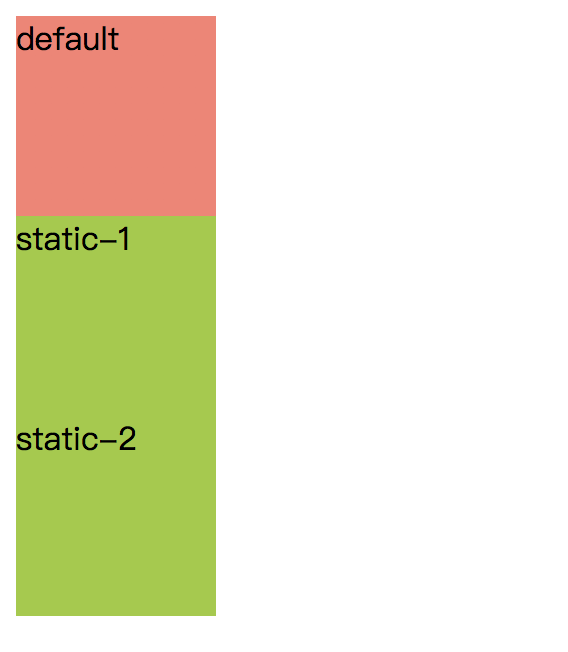
运行结果:
结果说明:
- 元素static-1 static-2的位置都是文档正常布局流中的位置,与①符合
- 元素static-1 static-2的位置都未发生偏移,与②符合
- default元素与static-1 static-2的表现一致,与③符合
relative (相对定位)
① 元素先放置在未添加定位时的位置(即文档正常布局流中的位置),然后在不改变页面布局的情况下,依据元素的top right bottom left重新调整元素位置。
② 它的偏移量对其它元素定位均不会产生影响,也就是是说,元素在页面布局中所占的空间是不变的,这一点与postion值是static的情况是相同的
下面的例子说明以上两点
.static{
    width: 100px;
    height: 100px;
    background-color: salmon;
    top: 20px;
    left: 20px;
}

.relative{
    position: relative;
    width: 100px;
    height: 100px;
    background-color: yellowgreen;
    top: 20px;
    left: 20px;
}
<body>
<div class="static">static-1</div>
<div class="relative">relative-1</div>
<div class="static">static-2</div>
</body>
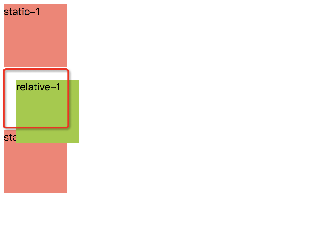
运行结果
结果说明:
- 根据文档常规流位置,relative-1首先被放置在static-1下面,然后根据top left属性向下向右各偏移20px,这与①中的定义相符合
- static-2的位置不受relative-1偏移量的影响,显示在它不发生偏移的位置正下方,即图中红色圈圈的正下方,这与②中的定义相符合
PS:当z-index的值不为auto时,这个值会创建一个层叠上下文。position:relative对table-*-group, table-row, table-column, table-cell, and table-caption元素无效
absolute(绝对定位)
① 元素脱离文档常规布局流不受其影响,页面布局不为该元素预留空间。
以下例子进行说明
.relative {
    position: relative;
    width: 200px;
    height: 200px;
    background-color: yellowgreen;
}

.static {
    width: 150px;
    height: 150px;
    background-color: lightskyblue;
}

.absolute {
    width: 100px;
    height: 100px;
    background-color: salmon;
    top: 50px;
    left: 50px;
    position: absolute;
}
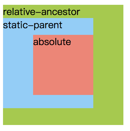
<body>
<div class="relative">
    relative-ancestor
    <div class="static">
        static-parent
        <div class="absolute">absolute</div>
    </div>
</div>
</body>
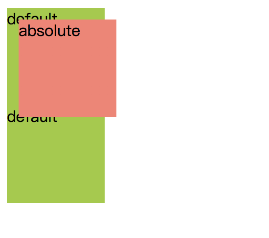
结果说明:如果按照文档布局流,元素absolute应该再图中元素default-2的位置,但是其实际结果位于default-1,default-2之上,且default-2位置不受absolute的影响,与①中定义相符合
② 如果有非static的祖先元素,可以通过相对于祖先元素的偏移量来确定元素位置;如果没有,它会相对于初始包含块进行偏移,偏移量由 top right bottom left来指定
以下例子进行说明:
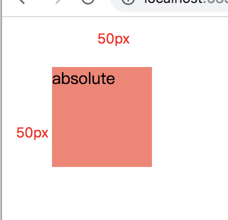
.static {
    width: 200px;
    height: 200px;
    background-color: yellowgreen;
}

.relative {
    position: relative;
    width: 200px;
    height: 200px;
    background-color: yellowgreen;
}

.absolute {
    width: 100px;
    height: 100px;
    background-color: salmon;
    top: 50px;
    left: 50px;
    position: absolute;
}
<body>
<div class="relative">
    relative-ancestor
    <div class="static">
        static-parent
        <div class="absolute">absolute</div>
    </div>
</div>
</body>
运行结果一:
修改html代码
<body>
    <div class="absolute">absolute</div>
</div>
</body>
运行结果二
结果说明:
- 运行结果一:absolute元素最近的父元素为static-parent,但是并没有相对于static-parent进行向下向右各50px的偏移,说明absolute元素的位置不受static父级元素影响。absolute元素实际是相对于relative-ancestor进行偏移的
- 运行结果二:在没有非static的父级元素时,absolute元素会相对于初始包含块进行偏移,此处的初始包含块为窗口视口还是浏览器窗口?
③ 当z-index的值不为auto时,这个值会创建一个层叠上下文。
④ 绝对定位元素的外边距与其他元素的外边距不会合并
例子如下:
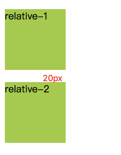
.relative {
    position: relative;
    width: 100px;
    height: 100px;
    background-color: yellowgreen;
    margin-bottom: 20px;
    margin-top: 20px;
}
<body>
<div class="relative">relative-1</div>
<div class="relative">relative-2</div>
</body>
运行结果一
修改代码
.relative {
    position: relative;
    width: 100px;
    height: 100px;
    background-color: yellowgreen;
    margin-bottom: 20px;
    margin-top: 20px;
}

.absolute {
    width: 100px;
    height: 100px;
    background-color: salmon;
    top: 100px;
    left: 100px;
    position: absolute;
    margin-bottom: 20px;
    margin-top: 20px;
}
运行结果二

结果说明:
- 结果一中的relative-1的margin-bottom的bottom外边距与relative-2的top外边距合并,变为20px。
- 结果二中absolute元素向下偏移了120px=top+margin-top,向右偏移了100px=left,外边距是相对于初始包含块的,与同级的relative没有相互影响
大多数情况下,height和width都设定为auto的绝对定位元素,按其内容大小调整尺寸。但是被绝对定位的元素可以通过指定top,bottom,保留height(即auto)来填充可以用的垂直空间。同样也可以通过指定left,right并将width指定为auto来填充可用的水平空间
- 如果top与bottom同时被指定(具体值而不是auto),top生效
- 如果left与right同时被指定,direction为ltr的情况下,left生效(direction为rtl时,right生效)
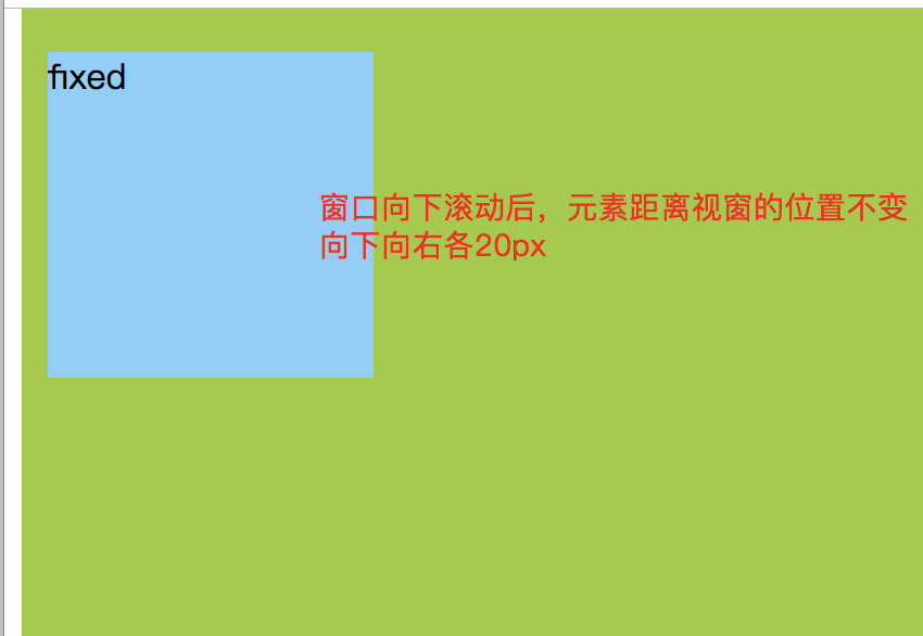
fixed(固定定位)
① 元素脱离文档常规布局流不受其影响,页面布局不为该元素预留空间。(与absolute元素一样,此处不做说明)
② 元素是相对于浏览器屏幕视口(viewport)进行定位的,偏移量由top right bottom left决定,元素的位置在窗口滚动时不会变化,这意味着可以用其创建固定的UI项目,如持久导航菜单。
例子如下
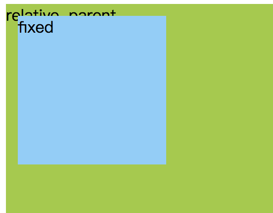
.relative {
    position: relative;
    width: 1000px;
    height: 1000px;
    background-color: yellowgreen;
}

.fixed {
    position: fixed;
    width: 150px;
    height: 150px;
    background-color: lightskyblue;
    top: 20px;
    left: 20px;
}
<body>
<div class="relative">
    relative-parent
    <div class="fixed">fixed</div>
</div>
</body>
运行结果
③ 当固定定位元素的祖先元素的transform, perspective或者filter属性设置为none时,它就相对于这个祖先元素进行定位(改变了②中的规则)
例子如下:
.relative {
    position: relative;
    width: 200px;
    height: 200px;
    background-color: yellowgreen;
    transform: rotate(7deg);
}

.fixed {
    position: fixed;
    width: 50px;
    height: 50px;
    background-color: lightskyblue;
    top: 20px;
    left: 20px;
}
<body>
<div class="relative">
    relative-parent
    <div class="fixed">fixed</div>
</div>
</body>
运行结果
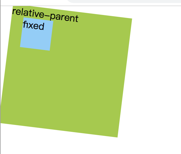
结果说明 :与③中的说明符合
④ 打印时,元素会出现在每页固定的位置(土豪可以自行打印测试)
sticky(粘性定位)
① 元素首先放置在文档正常布局流中指定的位置,然后相对于最近的块级祖先(containing block)进行偏移,偏移量由top right bottom left属性决定。
② 元素的位置偏移量不会对其他元素造成影响
③ 至少指定top right bottom left中的一个值,否则效果与relative相同
以下是例子:
.relative1 {
    position: relative;
    width: 200px;
    height: 200px;
    background-color: yellowgreen;
}

.sticky {
    position: sticky;
    width: 100px;
    height: 100px;
    background-color: lightskyblue;
    /*left: 50px;*/
    /*top: 50px;*/
}

.relative2 {
    position: relative;
    width: 100px;
    height: 100px;
    background-color: salmon;
    top:50px;
    left: 50px;
}
<body>
<div class="relative1">
    relative1
    <div class="sticky">sticky</div>
    <div class="relative2">relative2</div>
</div>
</body>
运行结果一

修改css代码,注释取消。html保持不变
.relative1 {
    position: relative;
    width: 200px;
    height: 200px;
    background-color: yellowgreen;
}

.sticky {
    position: sticky;
    width: 100px;
    height: 100px;
    background-color: lightskyblue;
    left: 50px;
    top: 50px;
}

.relative2 {
    position: relative;
    width: 100px;
    height: 100px;
    background-color: salmon;
    top:50px;
    left: 50px;
}
运行结果二

结果说明
- 运行结果一,在未设置偏移量的时候,元素sticky的位置为正常文档布局流中的位置。与①前半部分相符合
- 运行结果二,设置偏移量后,元素相对于relative1进行向下向右各50px的偏移,与①后半部分相符合
- 而运行结果一与结果二中,即sticky元素设置与不设置偏移量都对relative2位置没有影响,与②后半部分符合

 浙公网安备 33010602011771号