案例分析:首页单屏案例
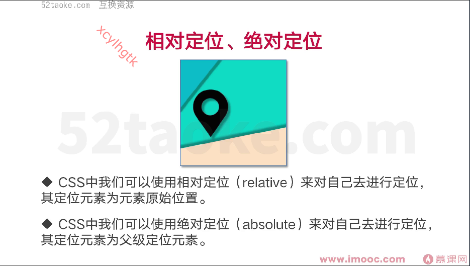
元素的相对、绝对定位
<!DOCTYPE html>
<html lang="en">

<head>
    <meta charset="UTF-8">
    <meta http-equiv="X-UA-Compatible" content="IE=edge">
    <meta name="viewport" content="width=device-width, initial-scale=1.0">
    <title>元素的相对、绝对定位</title>
    <style>
        * {
            margin: 0;
            padding: 0;
        }

        .outer,
        .outerTwo,
        .outerNext {
            width: 200px;
            border: 1px solid black;
            height: 100px;
            margin: 10px;
        }
        /* relative 定位是相对于自己来说 */

        .red {
            width: 100px;
            height: 100px;
            background: red;
            float: left;
            position: relative;
        }
        /* 如果green 也用上了定位,那么red就无法覆盖green的颜色 */

        .green {
            width: 100px;
            height: 100px;
            background: green;
            float: left;
        }

        .outerTwo {
            position: relative;
        }

        .outerTwo div {
            width: 10px;
            height: 10px;
            float: left;
        }

        .orange {
            position: absolute;
            background: orange;
            bottom: 0;
            right: 0;
        }

        .outerTwo .outerThree {
            width: 50px;
            height: 50px;
            border: 1px solid black;
            margin: 20px;
            /* position: relative; */
        }

        .outerNext div {
            width: 100px;
            height: 100px;
            float: left;
        }

        .pink {
            background: pink;
            position: absolute;
            z-index: -1;
        }

        .yellow {
            background: yellow;
            position: absolute;
            z-index: -2;
        }
    </style>
</head>

<body>
    <div class="outer">
        <div class="red"></div>
        <div class="green"></div>
    </div>

    <div class="outerTwo">
        <div class="outerThree">
            <div class="orange"></div>
        </div>
    </div>

    <div class="outerNext">
        <div class="pink"></div>
        <div class="yellow"></div>
    </div>

</body>

</html>
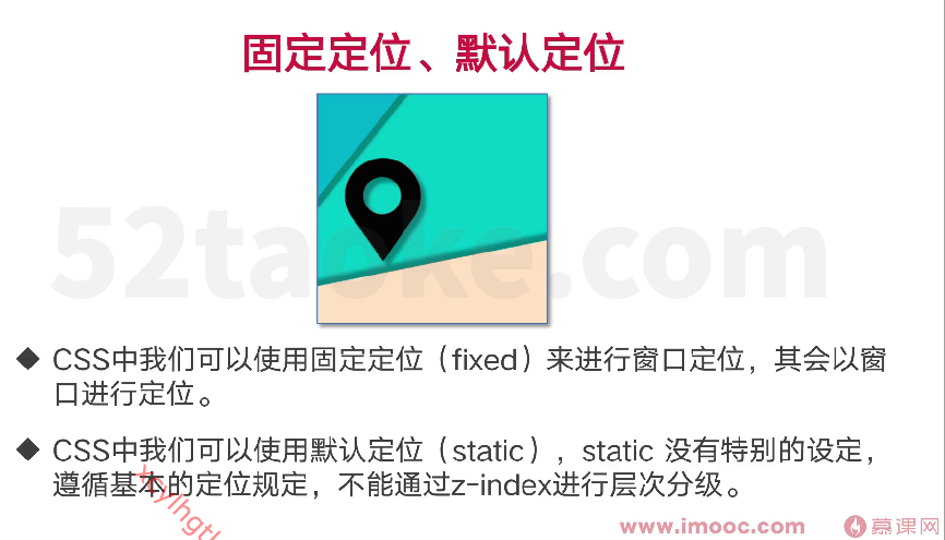
元素的固定、相对、默认定位
<!DOCTYPE html>
<html lang="en">

<head>
    <meta charset="UTF-8">
    <meta http-equiv="X-UA-Compatible" content="IE=edge">
    <meta name="viewport" content="width=device-width, initial-scale=1.0">
    <title>元素的默认、固定 定位</title>
    <style>
        .fixed {
            width: 100px;
            height: 100px;
            background: black;
            position: fixed;
            left: 0;
            bottom: 0;
            z-index: 2;
        }

        .absolute {
            width: 100px;
            height: 100px;
            background: orange;
            position: absolute;
            left: 0;
            bottom: 0;
            z-index: 1;
        }

        .static {
            width: 100px;
            height: 100px;
            background: pink;
            position: absolute;
            left: 0;
            top: 0;
        }

        .none {
            position: static;
        }
    </style>
</head>

<body>
    <div style="height: 3000px;">
        <div class="fixed"></div>
        <div class="absolute"></div>
        <div class="static none"></div>
    </div>

</body>

</html>
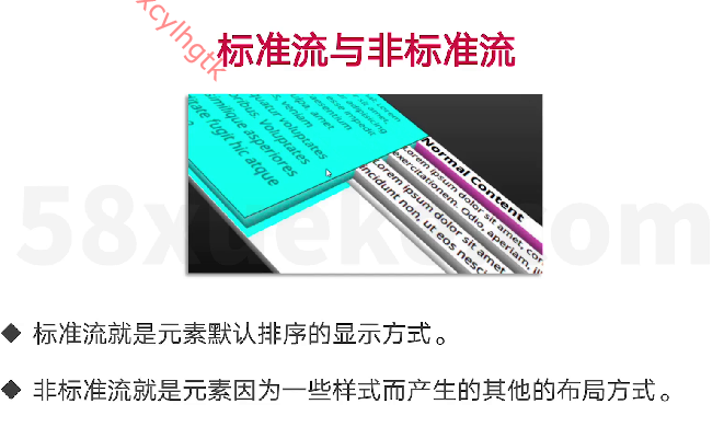
标准流和非标准流
<!DOCTYPE html>
<html lang="en">

<head>
    <meta charset="UTF-8">
    <meta http-equiv="X-UA-Compatible" content="IE=edge">
    <meta name="viewport" content="width=device-width, initial-scale=1.0">
    <title>标准流和非标准流</title>
    <Style>
        .leo {
            width: 100px;
            height: 100px;
            background: black;
            /* position: fixed; */
            /* float: left; */
        }

        .leo_div {
            width: 10px;
            height: 10px;
            background: red;
            margin-top: 10px;
        }

        .sky {
            width: 100px;
            height: 100px;
            background: orange;
            float: left;
        }
    </Style>
</head>

<body>
    <div class="leo">
        <!-- 如果是在标准流情况下,那么子元素的margin-top会有影响 -->
        <!-- 注意:尽量标准流和标准流一起使用,非标准流和非标准流一起使用 -->
        <div class="leo_div">

        </div>

    </div>
    <div class="sky"></div>
</body>

</html>
元素变行内、变块、变行内块样式
<!DOCTYPE html>
<html lang="en">

<head>
    <meta charset="UTF-8">
    <meta http-equiv="X-UA-Compatible" content="IE=edge">
    <meta name="viewport" content="width=device-width, initial-scale=1.0">
    <title>元素变行内、变块、变行内块</title>
    <style>
        div {
            width: 200px;
            height: 200px;
            background: black;
            margin: 50px;
        }

        a {
            width: 200px;
            height: 200px;
            background: black;
            /* 行内元素 margin-top不支持 */
            margin: 50px;
            padding: 50px;
        }
        /* 浮动也会变成块状元素 */

        .fa {
            width: 200px;
            height: 200px;
            background: red;
            float: left;
        }
        /* 定位也会把行内元素改为块状元素 */

        .position {
            width: 100px;
            height: 100px;
            background: red;
            position: absolute;
        }

        .block {
            width: 100px;
            height: 100px;
            background: red;
            display: block;
        }

        .inline {
            width: 100px;
            height: 100px;
            display: inline;
        }

        .ib {
            width: 100px;
            height: 100px;
            background: red;
            display: inline-block;
            margin-top: 50px;
            padding: 50px;
        }
    </style>
</head>

<body>
    <!-- 块状元素 块状元素会另起一行-->
    <!-- <div></div> -->
    <!-- 行内元素 会在同一行-->
    <!-- <a></a>
    <a></a> -->

    <!-- <a class="fa"></a>
    <a class="position"></a>
    <a class="block"></a> -->

    <!-- 块状元素改行内元素 -->
    <div class="inline">abc</div>

    <!-- 行内块元素 -->
    <img/>


    <!-- 行内块元素 -->
    <a class="ib">123</a>
</body>

</html>
CSS的重置方式与命名规范
<!DOCTYPE html>
<html lang="en">

<head>
    <meta charset="UTF-8">
    <meta http-equiv="X-UA-Compatible" content="IE=edge">
    <meta name="viewport" content="width=device-width, initial-scale=1.0">
    <title>Document</title>
    <link rel="stylesheet" type="text/css" href="css/reset.css" />
    <style>
        div {
            width: 100px;
            height: 100px;
            background: black;
        }

        .div1 {}

        .fbtnother {}

        .pfboxouter {}

        .pf-box-outer {
            background: red
        }
    </style>
</head>

<body>
    <div></div>
    <button class='fbtnother'></button>
    <div class='pf_box_outer'></div>
    <div class='pf-box-outer'></div>
    <div class='pf box outer'></div>
    <div class='pfBoxOuter'></div>
    <div class='leoTopBtn'></div>
    <div class='leo-top-btn'></div>
</body>

</html>
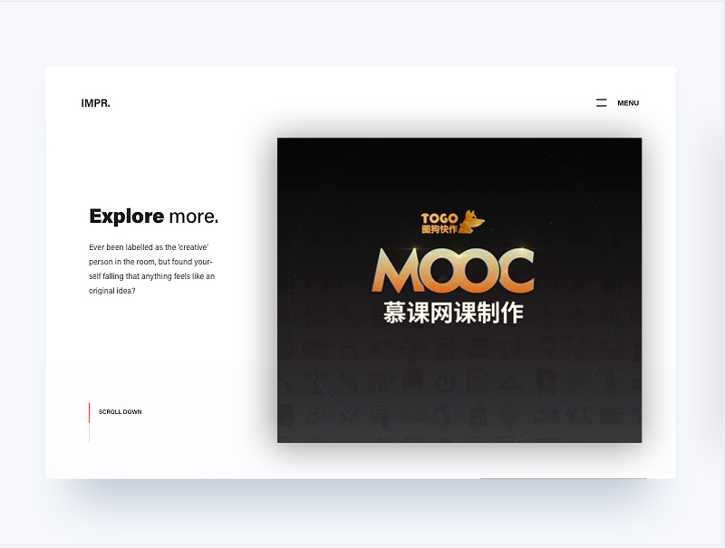
综合实战-首页单屏案例实战
<!DOCTYPE html>
<html lang="en">

<head>
    <meta charset="UTF-8">
    <meta http-equiv="X-UA-Compatible" content="IE=edge">
    <meta name="viewport" content="width=device-width, initial-scale=1.0">
    <title>首页单屏案例</title>
    <style>
        body {
            background: #f6f7fb;
        }

        .centerNode {
            width: 870px;
            height: 572px;
            background: #ffffff;
            margin: auto;
            margin-top: 90px;
            box-shadow: 0px 60px 60px #c9d2dc;
            position: relative;
        }

        .leftTopText {
            font-size: 14px;
            height: 14px;
            line-height: 14px;
            position: absolute;
            left: 50px;
            top: 44px;
            color: #000000;
        }

        .rightTopText {
            height: 13px;
            line-height: 13px;
            font-size: 12px;
            color: #0d0d0e;
            position: absolute;
            right: 50px;
            top: 44px;
            background: url(img/topRight_icon.jpg) no-repeat;
            padding-left: 29px;
        }

        .rightCenter {
            position: absolute;
            right: 47px;
            top: 100px;
            /* X轴 y轴 粗细 颜色 */
            box-shadow: 0px 0px 45px #d1d1d1;
        }

        .leftCenterText {
            font-size: 26px;
            line-height: 26px;
            height: 26px;
            color: #19131a;
            position: absolute;
            top: 197px;
            left: 61px;
        }

        .leftCenterText span {
            font-weight: bold;
        }

        .leftCenterContent {
            width: 178px;
            line-height: 22px;
            font-size: 12px;
            color: #403e4d;
            position: absolute;
            left: 61px;
            top: 240px;
        }

        .leftBottom {
            width: 103px;
            height: 57px;
            position: absolute;
            left: 59px;
            bottom: 51px;
        }

        .leftBottom .leftRedTop {
            width: 3px;
            height: 30px;
            background: #f93828;
        }

        .leftBottom .leftGrayBottom {
            width: 3px;
            height: 27px;
            background: #e0dfe2;
        }

        .leftBottom p {
            font-size: 12px;
            line-height: 12px;
            color: #121212;
            height: 12px;
            position: absolute;
            left: 14px;
            top: 8px;
        }
    </style>
</head>

<body>
    <div class="centerNode">
        <div class="leftTopText">
            IMPR.
        </div>
        <div class="rightTopText">
            MENU
        </div>

        <div class="rightCenter">
            <img src="img/rightCenter.jpg" />
        </div>
        <p class="leftCenterText">
            <span>Explore</span>more
        </p>
        <p class='leftCenterContent'>
            Ever been labelled as the "createive" person in the room.Ever been labelled as the "createive" person in the room.
        </p>


        <div class='leftBottom'>
            <div class='leftRedTop'></div>
            <div class='leftGrayBottom'></div>
            <p>SCROLL DOWN</p>
        </div>
    </div>

</body>

</html>


 浙公网安备 33010602011771号