
前端必学-40个精选案例实战-案例4-仿B站导航条案例【基础样式】
浮动布局实现导航元素连续排列
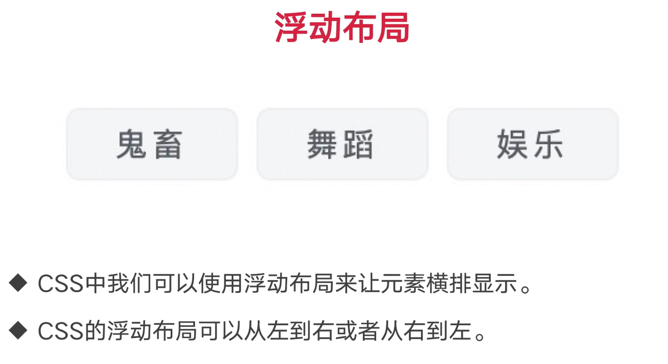
行内元素(span元素)给上了浮动,就可以当作块状元素(div元素)的特点来使用
<!DOCTYPE html>
<html lang="en">

<head>
    <meta charset="UTF-8">
    <meta http-equiv="X-UA-Compatible" content="IE=edge">
    <meta name="viewport" content="width=device-width, initial-scale=1.0">
    <title>浮动布局实现导航元素连续排列</title>
    <style>
        .outerBox {
            width: 400px;
            height: 100px;
            border: 10px solid black;
        }

        .outerBox>div {
            width: 100px;
            height: 100px;
            background: orange;
            float: left;
        }

        .outerBox>.end {
            width: 100px;
        }

        .outerBoxTwo {
            width: 400px;
            height: 100px;
            border: 10px solid black
        }

        .outerBoxTwo>span {
            width: 100px;
            height: 100px;
            background: red;
            float: left;
        }

        .outerBoxTwo>div {
            width: 100px;
            height: 100px;
            background: red;
            /* float: left; */
        }
    </style>
</head>

<body>
    <div class="outerBox">
        <div>1</div>
        <div>2</div>
        <div>3</div>
        <div class="end">4</div>
    </div>
    <div class="outerBoxTwo">

        <span>123</span>
        <span>123</span>
        <span>123</span>
        <div>444</div>
    </div>


</body>

</html>
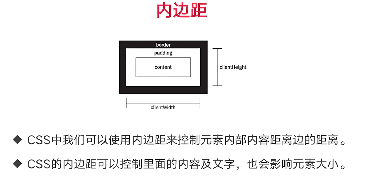
外边距
- CSS中我们可以使用外边距来控制元素上下左右距离
- CSS的外边距在浮动和非浮动环境下有区别
如果是浮动的话,外边距会进行一个叠加
如果不是浮动的话,外边距会选择最大的一个边距进行展示
<!DOCTYPE html>
<html lang="en">

<head>
    <meta charset="UTF-8">
    <meta http-equiv="X-UA-Compatible" content="IE=edge">
    <meta name="viewport" content="width=device-width, initial-scale=1.0">
    <title>外边距</title>
    <style>
        .leo {
            width: 100px;
            height: 100px;
            background: black;
            float: left;
            margin-right: 100px;
        }

        .sky {
            width: 100px;
            height: 100px;
            background: red;
            float: left;
            margin-left: 100px;
        }

        .outer {
            width: 100px;
            height: 100px;
            border: 10px solid black;
        }

        .outer .outer_one {
            width: 100px;
            height: 100px;
            background: orange;
            float: left;
            margin-bottom: 100px;
        }

        .outer .outer_two {
            width: 100px;
            height: 100px;
            background: green;
            float: left;
            margin-top: 100px;
        }

        .box {
            width: 500px;
            height: 500px;
            border: 10px solid black;
        }

        .box_one {
            width: 100px;
            height: 100px;
            background: black;
            float: left;
            margin: 100px 200px 300px 400px;
        }

        .box_one {
            width: 100px;
            height: 100px;
            background: black;
            float: left;
        }
    </style>
</head>

<body>
    <div class="leo"></div>
    <div class="sky"></div>

    <div class="outer">
        <div class="outer_one"></div>
        <div class="outer_two"></div>
    </div>
    <div class="box">
        <div class="box_one"></div>
        <div class="box_two"></div>
    </div>
</body>

</html>
元素内边距样式实现文字与元素的间隙
<!DOCTYPE html>
<html lang="en">

<head>
    <meta charset="UTF-8">
    <meta http-equiv="X-UA-Compatible" content="IE=edge">
    <meta name="viewport" content="width=device-width, initial-scale=1.0">
    <title>内边距</title>
    <style>
        .box {
            width: 100px;
            height: 100px;
            border: 10px solid black;
            padding-left: 10px;
            padding-top: 10px;
            padding-right: 10px;
            padding-bottom: 10px;
        }

        .box_two {
            width: 100px;
            height: 100px;
            border: 10px solid black;
            padding-left: 50px;
            padding-top: 50px;
        }

        .box_twoNode {
            width: 50px;
            height: 50px;
            background: orange;
        }

        .box_three {
            width: 100px;
            height: 100px;
            border: 10px solid black;
            padding: 100px 200px 300px 400px;
        }

        .box_three>div {
            width: 100px;
            height: 100px;
            background: green;
        }
    </style>
</head>

<body>
    <div class="box">
        呵呵呵呵呵呵呵
    </div>
    <div class="box_two">
        <div class="box_twoNode"></div>
    </div>
    <div class="box_three">
        <div></div>
    </div>
</body>

</html>
重点知识:盒子模型
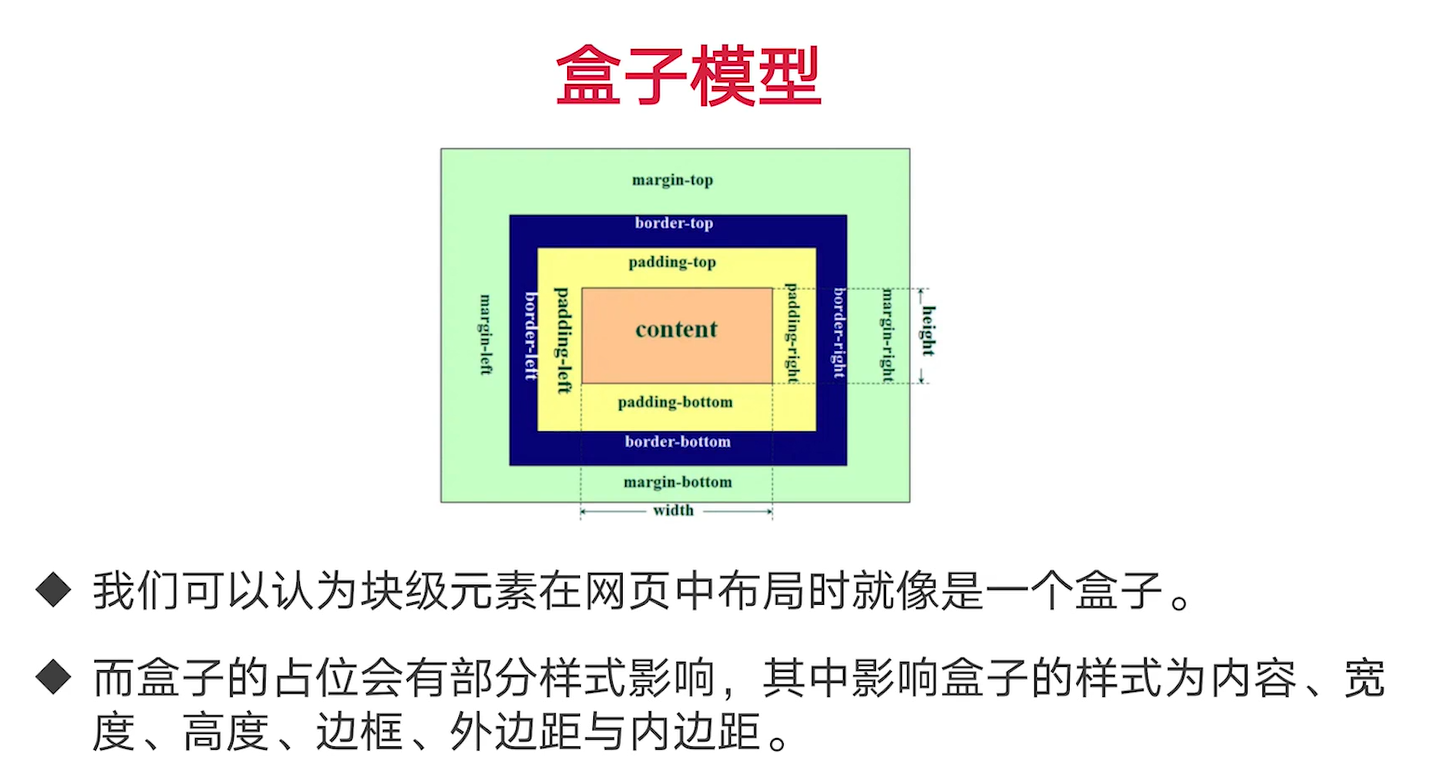
span在样式中有两种方法可以转变成 块状元素
一个是加上float浮动,还可以加上display:block ,就变成了块状元素
<!DOCTYPE html>
<html lang="en">

<head>
    <meta charset="UTF-8">
    <meta http-equiv="X-UA-Compatible" content="IE=edge">
    <meta name="viewport" content="width=device-width, initial-scale=1.0">
    <title>盒子模型</title>
    <style>
        .leo {
            width: 100px;
            height: 100px;
            background: black;
            border: 10px solid red;
            padding: 10px;
            float: left;
            margin: 10px;
        }

        .sky {
            width: 100px;
            height: 100px;
            background: green;
            float: left;
        }

        .blue {
            border: 10px solid black;
            float: left;
        }

        .blue>div {
            width: 100px;
            height: 100px;
            background: red;
            float: left;
        }

        span {
            width: 100px;
            height: 100px;
            background: red;
            float: left;
            padding: 10px;
        }
    </style>
</head>

<body>
    <!-- <div class="leo"></div>
    <div class="sky"></div>
    <div class="blue">
        <div></div>
    </div> -->

    <div>
        1111
    </div>
    <br/>
    <span>123</span>
    <span>bb</span>
</body>

</html>
完善b站导航条效果
这里需要注意,效果图需要根据自己的来,不然很容易不对称,我这边截取的图就是不对称,最终效果不太理想。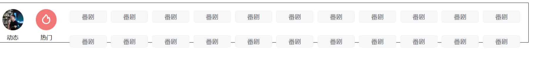
<!DOCTYPE html>
<html>

<head>
    <meta charset="utf-8" />
    <title></title>
    <style>
        ul,
        ol {
            margin: 0;
            padding: 0;
        }

        a {
            text-decoration: none;
        }

        .outerNode {
            width: 1248px;
            height: 104px;
        }

        .outerNode>.left {
            width: 237px;
            height: 104px;
            float: left;
        }

        .outerNode>.right {
            width: 1011px;
            height: 104px;
            float: left;
        }

        .outerNode>.left>.left_ul {
            float: left;
            list-style: none;
            margin-top: 17px;
            margin-left: 6px;
        }

        .outerNode>.left>.left_ul>li {
            height: 70px;
            width: 48px;
            float: left;
            margin-right: 22px;
        }

        .outerNode>.left>.left_ul>li .top_image {
            width: 48px;
            height: 48px;
            float: left;
        }

        .outerNode>.left>.left_ul>li a {
            display: block;
            color: black;
        }

        .outerNode>.left>.left_ul>li .top_text {
            width: 48px;
            height: 14px;
            line-height: 14px;
            margin-top: 8px;
            text-align: center;
            float: left;
        }

        .right>ol {
            float: left;
            list-style: none;
            margin-top: 17px;
        }

        .right>ol>li {
            width: 75px;
            height: 30px;
            float: left;
            border: 1px solid #f2f2f3;
            background: #f6f7f9;
            text-align: center;
            line-height: 30px;
            font-size: 14px;
            border-radius: 5px;
            margin-right: 7px;
            margin-bottom: 9px;
        }

        .right>ol>li a {
            color: #505256;
        }
    </style>
</head>

<body>
    <div class='outerNode'>
        <div class='left'>
            <ul class='left_ul'>
                <li>
                    <a href="#">
                        <div class='top_image'>
                            <img src="img/img_01.jpg" />
                        </div>
                        <div class='top_text'>动态</div>
                    </a>
                </li>
                <li>
                    <a href="#">
                        <div class='top_image'>
                            <img src="img/img_02.jpg" />
                        </div>
                        <div class='top_text'>热门</div>
                    </a>
                </li>
                <li>
                    <a href="#">
                        <div class='top_image'>
                            <img src="img/img_03.jpg" />
                        </div>
                        <div class='top_text'>频道</div>
                    </a>
                </li>
            </ul>
        </div>
        <div class='right'>
            <ol>
                <li>
                    <a href="#">
							番剧
						</a>
                </li>
                <li>
                    <a href="#">
							国创
						</a>
                </li>
                <li>
                    <a href="#">
							综艺
						</a>
                </li>
                <li>
                    <a href="#">
							番剧
						</a>
                </li>
                <li>
                    <a href="#">
							番剧
						</a>
                </li>
                <li>
                    <a href="#">
							番剧
						</a>
                </li>
                <li>
                    <a href="#">
							番剧
						</a>
                </li>
                <li>
                    <a href="#">
							番剧
						</a>
                </li>
                <li>
                    <a href="#">
							番剧
						</a>
                </li>
                <li>
                    <a href="#">
							番剧
						</a>
                </li>
                <li>
                    <a href="#">
							番剧
						</a>
                </li>
                <li>
                    <a href="#">
							番剧
						</a>
                </li>
                <li>
                    <a href="#">
							番剧
						</a>
                </li>
                <li>
                    <a href="#">
							番剧
						</a>
                </li>
                <li>
                    <a href="#">
							番剧
						</a>
                </li>
                <li>
                    <a href="#">
							番剧
						</a>
                </li>
                <li>
                    <a href="#">
							番剧
						</a>
                </li>
                <li>
                    <a href="#">
							番剧
						</a>
                </li>
                <li>
                    <a href="#">
							番剧
						</a>
                </li>
                <li>
                    <a href="#">
							番剧
						</a>
                </li>
                <li>
                    <a href="#">
							番剧
						</a>
                </li>
                <li>
                    <a href="#">
							番剧
						</a>
                </li>
                <li>
                    <a href="#">
							番剧
						</a>
                </li>
                <li>
                    <a href="#">
                        <span>更多</span>
                        <img src="img/icon.jpg" />
                    </a>
                </li>
            </ol>
        </div>
    </div>
</body>

</html>
浮动坑问题
只有一个浮动的话,那么第一个元素会压住第二个元素
如果第二个元素有浮动,第一个元素会在原来的位置上,第二个元素会跑到下面
<!DOCTYPE html>
<html lang="en">

<head>
    <meta charset="UTF-8">
    <meta http-equiv="X-UA-Compatible" content="IE=edge">
    <meta name="viewport" content="width=device-width, initial-scale=1.0">
    <title>浮动的坑问题</title>
    <style>
        div {
            width: 100px;
            height: 100px;
            background: black;
        }

        .leo {
            float: left;
            background: red;
        }
    </style>
</head>

<body>
    <div class="leo"></div>
    <div></div>
</body>

</html>
<!DOCTYPE html>
<html lang="en">

<head>
    <meta charset="UTF-8">
    <meta http-equiv="X-UA-Compatible" content="IE=edge">
    <meta name="viewport" content="width=device-width, initial-scale=1.0">
    <title>浮动的坑问题</title>
    <style>
        div {
            width: 100px;
            height: 100px;
            background: black;
        }

        .leo {
            float: left;
            background: red;
        }
    </style>
</head>

<body>
    <div></div>
    <div class="leo"></div>
</body>

</html>
有浮动就都写浮动,没有浮动就都不写浮动

 浙公网安备 33010602011771号