
自定义控件——视图的构建过程——视图的构造方法
视图基类View有四个构造方法,分别是:
(1)带一个参数的构造方法public View(Context context)
(2)带两个参数的构造方法public View(Context context, AttributeSet attrs)
(3)带三个参数的构造方法public View(Context context, AttributeSet attrs, int defStyleAttr)
(4)带四个参数的构造方法public View(Context context, AttributeSet attrs, int defStyleAttr, int defStyleRes)
构造方法的四个参数说明如下:
(1)Context context,视图的上下文
(2)AttributeSet attrs,视图的属性设置
(3)int defStyleAttr,默认的样式属性
(4) int defStyleRes,默认的样式资源
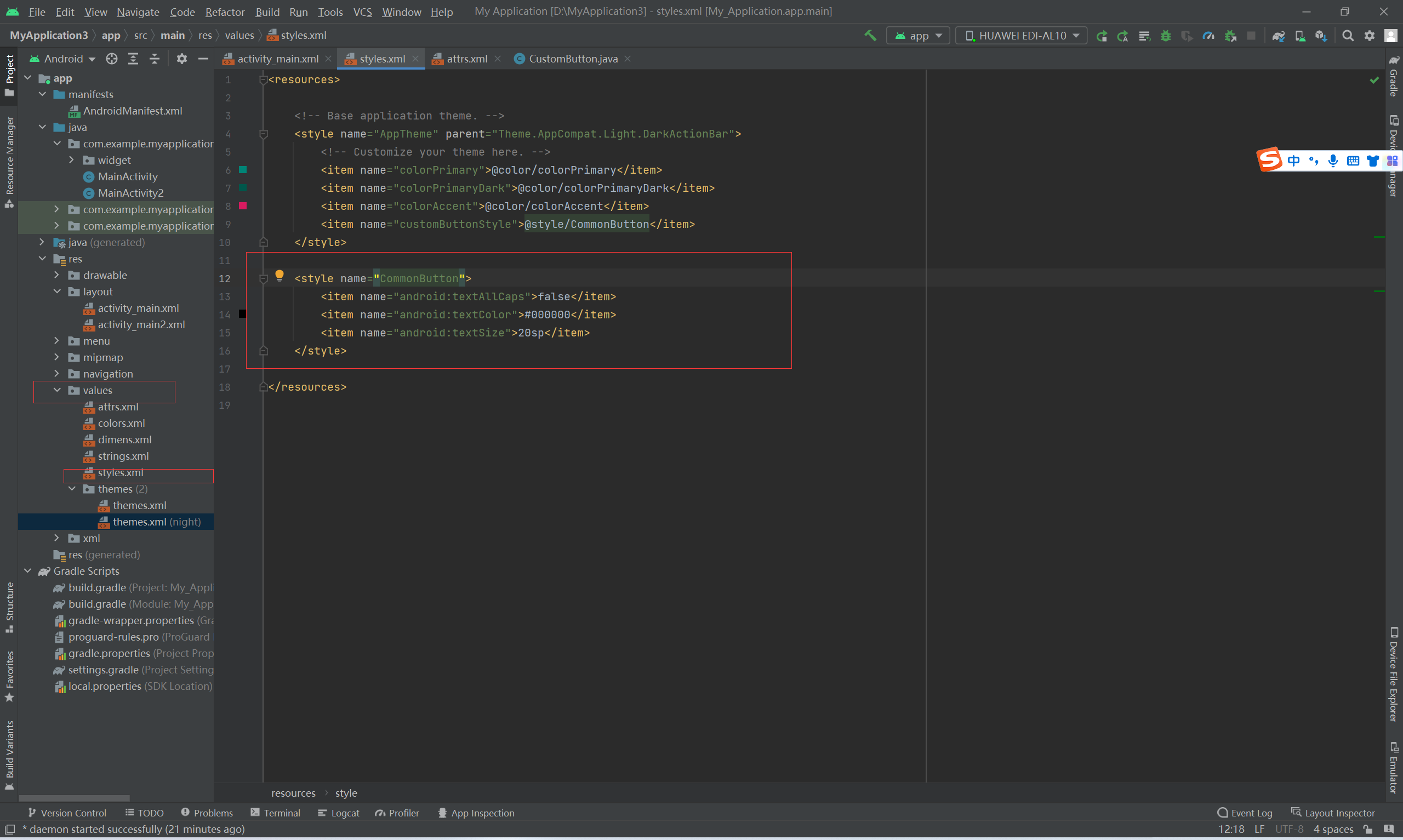
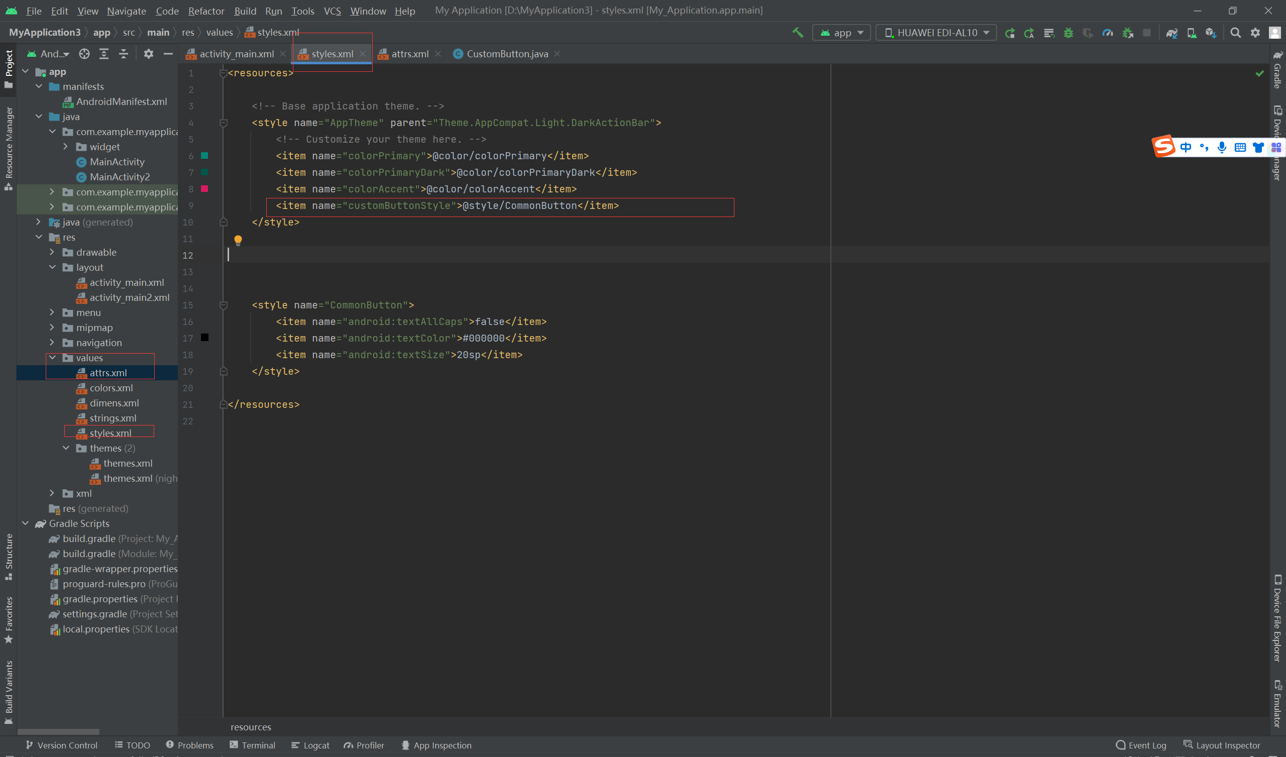
styles.xml定义的样式风格允许用在多个地方,这些地方的优先级顺序为:style属性>defStyleAttr>defStyleRes
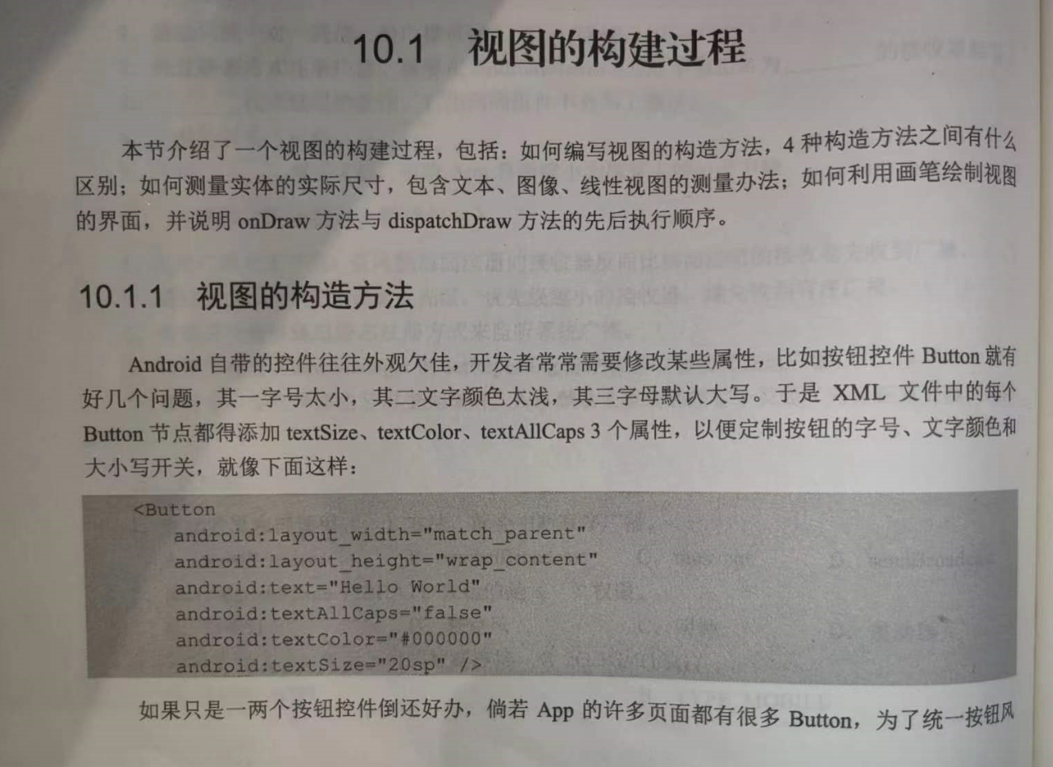
===========================================================================================
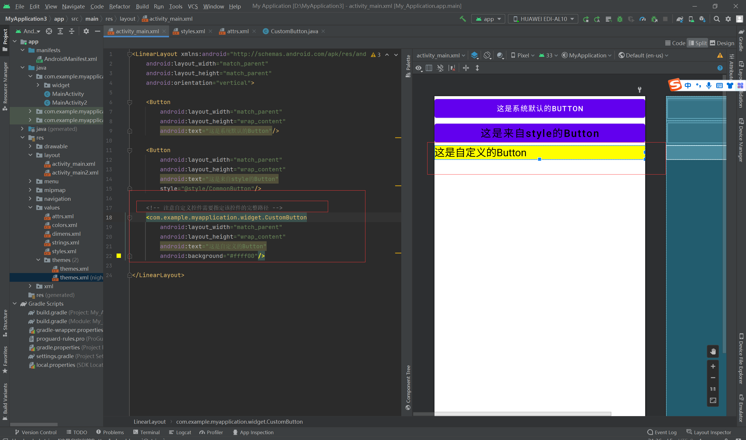
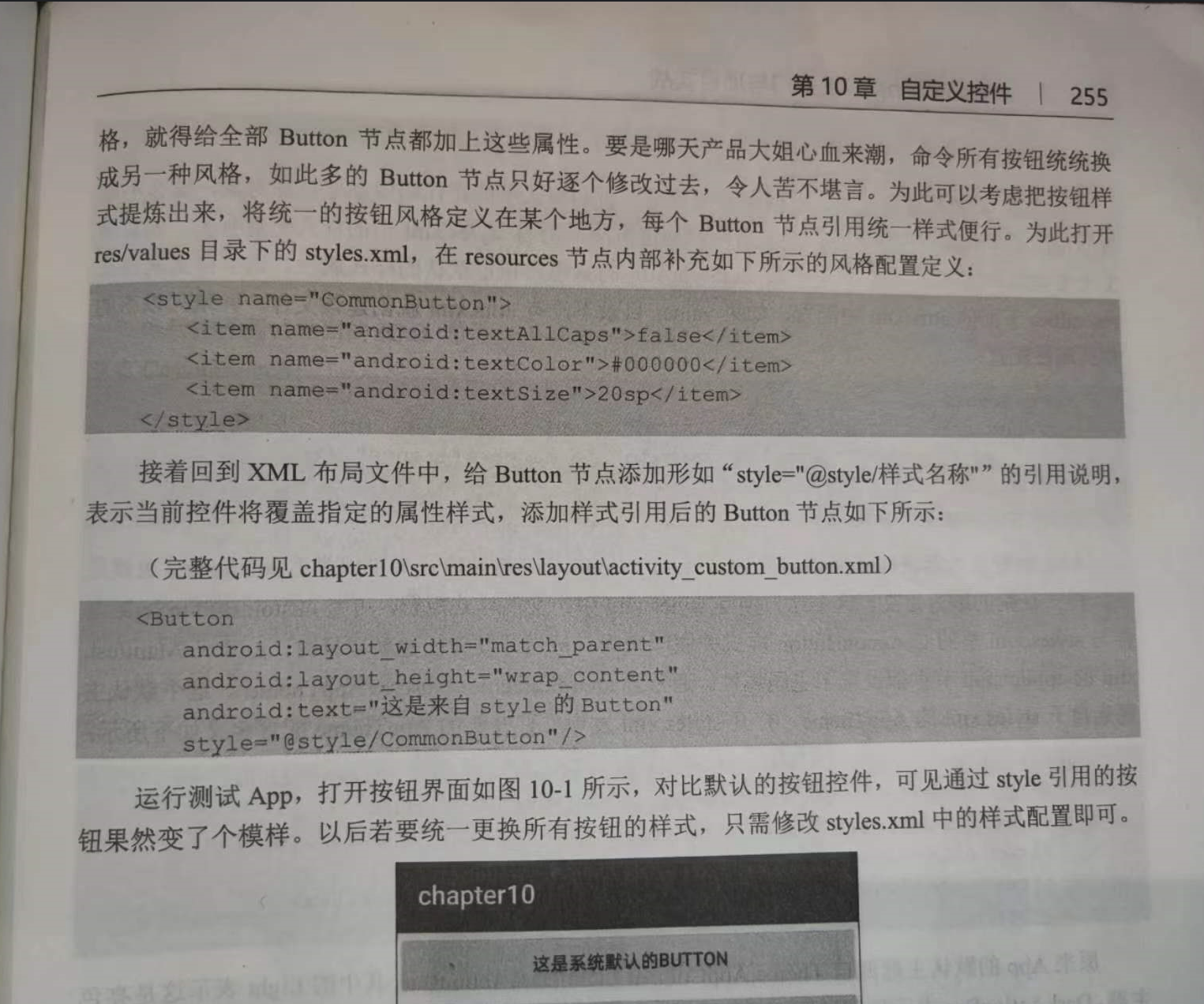
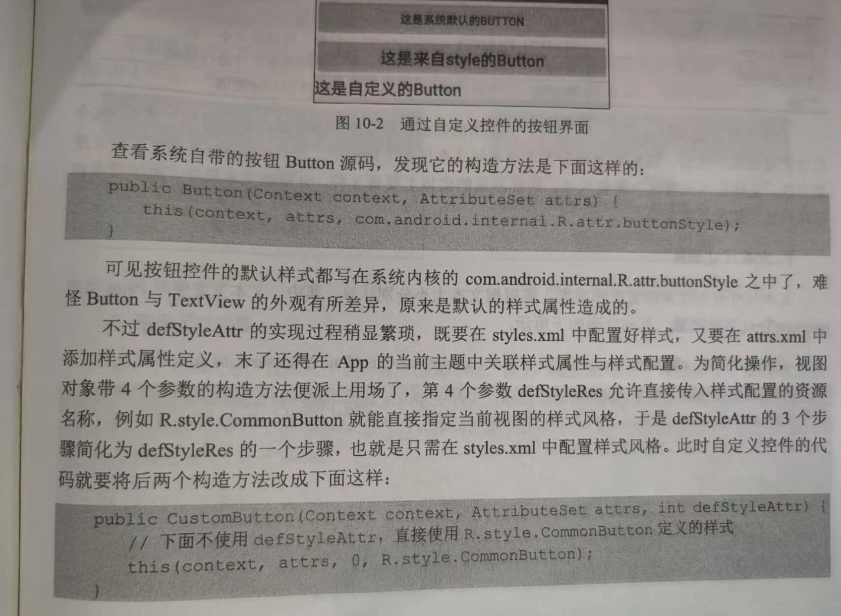
第一个,系统默认的button
    <Button
        android:layout_width="match_parent"
        android:layout_height="wrap_content"
        android:text="这是系统默认的Button"/>

第二个,来自style的button

第三个,自定义样式

<LinearLayout xmlns:android="http://schemas.android.com/apk/res/android"
    android:layout_width="match_parent"
    android:layout_height="match_parent"
    android:orientation="vertical">

    <Button
        android:layout_width="match_parent"
        android:layout_height="wrap_content"
        android:text="这是系统默认的Button"/>

    <Button
        android:layout_width="match_parent"
        android:layout_height="wrap_content"
        android:text="这是来自style的Button"
        style="@style/CommonButton"/>

    <!-- 注意自定义控件需要指定该控件的完整路径 -->
    <com.example.myapplication.widget.CustomButton
        android:layout_width="match_parent"
        android:layout_height="wrap_content"
        android:text="这是自定义的Button"
        android:background="#ffff00"/>

</LinearLayout>
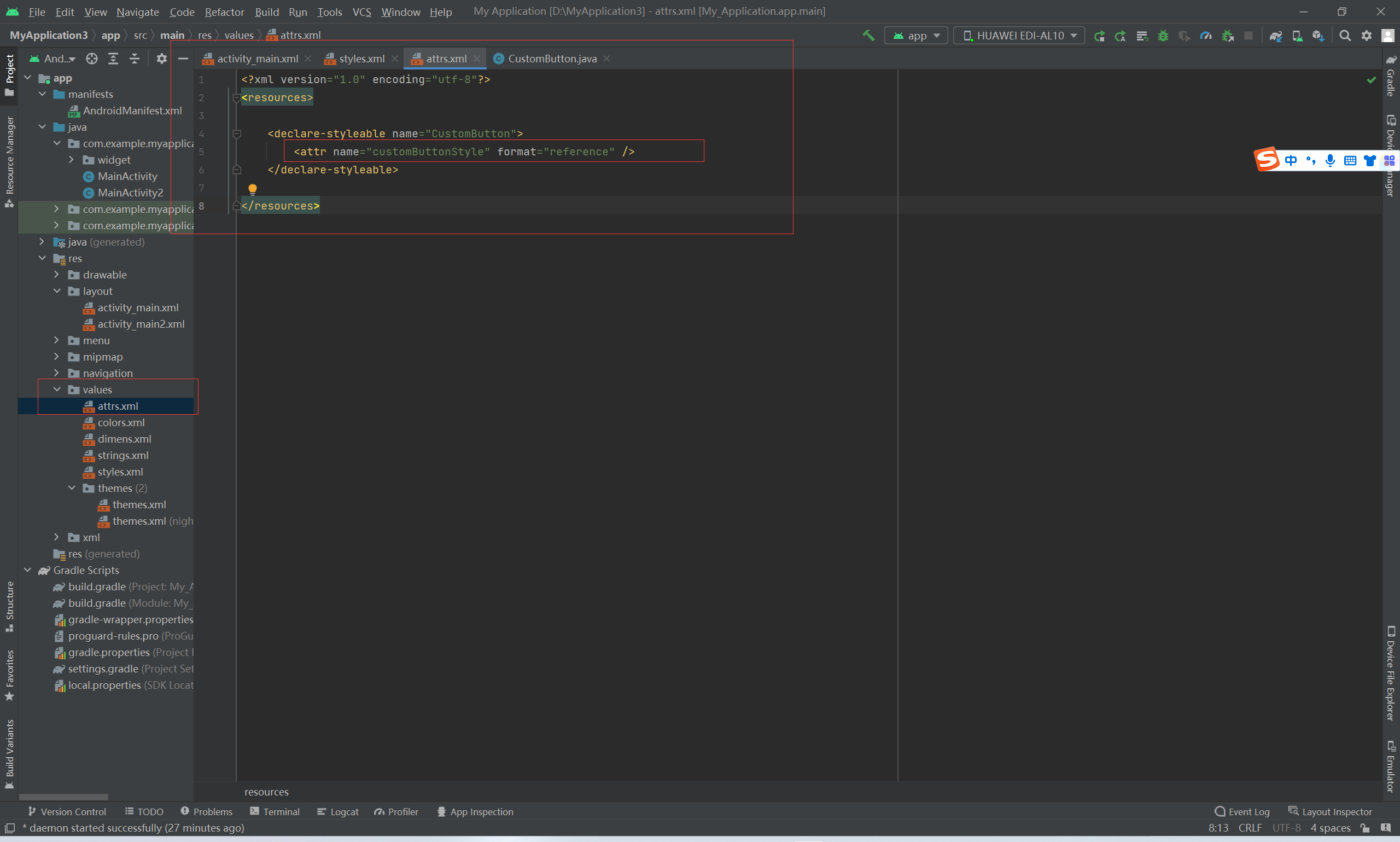
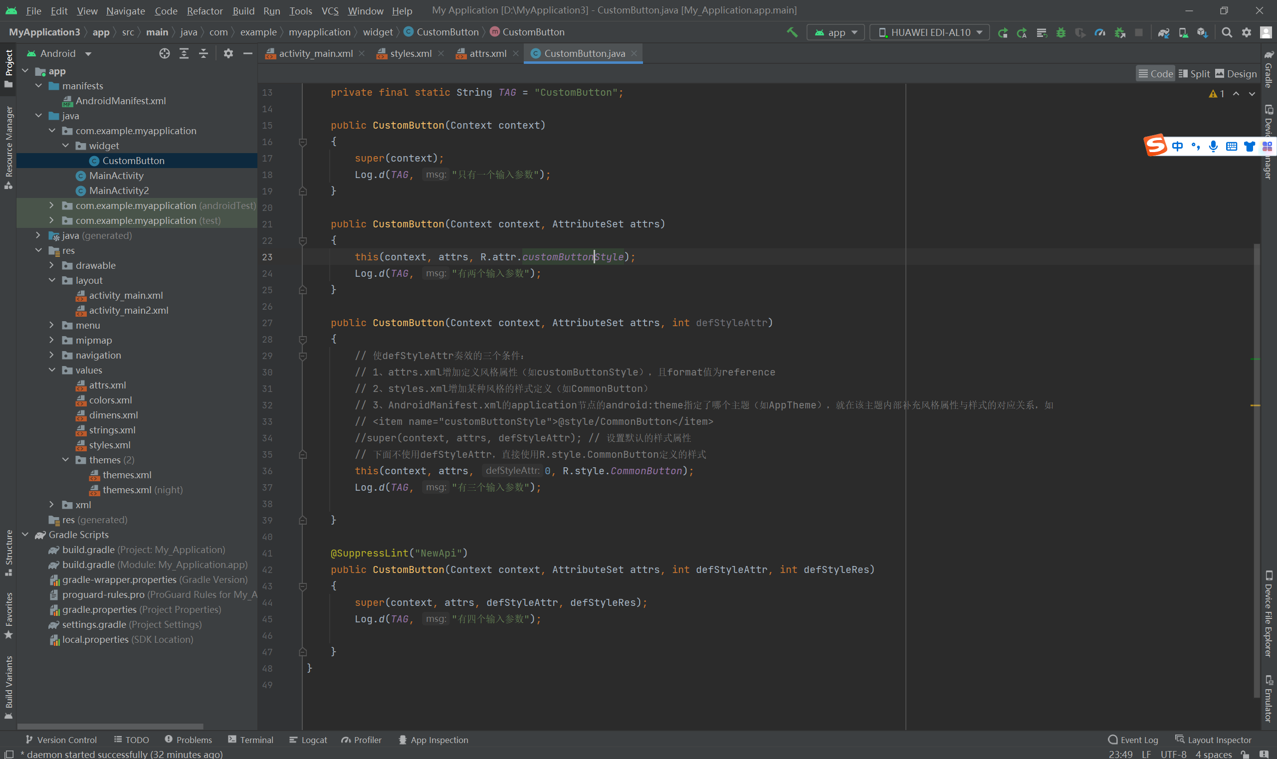
第三个参数:defStyleAttr,指定默认的样式属性:
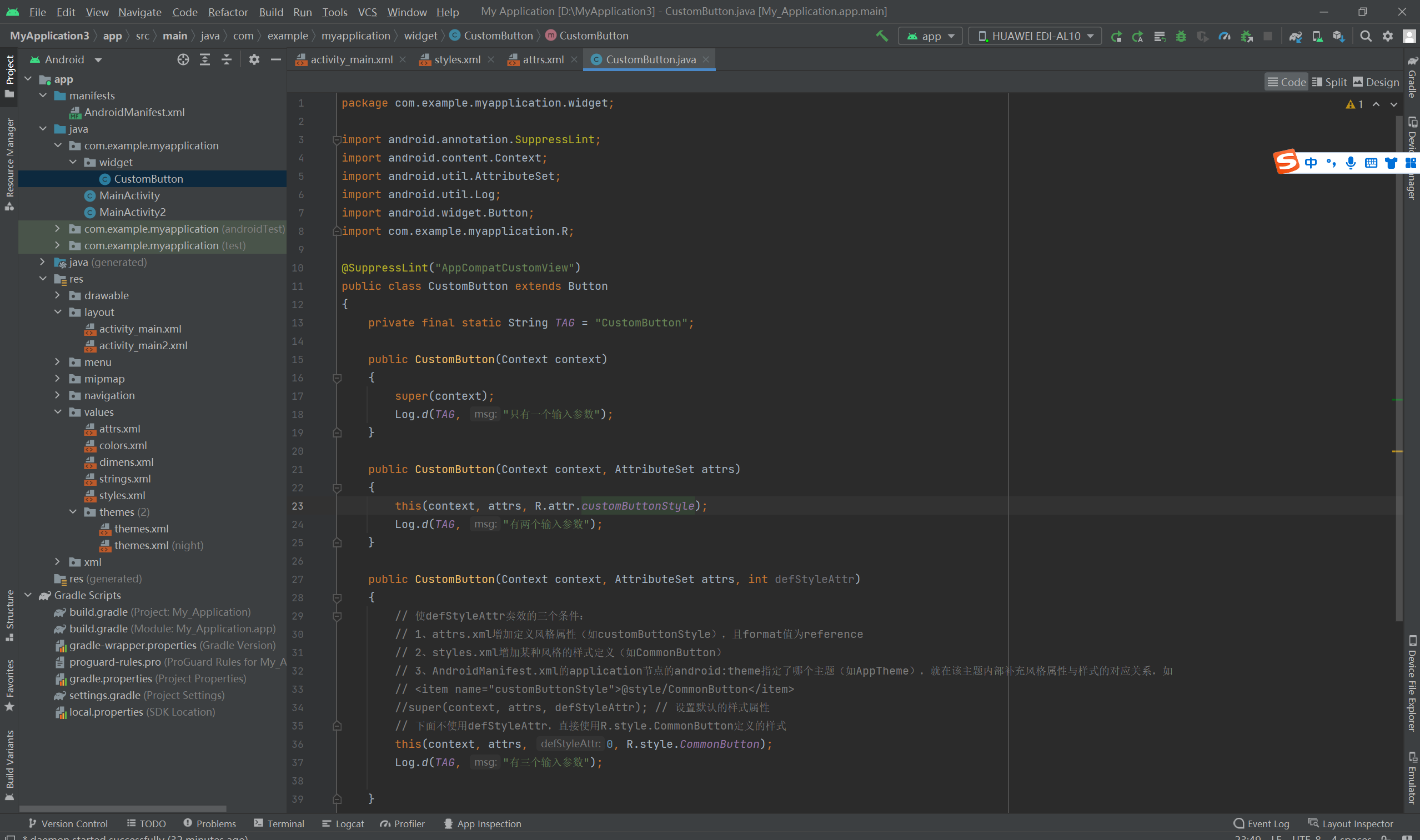
<?xml version="1.0" encoding="utf-8"?>
<resources>

    <declare-styleable name="CustomButton">
        <attr name="customButtonStyle" format="reference" />
    </declare-styleable>

</resources>
<resources>

    <!-- Base application theme. -->
    <style name="AppTheme" parent="Theme.AppCompat.Light.DarkActionBar">
        <!-- Customize your theme here. -->
        <item name="colorPrimary">@color/colorPrimary</item>
        <item name="colorPrimaryDark">@color/colorPrimaryDark</item>
        <item name="colorAccent">@color/colorAccent</item>
        <item name="customButtonStyle">@style/CommonButton</item>
    </style>


    <style name="CommonButton">
        <item name="android:textAllCaps">false</item>
        <item name="android:textColor">#000000</item>
        <item name="android:textSize">20sp</item>
    </style>

</resources>
代码:
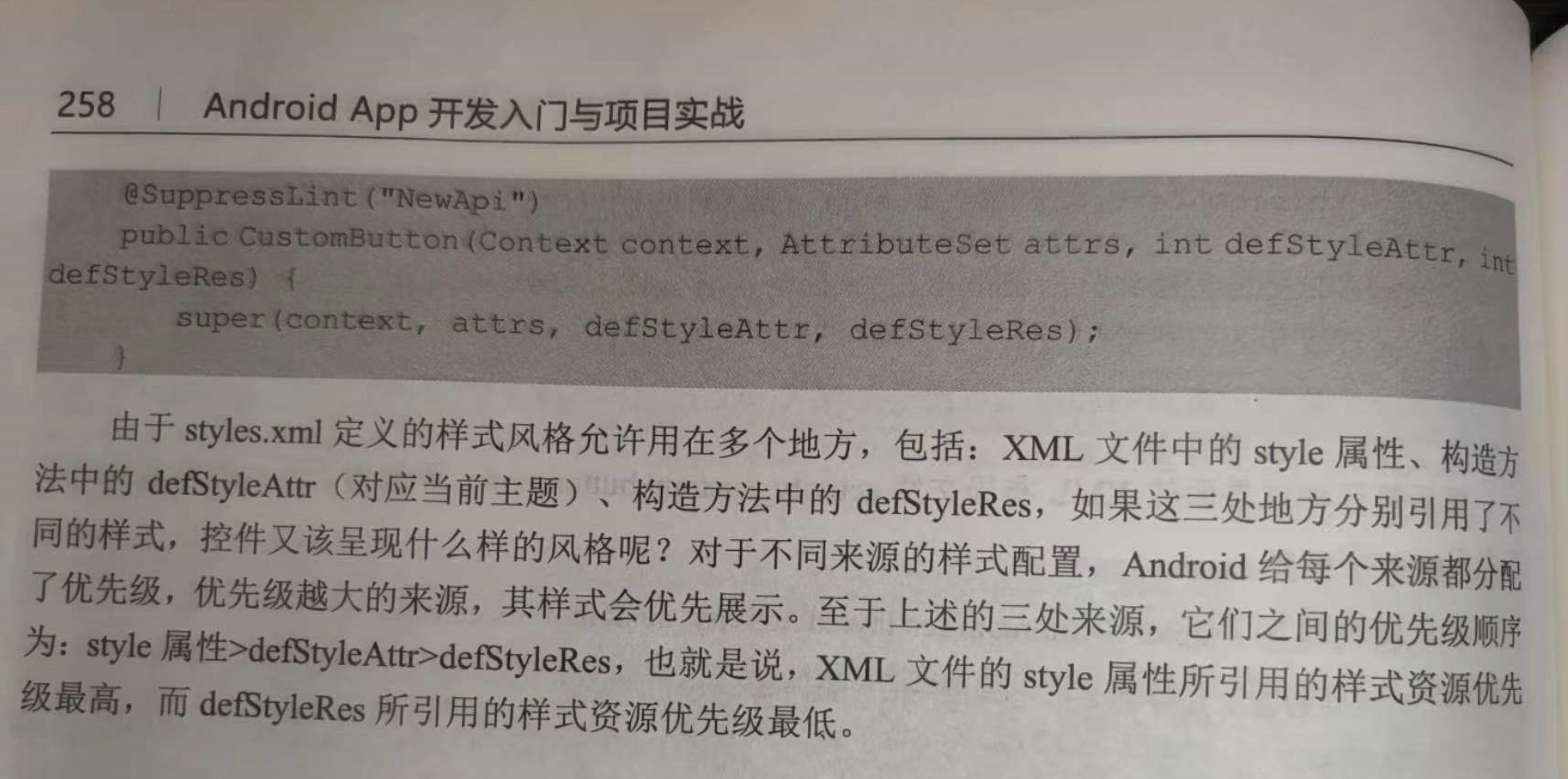
package com.example.myapplication.widget;

import android.annotation.SuppressLint;
import android.content.Context;
import android.util.AttributeSet;
import android.util.Log;
import android.widget.Button;
import com.example.myapplication.R;

@SuppressLint("AppCompatCustomView")
public class CustomButton extends Button
{
    private final static String TAG = "CustomButton";

    public CustomButton(Context context)
    {
        super(context);
        Log.d(TAG, "只有一个输入参数");
    }

    public CustomButton(Context context, AttributeSet attrs)
    {
        this(context, attrs, R.attr.customButtonStyle);
        Log.d(TAG, "有两个输入参数");
    }

    public CustomButton(Context context, AttributeSet attrs, int defStyleAttr)
    {
        // 使defStyleAttr奏效的三个条件:
        // 1、attrs.xml增加定义风格属性(如customButtonStyle),且format值为reference
        // 2、styles.xml增加某种风格的样式定义(如CommonButton)
        // 3、AndroidManifest.xml的application节点的android:theme指定了哪个主题(如AppTheme),就在该主题内部补充风格属性与样式的对应关系,如
        // <item name="customButtonStyle">@style/CommonButton</item>
        //super(context, attrs, defStyleAttr); // 设置默认的样式属性
        // 下面不使用defStyleAttr,直接使用R.style.CommonButton定义的样式
        this(context, attrs, 0, R.style.CommonButton);
        Log.d(TAG, "有三个输入参数");

    }

    @SuppressLint("NewApi")
    public CustomButton(Context context, AttributeSet attrs, int defStyleAttr, int defStyleRes)
    {
        super(context, attrs, defStyleAttr, defStyleRes);
        Log.d(TAG, "有四个输入参数");

    }
}


【推荐】国内首个AI IDE,深度理解中文开发场景,立即下载体验Trae
【推荐】编程新体验,更懂你的AI,立即体验豆包MarsCode编程助手
【推荐】抖音旗下AI助手豆包,你的智能百科全书,全免费不限次数
【推荐】轻量又高性能的 SSH 工具 IShell:AI 加持,快人一步
· 震惊!C++程序真的从main开始吗?99%的程序员都答错了
· 单元测试从入门到精通
· 【硬核科普】Trae如何「偷看」你的代码?零基础破解AI编程运行原理
· 上周热点回顾(3.3-3.9)
· winform 绘制太阳,地球,月球 运作规律
2021-09-03 测试开发进阶——python-java——appium002自动化常用方法——面试整理
2021-09-03 测试开发进阶——python-java——appium001自动化常用方法——面试整理