flex布局
什么是flex布局
flex布局即为弹性布局,使用display:flex进行布局,此布局使得盒模型布局更易使用。值得注意的是设为flex布局后,子元素的float、clear和vertical-align属性将失效。
flex的使用
当元素使用flex后,该元素则成为flex容器(container),其容器属性有:flex-direction、flex-wrap、flex-flow、justify-content、align-items、align-content。该容器中的元素则成为flex项目(item),其项目属性有:order、flex-grow、flex-shrink、flex-basis、flex、align-self(此6属性父元素必须为flex容器,否则失效),下面仅对容器属性做说明。
flex-direction
共有4个值:row(默认值) | row-reverse | column | column-reverse;
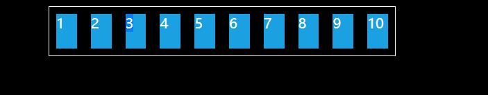
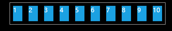
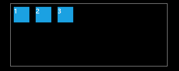
flex-direction:row,从左至右依次排列。
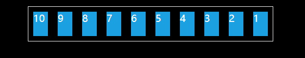
flex-direction:row-reverse,从右到左依次排列。
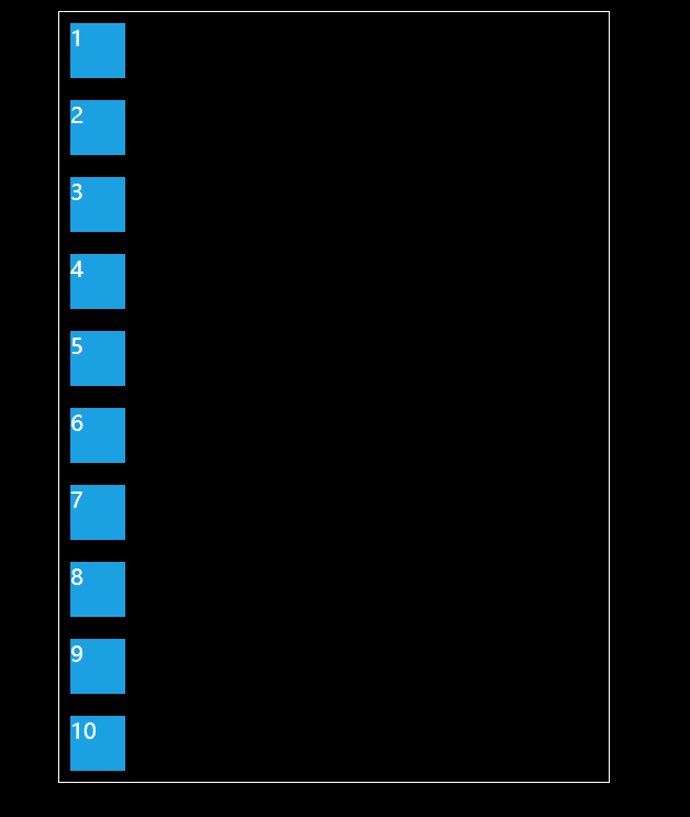
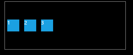
flex-direction:column;从上到下依次排列。
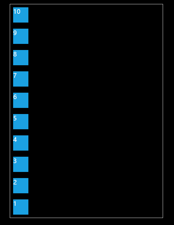
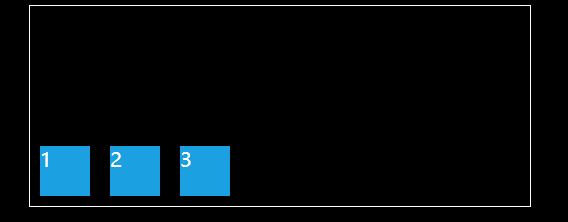
flex-direction:column-reverse;从下到上依次排列
flex-wrap
共有3个值:nowrap(默认值) | wrap | wrap-reverse;
flex-wrap: nowrap;不换行。
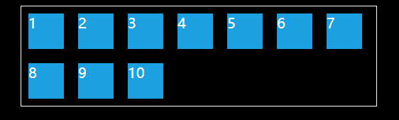
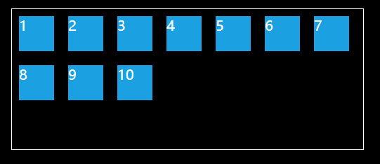
flex-wrap:wrap ;换行。
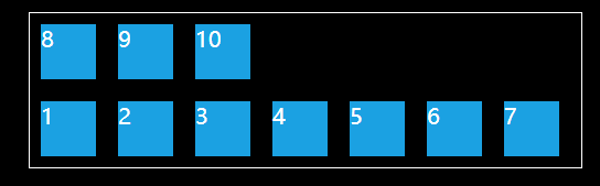
flex-wrap: wrap-reverse;换行,但第一排在下面。
flex-flow
该属性是flex-direction与flex-wrap属性的简写,flex-flow有他们所有的值。
justify-content
该属性有五个值:flex-start(默认值) | flex-end | center | space-between | space-around;
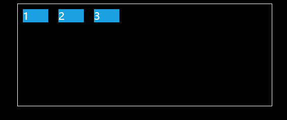
justify-content:flex-start;左对齐
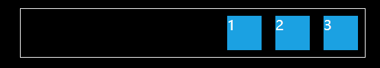
justify-content:flex-end;右对齐。
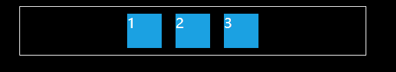
justify-content:center;居中。
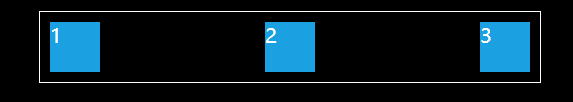
justify-content:space-between;均匀分布,但没有额外margin。
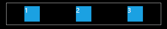
justify-content:space-around; 均匀分布,有额外margin。
align-items
五个值:flex-start | flex-end | center | baseline | stretch(默认值);
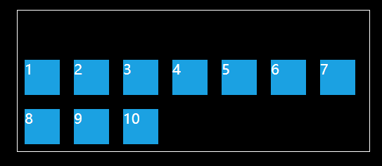
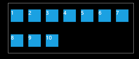
align-items:flex-start;顶部对齐
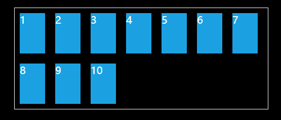
align-items:flex-end;底部对齐
align-items:center;垂直居中
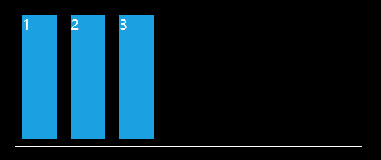
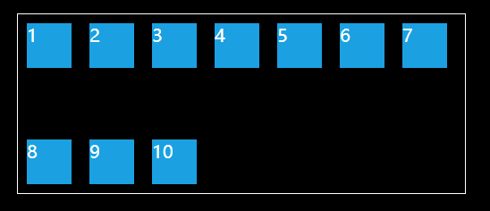
align-items:stretch;若子元素未设置高或为auto,将占满整个容器的高度。
align-items:baseline;子元素第一行文字基线对齐。
align-content
共6个值:flex-start | flex-end | center | space-between | space-around | stretch(默认值);
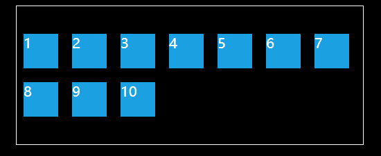
align-content:flex-start;从顶部对齐。
align-content:flex-end;从底部对齐。
align-content:center;从中部对齐。
align-content:space-between;顶部底部都占用。
align-content:space-around;均匀分布。
align-content:stretch;子元素无高度时自动铺满。

 浙公网安备 33010602011771号